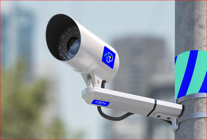
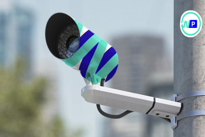
Client: I’m launching a tech startup that will help control parking spaces of any city using video surveillance and neural networks. Quick deployment of paid parking in any area of any city, absence of parking enforcement cars and officers, high accuracy of license plate recognition and ability to show free spaces in real time. All of this is called Neuroparking. The logo will be placed on CCTV cameras, the company’s website and in presentations.
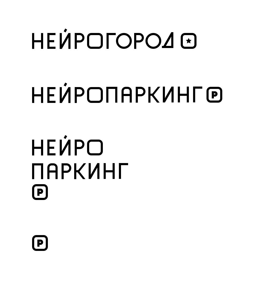
Right now I’m creating a system for automated parking control in a city. The name is Neuroparking (neural network + parking). The domain is neuroparking.ru. You can write it as Neuroparking or Neuroparking.ru. I’m not sure what would be best and need your advice.
In theory, Neuroparking will be a part of the Neurocity system (neurocity.ru). The system will solve the problems of safety and vandalism (if anyone takes out a gun on the street and a camera sees it, we will know precisely where it happened).
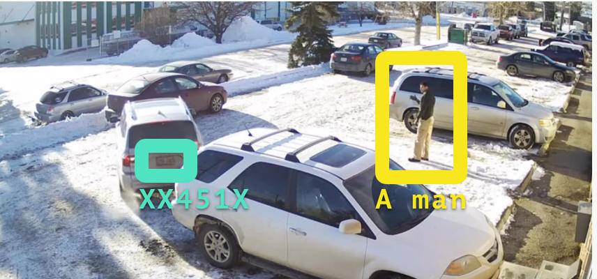
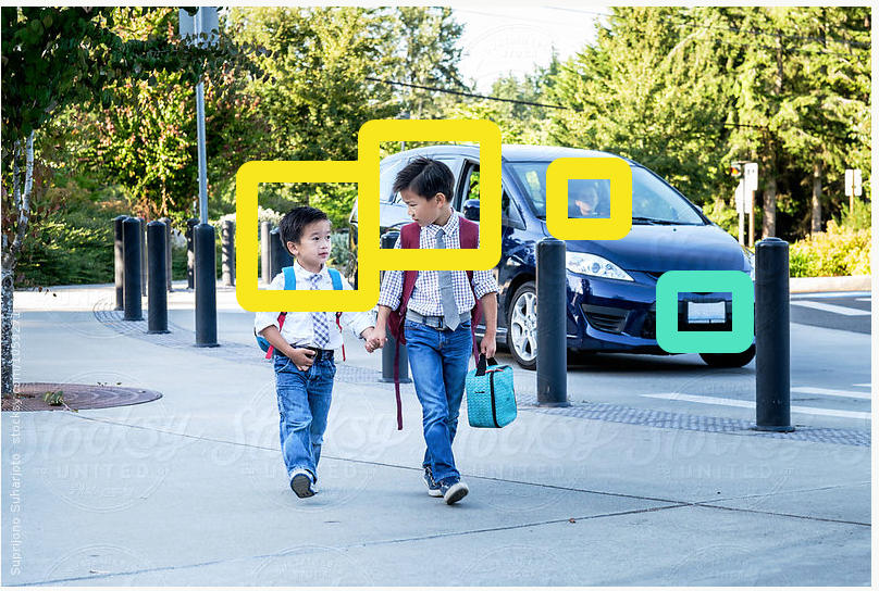
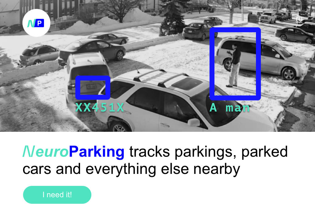
How it all works: instead of having parking enforcement officers and cars roam the city, we install CCTV cameras at parking lots. A neural network can identify cars, distinguish license plates and recognize them in real time with a certain precision. There’s no point in removing or covering up your license plate: it’s registered even before you had a chance to do that.
The solution uses NVIDIA Jetson TX2 microcomputers. They are connected to cameras and the data is analyzed on the spot the moment the camera registers it. Here’s an article on image recognition: habrahabr.ru/company/recognitor/blog/329636
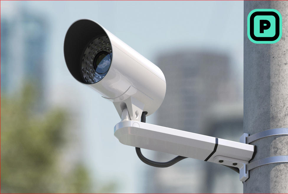
The logo will probably also go on a sign that will let people know parking is enforced with cameras or Neuroparking. And all the classic uses, of course: people are expecting presentations and business cards.
As for the logo, I want it to be clear that we are about parking and neural networks and a part of some big story about a city of the future.
The first attempt:

Art director: The symbol is too simple, nothing catches the eye. A logo should be slightly irritating.
Designer: I’m slightly irritated by a sign that’s staring at me.
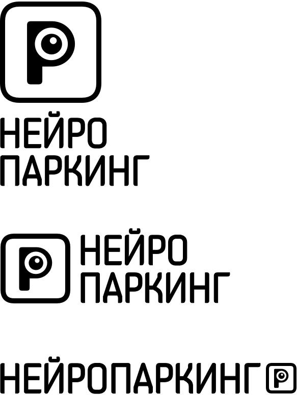

If we remove the eye, it looks like a REC button, camera, eye, brain. It’s more bold. Frame + dot can be a template for other services.
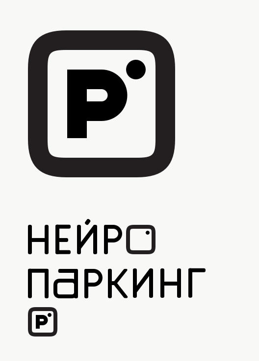

Art director: This looks too much like Instagram. We need a different symbol.
Designer: Neuroparking is parking with superpowers.
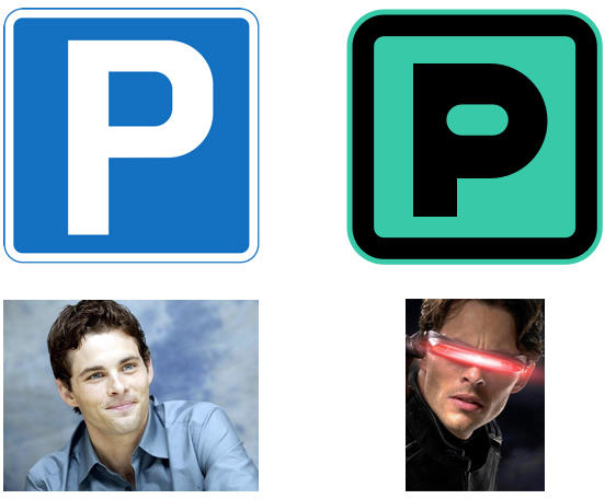

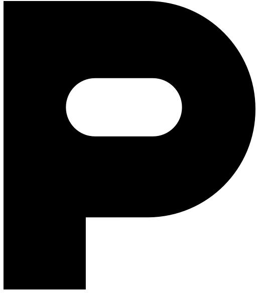
The art director is hesitating. The designer suggests another variant with a spring.
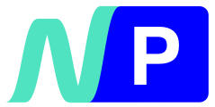
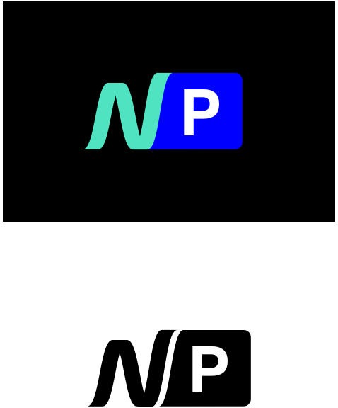


And another one with a robot button.

The art director chooses the button and asks to make it a bit more odd. Adding neural networks.
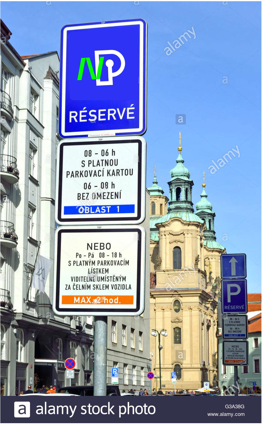
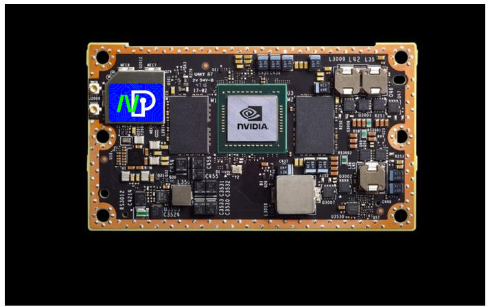
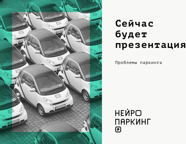
Taking a picture of the studio’s parking lot for the demonstration.
