Logo and corporate identity for the Oral Surgery and Dentistry Department of the Krasnoyarsk City Children’s Hospital No. 5

Overview   Process  

Task: to create a logo and a corporate identity for a children’s oral surgery department.

The oral surgery and dentistry department of the Krasnoyarsk City Children’s Hospital No. 5 is the only medical center in Krasnoyarsk region, republics of Khakassia and Tyva that provides rehabilitation for children with inflammatory diseases, traumas, tumors, and cogenital malformations of the maxillofacial region. A logo and a corporate identity for the department were developed at the studio.


gdkb logo
A cheerful and bright logo

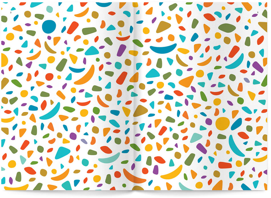
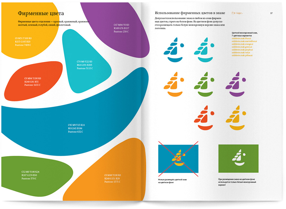
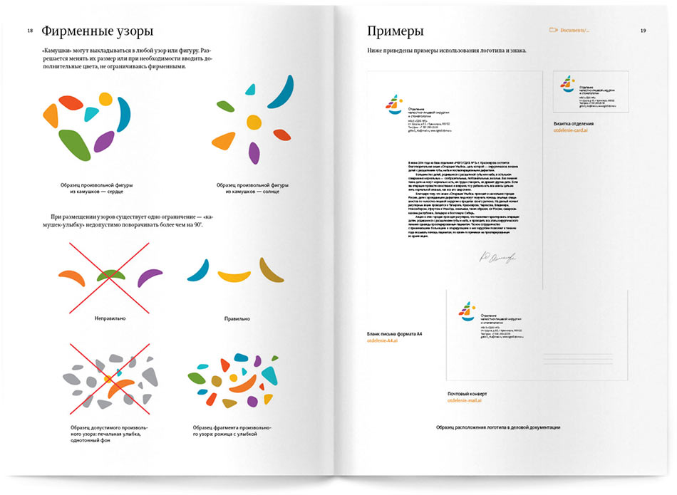
At the heart of the logo is an image of a smiling face composed from colored pebbles. The logo emphasizes the line of work of the department, while the bright colors hint at its specialization on children. Besides, a sail boat, sun and a rainbow can also be seen in the logo, bringing a good mood, confidence and hope for the best.

Release date: December 10 2013

Cast:

art director
designer
chief typesetter
editors
project manager
Typeface: Schlange
gdkb balloon
Get well soon!

Rules for the use of the logo and of all the elements of the corporate identity are given in the style guide.


gdkb bb stones
Guide endpaper: pebbles form an expressive pattern.

gdkb bb logo
Opening with different versions of the logo

gdkb bb colors
Opening with corporate colors

gdkb bb pattern
Information about corporate patterns and examples of logo placement

gdkb child

In June 2014 the department will be holding a charity event “Operation Smile” where surgical help will be provided to all children in need free of charge.


Order a design...