The making of the logo and corporate identity for the Oral Surgery and Dentistry Department of the Krasnoyarsk City Children’s Hospital No. 5
Overview Process
Starting to look for key images and approaches. We think of hand animals, of a ship in the sea as a symbol of warmth and hope, of dancing children in the form of clover and of a smile as a simple graphic technique.
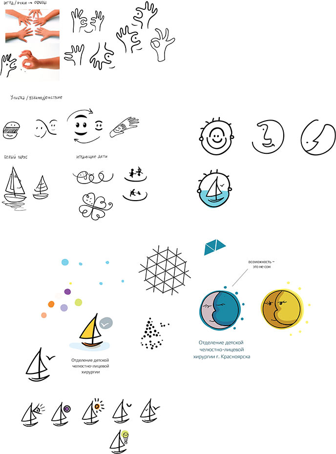
Leaving the two preferred approaches: the sun-moon, and the ship, but bringing in a mosaic wind of change.
Assembling all the essentials into a presentation.
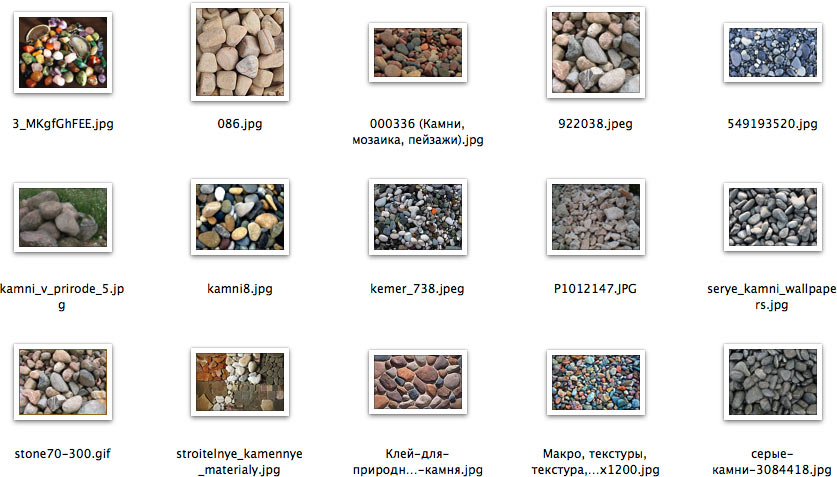
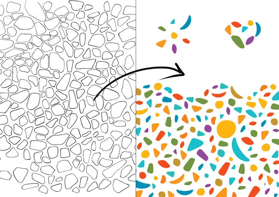
The client chooses the ship. And asks to make a better version out of pebbles.
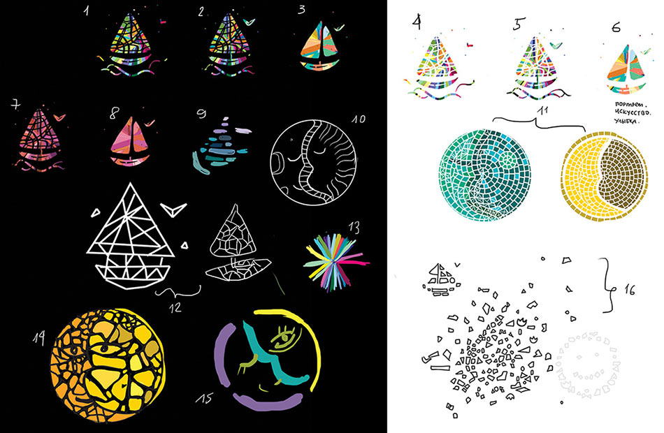
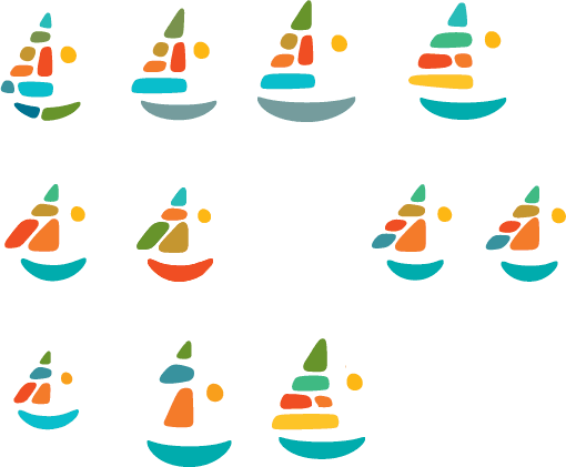
Getting inspired by natural forms.
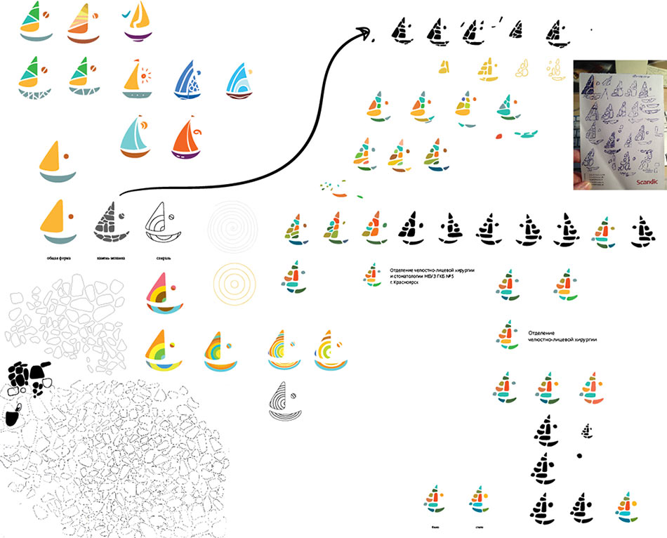
Finding an intermediary option.
Continuing the pursuit for form, proportion and balance of inner elements.

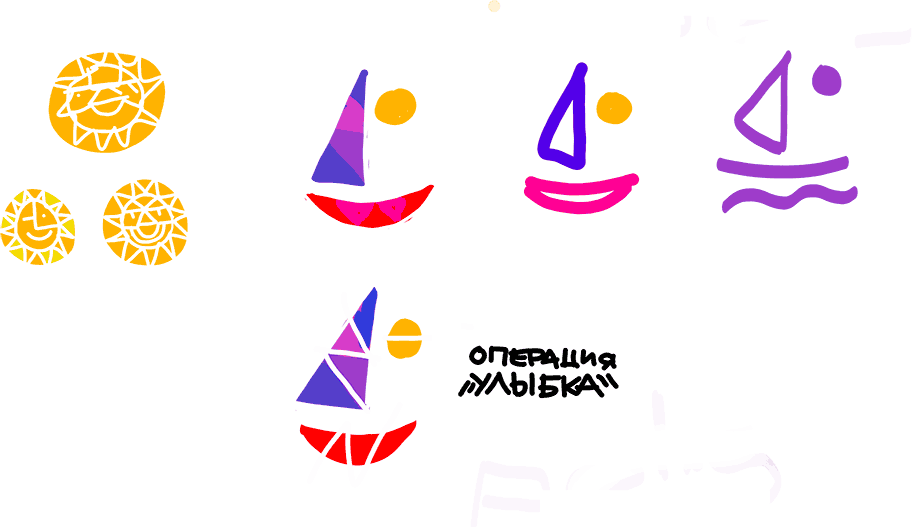
Thinking about making a wordmark, but quickly dropping this idea in favor of a simple and neat logotype for the long name of the department.
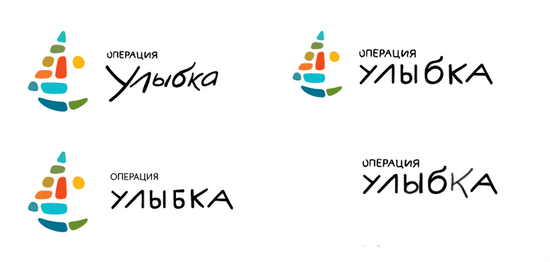
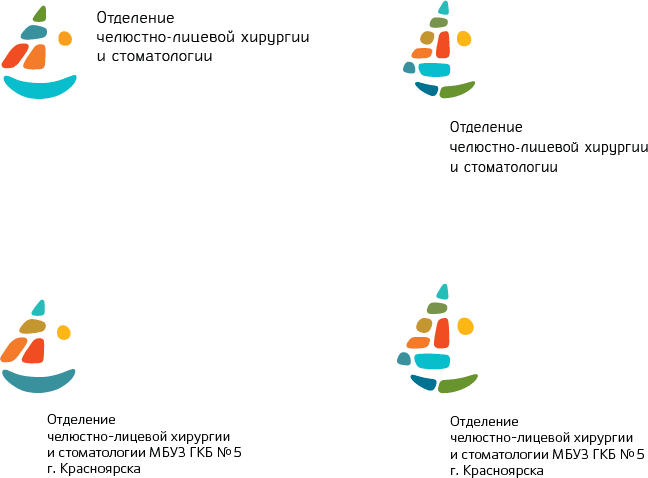
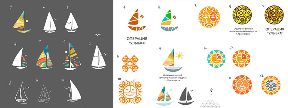
Finding an acceptable solution that satisfies both the designer and the art director, but still trying out different variations of the logo and the type.

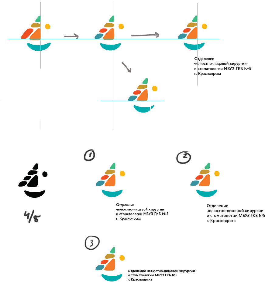
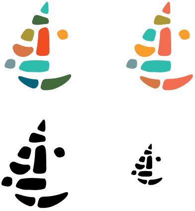
Settling on the color arrangement.
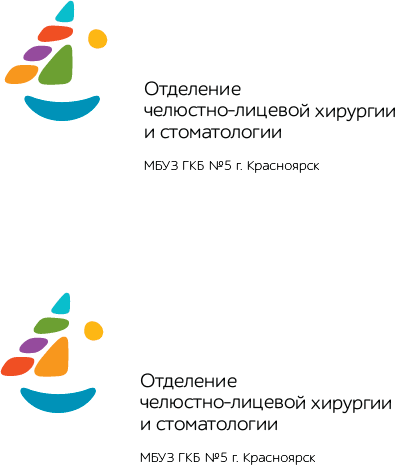
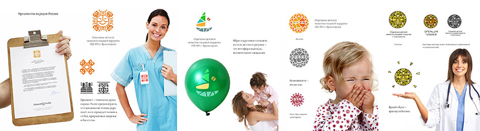
This is it!
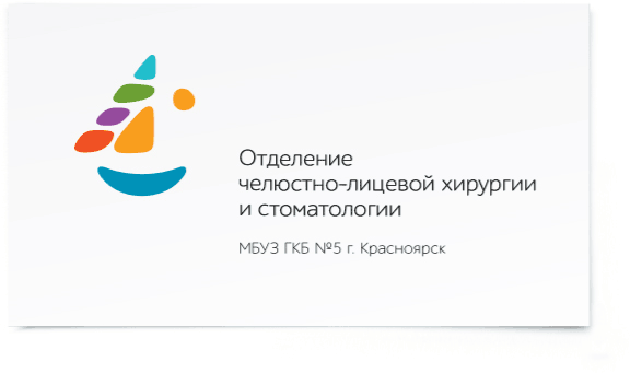
Seven clear elements gave birth to a whole concept: a sail boat, sun, and a rainbow in a single image of a smiling face. And pebbles can be used to lay out different shapes.
Preparing another presentation and assembling the style guide.
