The making of the Parallels Desktop user interface
Overview Process
When we started working on the interface, we have distinguished three basic types of users: MS Windows migrants, Mac OS users and IT professionals. After the discussion with the client we also added users of public computers and reviewers.
For each of the type we described the most popular actions, goals and needs.
Then we chose representatives of each of the groups and asked them to go over these scenarios. A lot of exciting information was discovered. For example, some of the subjects felt more comfortable working in the traditional windowed interface instead of using the benefits offered by the Coherence mode. Even so, many features remained obscure to them.
Thinking how to make the functionality of the program more evident. Working on the toolbar and status bar, adding tips and virtual devices information in a floating panel.
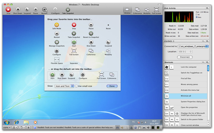
The result is too complex. Besides, the panel is not always needed, yet takes up precious space.
Making everything even more simple, using a hiding panel to optimize used space, thinking how and where to show notifications.
Inventing visual effects.
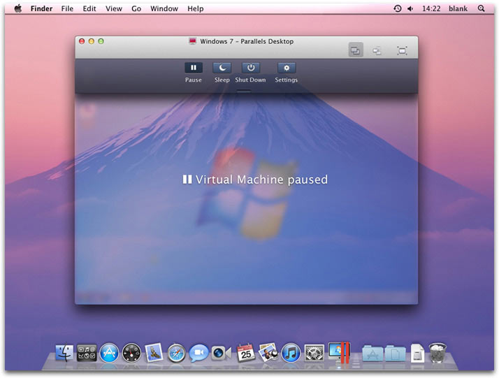
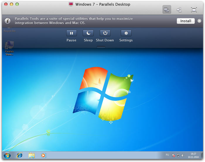
The windowed mode is now much more convenient.
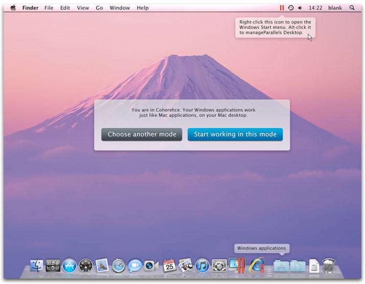
But the Coherence mode offers many benefits: it allows working with guest applications as if they were native to Mac.
Thinking how to make the Coherence mode more friendly so that users are less scared of using it.
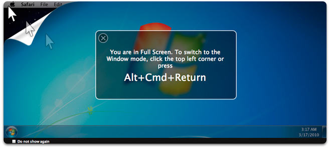
Drawing visual effects for changing modes.
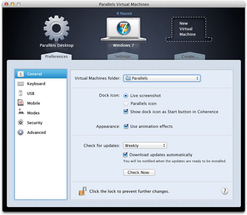
Another important scenario is changing program preferences.
Representatives of Parallels read us a fine lecture on the software features as well as planned new ones. After a very careful examination of the user guide we started to reorganize the menus.
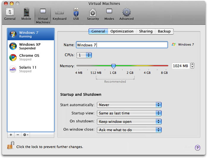
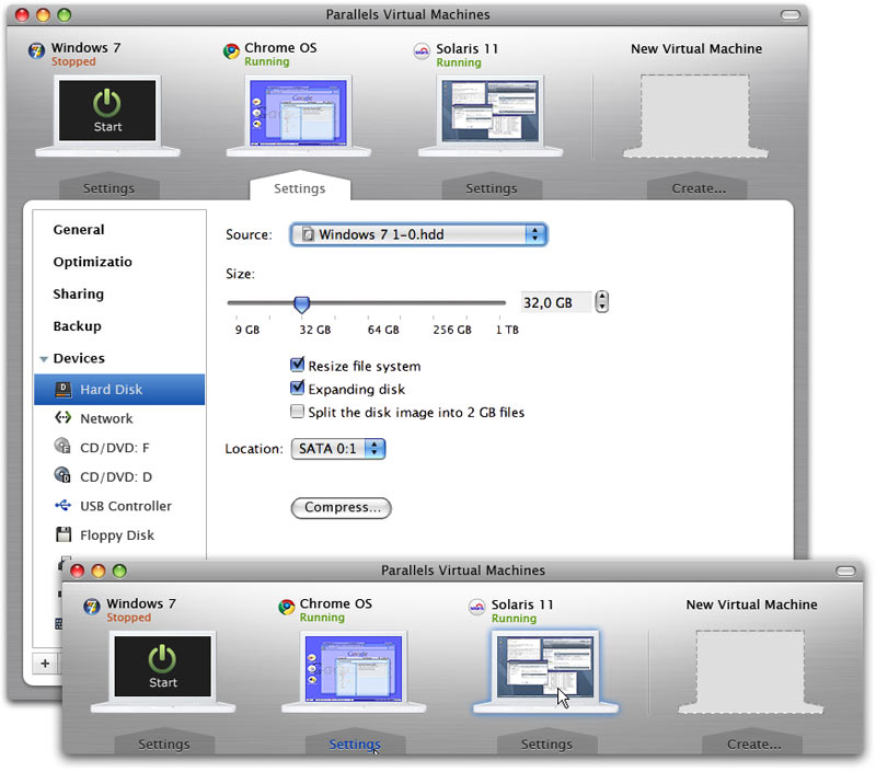
Virtual machine settings and program preferences were separated which made searching for a specific function harder. We decided to combine them.
But no, a large number of multi-layered options is also bad. We need something simpler.
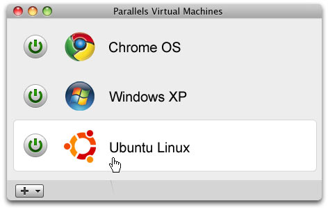
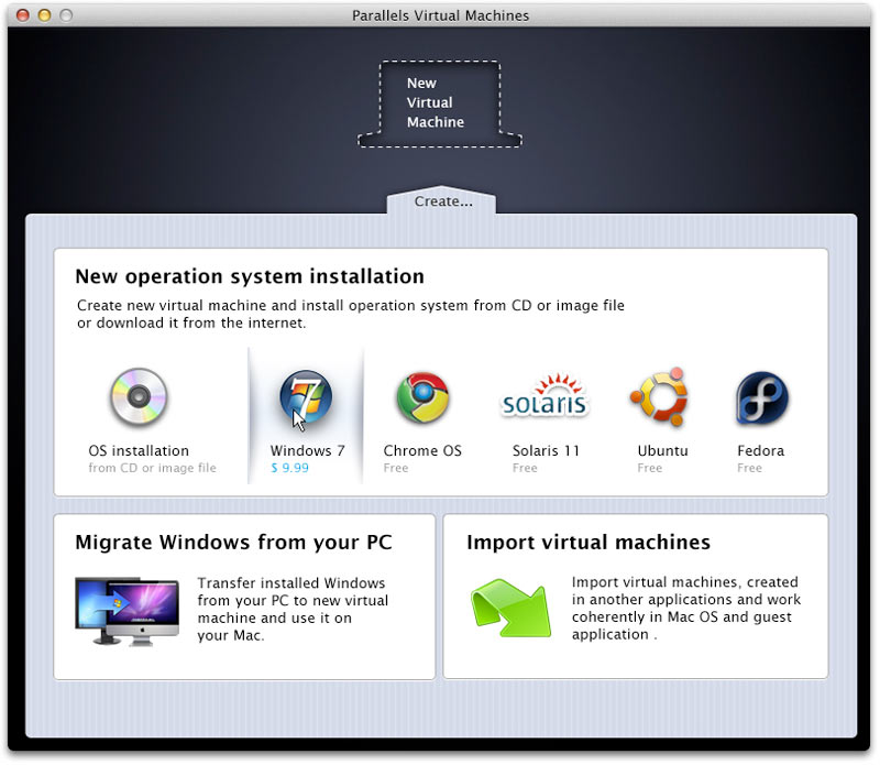
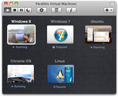
Simultaneously thinking about a way to display the list of the user’s virtual machines.
This made it clear that it would be best to combine the list of virtual machines and their settings into a single control panel.
The visual representation of “virtual machines” makes the concept evident even to new users.
After checking the starting scenario (from opening the box/downloading software to getting a Windows virtual machine running) it turned out that the process of installation and activation of the program is seen as unnecessary lengthy by many users.
Creating flowcharts for the processes of software installation, activation and shutdown to understand what can be improved.
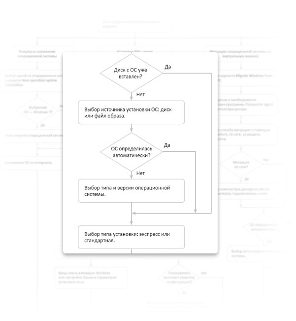
Drawing schematic screens.
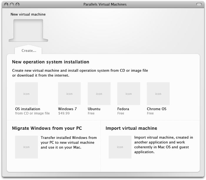
After the schemes are approved, creating the design.
Adding the Parallels Desktop preferences window.
At the last moment changing the concept in favor of a grid layout that can be easily scaled.
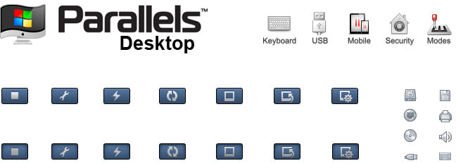
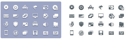
Working on icons.