Client: Hi. My name is Pavel Ryabinin, I design and make women’s clothing. I currently have a Cyrillic logo in Russian style. People in Russian-speaking countries understand it. But recently I’ve been getting more clients from Europe, Asia, from the East and the West. They don’t understand my logo which is why we desperately need a new English one.
Pavel Ryabinin. Made in Russia. brand of women’s clothing from fashion designer Pavel Ryabinin offers modern, feminine and sophisticated images in clothing and promotes Russian culture and traditions. The brand philosophy is that a woman should always remain a woman in every possible sense, including in her choice of clothing. This is always reflected in our choice of fabrics, prints, as well as the design, style, images, etc.
We need a modern laconic logo for a fashion brand from a Russian designer that would work not only for Russian clients, but foreign ones as well. Most likely, the logo will have to be in two languages, in Russian and in English.
We are planning to open an online store as well as to develop a line of interior and home accessories under the brand Pavel Ryabinin. Made in Russia. using the motifs of folk art and craft in modern interpretation. We are planning to subtly and inconspicuously employ folk art themes in clothes and textiles, yet the design of all items including clothing will always remain understandable, meeting the needs of the modern consumer and fitting into the usual environment.
First designer: Birch trees and the Р as a coat hanger.
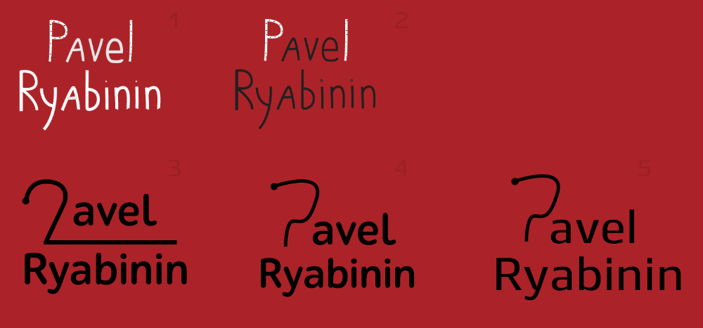
Art director: Crap.
Second designer: I tried to play with reflection in 11–13 and use more feminine lowercase letters in 17–19.
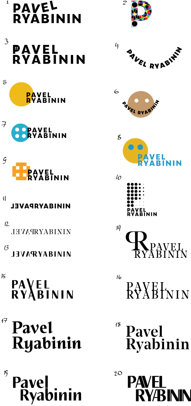
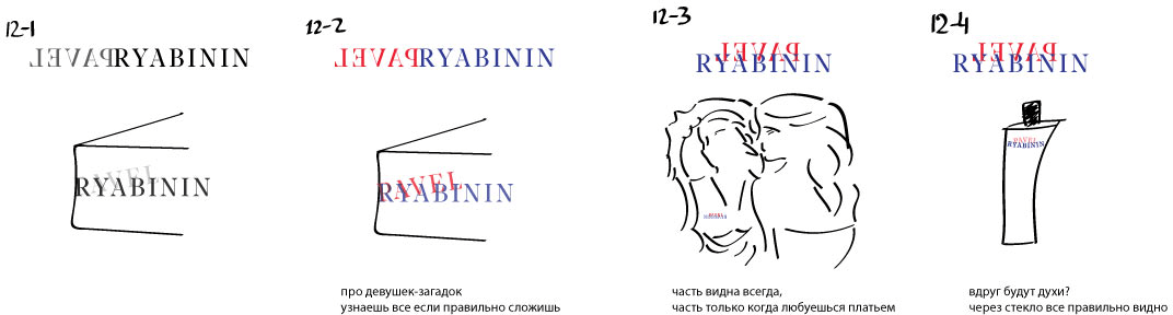
Second designer: Tried to add more play to 12.
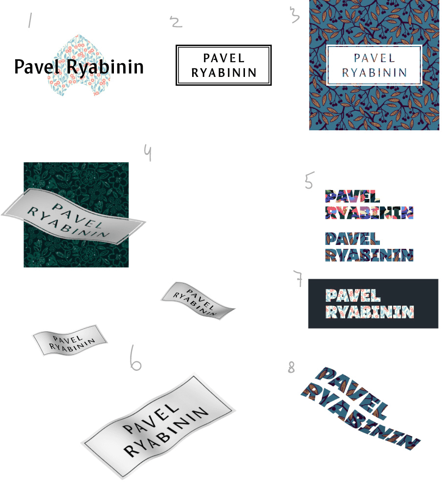
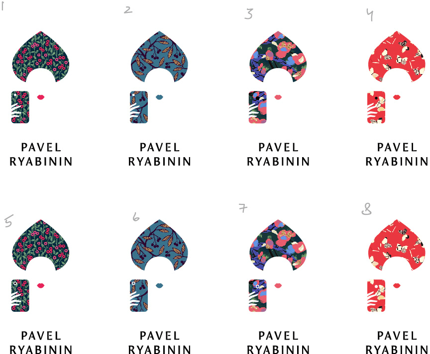
Third designer: Ideas around using patterns and an attempt to show airy fabric (4, 6, 8).
Art director: What if we take number 1 and add an iPhone that is used to take a selfie? Just as a rectangle at face level.
Third designer: If that’s intended for me, then the result looks a bit vulgar.
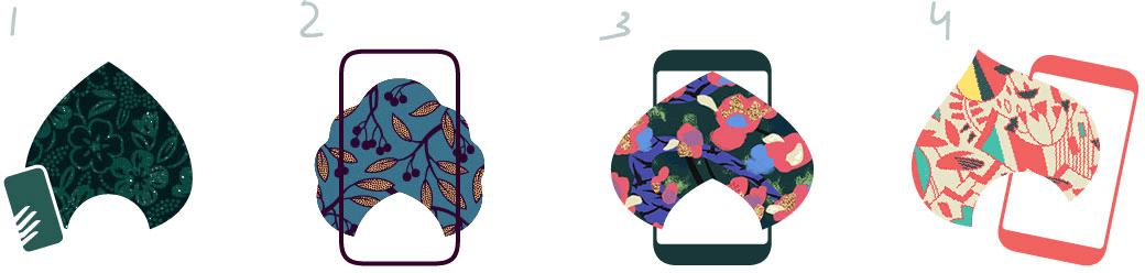
Art director: Yeah, number 1 is warmer. But don’t tilt the phone. And search for better angles and proportions. The fingers look good.
First designer: With a bow tie.
Art director: Nope.
First designer: An effort to inscribe a woman’s silhouette. Wrong direction?
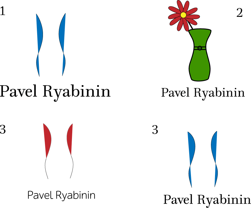
Art director: Crap.
First designer: More.
Art director: Crap.
Third designer: Can’t seem to create anything meaningful with the phone. Maybe lips will do?
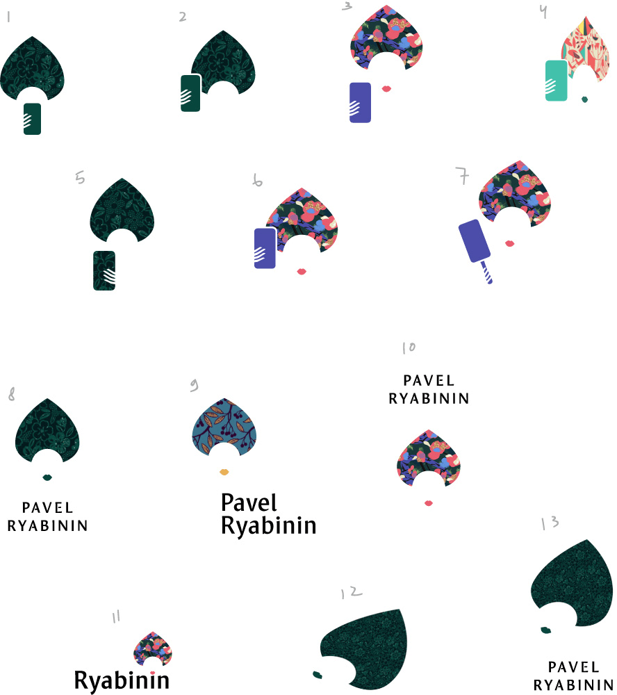
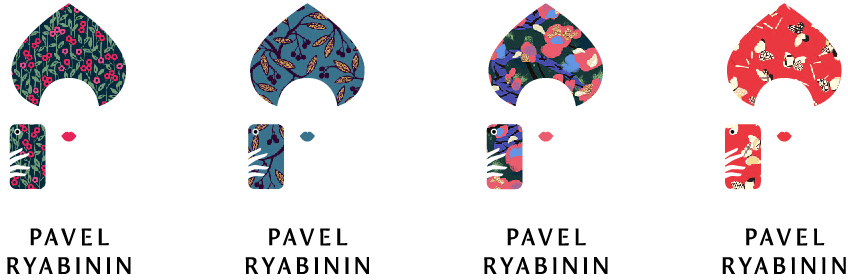
Art director: I like number 5. The lips are OK. Fingers need to get better.
Third designer: Redrew the fingers.
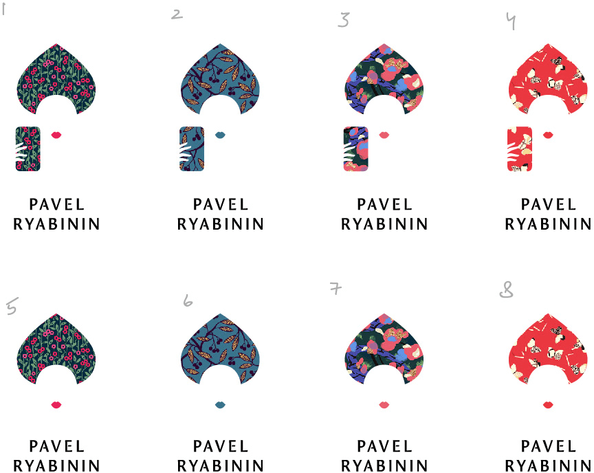
Art director: What’s that typeface? Make the fingers longer. Overall I like it.
Third designer: It’s Mezzo, but I chopped the horizontal strokes off a bit. Bad choice?
Art director: No, it’s good.
Third designer: Made the fingers longer. Are we keeping the phone?
Art director: Yep. But add a black camera lens to the back.
Third designer: A black one can’t be seen in the pattern. A white or a contour one would look better.
Art director: 5, but make the white circle thinner.
Third designer: Like this?
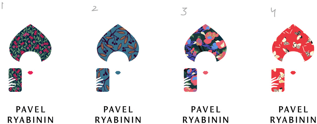
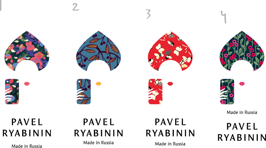
Art director: OK. Add “Made in Russia” and prepare the announcement. And render it in two languages.
Third designer: Done. Also added hair and a beauty spot by the lips. And made the camera simpler.
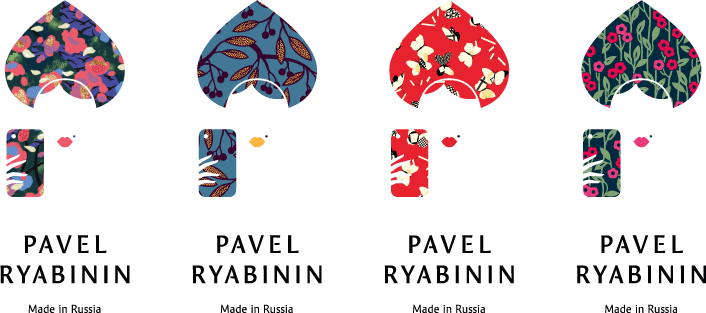
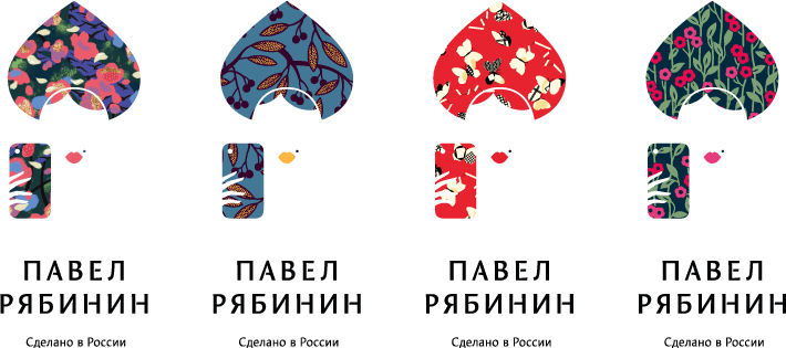
Art director: No, the beauty spot is too much. As is the hair. Make the “Made in Russia” text the same width as Павел and look for a better place to put it.
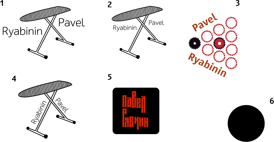
Third designer: I think, 1.
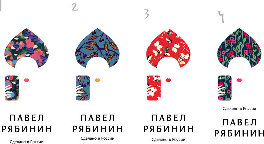
Art director: 3 is OK.
