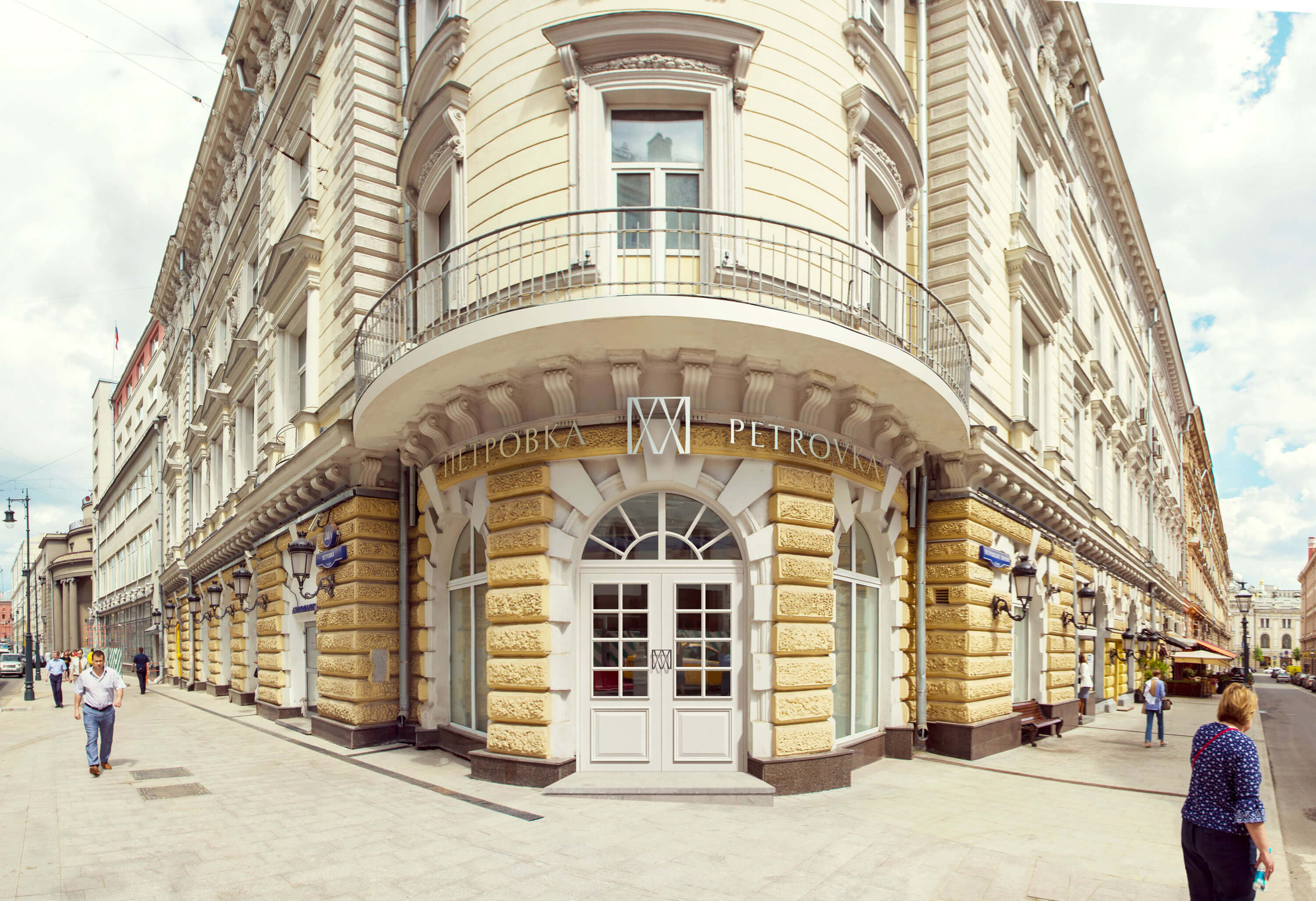
A legendary house is located in the center of Moscow at the corner of Petrovka and Petrovsky Lines. It once used to be a revenue house with bookstores and libraries, then it housed the office of The Courier newspaper frequented by Bunin, Chekhov and Gorky, while the top floors were always rented out to scientists.
The Courier is long gone, revenue houses are a thing of the past and the house between Petrovka and Petrovsky Lines is now a business complex. The development’s name and logo developed at the studio elegantly recount the mansion’s rich history.
The address is Petrovka Street, 20.
First of all, this is a brand in itself: an Old Moscow street, a famous house. Secondly, the problem of all business complexes is that they are impossible to find.
—Can you tell me the address again?
—Petrovka 20. The semi-circular house.
Repeating the name several times over: Petrovka twenty, Petrovka twenty, Petrovkatwenty. Stop, that’s our name!
It sounds pleasant, evokes historic associations and dismisses any possible topographical problems.
Now for the logo. Taking the Roman number XX (Roman, because it has a number of pleasant connections: the clock of the Spasskaya Tower, the XX century, the overall elusive antiquity), surrounding it with the letter П at the top, finding a dynamic shape of the stroke.
The resultant classic logo includes several symbols: the number XX, the pattern of the Moscow fences and even facets of a diamond.
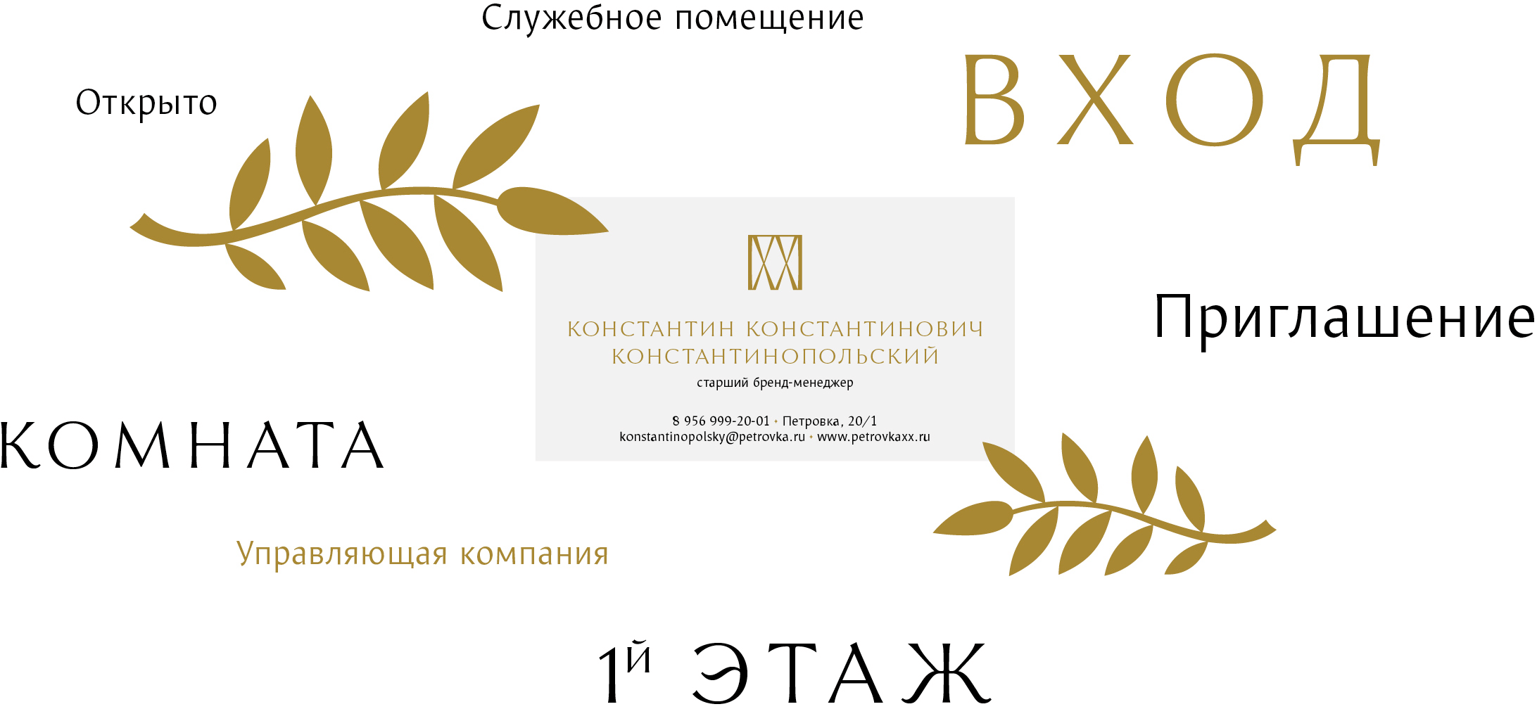
Decorated with additional elements, signs and door plates make use of Alumna and Mezzo typefaces and rhyme with the historical façade.
