The making of the Cover design for Talkability: Discover the Secrets of Effective Conversation by James Borg
The illustrator gets the task: to draw an illustration for a cover of a book on communication, talking and negotiations.
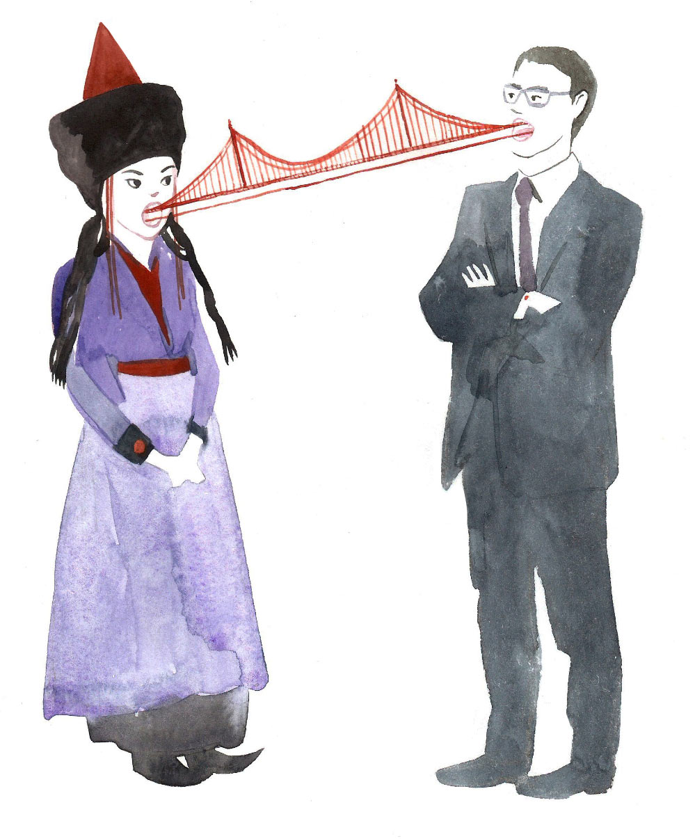
Starting with simple sketches. First associations are related to interaction, the visual metaphor here is the bridges between people of different cultures and genders. The result is vague and rigid.
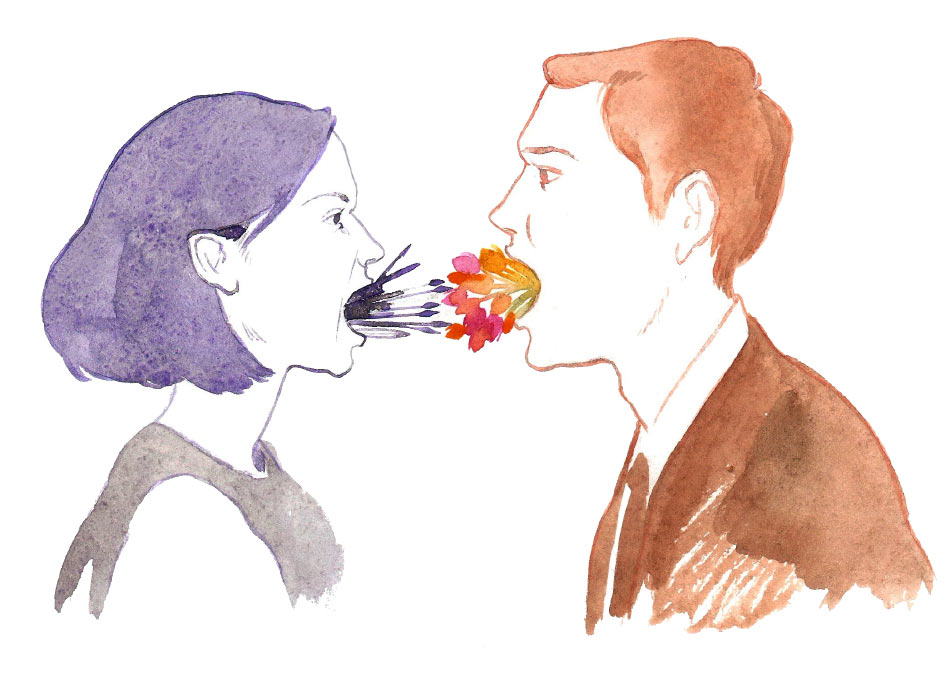
The second idea: a word is enough to start or end a conflict. To show the differences here we use the dichotomy of hot and cold and characters of different genders. Even their point of contact works to increase the contrast: sharp spears against tender bright flowers. The resulting picture doesn’t look aesthetic or serious.
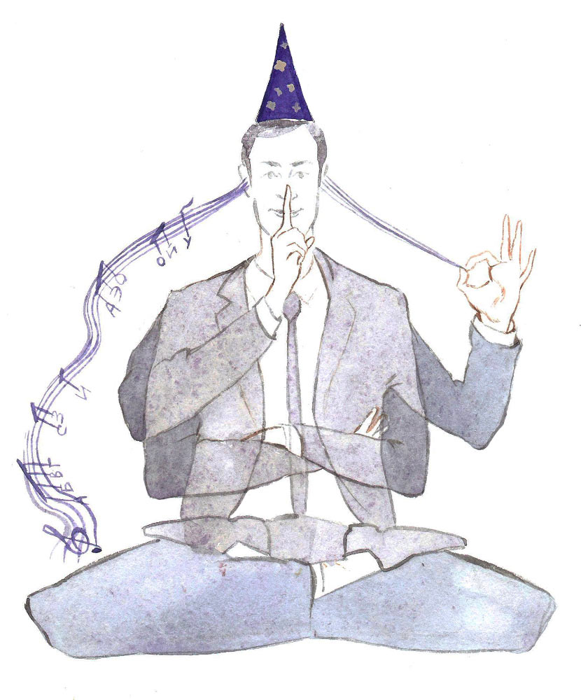
The next sketch is an effort to read the title of the book (which is translated into Russian as Secrets of Communication. Magic of Words) literally. Since it has the word magic in it, we give the character a wizard’s hat and have several arms represent nonverbal means of communication. The musical staff is also a quote from the book where talking is compared to music, only instead of notes it has verbal exclamations.
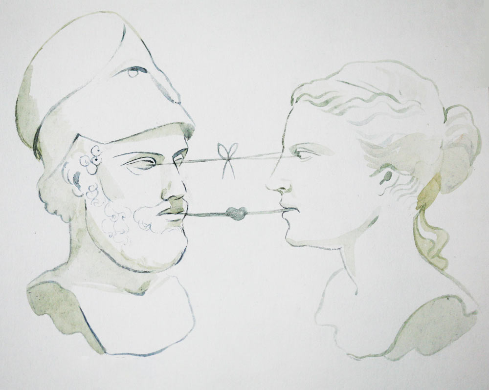
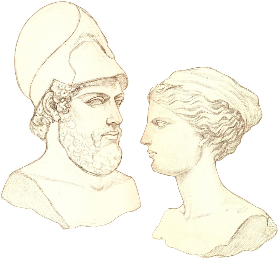
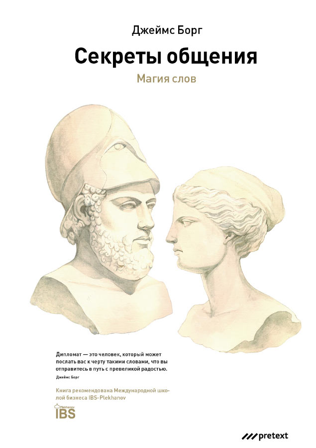
The final design draws inspiration from history. Maintaining the idea of interaction between people of different gender, we choose Pericles, ancient orator from Athens and Peitho, Greek goddess of persuasion. We need to imagine the way Peitho looked on our own based on the few remaining wall paintings and traditions of Greek sculpture. The verbal and visual contact between the heads is represented by ties and threads with knots. But this is a very primitive and evident solution, which is pointed out by the client who nevertheless chooses this sketch.
Starting to work on the final image using cardboard.
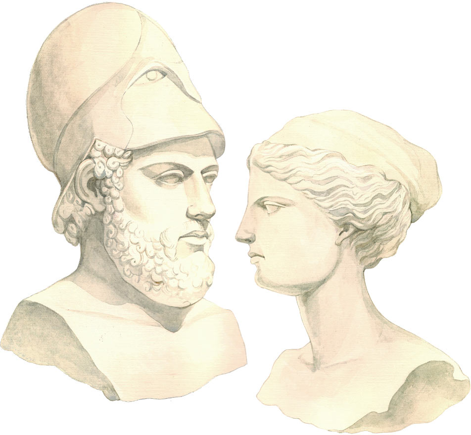
The result looks almost exactly like the sketch but drawn in watercolor and with more detail.
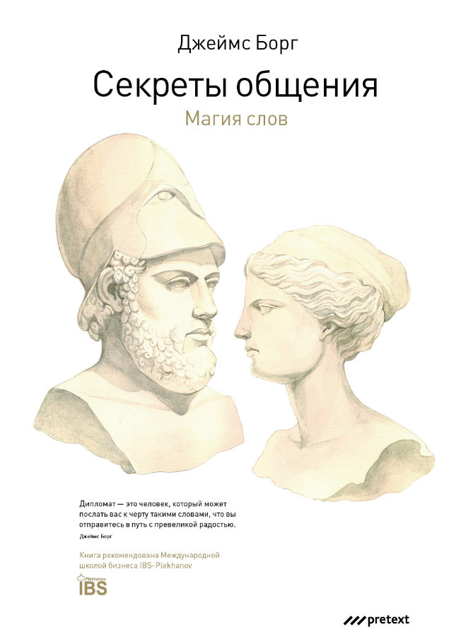
Suggesting two placement options and sending for typesetting.
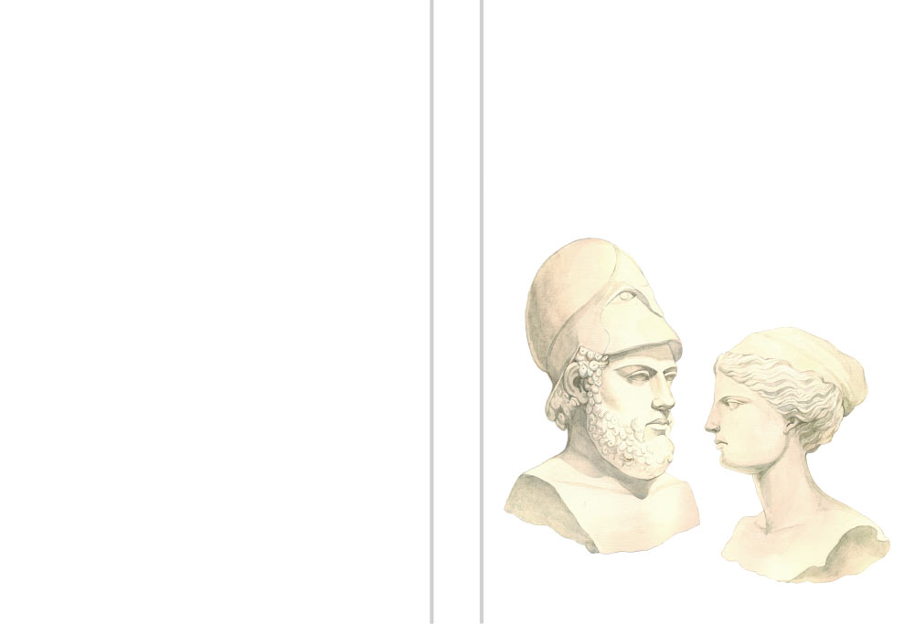
The typesetter receives the mock-up of the cover and all the necessary text. The drawing looks nice, we should place it entirely on the front cover. The style of the edition is clean and business-like, which allows us to create a nice cover with little effort.
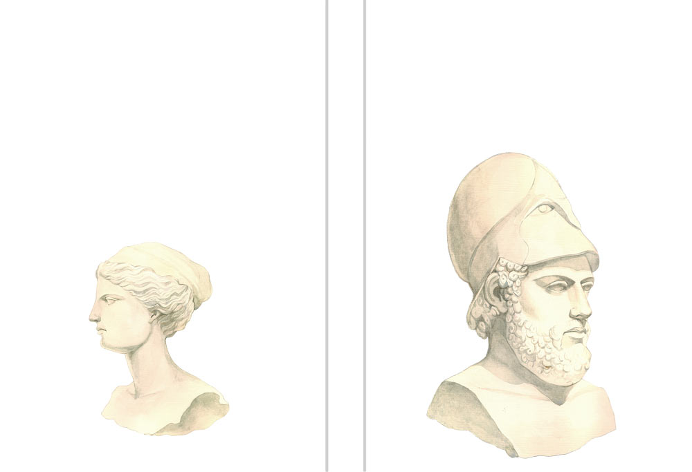
The chief typesetter provides constructive criticism of the layout and a couple of iterations later we finally arrive at mock-ups that we can show to the art director and of course the client.
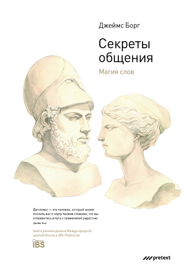
The client chooses the design with the centered text. The art director has no objections. The typesetter places the final version of the illustration, the editor corrects mistakes, we polish a few things here and there and it’s ready to be printed.
