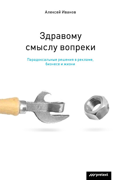
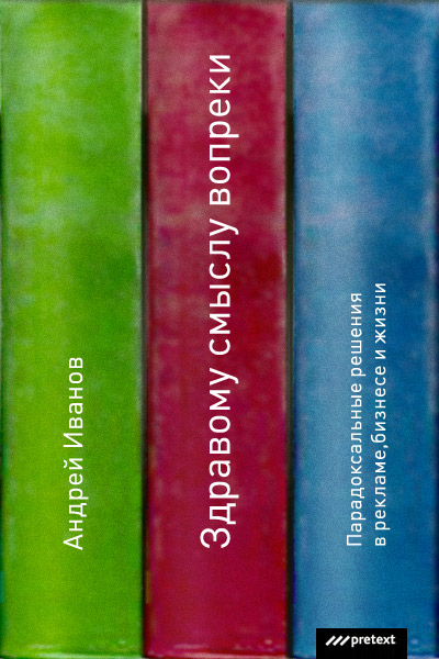
Making of the book cover for Against Common Sense by Alexey Ivanov
Overview Process
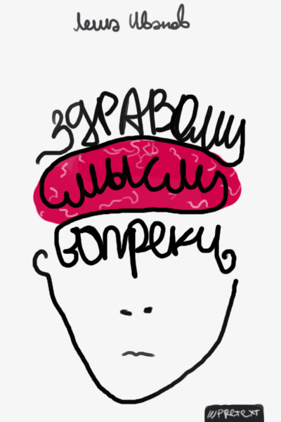
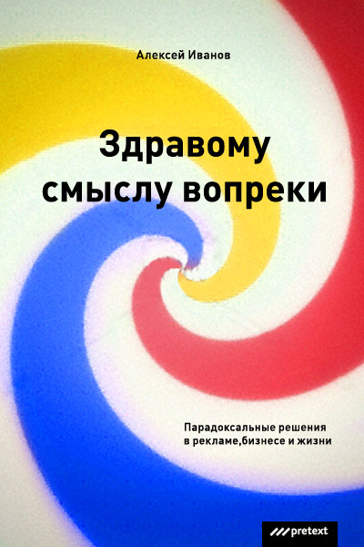
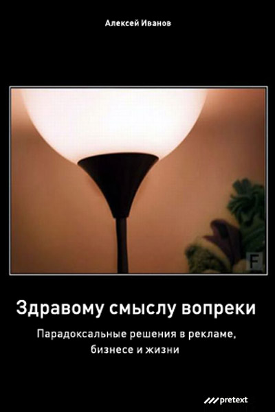
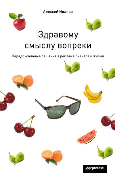
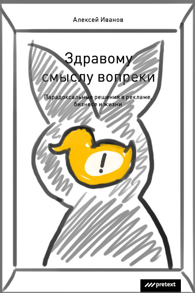
Designer: Sketches for the new book.
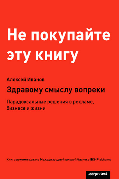
Art director: I’d go with the red one that says “Don’t buy this book”. And what is the underpants-looking lamp doing among the sketches? It’s all over the web.
Designer:
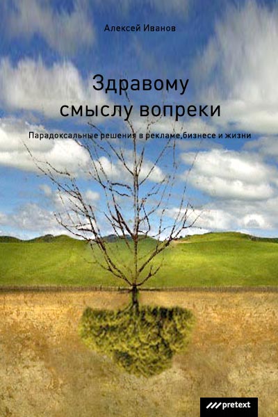
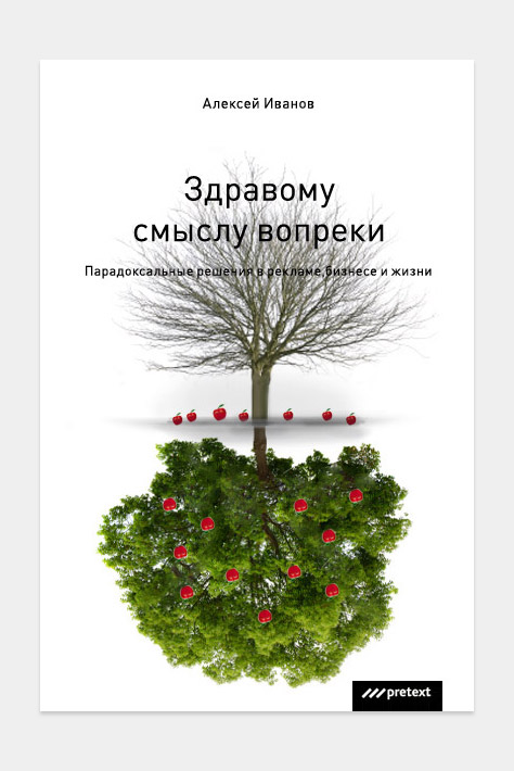
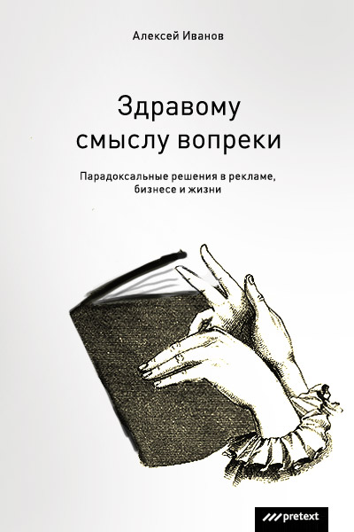
Art director: The tree is okay, if you put it on a white background.
Designer:

Art director: Looks lame.
Designer: Should we show the idea to the client?
Art director: OK.
Manager: Boroda has already showed you some sketches for the book. I’m attaching all of them. Please let me know which of them I should present to the client.
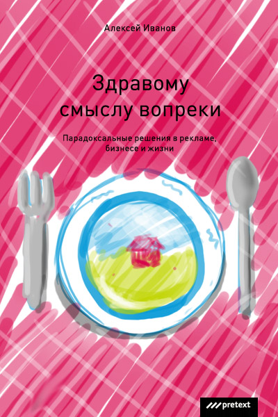
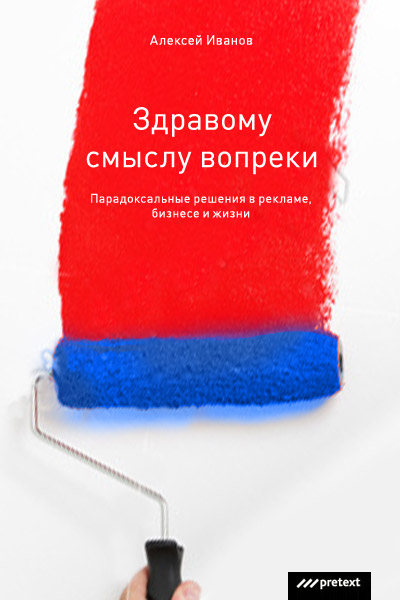
Designer: More book cover sketches.
Designer: Should we show these to the client?
Designer:

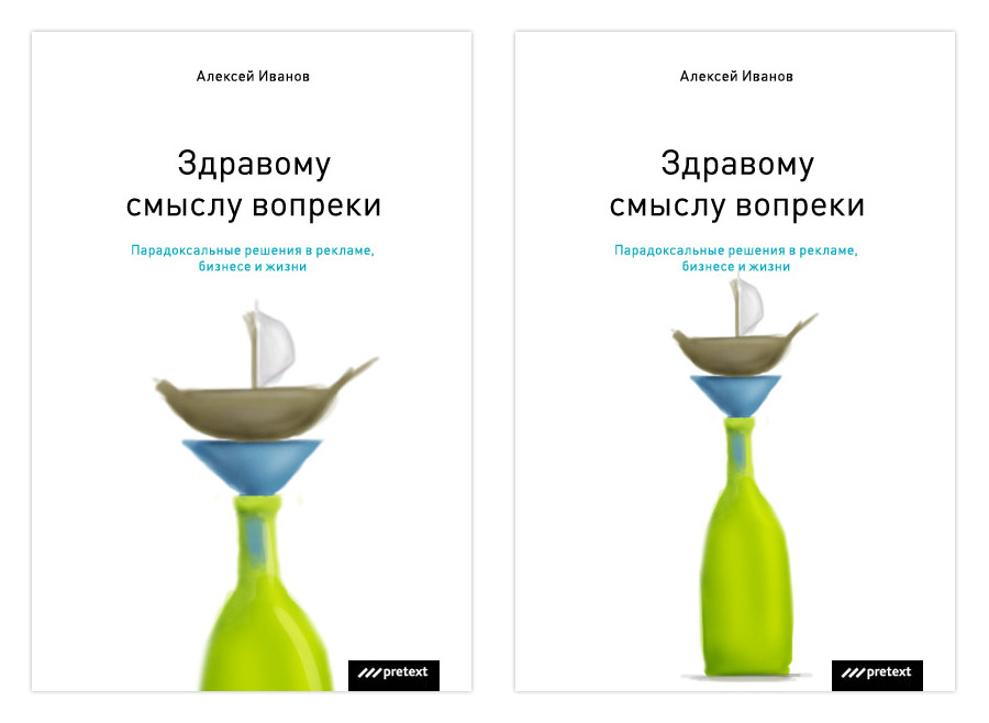
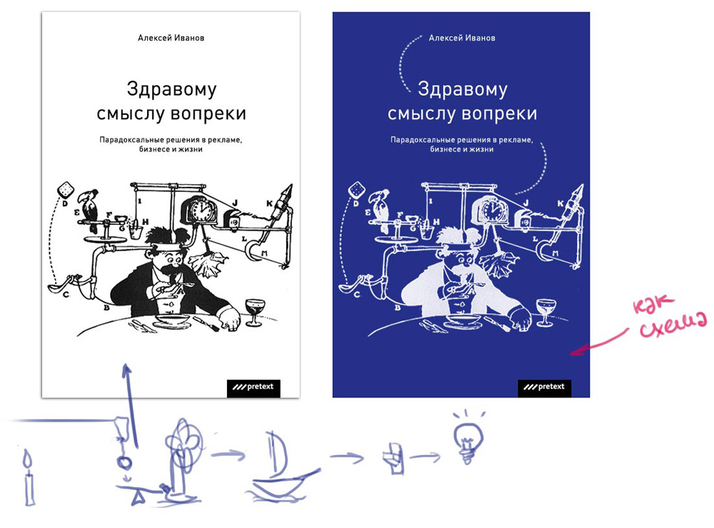
Art director: Let’s make a simple image with water pouring from one bottle into another through an upside down funnel.
Designer:
Art director: Kind of.
Designer:
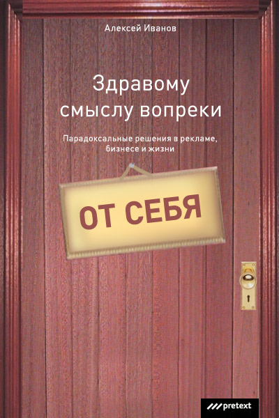
Art director: Let’s show this one.
Manager: Tema, I would like to discuss the cover for “Against Common Sense” again. The client refuses to accept any of the ideas. We’ve been talking for two days. Dmitry insists that there is no paradox that he mentioned at the very start. We’ve gone into more detail. Below are his thoughts on what kind of paradox he would like to see on the cover.
Paradox is a thruth. Not immediately recognizable. A truth that looks like a lie. If something is paradoxical, it strikes you. You could be thinking one way, while it turned out to be the other way around. Things that don”t match your expectations. But not UNREASONABLY so.
Example. Being famous is near obscurity... Here is an obvious mismatch. But this only becomes paradoxical if the second part is added: “Being famous is near obsurity as to who knows you and what it is they know”. Now this is a paradoxical statement.
Such situations, thoughts, images are hard to find and come up with. The book is interesting to read because it contradicts common knowledge. But there are GOOD REASONS for this.
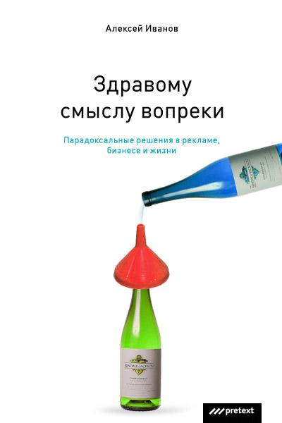
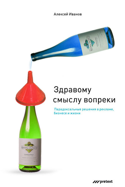
It isn’t enough to turn the funnel upside down and say it’s a paradox. But why is it upside down? No one knows. A paint is one color, but the painted thing is different. Why is that? No reply. Et cetera. This is confusion, not paradoxes.
Paradoxes can be verbal. See above. Or visual. Mobius loop could be an example. It has a surface with only one side, so the conventional distinction between this and the other side is lost. Or a paradox can be verbal-visual. Like that beer with its foam down at the bottom.
Sophism is Paradox’s closest relative. Only vice versay. It’s a lie that looks like a truth. Example. Stairs that ascend in an infinite loop. This isn’t possible, but the drawings shows just that. That would be negative paradoxicality.
Like paradoxes, sophisms can be verbal, visual or verbal-visual. No difference here. They work the same way. Both stand up against common sense. But to stress my point again, there are GOOD REASONS.
The cover needs a visual paradox. A sophism could work too. The one with book backs is a sophism.
To make it short, none of the draft designs seemed to impress them. Coaching had taken long too, but after all Boroda himself was glad that he did pull through and created that bow tie cover. Can we somehow refine one of the idea we’ve already shown them, or should we ask Boroda to think up something else?
Just in case, I’m listing things they find important:
— paradox;
— good reasons;
— no jokes;
— white background;
— no bottles (these publishers have already released a book with bottles on its cover).
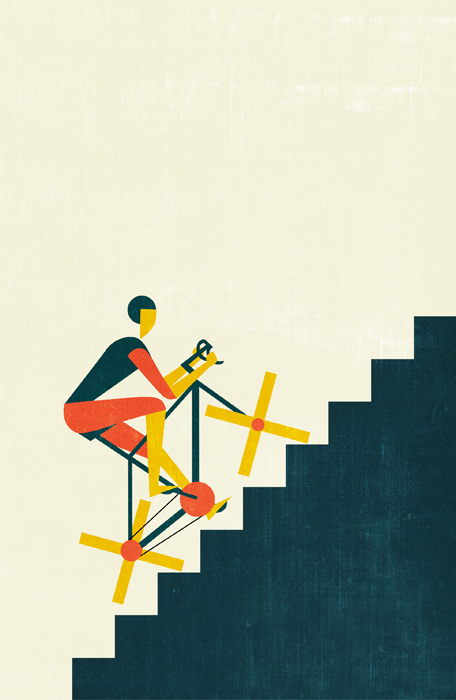
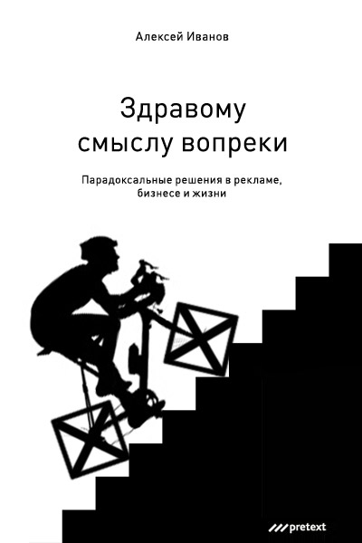
Art director: Let’s make a cover with a cyclist riding up the stairs on X-shaped wheels.
Designer:
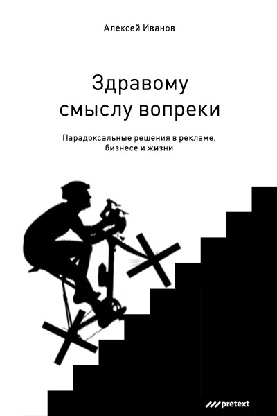
Client: OK.
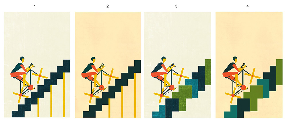
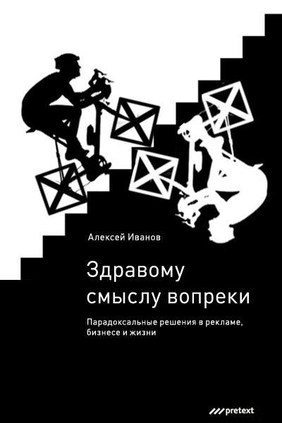
One illustrator:
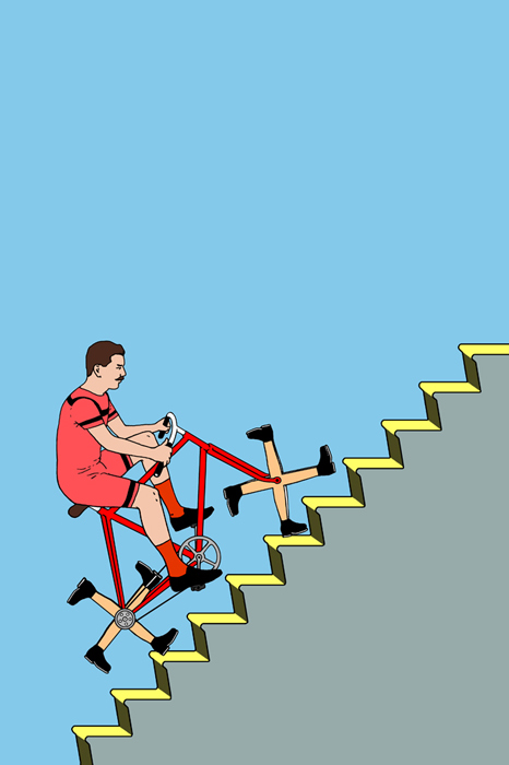
Another illustrator:
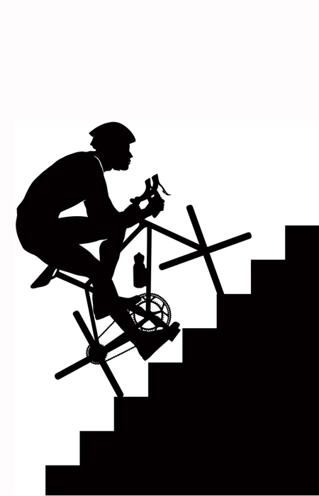
The client calls the art director. Thirty-minute conversation on the first black and white version being the best one.
Art director: B/W it is.
Another manager: Tema, here is the illustration to satisfy the client. It is as close as could be to the earliest draft design. It’s by another illustrator, since Iv Orlov doesn’t use such a technique.
Should we show it to the client?
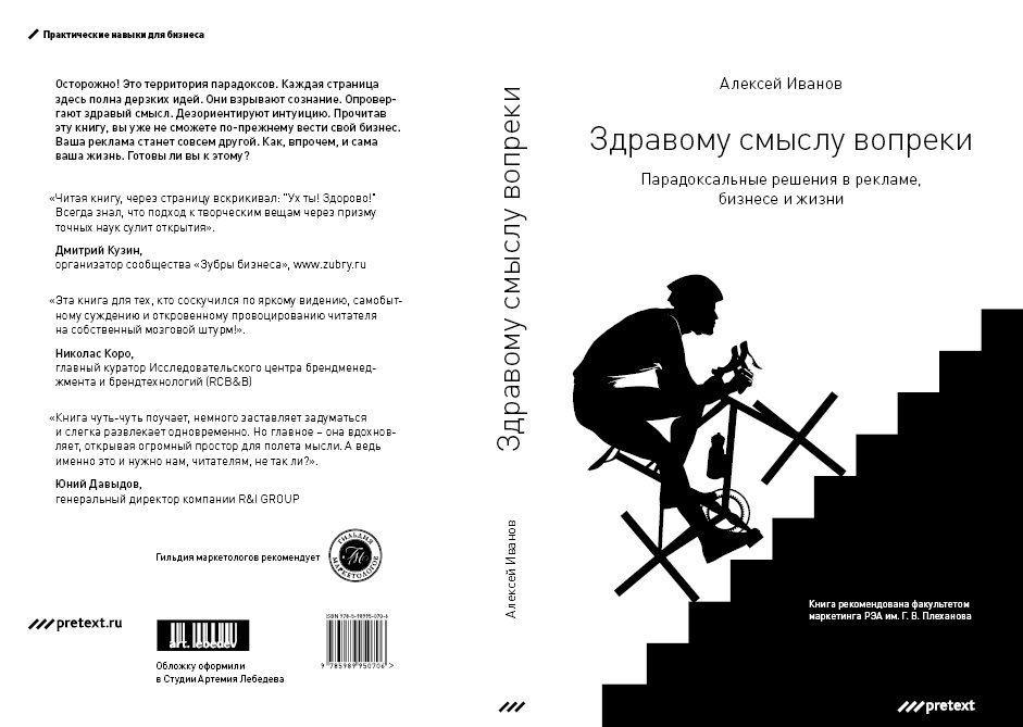
Art director: Yes.
Desinger: Are we ready to submit it to print?
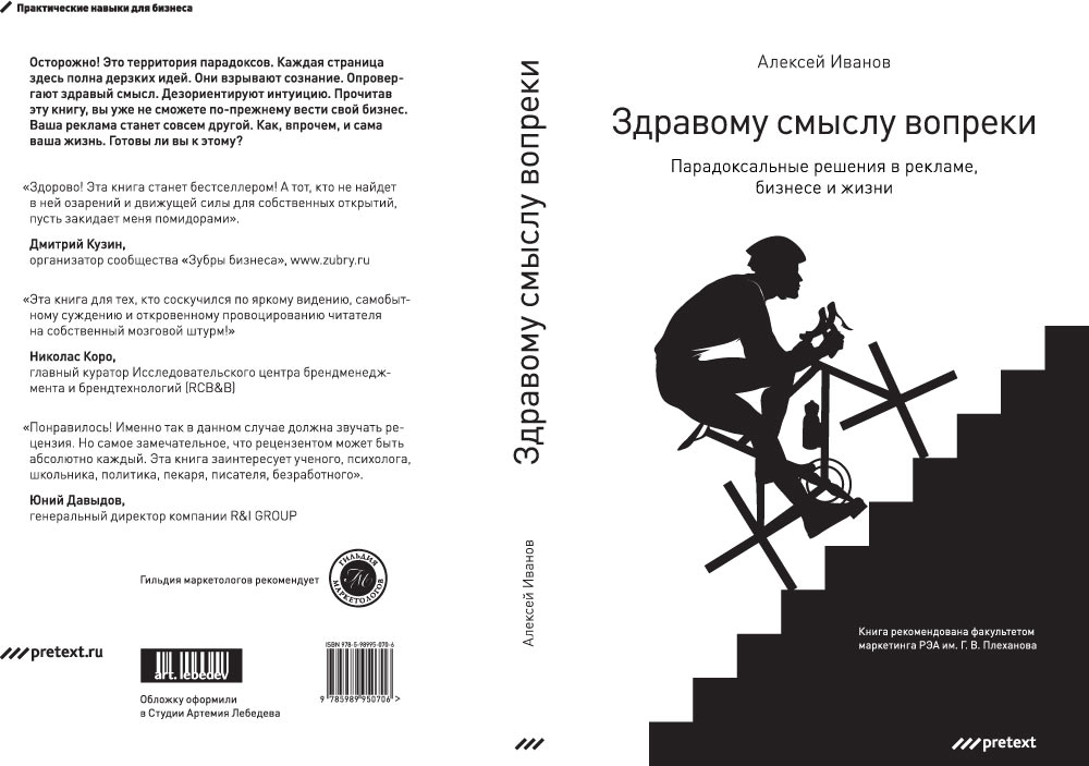
Art director: I don’t like his feet on the pedals. And his chin. And his stomach is gone.
Illustrator:
Designer:

Art director: zsv-book-01.jpg.
