Logo Navigation Website
The making of the Pulkovo Airport logo
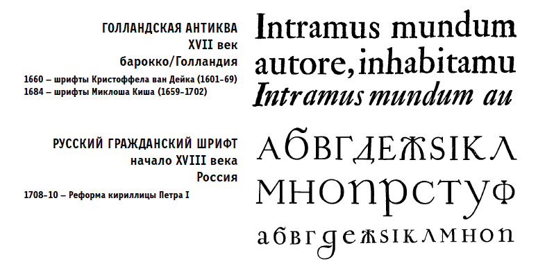
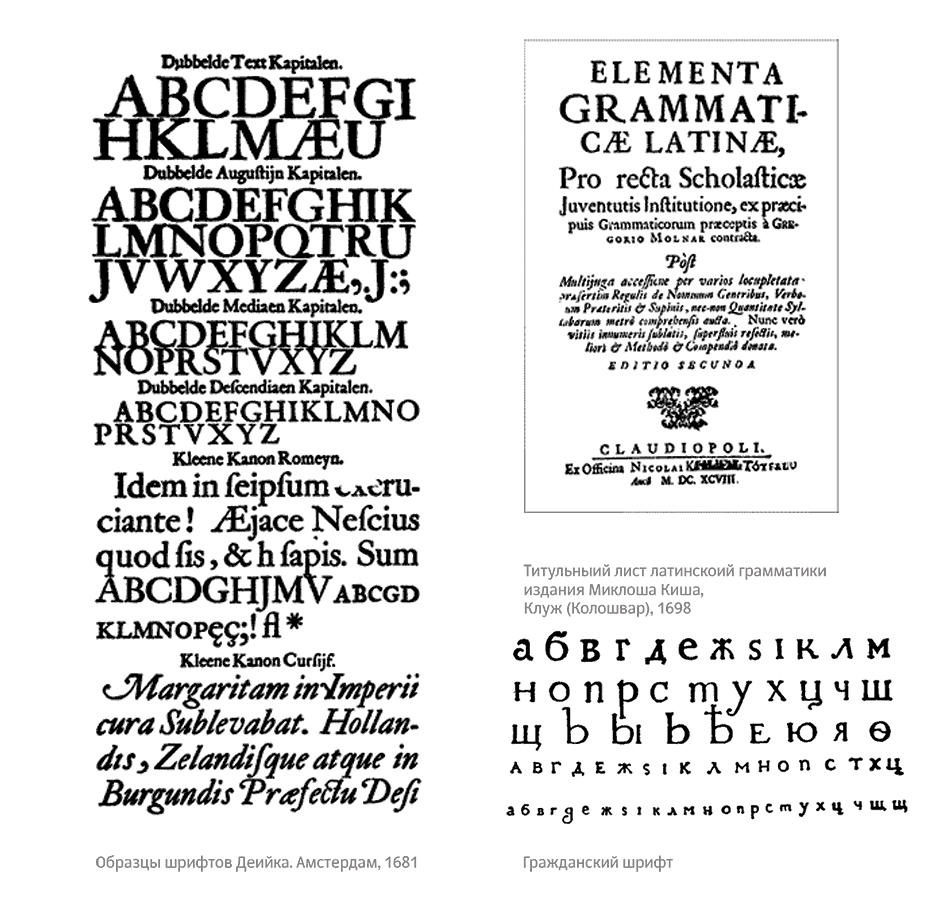
The art director suggests making a Venetian type that resembles the Dutch Antiqua and the Russian Civil type, but warns not to get carried away.
Type designer: Like so?


Art director: No, keep looking.
Type designer: Maybe try something different?

Art director: No.
Studying the Dutch Antiqua and Russian Civil types.
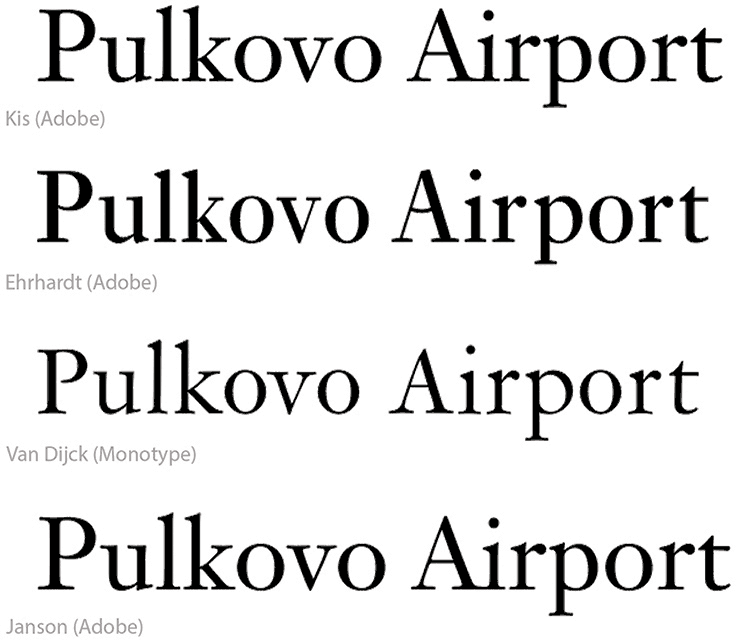
Setting the airport name in several Dutch Antiqua types.
Type designer: Maybe like this?
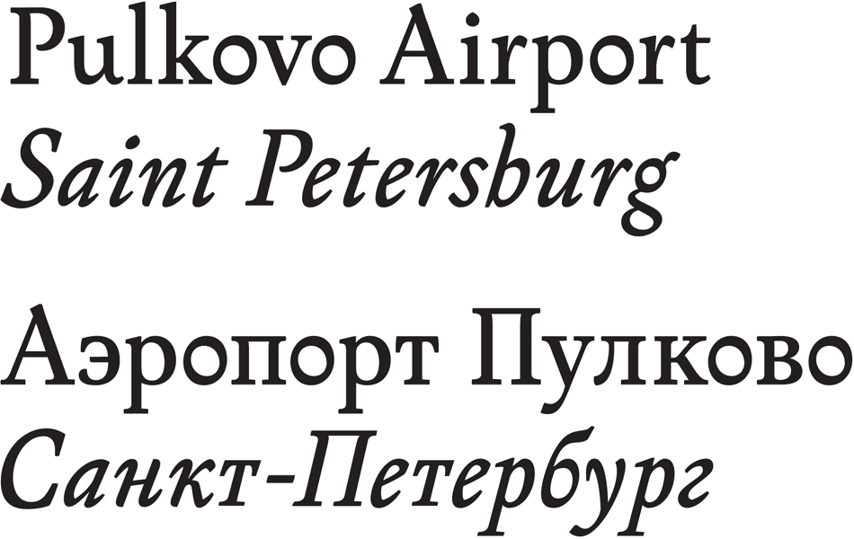
Art director: OK.
Trying different arrangements of the logo: in one or two lines. At the same time working on the letters.
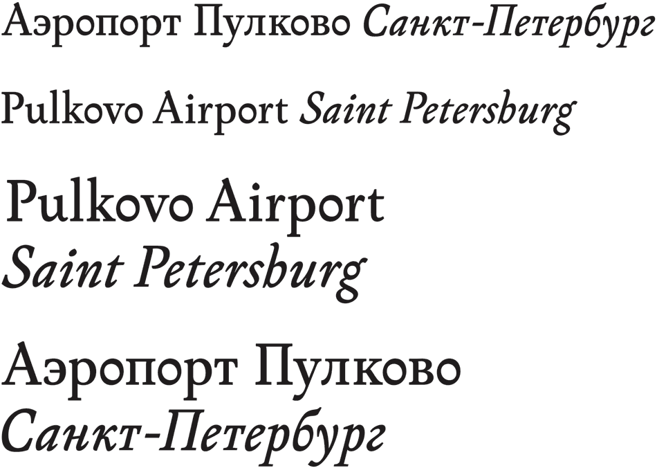
Coming up with another version of the logo.

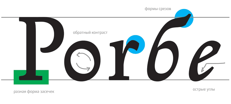
No, it won’t be of use for now. Designing the characters’ features.
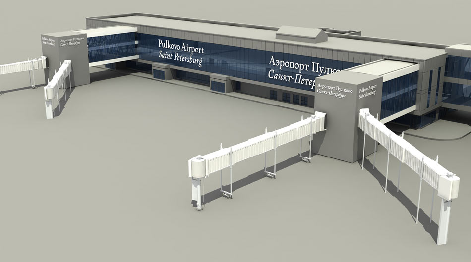
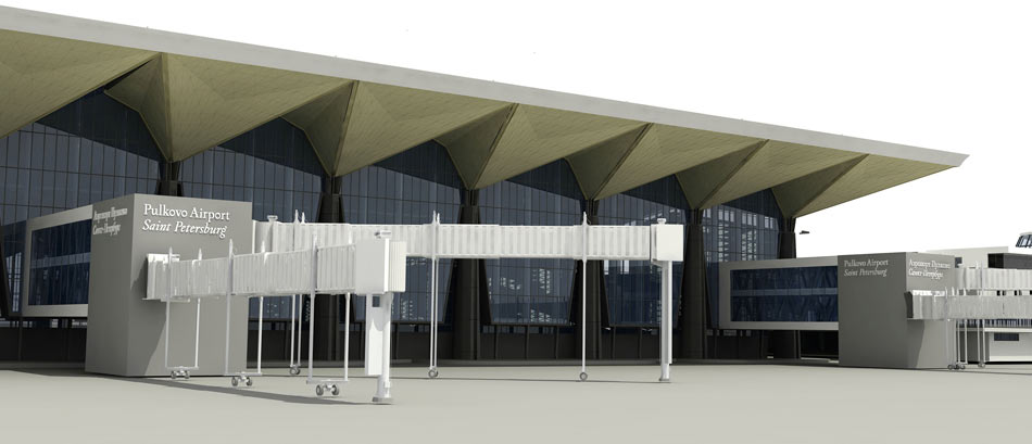
The architect is figuring out where to position the logo on the terminal.


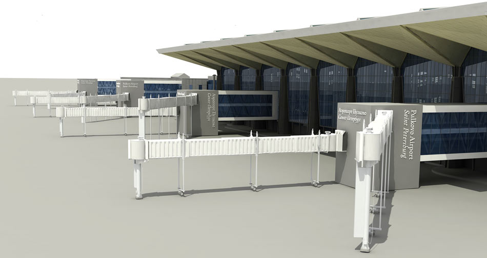
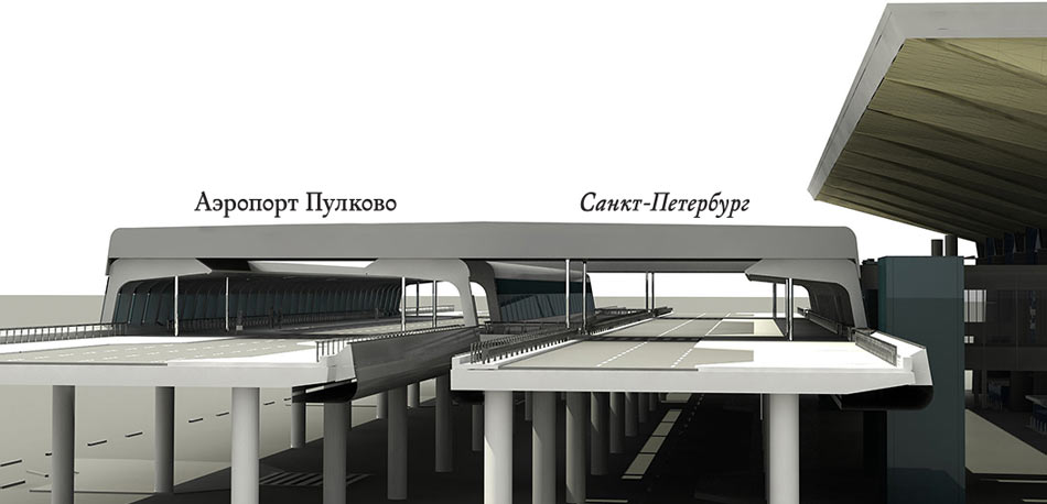
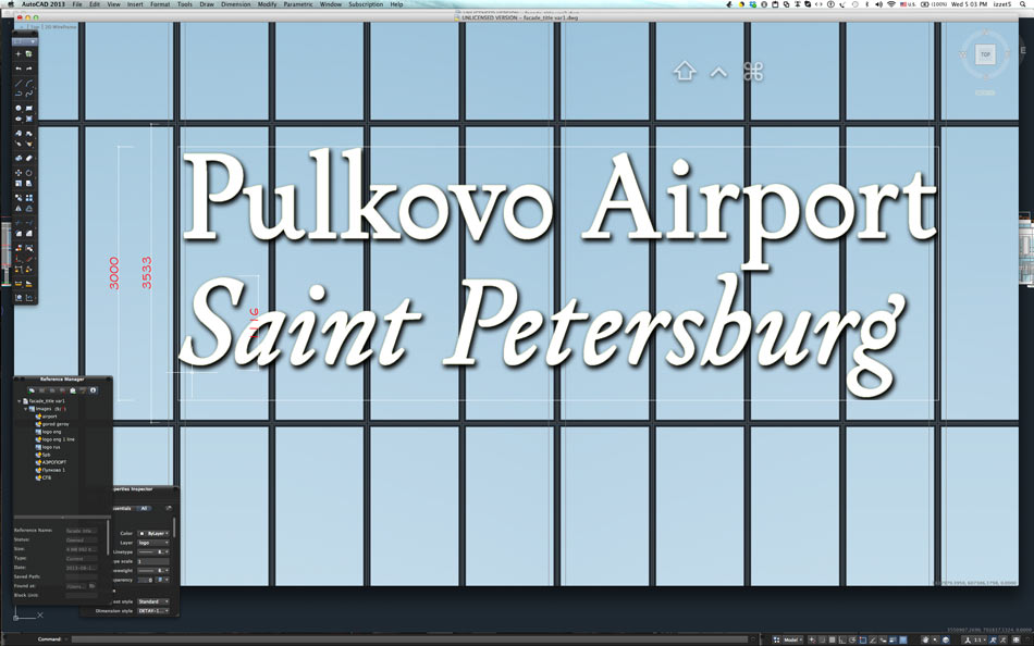


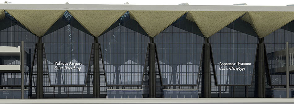
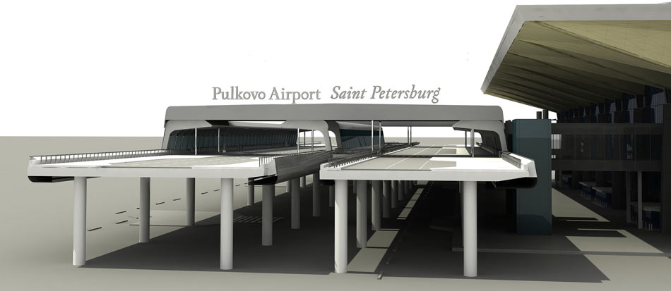
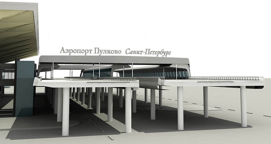

Moving on to the mark.
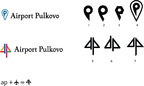
Art director: No, wrong direction. More St. Pete please.


Art director: Yeah, that’s it. Add perspective—one tail should be bigger, the other in the distance.
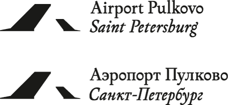
Art director: That’s better. Let’s make bridges look like airplane tails. Play with shapes. Look into the tails of the Soviet aircrafts. Study Boing, Aerobus, Tu airplanes.
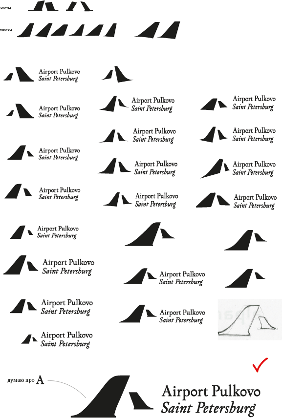
Art director: Not bad. Let’s play with the arrangement of the tails and the text.
Trying different colors, getting rid of serifs.
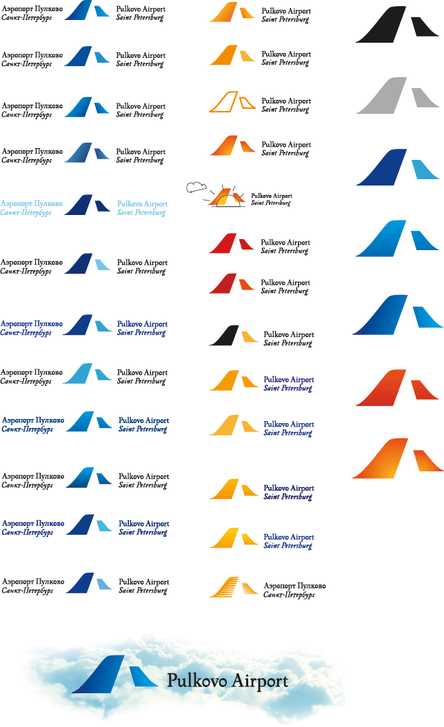
Presenting the logo to the client.
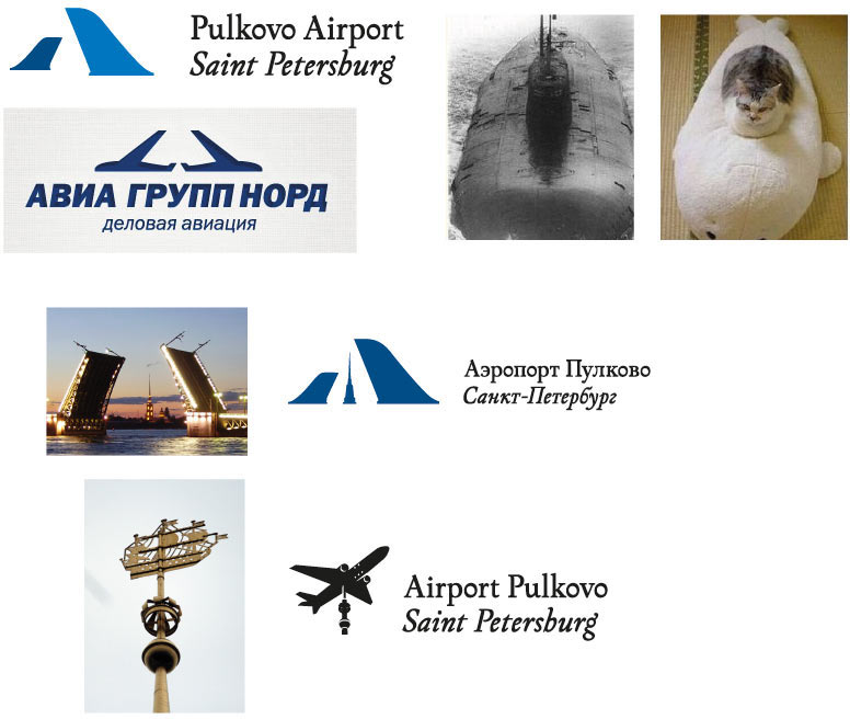
Finding a new shape for the mark and going back to serifs. The client thinks that the logo resembles the Avia Group Nord logo. Proving him wrong. At the same time suggesting alternative variants.
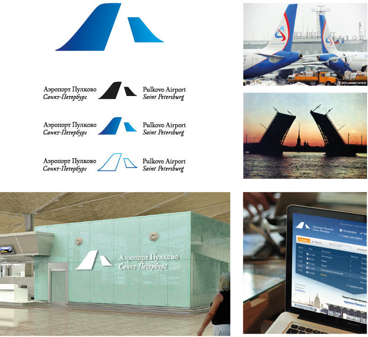
Polishing the first variant and trying it on.
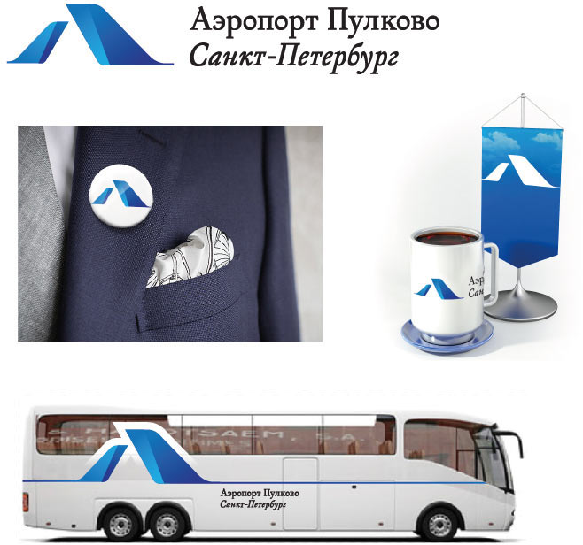
Making a guidebook.