The making of the Pulkovo Airport navigation system
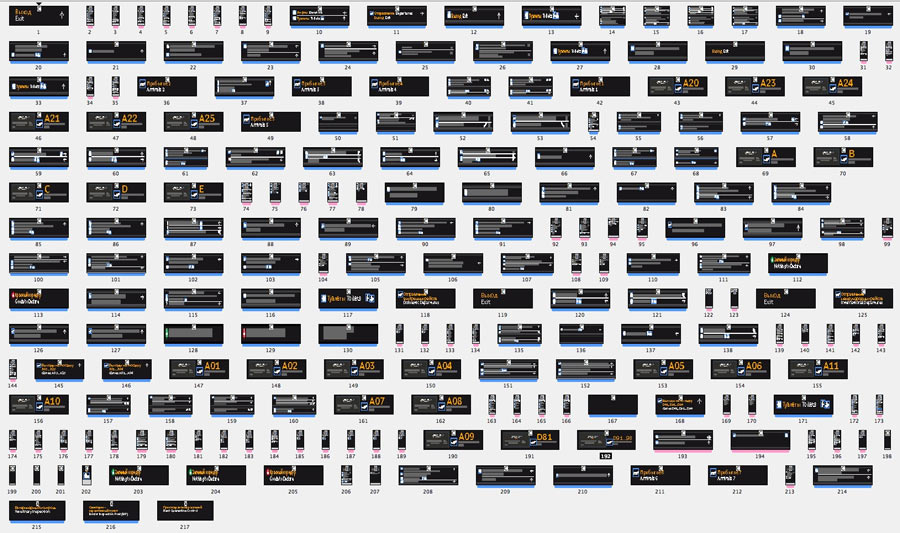
By the time we joined the project, the airport already had some work done, but it needed improvement. The Turkish contractor sent us a massive PDF file with around four hundred signs.
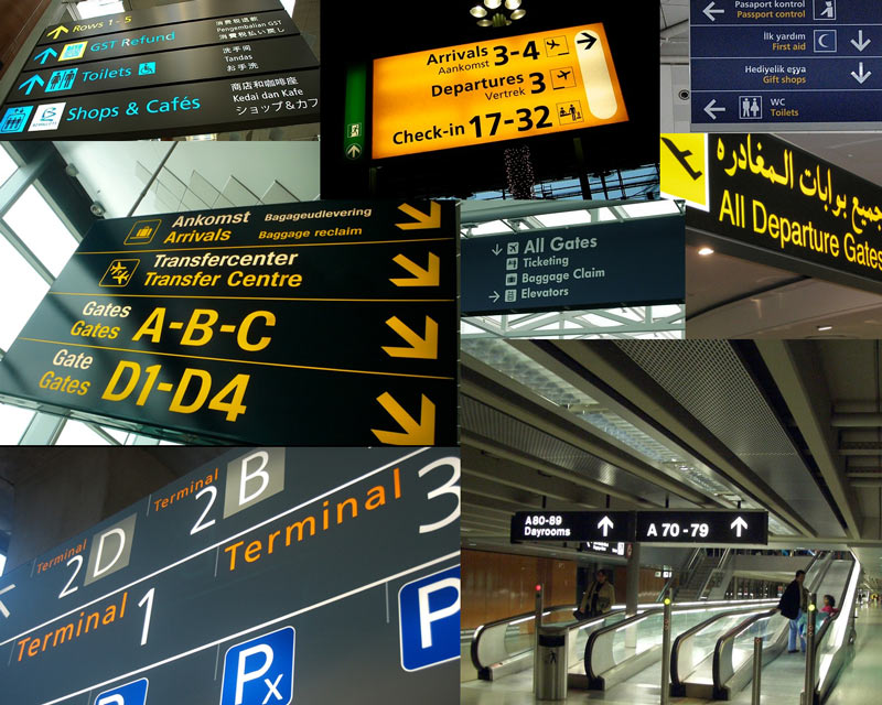
Getting ready for the presentation. Studying other airports’ navigation.
Roughly explaining what is wrong with the current signs. Making sketches to show how they can be improved.
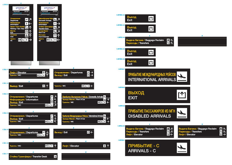
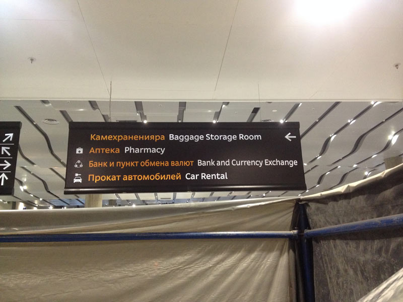
There are three main types of navigation elements: a panel with a screen, a panel without a screen and a hanging sign. Their size, shape and color are predetermined as they have already been produced.
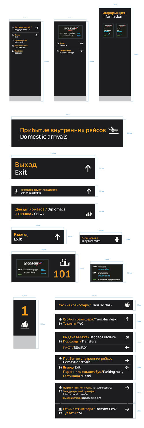
At the same time deciding which objects need icons. The art director suggests following the principle “the fewer icons the better.” Studying the existing icons, starting to draw our own.
Designer: Here are the sketches.
Art director: The one with the finger in the ass is fun, but the overall style is too playful and unconventional. Try using the existing airport navigation icons and improving them if they are out of date.
And these characters with the macrocephaly are really frightening.
Drawing more sketches.
Everything seems OK.
Drawing the first fair copy.
Art director: I don’t like it at all.
The lines on the suitcases are too thick, they cut them into pieces.
The characters for the WC, elevator and wheelchair-accessible icons must be normal people. The guy in the wheelchair is terrible. It's just a mess. Let's take the car, bus and the passport control fellow as the reference to build the rest of the icons.
Going on.
Correcting.
Editing.
Brushing up.
Redesigning.
Drawing.
Polishing.
Finalizing.
Improving.
Adjusting.
Redrawing once again.
Looking back.
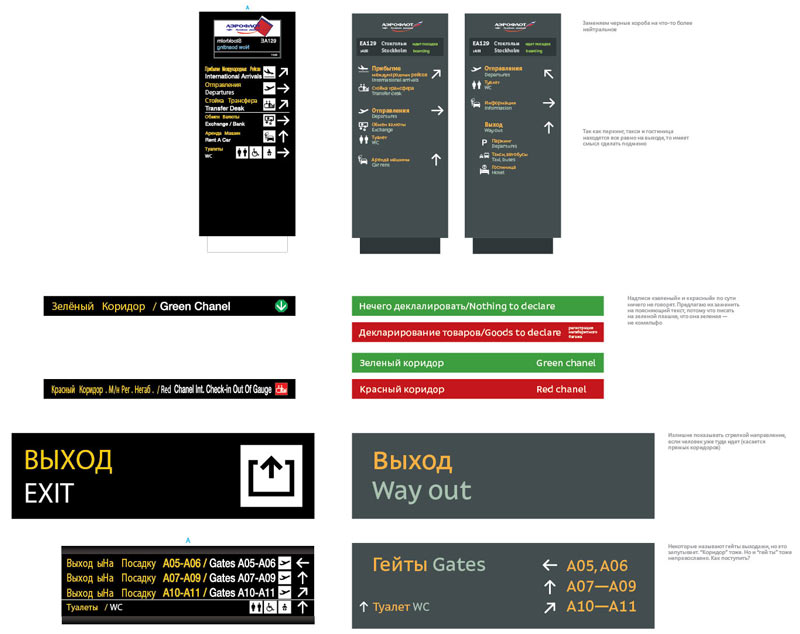
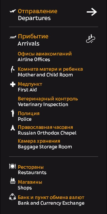
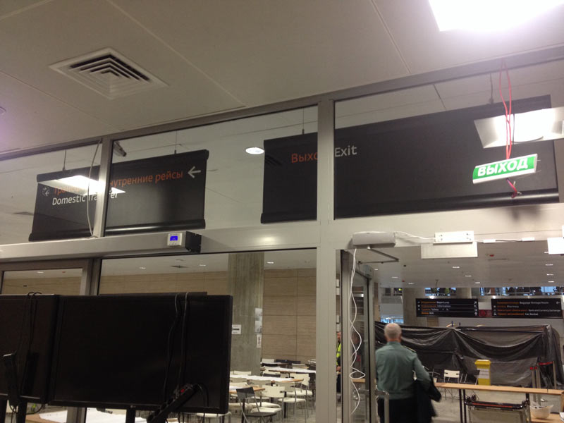
Getting the first version of the translation. Running into a problem with labeling gates and exists. In English it would be Way Out and Gate, but in Russian there is one word выход (meaning exit) for both of them. Deciding to denote the exit to the city as выход (no icon required) and the departure gate as выход на посадку.
As a bit of a tangent, turning to history to understand how the words Exit and Way Out are used. In 1987, there was a fire at King’s Cross station in London. The exit to the street was blocked, and there were no emergency exits at that time. After the tragedy, the station was rebuilt and emergency exits were added. The difference in these two notions is that an emergency exit is not always a way out. It indicates an escape route to a safe place, not the main exit. The way out is the exit to the street which at King’s Cross station was blocked.
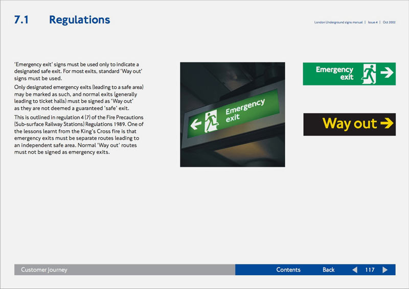
It is not a guideline to follow, but it can come in useful.
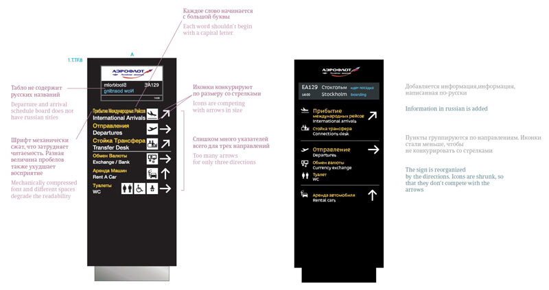
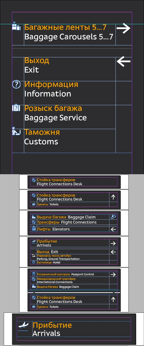
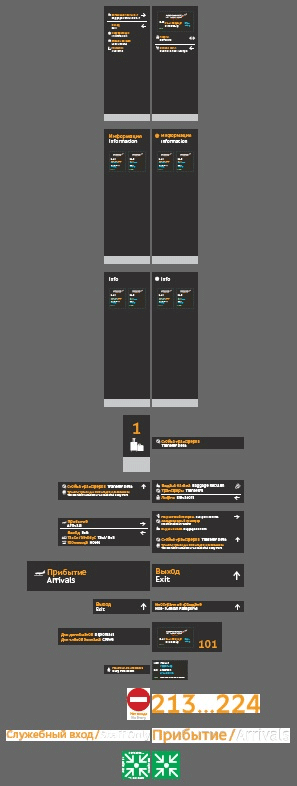
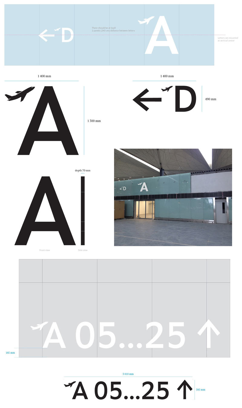
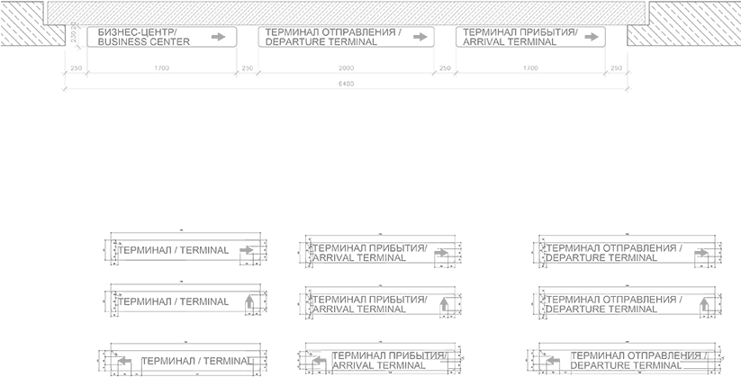
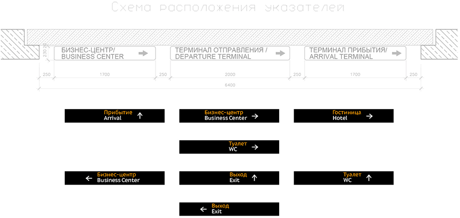
Designing a grid that would incorporate all elements: icons, arrows along with escalator icons, dividing lines and objects’ names placed in several lines.
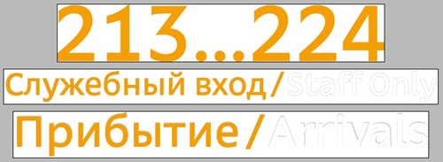
The art director suggests indicating ranges with ellipsis instead of a dash.
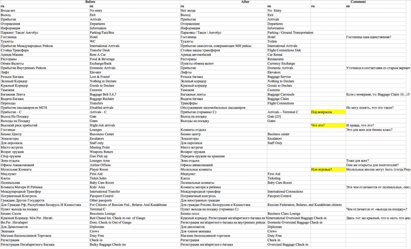
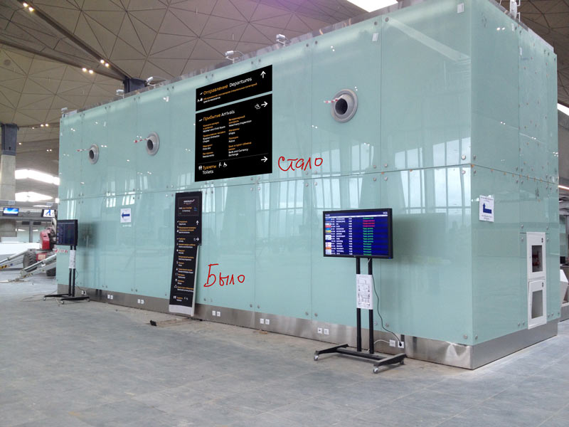
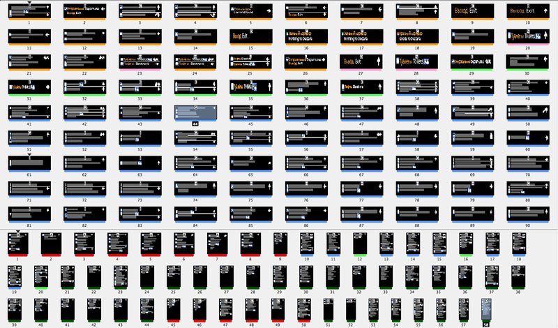
Submitting to the client the first set of templates and a Before/After chart.
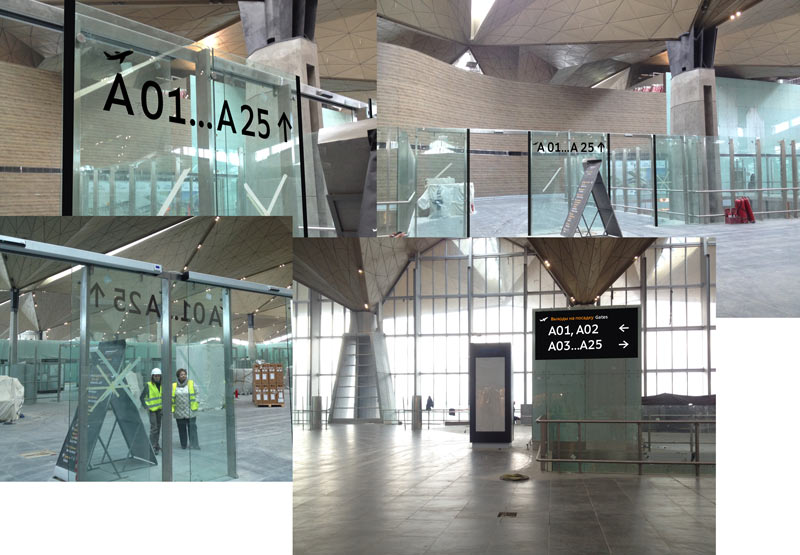
Getting the designs from the contractor, starting design supervision, studying the navigation elements arrangement plan.
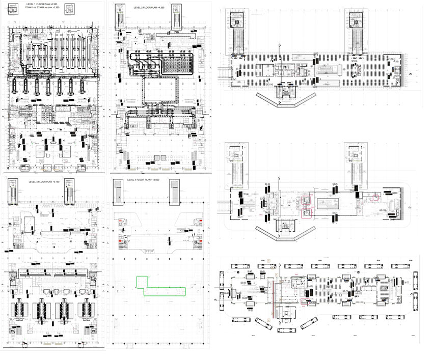
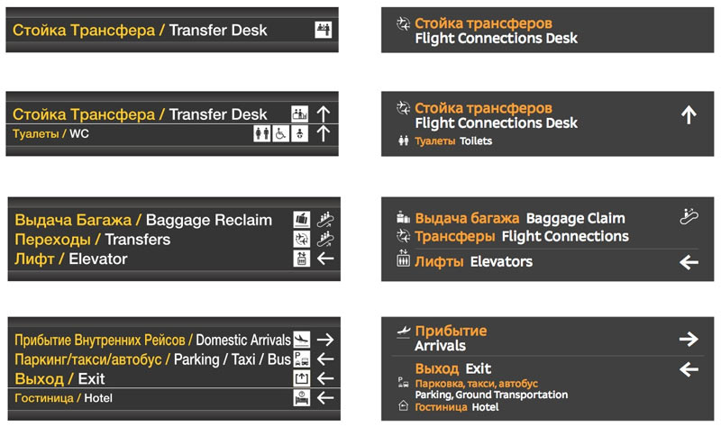
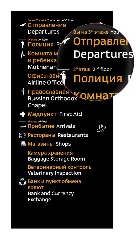
The current signage layout doesn’t solve one very important problem. Arrivals hall is located on the first floor, and Departures—on the third floor. If we sort the objects on the sign by priority it would seem that the Arrivals area isjust one level down from Departures, together with first aid, police station and other facilities, and that’s not true. The signs by the escalators should clearly communicate what is on what floor.
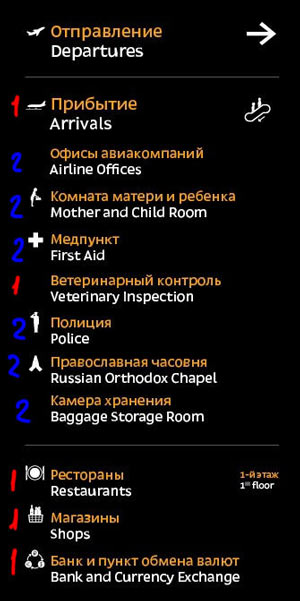
Solving the problem in two ways: by adding captions and arranging objects by floors, not by priority. Adding captions only to the signs located between different levels and parts of the terminal (on escalators, in elevators and on stairs).
Redesigning all navigation panels.
Trying on different variants.
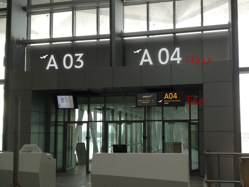
Suggesting to considerably size up andilluminate the gate signs.
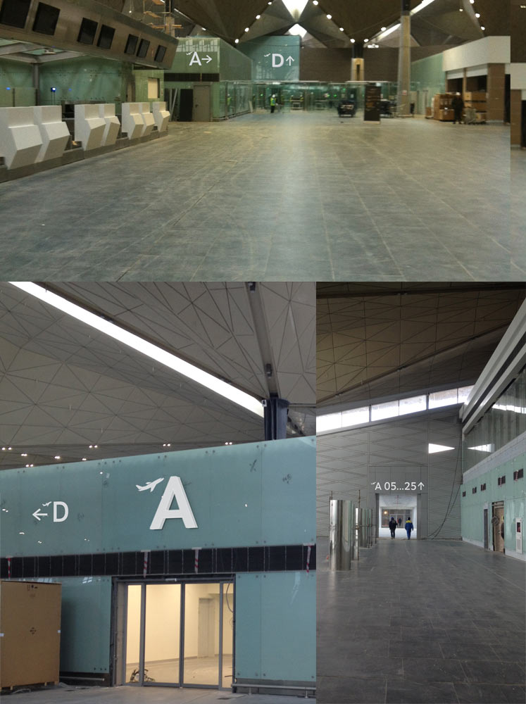
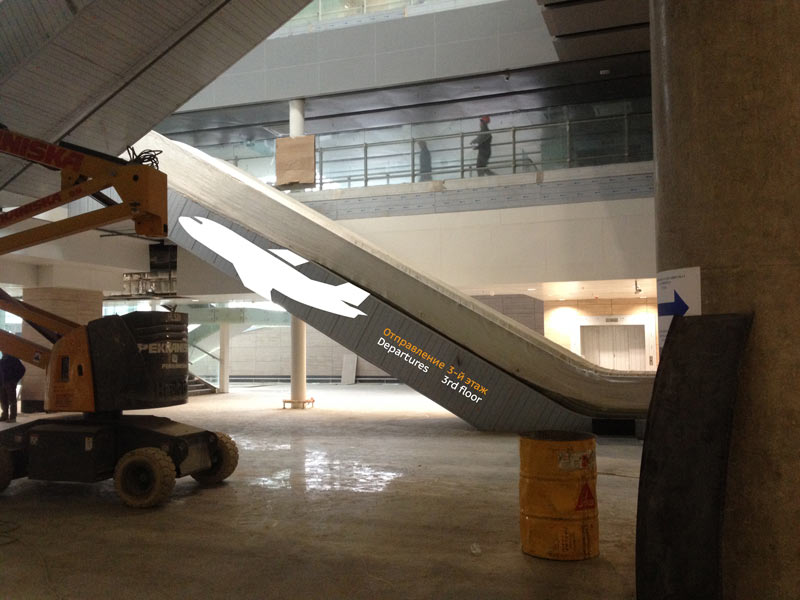
On entering the airport, passengers should see the directions to the Departures hall straight away.
Gate numbers should be larger than screens and billboards.
Helping passengers understand where to go after passing passport control without looking at navigation panels.
Preparing additional navigation elements with comments.
Meanwhile getting a new task—to make instructional signs and such: information stands, warnings, signs for staff, passport booths numbers and so on.
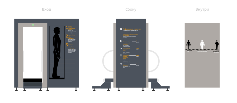
Drawing a security screening chart.
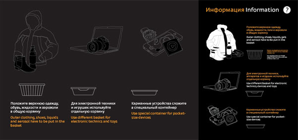
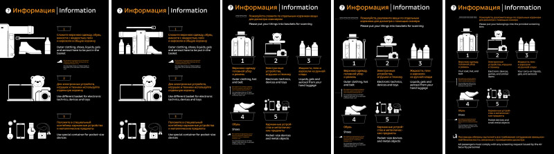
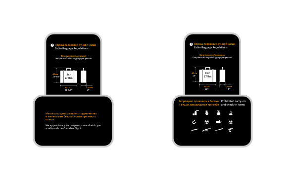
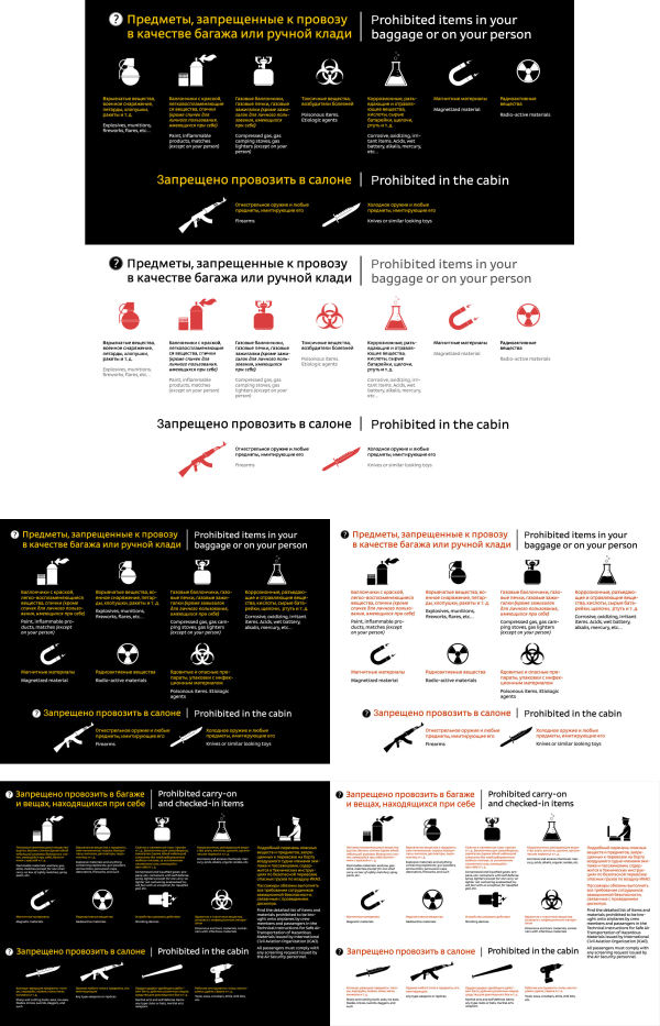
Moving on to the instructions on using the scanner, check-in desk information and prohibited items posters.
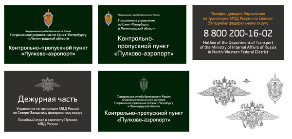
Making signs for border guards and the police.
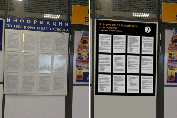
Working on information stands.
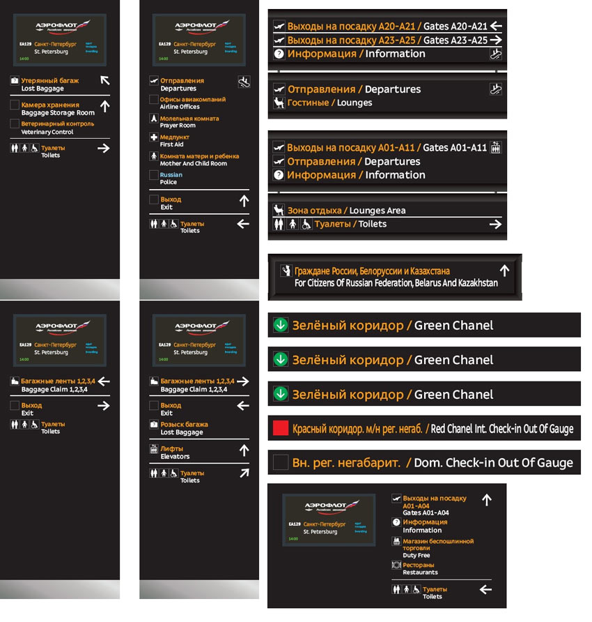
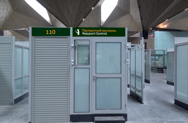
Preparing signs for passport control booths (green is the border guards’ color).
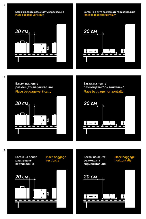
Designing a poster with rules for placing luggage on the belt.
Something unexpected and ridiculous happens: our Turkish contractor makes a dozen of signs with mistakes in Russian texts. Once again conducting design supervision.
Fixing the signs’ placement.
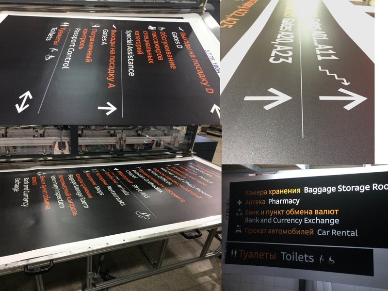
As the signs’ sizes were changed by the contractor, this time preparing files for print by ourselves.
Getting technical requirements to print the signs.
The client announces that passport control booths will be equipped with red and green lamps incorporated in number plates. Getting the booths arrangement plan.
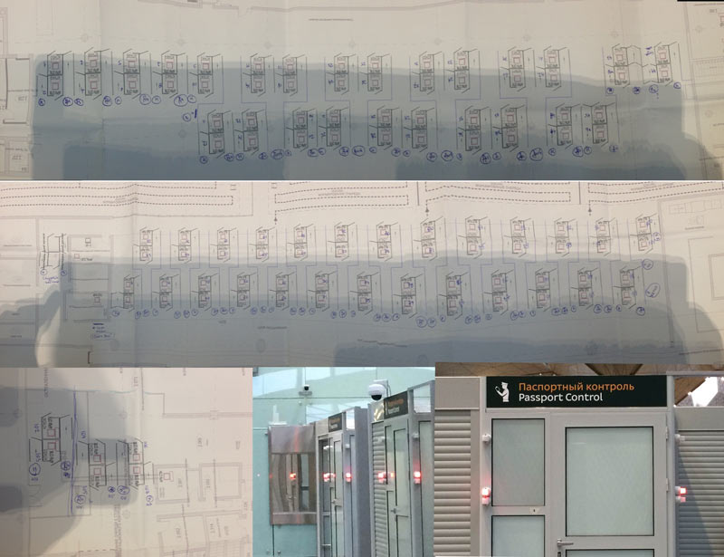
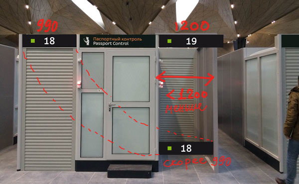
The numbering is very strange. Developing our own. Suggesting to get rid of red lamps, as they are unnecessary—if the green light is on, you can go ahead.
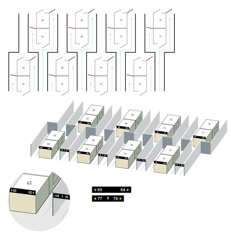
Getting the new arrangement scheme. Insisting on our version. Specifying the sizes.
To save ourselves from redoing everything once again, flying to the factory in Turkey to control the production.
Moving on to the parking lot. The client sends us drafts.
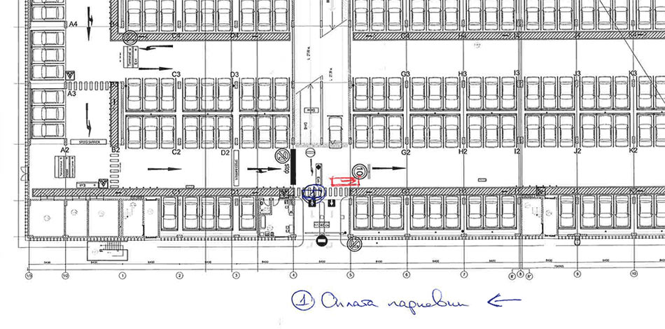
Signs are laid out in two lines.


The text is too small, and the gaps are too large. Besides, the signs are too close to the ceiling and hard-to-notice. Putting the text in one line, adding icons and leaving a big gap on the top.


Preparing additional signs.
