Queengroup corporate identity
|
Queengroup managing company started off as an importer of Daewoo and UZ-Daewoo brands to the Russian market. Saying that today the company is making great strides is to say nothing at all. Art. Lebedev Studio developed Queengroup corporate identity based on the Latin letter Q styled as a car rear mirror. The sign symbolizes a company that’s moving forward but also looks back on the road behind. Additionally, the studio compiled the corporate identity guidelines.  English version of the logo. Latin and Cyrillic typefaces were especially developed for Queengroup
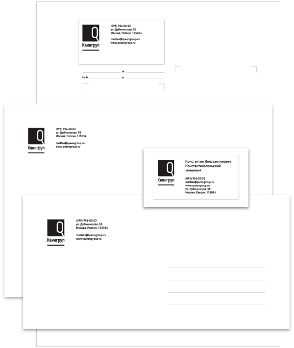 Letterhead, envelopes and business card. Major corporate color is black
 One of the samples of print advertising and a modular network for its composition
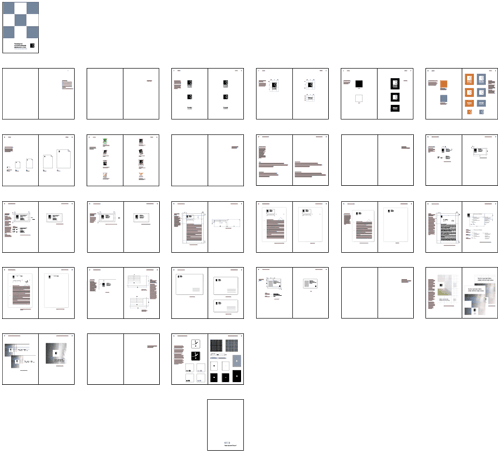 Abridged version of Queengroup corporate identity guidelines
|
Release date: March 18 2004 Cast: art director
designers
editor
manager
|

Order a design...