Corporate identity Website
Making of the Residence Tyrshova website. Part 1
Overview Process
Part I Part II
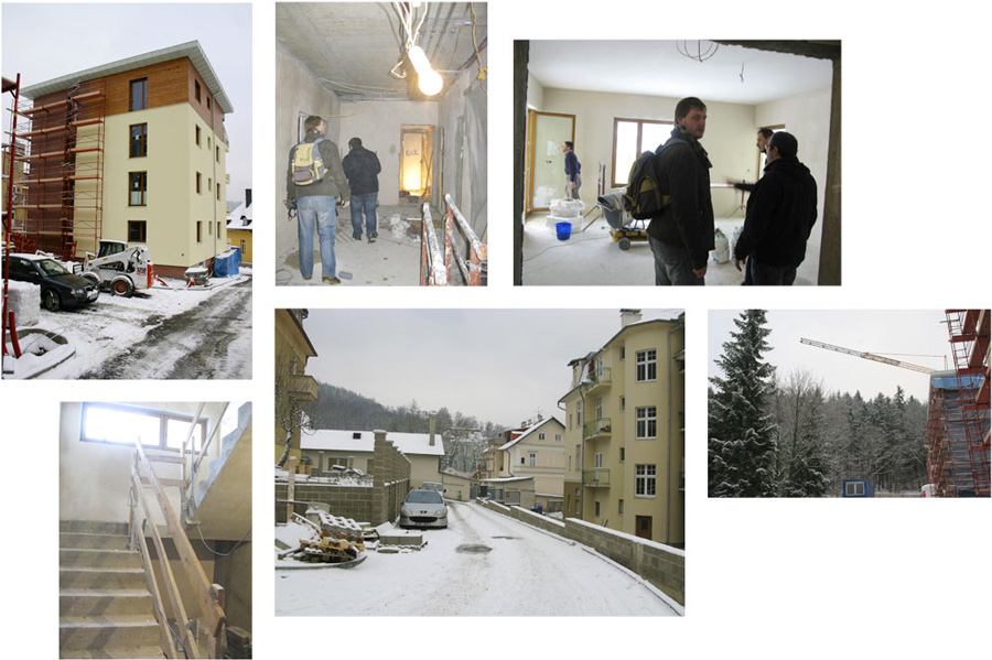
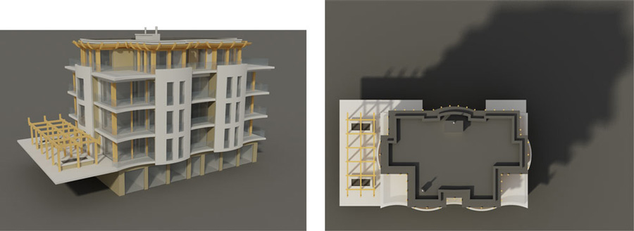
Before we started, we went to the Czech Republic to take a look at the site and the construction plans.
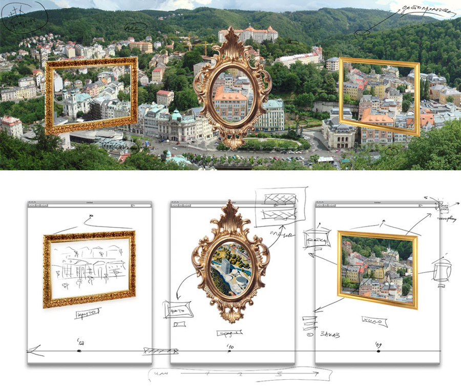
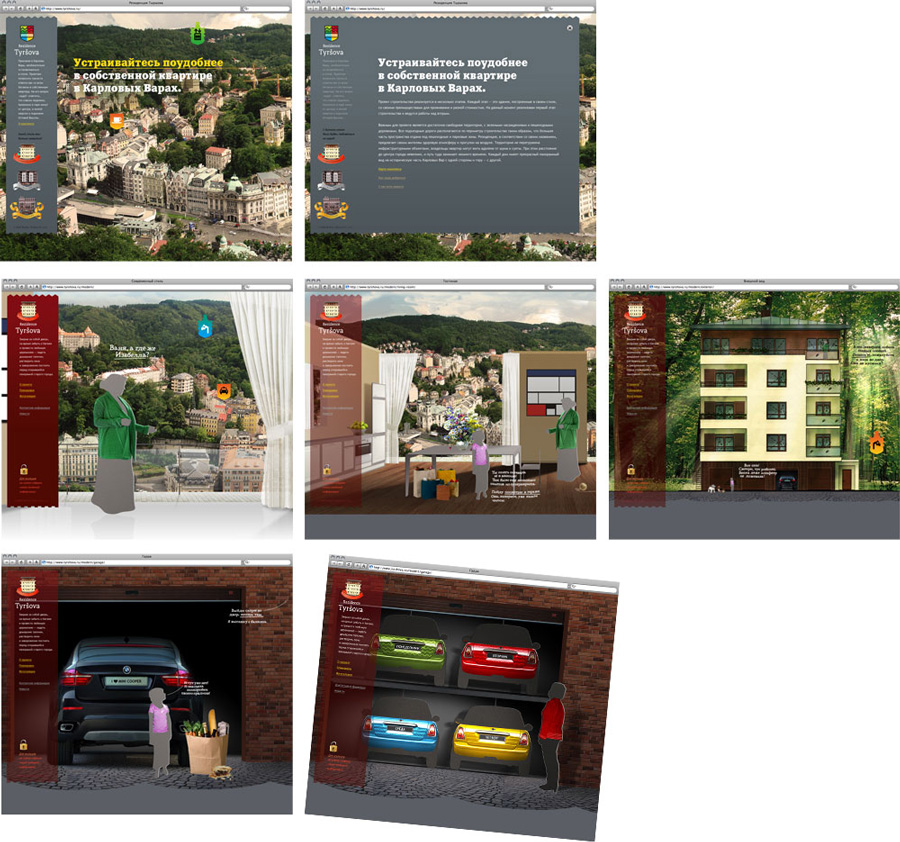
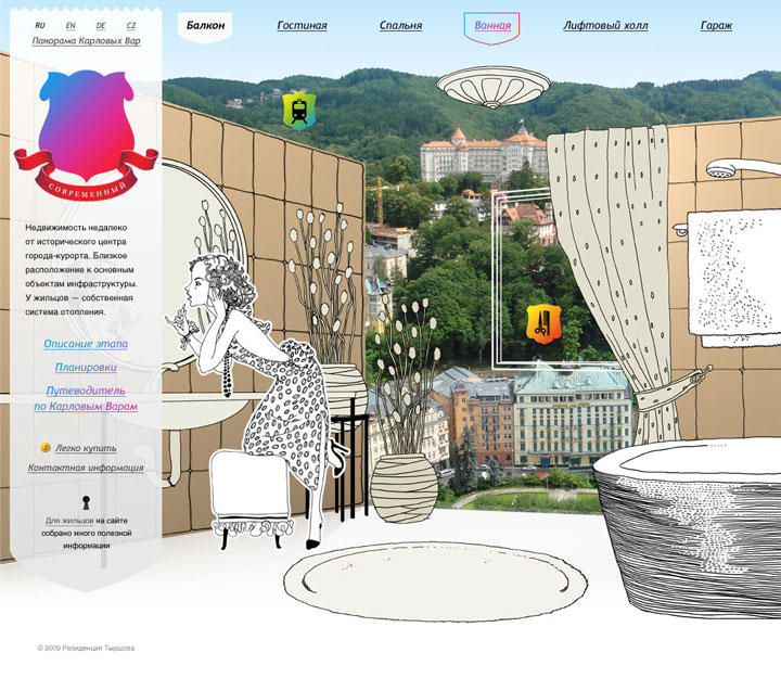
The best thing about the Residence is its great location—it has wonderful views over Karlovy Vary from the top floors. We decided that the cityscape panorama would be the theme.
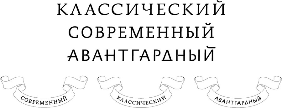
First attempt to visualize the stages of the project—three works of art of different styles.
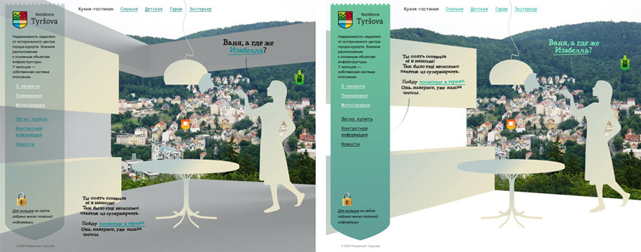
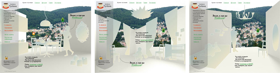
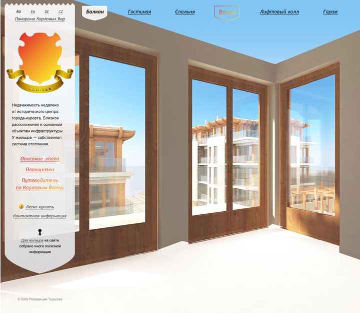
Gradually introducing visitors into the Residence—from the landscape and the balcony view to the interior.
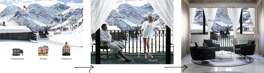
Playing with the cityscape view.
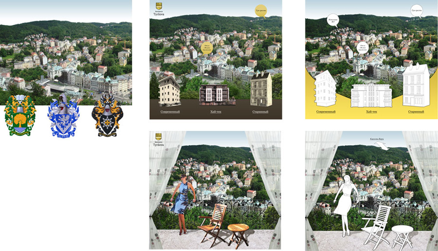
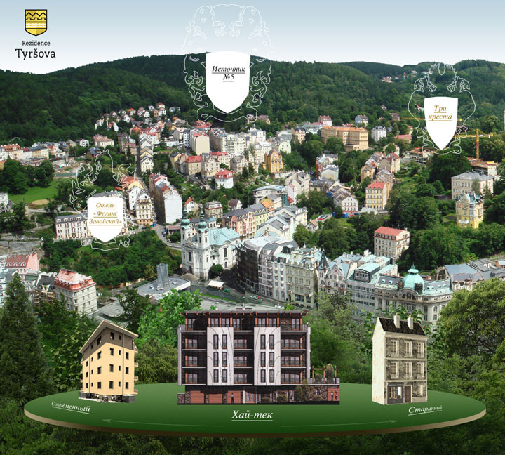
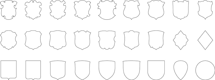
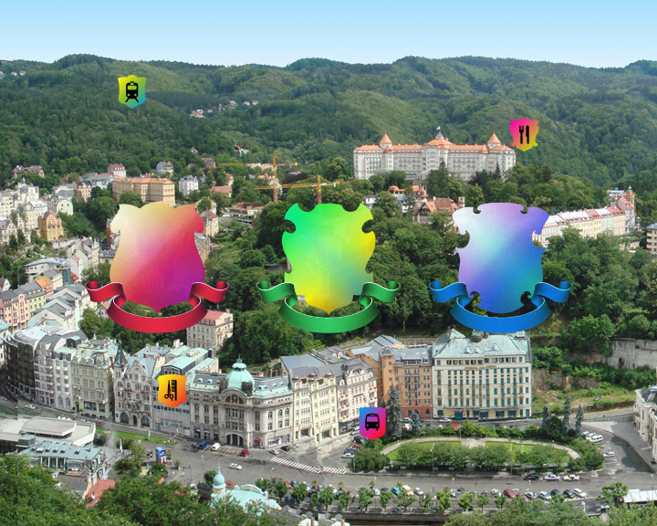
Adding coats of arms with links to the closest places of interest and stores for future residents.
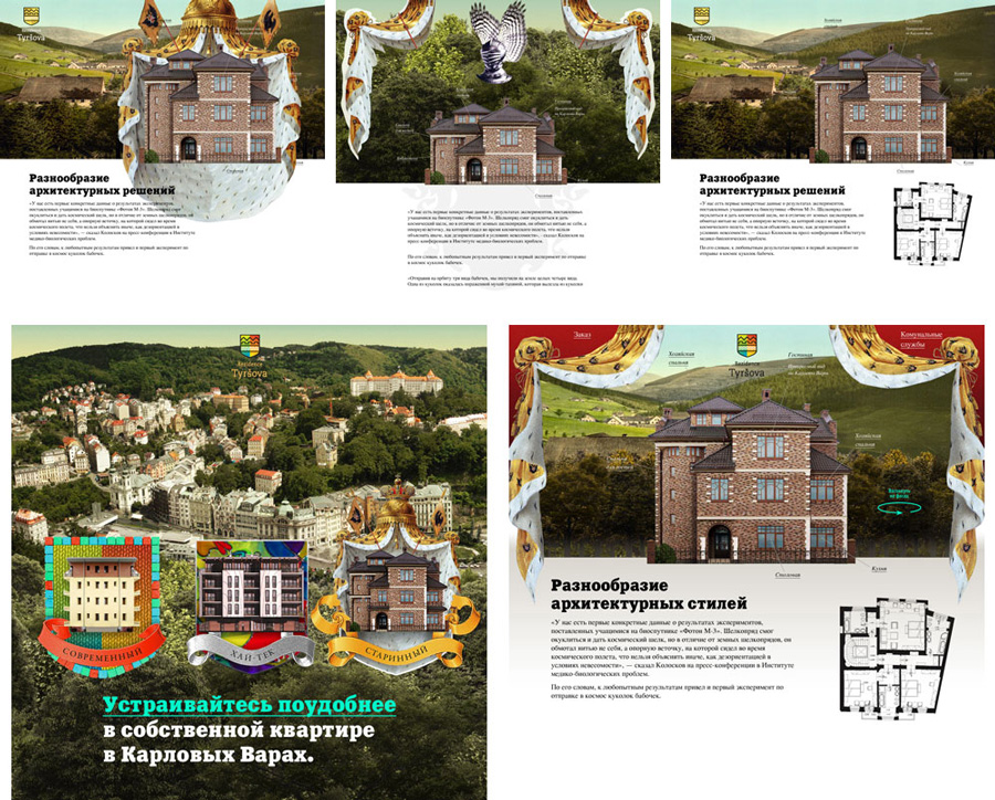
Extending and elaborating the heraldic symbolism.
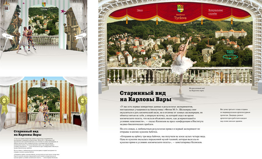
Stage-like design idea.
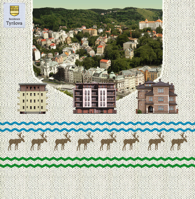
Developing the knitted pattern idea used for a print ad, part of the coprorate identity package.
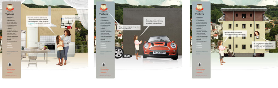
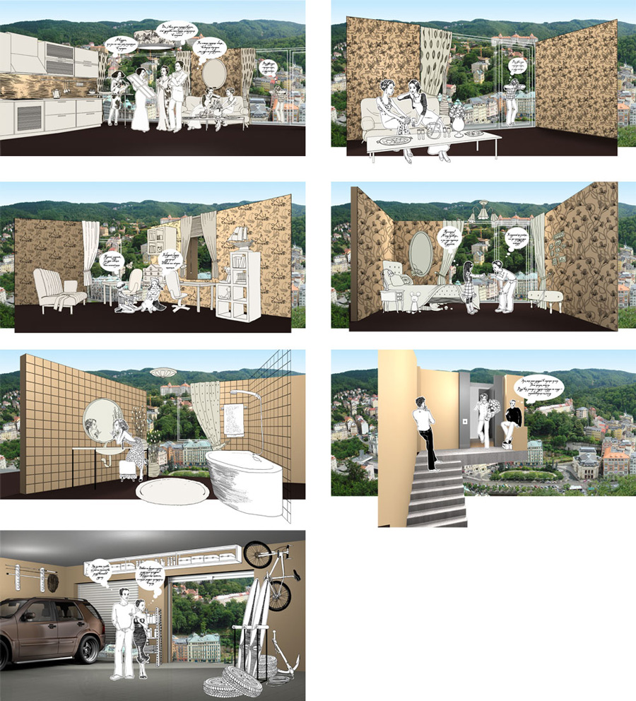
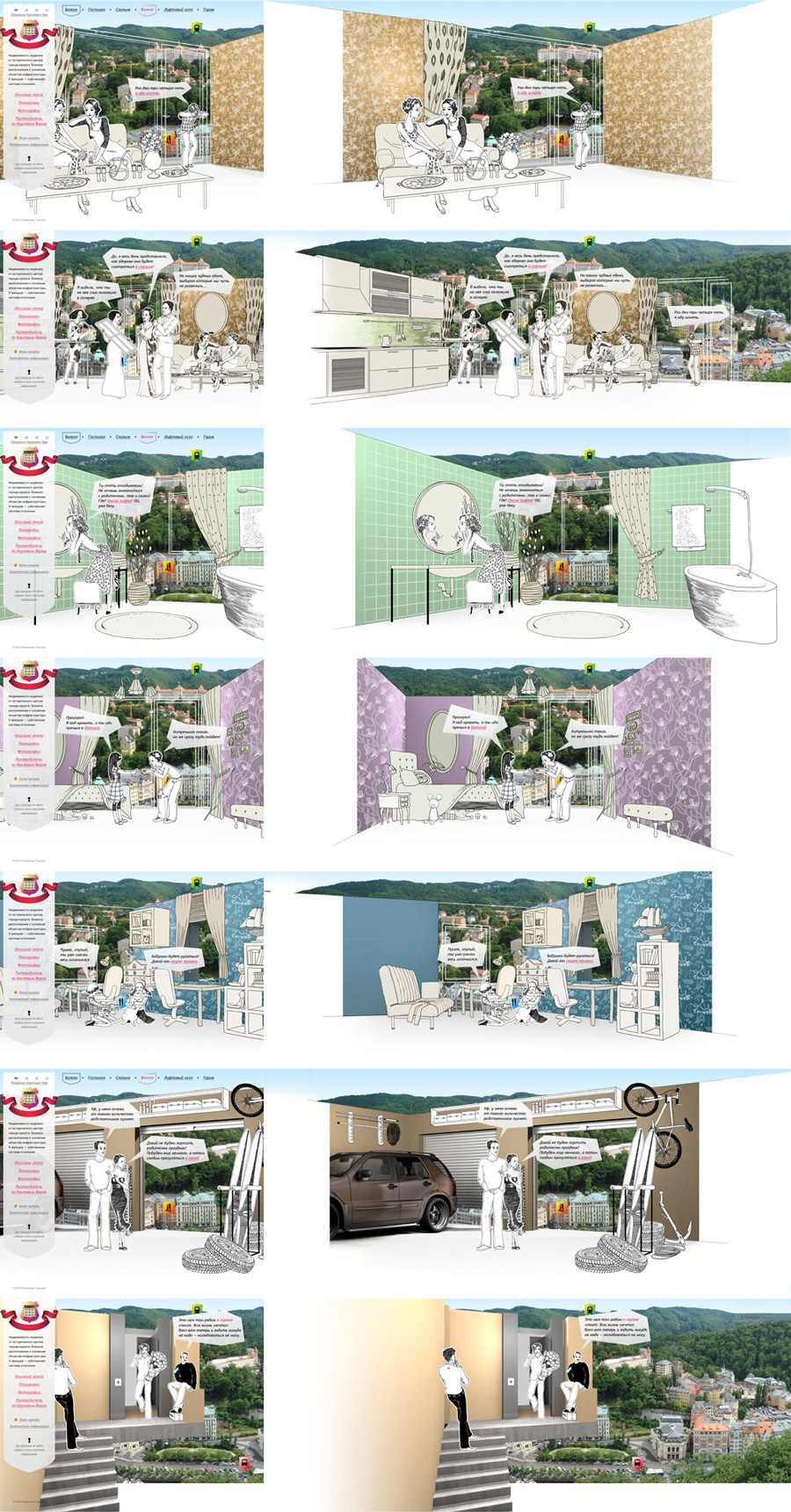
Bringing the idea of living at Residence Tyrshova into the spot light. Creating characters and stories set in one of the apartments.
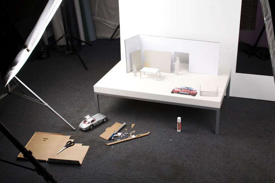
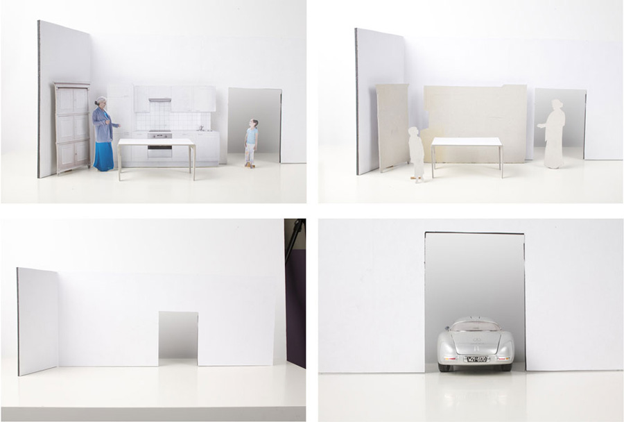
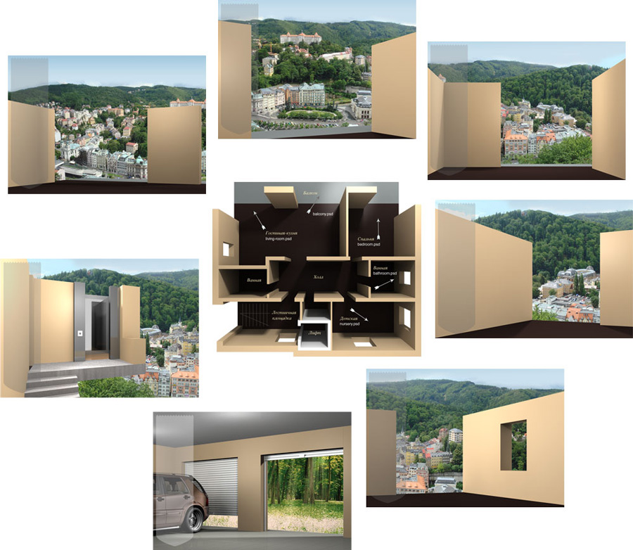
Then we thought of making a paper website. We built improvised cardboard models of a living room and a garage.
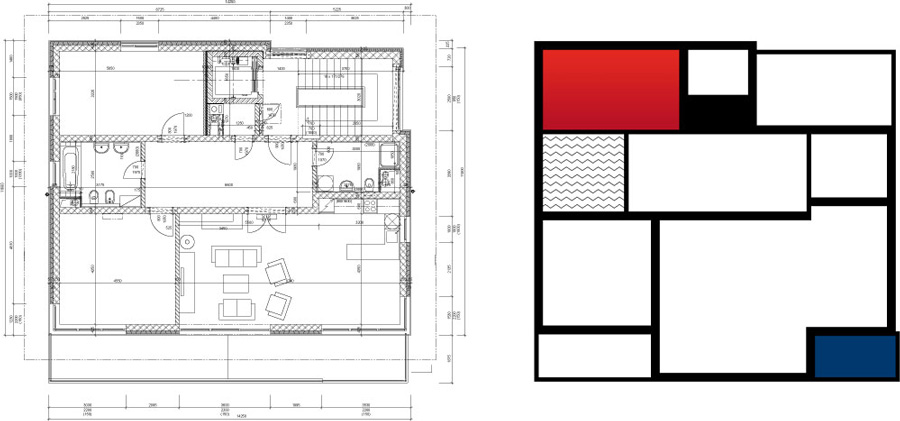
We combined a standard apartment plan and Mondrian’s style to create a painting to hang in the room.
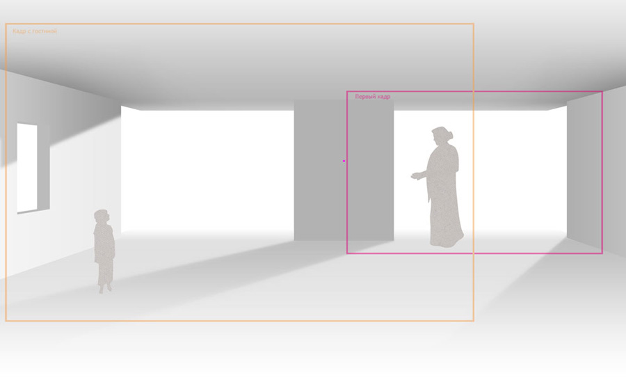
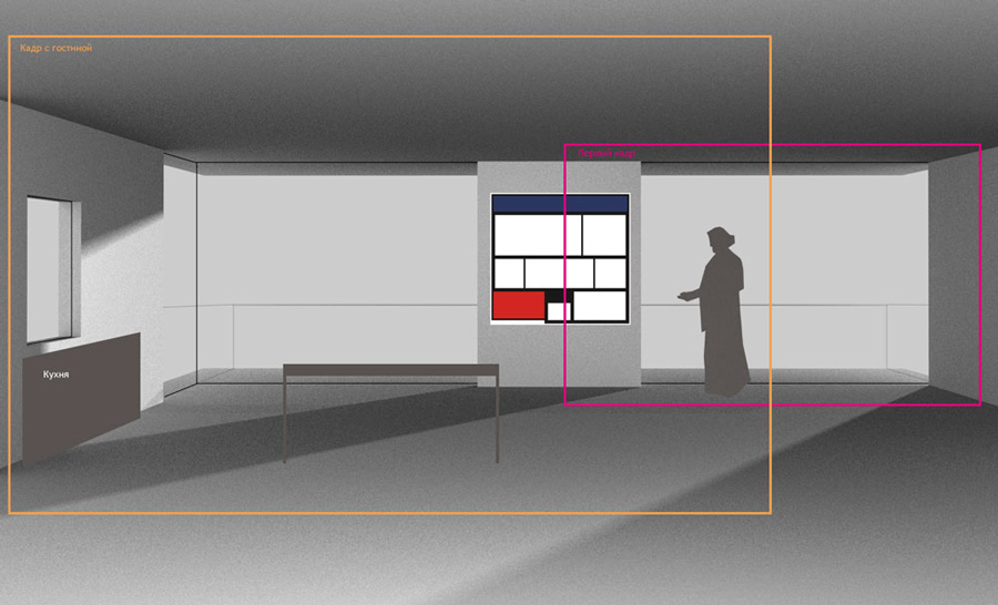
Then we refined the room view meant for two pages showing the living room and the balcony.
We threw in some spoken lines, polished the drafts and presented the concept to the client.
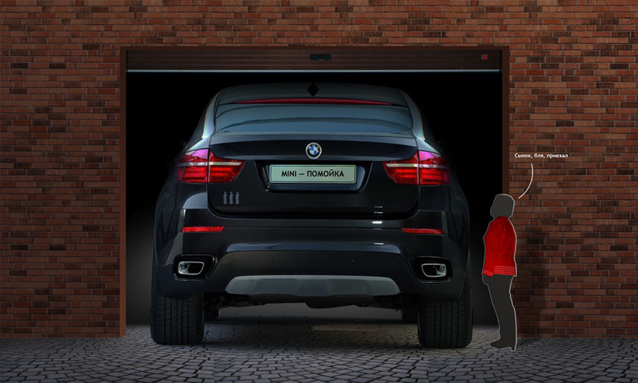
Visual joke. The plate reads: “Mini is junk”. And the guy says: “Oh dear, my son’s here.”
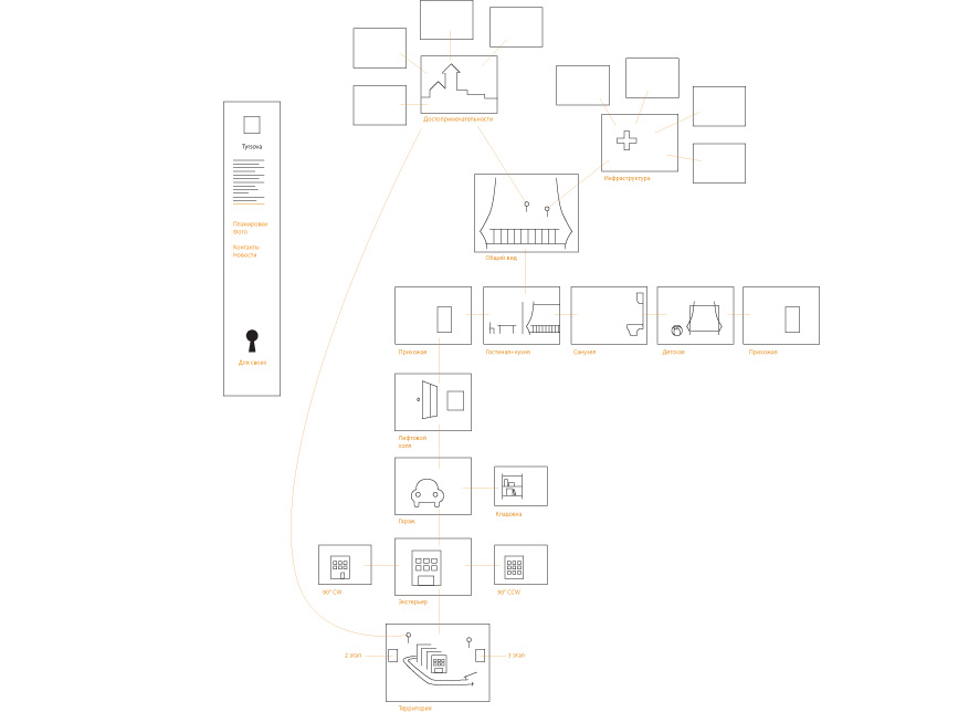
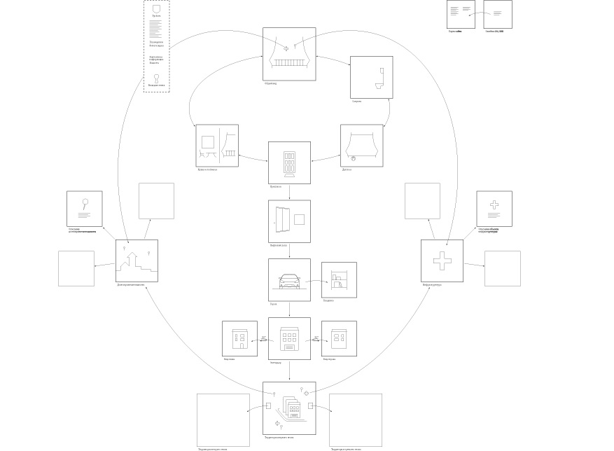
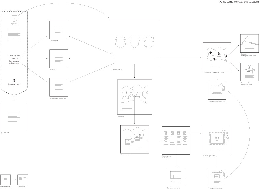
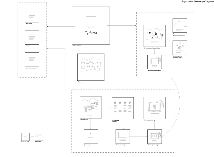
Evolution of the sitemap.

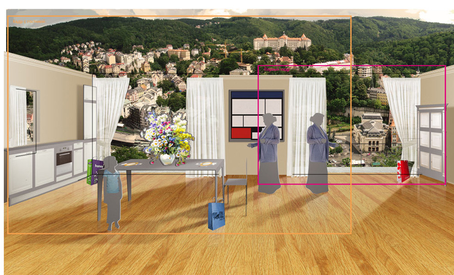
Paper design was replaced with illustrations. We created drafts for all rooms selecting the best view angles, choosing to remove the ceiling and the window bar.
We prepared a 3D model of the apartment, rendered the selected angle views, and sent the finished images with descriptions to our illustrator.
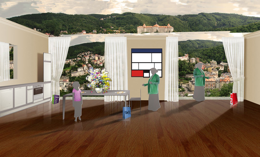
First artwork.
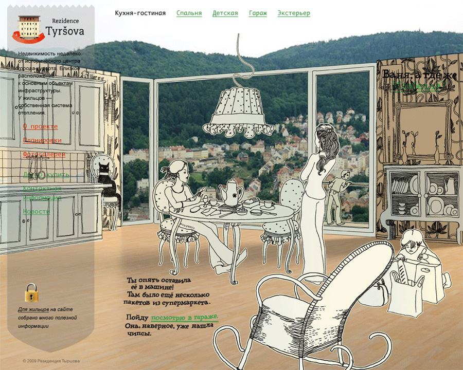
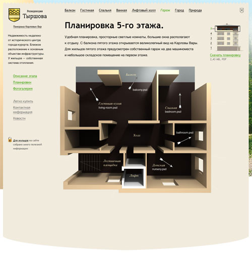
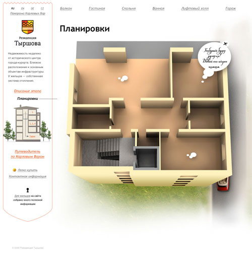
Illustrations for every room.
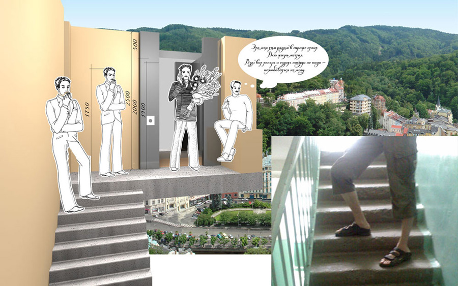
Correcting heights.
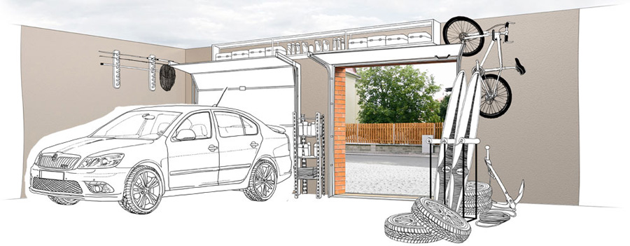
Parking the drawn car inside the garage.
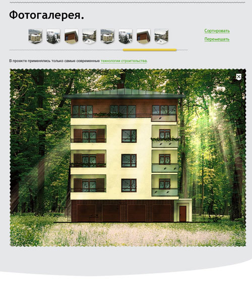
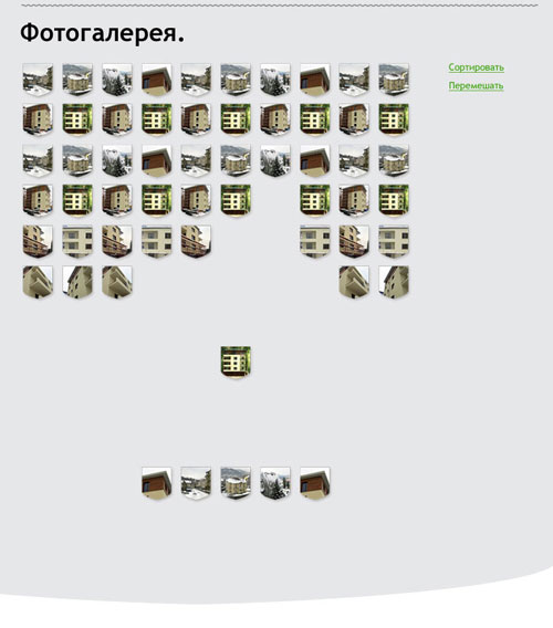
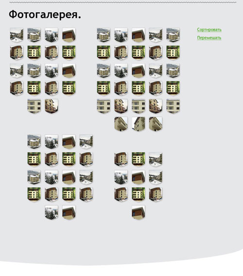
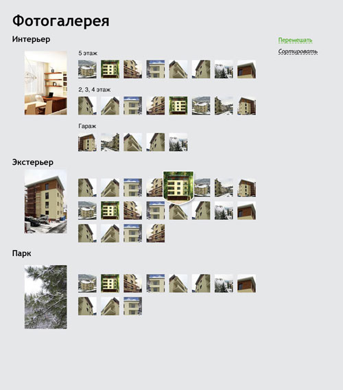
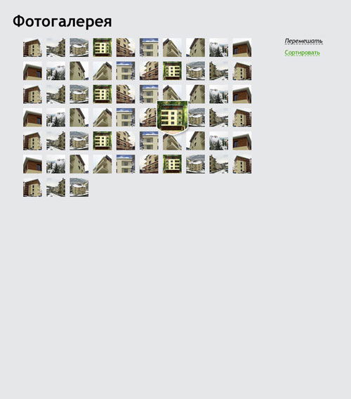
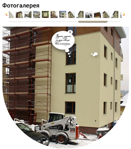
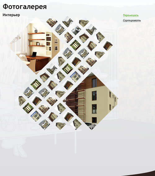
Meanwhile, we worked on other page templates, such as room plans, the gallery, etc.


Looking for a way to show three stages on the home page. Nailing the idea of coats of arms with a standard house for each stage.
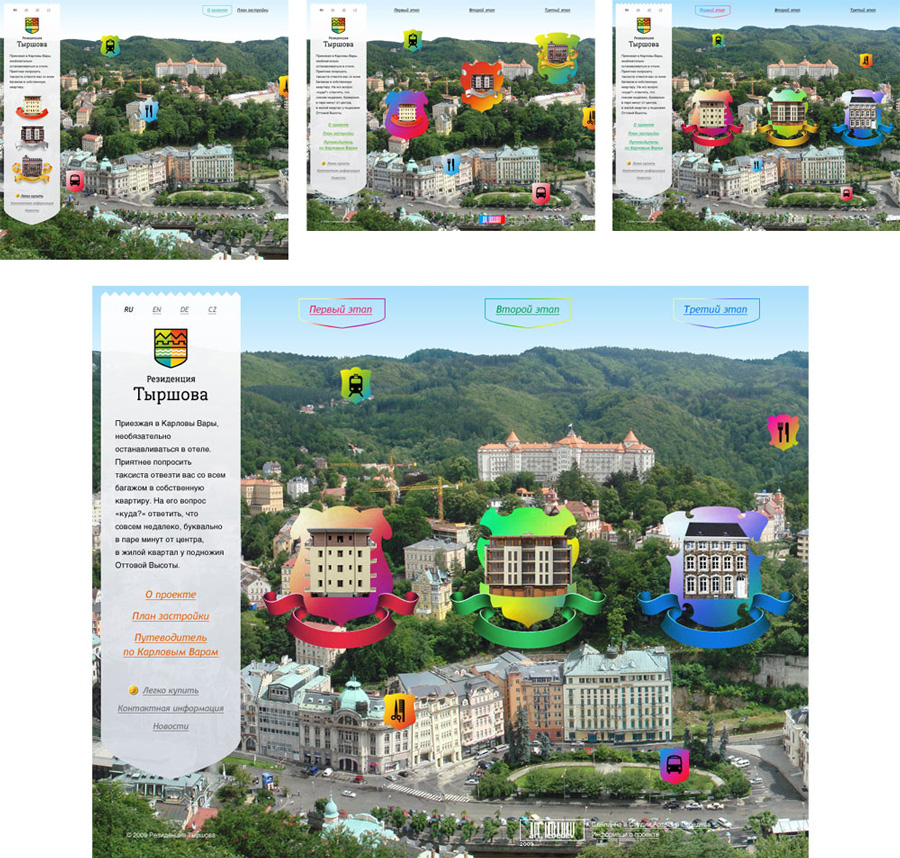
At that time Stage 1 was nearly finished, Stage 2 was being planned and Stage 3 had nothing but ideas. We modeled a house for the second stage.
Type design for the three coats of arms.
On the map of Karlovy Vary, places of interest would also be marked with various coats of arms.
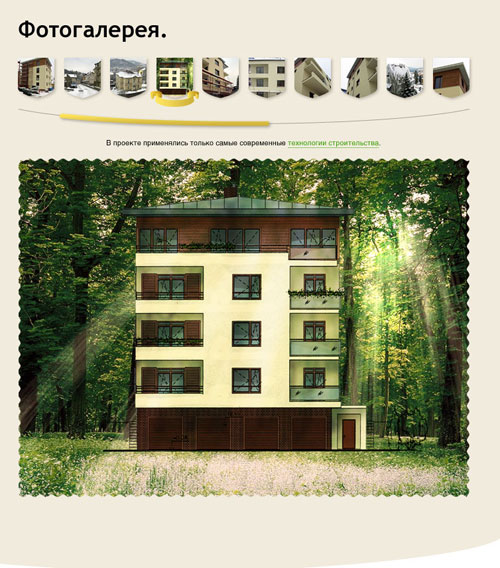
Inner pages for each of the stages.

Then we entered speech bubbles. Characters, things in the room and bubbles would move depending on the window width, so we prepared two layouts for each page: for large and small displays.
And then all of the above had to be trashed.

Order a design...