Client: Russian Blogger Research Agency is an independent analytics agency that explores trends in social media. Our experts track dynamics of the development of blogosphere and social media in Russia and the world.
In reality, we are freelancers who purchase advertising in blogs on behalf of our clients. And we decided to create an independent analytics service since we know our bloggers better than anyone and can share this knowledge.
Our agency performs research and analytics in the spheres of blogging and internet phenomena.
Bloggers are often associated with something childish (jokes, memes, etc.) but we would like to demonstrate that we are doing serious research founded on a sound analytical basis that can be trusted.
We would like our logo to be:
—simple and minimalist rather than complex and excessively detailed;
—modern rather than classic;
—serious and strict rather than light and frivolous;
—conspicuous and loud rather than reserved;
—expensive-looking rather than affordable.
First designer: Here are a few ideas.
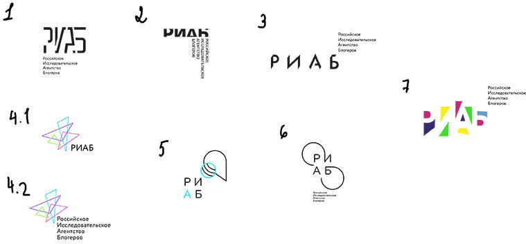
Art director: Number 1 is interesting, but you can’t make out the name. Can you make it more readable?
The second designer offers his ideas.
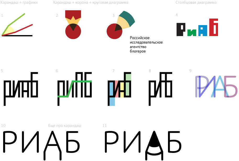
Art director: Number 3 is not bad.
Second designer: Variations around number 3.
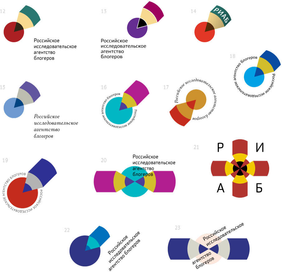
Art director: Go with number 17 but use the typeface from 18 and try it in different colors.
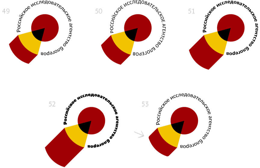
Second designer: Variations in colors, typeface and pencil length.
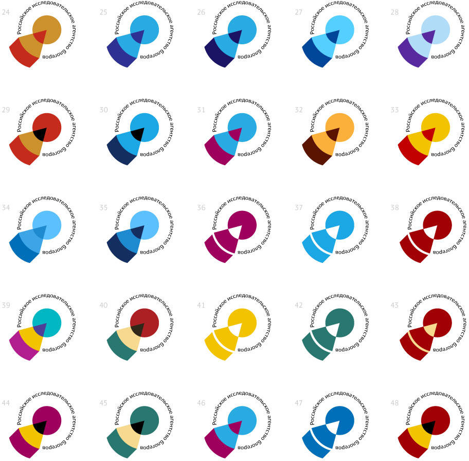
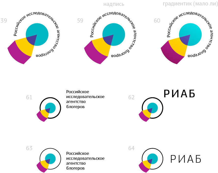
Art director: 39 is OK. 61 and 62 too.
