Client: We are launching a programming club in Novosibirsk. We will be teaching students 6–15 years old the basics of programming and robotics, game design and music coding. We will have courses on Java, Python, C++, Scratch and Arduino. The project isn’t very commercial and more social in nature. We have an initiative group that is ready to invest in the formation of a creative engineering generation.
We are planning to cooperate with regional leaders in electronics development and production. We have preliminary agreements for renting a space in the Academgorodok technopark. We need help in developing a logo and design for the classroom to make it modern and comfortable. We don’t have a name yet.
The style should be simple but technological, modern but understandable, memorable but not excessive. It should be a style that would remain recognizable for the next 5–7 years (1–3 program cycles for students in grades 5 to 11).
The logo should reflect the essence of the work of a programmer and engineer and the fact that IT is the profession of the future. It should be clear both to parents who will send their children to get a start in the profession and to children who will make this choice unconsciously. The “Russian hacker” meme today has a negative connotation and we would like to avoid any negative associations. Yet, children seem to like it. Being a hacker is cool and fashionable (as far as we can understand).
We will create uniforms (t-shirts, sweatshirts, hoodies, scarves) or other distinctive signs for the club’s members. The classrooms will be located in technoparks to bring the children closer to the profession and to introduce them to the real process of software design and development. Printed materials will be designed in the same style. This will include for example, workbooks for junior groups and advertising materials for parents about the club, prospects of the engineering profession and the focus on computer science state exams. For local governments we will prepare dashboards (potentially, paper-based) with infographics on student performance and state exam grade statistics.
We have lots of ideas. We have our work cut out for us for years ahead and we are just getting started. Right now we’re having difficulties choosing a name for the club. We like the Genius Academy, but it is taken. Maybe we’ll go with one of the following: First Programming Club, Engineer Club, Engineering Academy, Binary Academy, Bit Academy, Bit and Byte, 21 Century Academy.
If in the course of your work you get any ideas for a name or develop a preference for any from our list, please let us know.
In any case, thank you!
Designer: What about the name? Robomuzokod, First Programming Club or should I keep thinking?
Art director: Since they wrote Robomuzokod, let’s go with it.
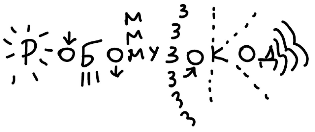
Designer: If I could draw like Egor, I would draw a Robomuzocat, but fortunately I can’t. I mean something like this:

Which is why I’ll try to look at it from the classic standpoint. Each letter is a control element, it does something.
Art director: Do you have any more ideas?
Designer: According to http://php-zametki.ru/binary-text.html this is what the word Robomuzokod looks like in binary. We can try to make the Р look better. The dot in the end is the EOF character.
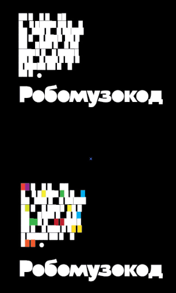
Art director: Nice.

Art director: Not bad either.
Designer: And the English version. We’ll just need to adjust the typeface to make sure the 8 looks like a B and the 2 reads like a Z.

Art director: So what’ll it look like altogether?
Designer: Let’s replace empty spaces with colors. If it looks like a sweater, I’ll use different colors. We can also bend the shape. I like the third one. And yes, all of this is the same set of bits. Changes in line width result in unexpected patterns.
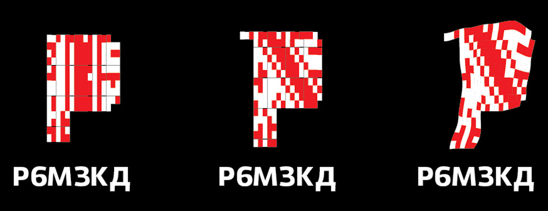
Art director: Looks like something from Belarus, like a Rushnyk. Even the third one that’s bent. And the typography is as incomprehensible as it can be.
Designer: Not too sure about these. Looks a bit like PricewaterhouseCoopers. I’ll keep thinking.
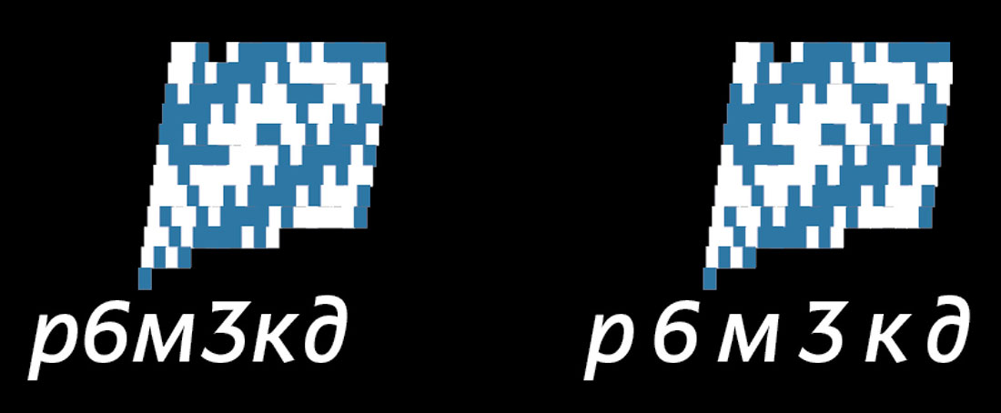
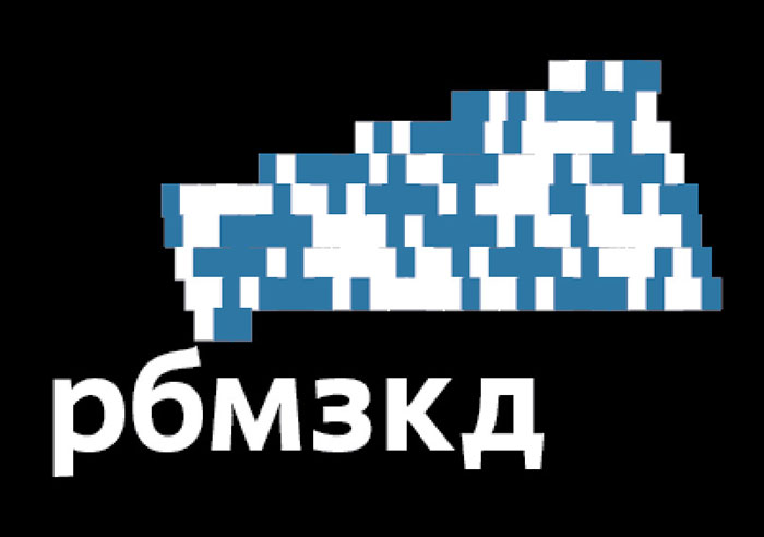
Art director: The right one looks cool. But I think this abbreviation can be misunderstood. Let’s create a full version too.
Designer: The English version uses the Latin character set so the pattern looks different. I asked the technologist to check the decoder to prevent any errors.
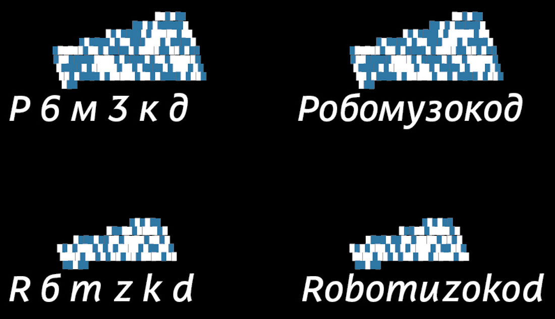
Art director: OK.
Designer: We double-checked the bit mask, I’m preparing the final files. We were looking at the logos against a black background, here they are on yellow. There won’t be a yellow rectangle though, it’s an error on the swatch.
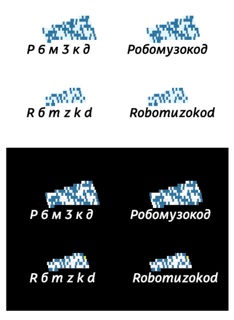
Art director: Okey dokey.