It starts with a letter.
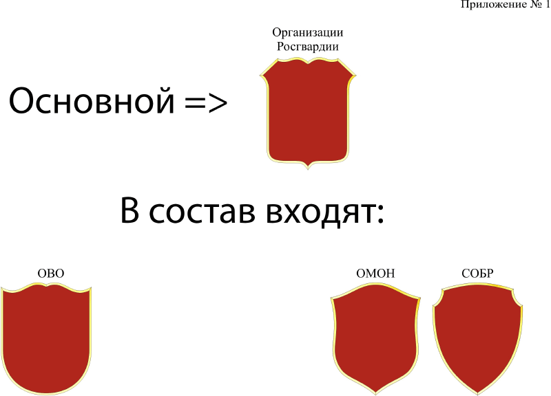
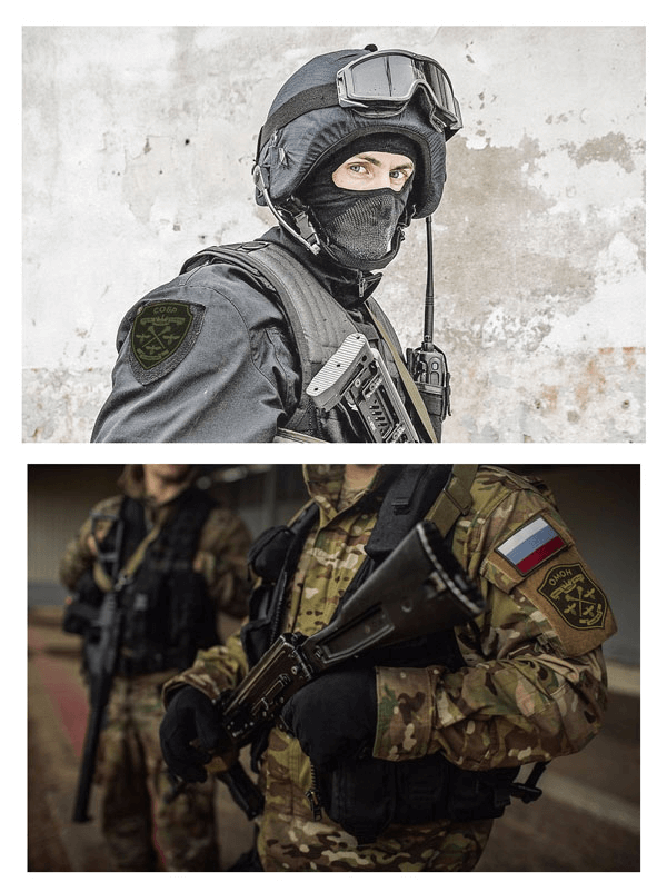
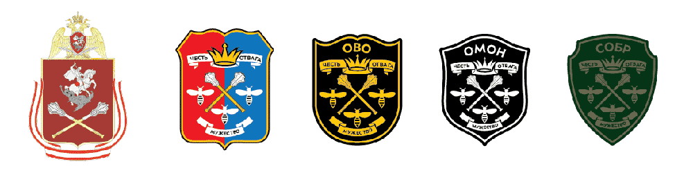
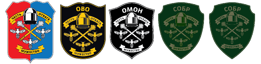
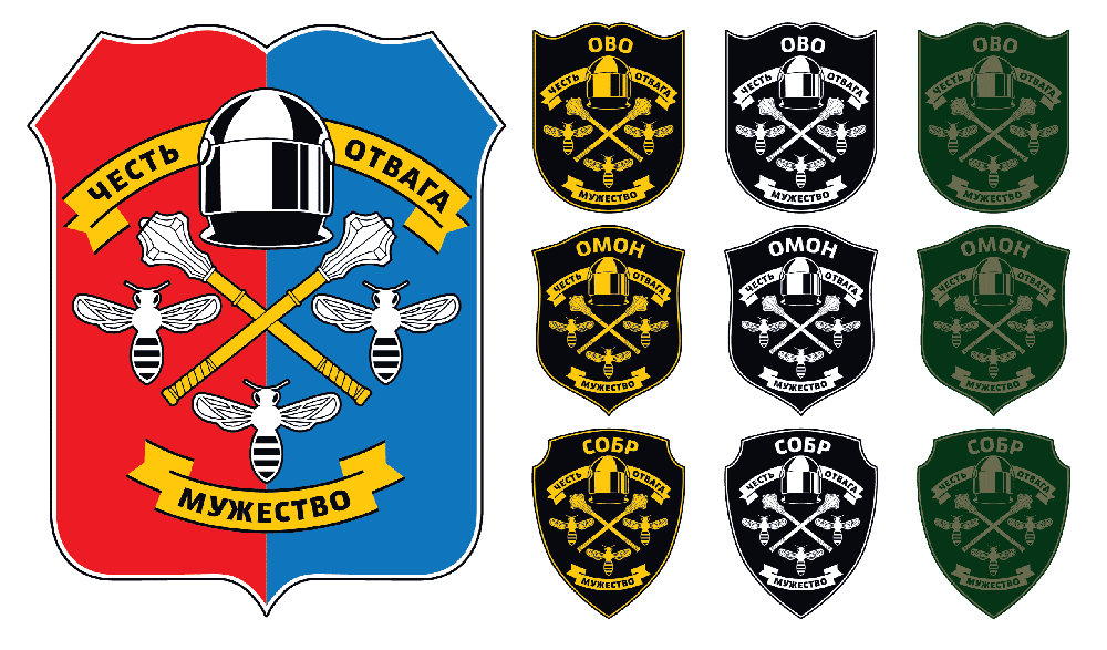
Client: The main one is the symbol of the regional branch, but right now it’s only a department comprising Private Security Department, OMON and SOBR. There is also the Center for Licensing and Authorization Work but so far we have no information about them. Overall, we are mostly interested in the main symbol.
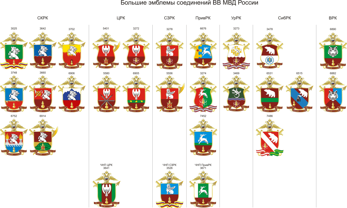
Samples of Internal Troops emblems which were used for inspiration, they differ in their top symbols.
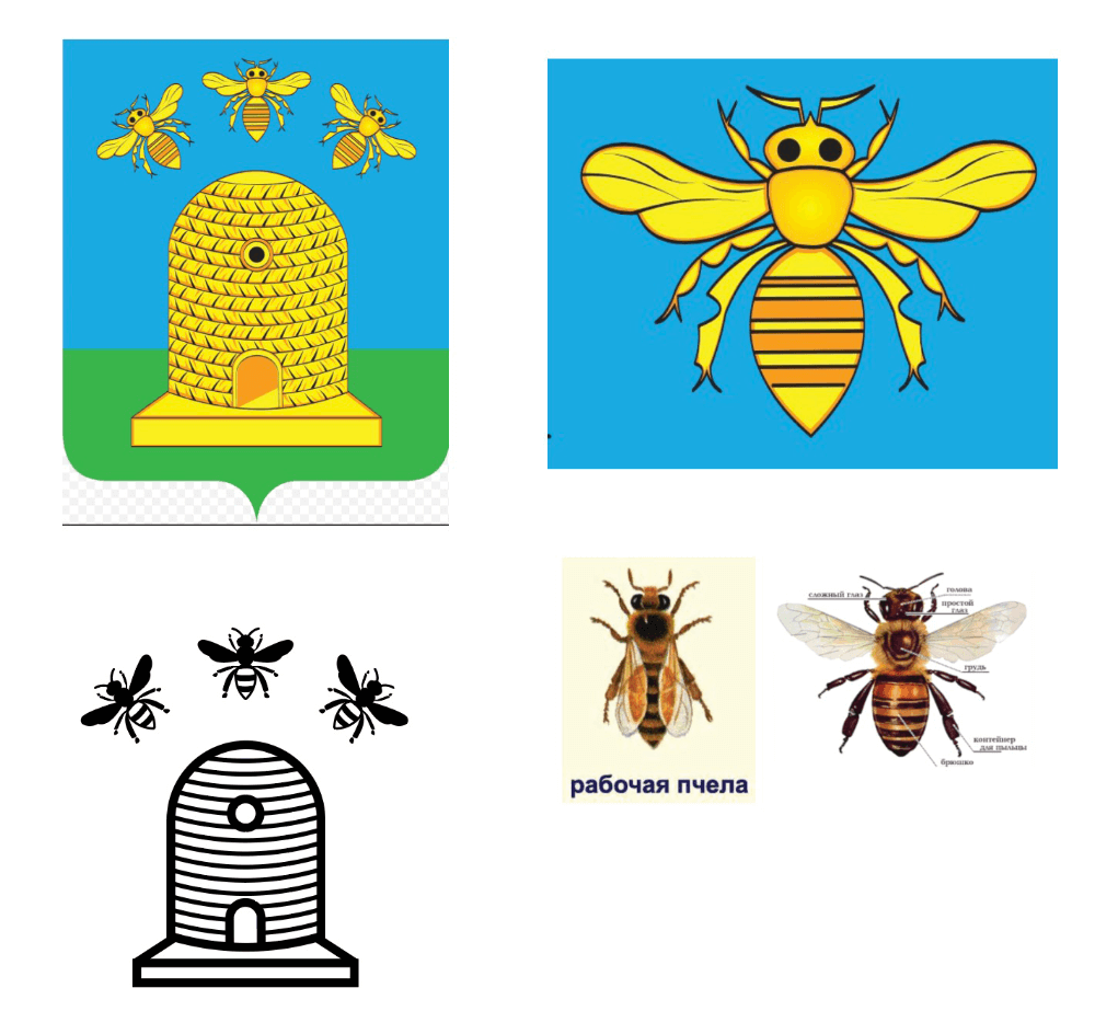
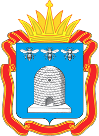
First designer: We can use the Tambov Oblast coat of arms, keep the bees, or maybe just one as the quality of embroidery leaves much to be desired.
Art director: Not really cool right now.
First designer: A T-shaped bee.
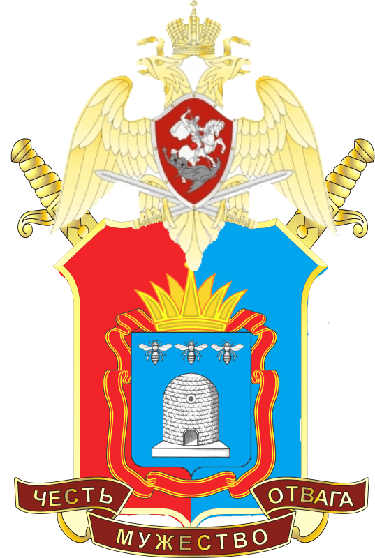
Second designer: I went to a military store to have a look at some insignia. The drawing is either embroidered or applied with rubber. The quality of embroidery is extremely rough, so the image needs to be very simple. I started by recreating the Tambov coat of arms. Besides, the bee on the coat of arms is not exactly anatomically correct.
Second designer: I looked at the insignia used in the States and Germany. Ours can’t be any worse. We can go with a single symbol of the city, the bee or stripes (variants 1–3). Alternatively, we can draw a complete coat of arms. I like 7a. In my previous life as a policeman, I would have gladly worn the insignia with the coat of arms of my home town.
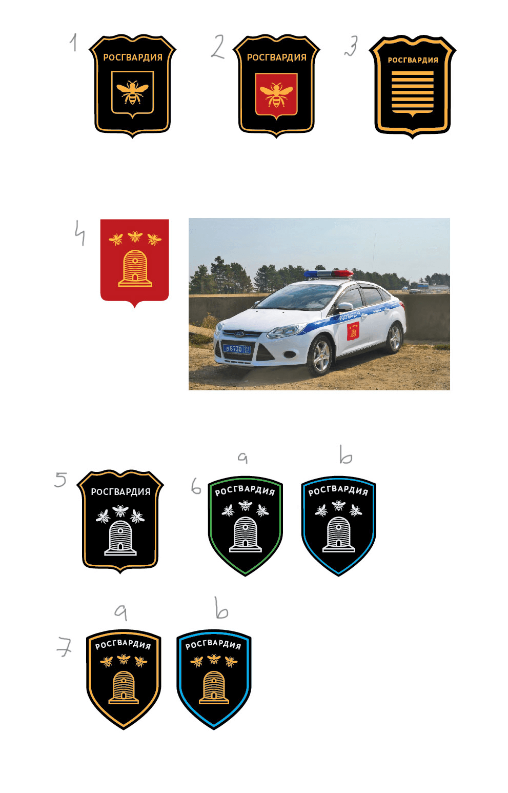
Second designer: Yesterday I tried to marry the National Guard eagle with Tambov city emblems (lines 1...5). Nothing good came out of it. The result looked like a box of Tiger Balm.
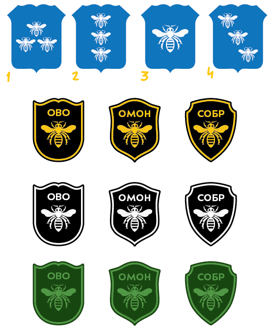
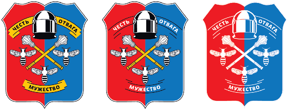
As for the heraldic symbols, the results were more interesting. The Tambov coat of arms has three bees on it. It turns out that a bee is a real heraldic symbol (unlike, for example, the Chelyabinsk camel). We can add the bee to the logo or use the recognizable stripes. Plus, we can add the usual sword and crown that symbolize power.

First designer: A bee monogram.
Art director: Not bad, but looks a lot like a logo. The genre of this task requires us to better fill the area and incorporate more symbols and text.
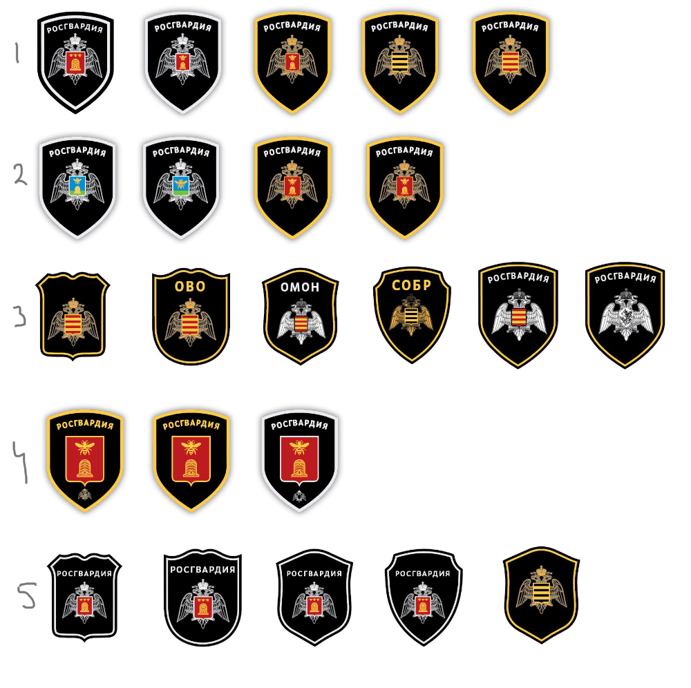
Second designer: I added more symbols. The eagle in the shield is the emblem of the National Guard of the Central Region. The bees hint at Tambov. This gives us precise identification of the region. We can turn it into a ceremonial emblem by adding the double-haded National Guard eagle above the shield and a motto under it. As far as I could understand from studying heraldry, the positioning of colored areas on the shield has no meaning.
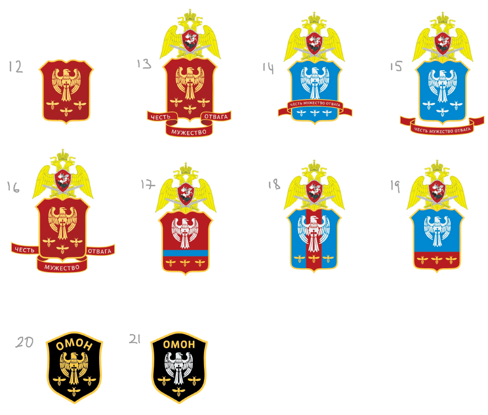
Art director: An eagle and bees, ook. But none of this looks like police insignia.
First designer: The coat of arms of the National Guard of the Central Region will be Georgy and clubs.
Art director: This is much better, only the crown looks like jester’s. And I’m not too sure we can add crowns to coats of arms like this.
First designer: The appendix says that we can add elements of local and territorial heraldry (fragments or individual elements of city, oblast and regional coats of arms listed in the State Heraldic Registry of the Russian Federation).
Art director: Sure, but it’s about the coat of arms, it’s about what surrounds it, and these elements are not listed in the Heraldic Registry. And a crown always has a meaning in heraldry. So, it’s better to play it safe.
Second designer: A crown is a symbol of state and power, it would look better on a government symbol than that of a security agency. What if we replace the crown with the head of the eagle of the National Guard of the Central Region?
Art director: We can, but right now the eagle looks completely American.
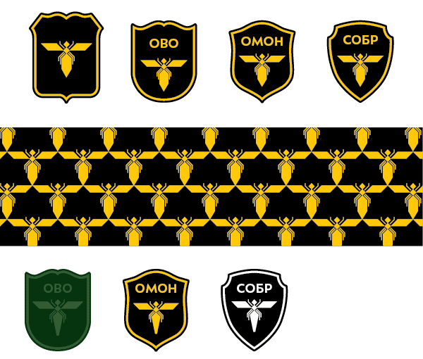
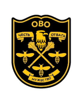
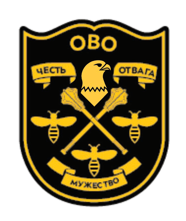
First designer: A helmet.
Second designer: It turns out it was a falcon after all, not an eagle. I’ve redrawn the emblem.
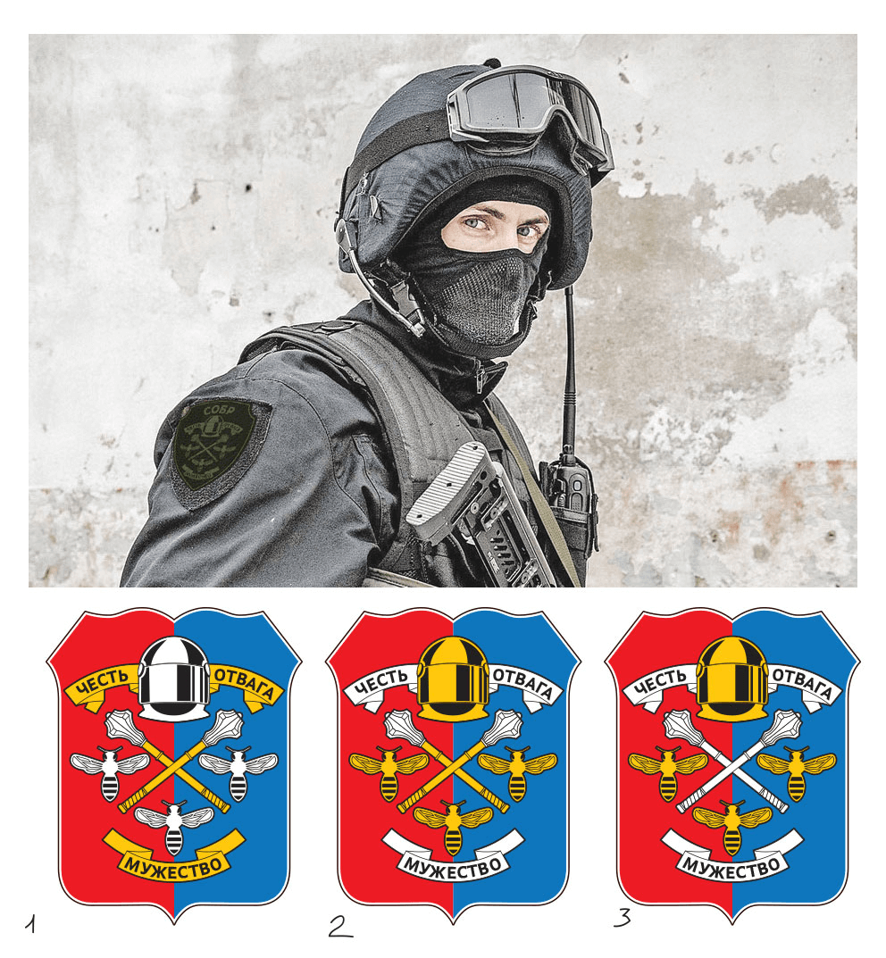
Art director: Looks nice with the helmet. What if we replace it with a modern one?
First designer: According to the rules for creating emblems, it seems we will need sufficient rationale or even coordination with the President’s Heraldic Council to use the modern helmet. The old helmet also hides the letter T.
Art director: Screw the rules. The modern helmet is simply cooler. Let’s go with it and let them fight for it.
First designer: Silver or gold?
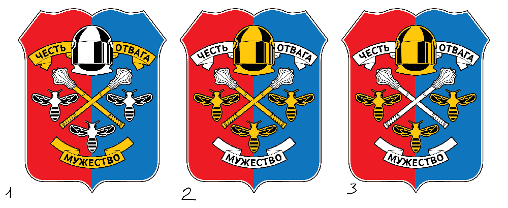
Art director: Silver. But I don’t like the ribbons, they’re old in style and simply don’t look cool.
First designer: Wings with fill look better.
Art director: OK.
First designer: Something like this?
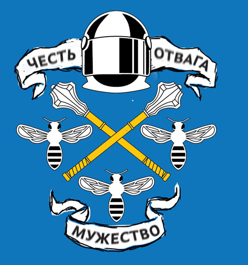
Art director: No, make it more modern.
First designer: The flag, plus I also changed the helmet a bit.
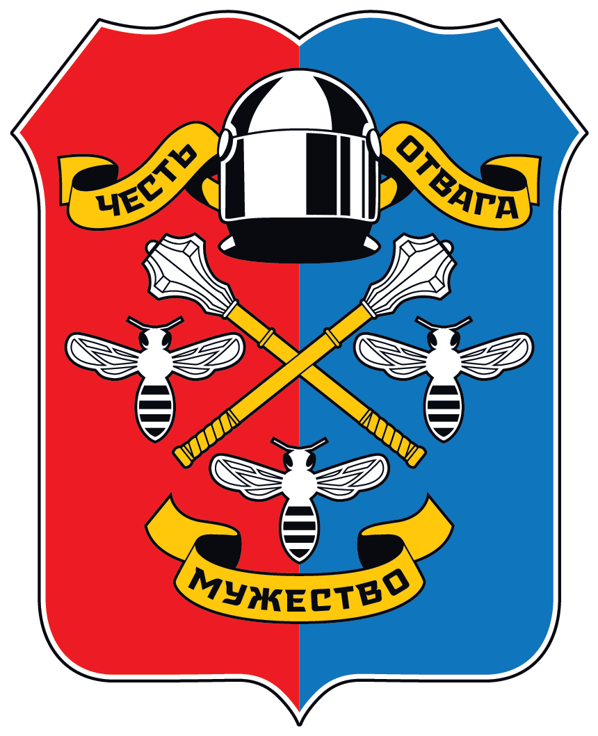
Art director: The typeface doesn’t seem to fit well. Also, draw the ribbons so they don’t remind of anything from the past. You can make them look hipster-like, or even bolder than that.
First designer: Like this?
Art director: That’s better. What if we make corners at the end of each ribbon? And make sure the ends of the bottom ribbon bend down.
First designer: Bending the ends of the bottom ribbon down will make the SOBR shield look empty.
Art director: Sure, OK.
First designer: What should we do now?
Art director: I’m waiting for them to respond, they took a couple of days to think.
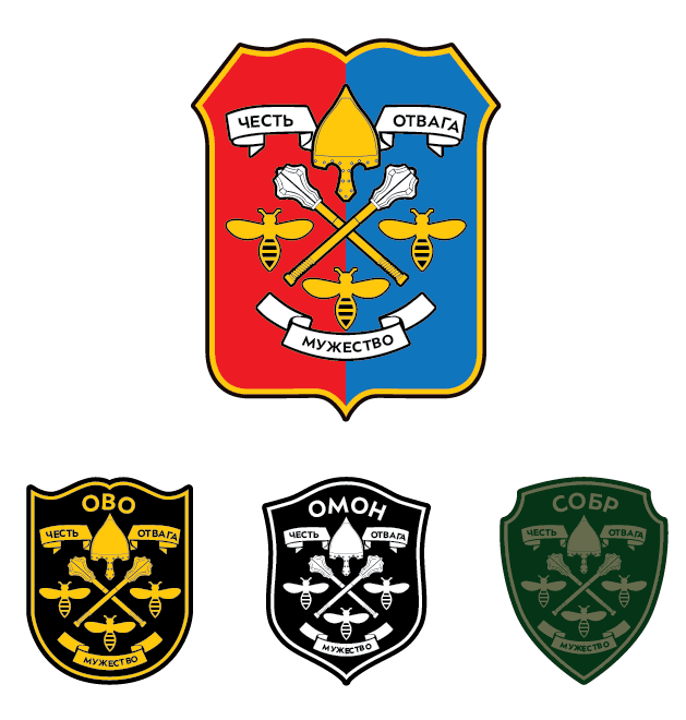
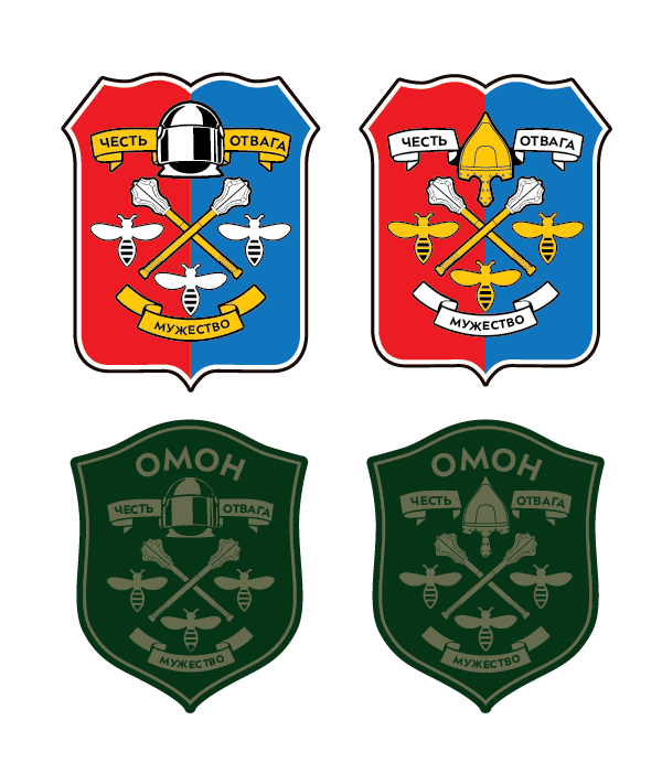
Client: We apologize for the long silence, there was a reason. The results of your work were discussed at a meeting with heads and deputy heads of the departments. It was suggested to evaluate the use of your works for each department independently. OMON and SOBR commanders were extremely critical of your work, while the commanders of the Private Security Department, on the contrary, liked your efforts with the only comment suggesting to replace the helmet with a wolf’s head. As for OMON and SOBR, their commanders presented works prepared by employees of their departments copies of which we are sending to you. Would it be possible to combine the wishes of these departments with your professionalism to rework the heraldry? We apologize in advance for bothering you, but we did our best to defend your interests as professionals in this difficult but very important area, as the results of these efforts will remain with us for a long time to come.
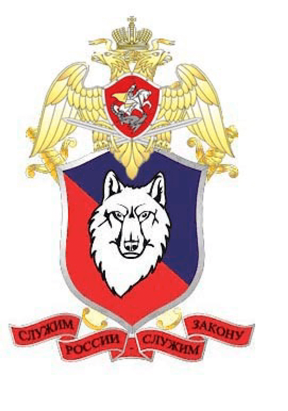
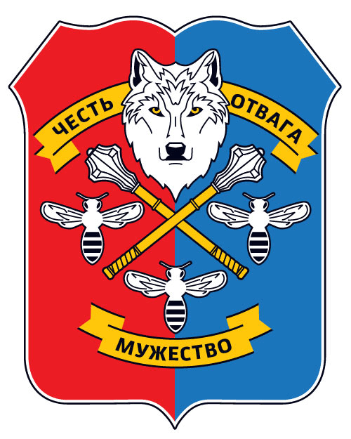
Art director: Mikhail, as for the helmet and the wolf’s head, would it be possible to combine them? To maybe have the wolf wear the helmet? Or is it the helmet that irritates them? As for the attached designs, we understand the idea, although the wolf’s eyes are bulging somewhat strangely. Obviously, we’ll have to draw a different wolf. As for the surroundings (the eagle on top, etc.) we can work on that later. Right now it’s important to work on the emblem itself.
Client: I’ll answer all of your questions. The helmet is rejected by OMON and SOBR, so we’ll go with the wolf. As for your comment about the wolf, I’ll point out that this sketch was done by an amateur, so we will follow your recommendations on the subject. I completely agree about the surrounding elements.
Art director: In short, we need to replace the helmet with a wolf.
First designer: The Tambov wolf and oprichnina.
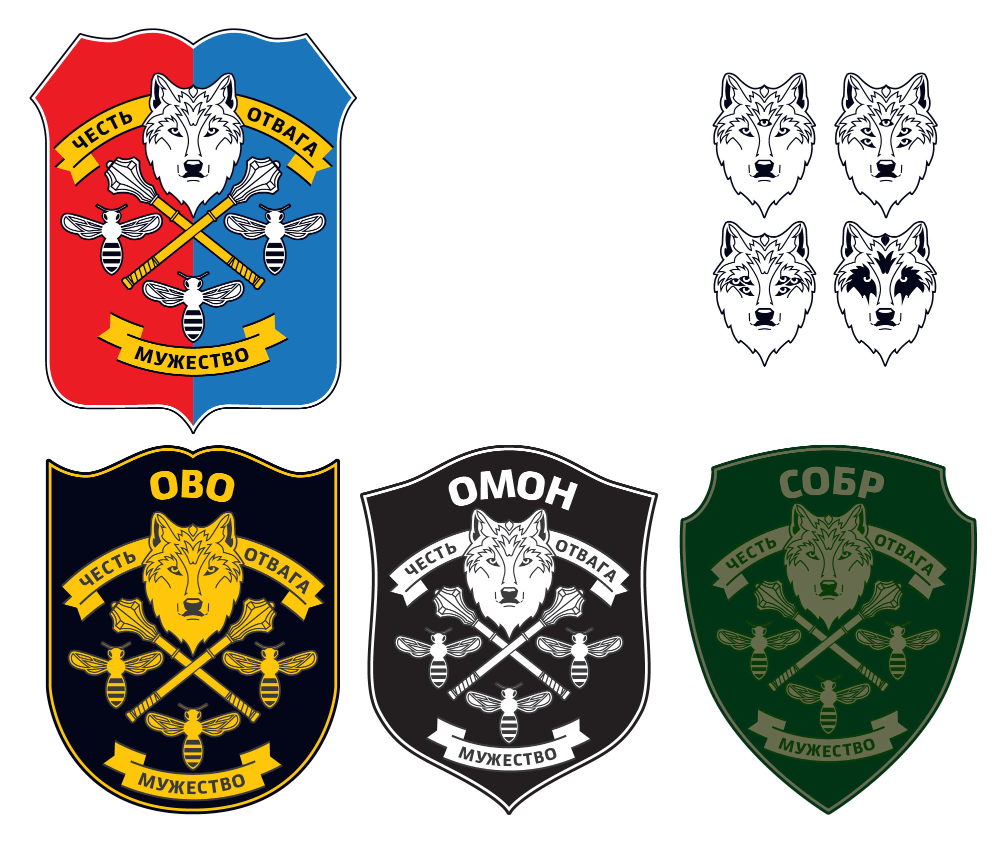
First designer: A slightly more stern wolf and slightly lighter bees’ wings.
Art director: Time to prepare the announcement.
