|
|
|
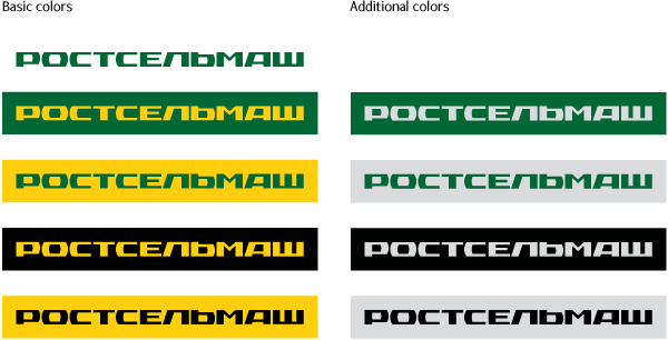
Rostselmash logo is the graphic incarnation of the image of a machine-building company that’s contemporary and at the same time rich in traditions, transparent and reliable. The font of the logo is monumental, open and highly legible. The contrasting combination of sharp angles and rounded parts lends a characteristic pattern to the logo and makes it very memorable. The clear-cut horizontal position and the strong connection of logo characters provokes a feeling of stability, firmness, endurance, ponderability, being a manifestation of the company’s constancy and the dependability of its products. |
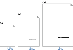
Matrix for choosing the size of logo depending on format |
 |

Order a design...