When fans get comfortable on a sofa in front of a TV, they first of all want to see their favorite team play. However, up until now TV broadcasts of the Russian soccer championship had a variety of excessive elements: dense skeuomorphic text bars, excessive metallic shadows or elements with odd textures. This visual noise made it difficult to enjoy soccer and we decided to change that.
Less bars
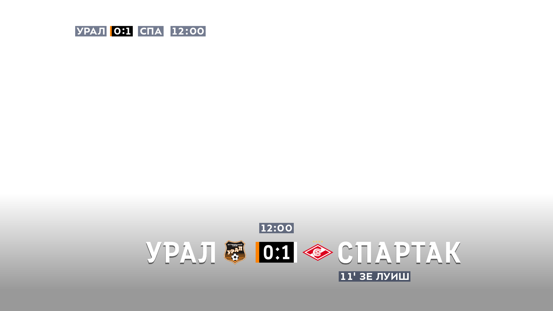
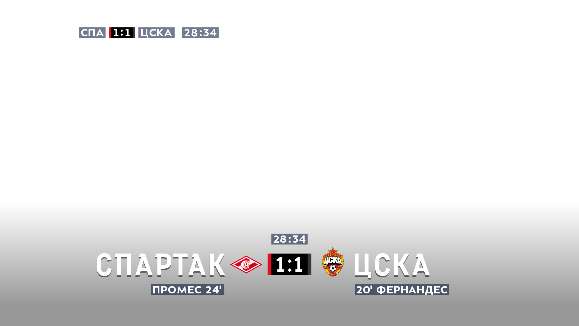
The new informative and restrained design of RPL match broadcasts has no excessive bars. Instead, we use large letters typed with the league’s signature typeface.
When dynamic movement is being shown on screen, which in soccer is pretty much always, symbols become very easy to read against a bright and rapidly moving background.
Colors
In certain situations there is no way to avoid color coding, for example when it is necessary to show that a visual element or some important information is specific to only one team.
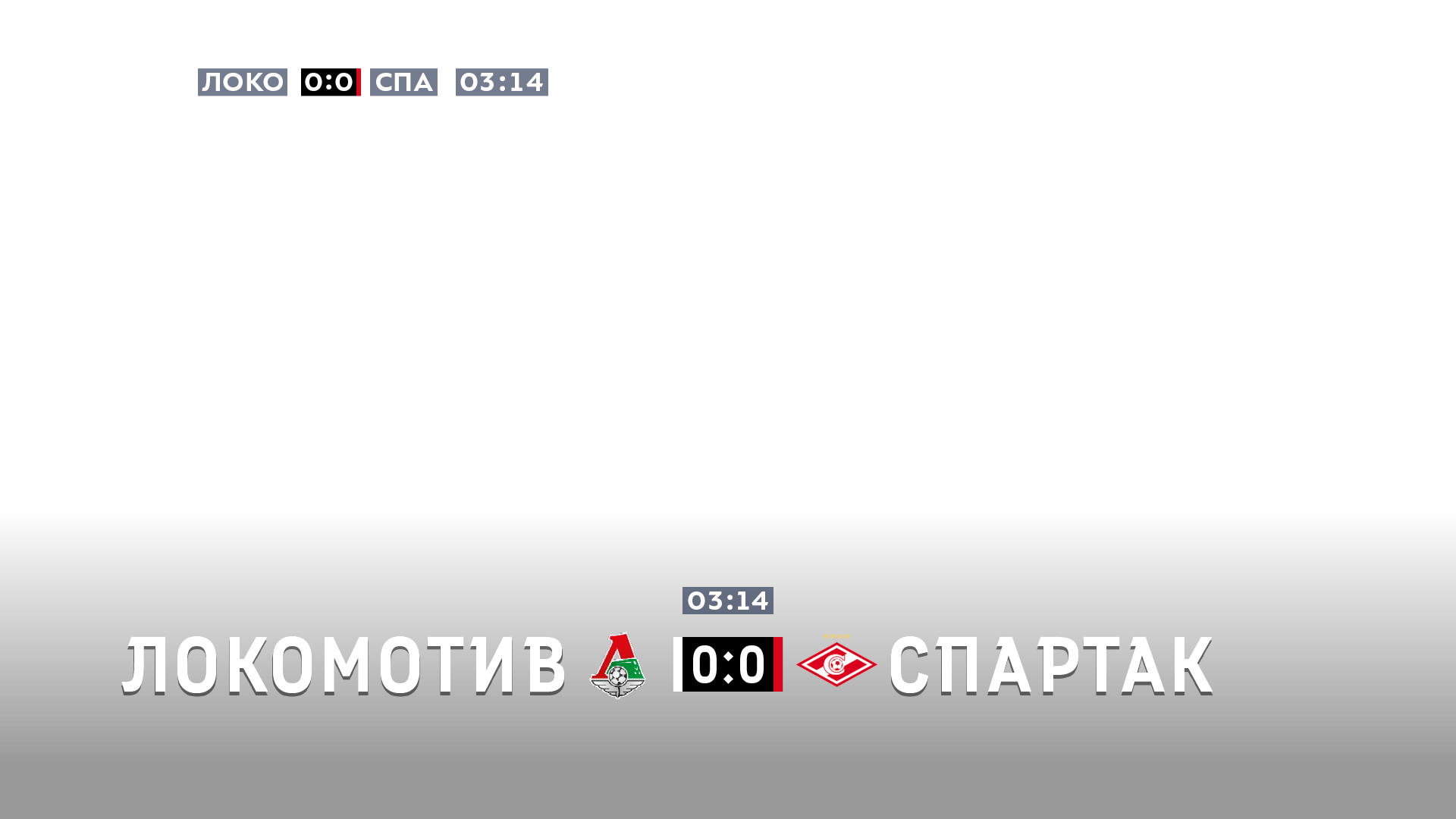
Sixteen clubs play in the Russian Premier League and every one of them now has a unique bar colored in the team’s signature colors.


When the current score is being shown at the bottom of the screen, the bars appear for just a couple of seconds and then disappear, leaving only the white captions. The bars move towards “their” numbers, adding dynamics to the picture.
The most interesting part begins as soon as both bars reach the center of the screen: they turn into small elements the height of the central block and change their colors to match the uniforms of the playing teams. For example, if Spartak is playing CSKA, the red stripe becomes a white rectangle.
Additionally, team uniform colors are always shown in the top left corner of the screen.
Captions that always work
The captions continue to work regardless of how low-contrast or light the picture on the screen is at the moment. All because there is almost no 100% white color in nature. Even if the field is covered with snow, it would be difficult to confuse white text with blue and gray snow piles. The captions work in any weather and any visibility conditions, from bright sun to heavy snowfall.
To make assembling captions easier, the text is placed on a grid where all modules depend on each other. If one of the graphic building blocks changes its position, others automatically move with it shifting the entire structure. Which means the layout doesn’t care if it’s being shown on a 4:3 or 16:9 screen, it always looks elegant and logical.
We created captions for any occasion.
Stunning animations
The unobtrusive animations that mark screen changes (for example, before repeats) use elements of RPL’s corporate identity that was also developed by us.
