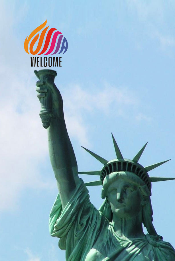
It all started with news that a new logo for Russia was approved. The logo chosen was far from ideal, we wanted to show that Russia can do better.
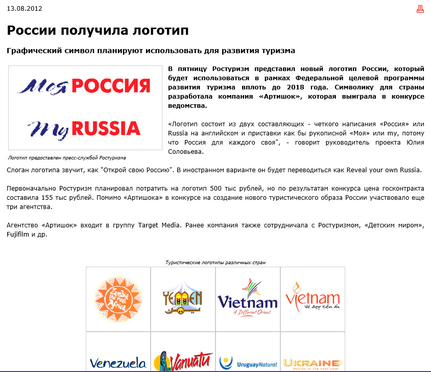
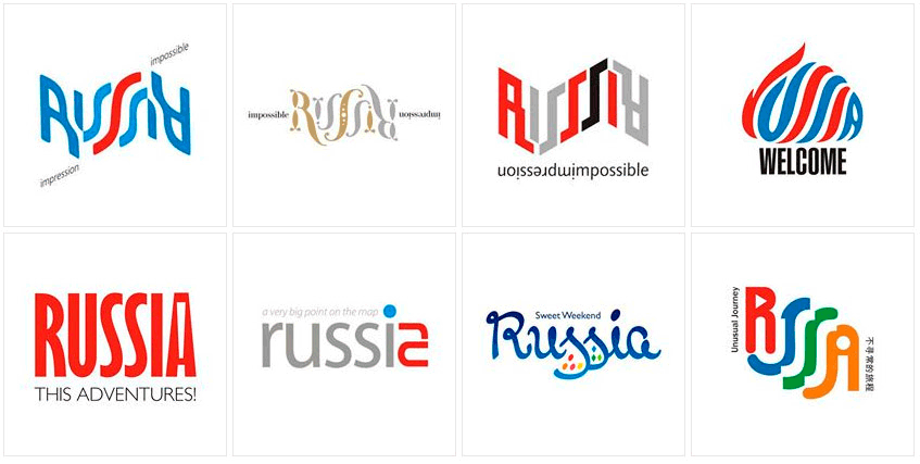
A couple of sketches were born in the first few weeks.
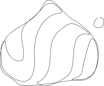
The idea to combine the dome with letters was sketched very roughly.
Drawing the first draft in vector. The shape is basic for now, we can work on it later. Alternating the color of the letters to make the logo more decorative.

Maybe start with a capital letter? No, that would break the rhythm of diagonal lines.

The typeface looks heavy, it needs to be lighter. Wow, it appears that letters of varying density precisely convey the lighting of the Cathedral’s dome: darker towards the edges, lighter in the center. There is even a reflection inside the S!
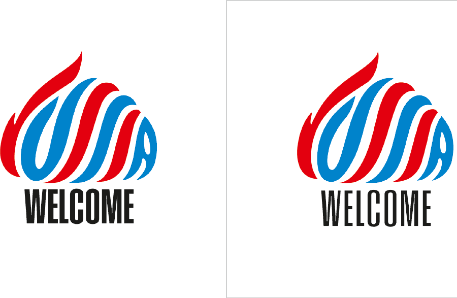
We need to work on the external outline, the shape of the U and the optimal curve of the S. We need to make sure the letters look neither like worms nor like straight sticks.

Coloring everything black to see the gap pattern better.

The blue and red colors seem too American. It’s better to have a logo that looks like lollipop, although we don’t want it looking like a rainbow color scale either. Testing even the most unconventional color schemes.
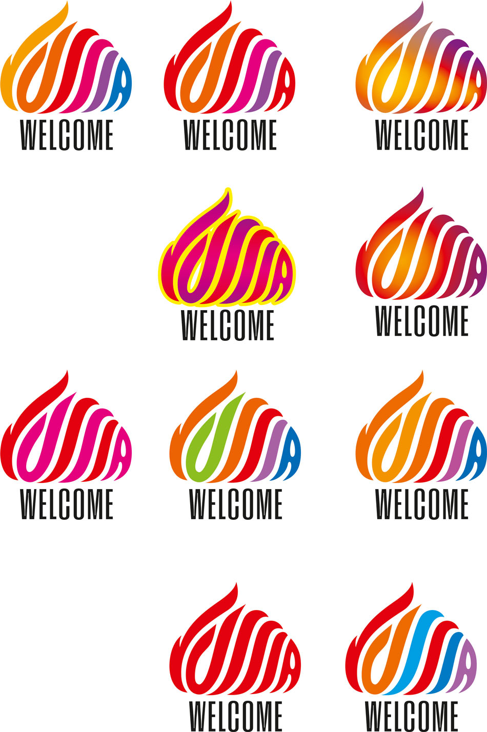
Finally, we like everything. Introducing the logo to the world :)
