Making of the interface for Shturmann car navigation system
Overview Process
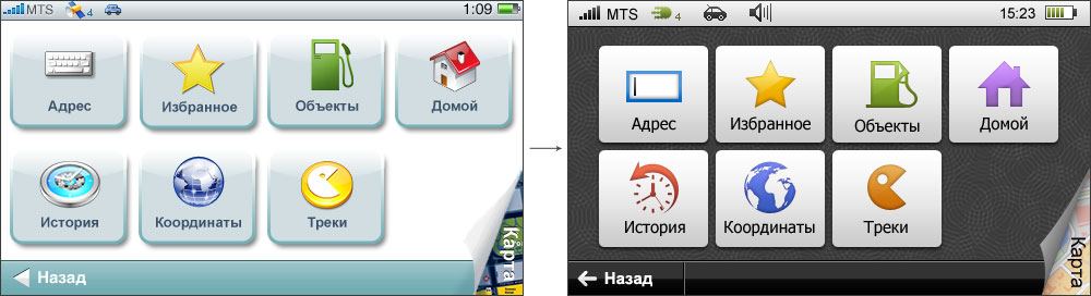
First approach.
Searching for an optimal way to arrange the elements.
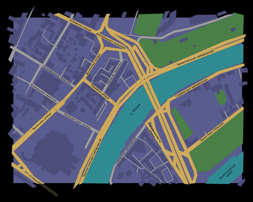
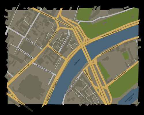
Coloring daylight and nighttime maps.
An interface, just like any living thing, tends to evolve as it’s being developed.
Here, the pages used to have light background, but then adapted to become much darker to work better for the human eye (and eliminate inconveniently large areas of white that would glow in the dark).
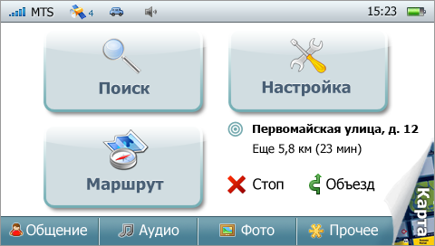
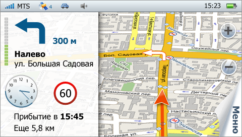
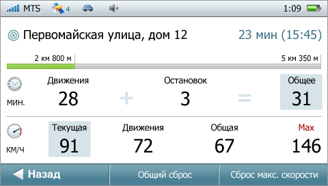
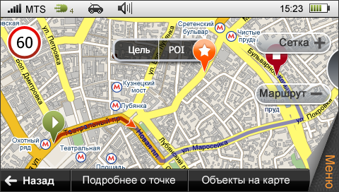
A version of the page with turn instructions and estimated arrival time.
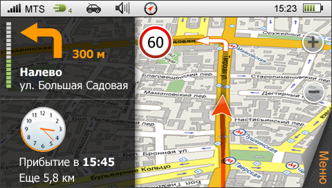
The client accepted the design, put it in practice, and tested on their staff. Many complained that the panel on the left occupied too much space, the street name was not large enough (and if it was long, couldn’t fit on one line), the hands of the clock had little contrast, and the names of the parallel streets lacked readability.
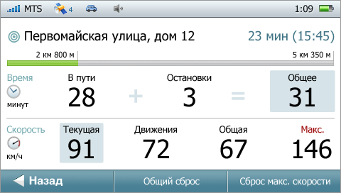
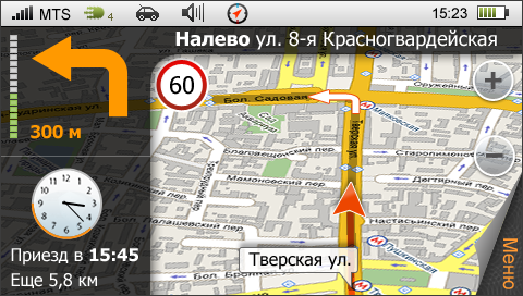
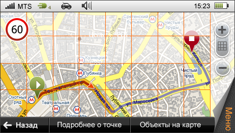
We offered an alternative.
Searching for functional ways, and looking at the scale buttons.
Active elements took on different shape, changed size, acquired new species.

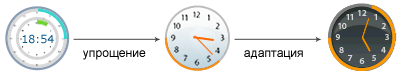
Even the clock underwent transformation becoming an example of evolution in just 70 square pixels.
One of the offered ideas was to show show current weather conditions in the background.
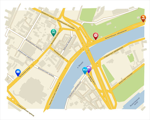
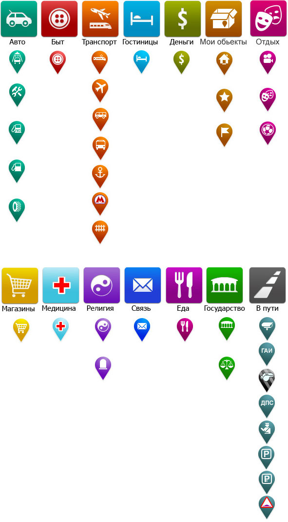
As soon as the interface was approved, we started creating nice features, such as color-coded icons for all sorts of objects to be marked on the map.
Petal unfolding designs.

All icons for the status bar.

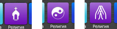
Finding the icon for the Religion group of objects that would not hurt anyone’s feelings.
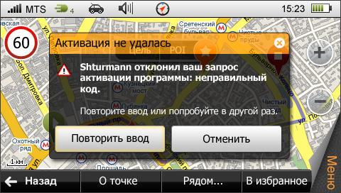
Templates for various errors and alerts.
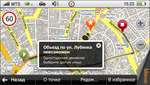
Search in progress.

