Solnechny is a family-friendly shopping and entertainment center in Tyumen which helps easily accomplish everything planned for the weekend: buy groceries, household goods and appliances, update wardrobe, watch a movie and have fun with friends. A cheerful corporate identity was created for Solnechny at the studio.
The logo combines three letters C that symbolize the main features of the shopping center: the dotted line stands for shopping, the wavy line represents entertainment and the straight line is for relaxation.
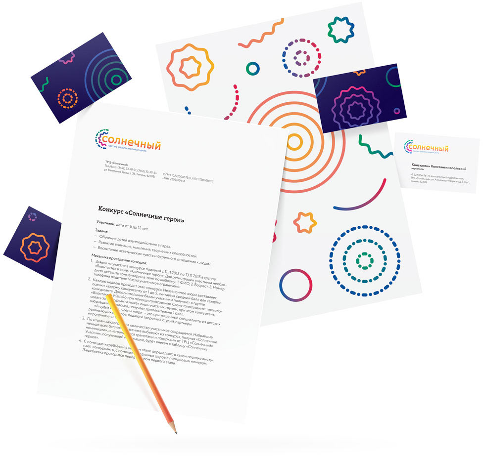
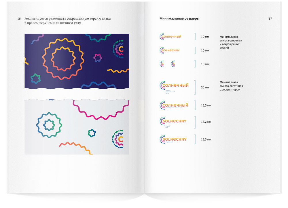
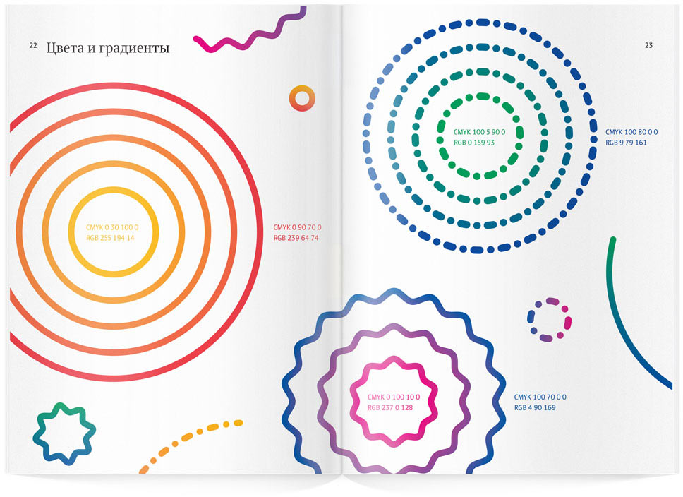
The lines of the logo were used to create emotional elements of the corporate style. Rules for the use of the logo and the graphics are assembled in a guide.
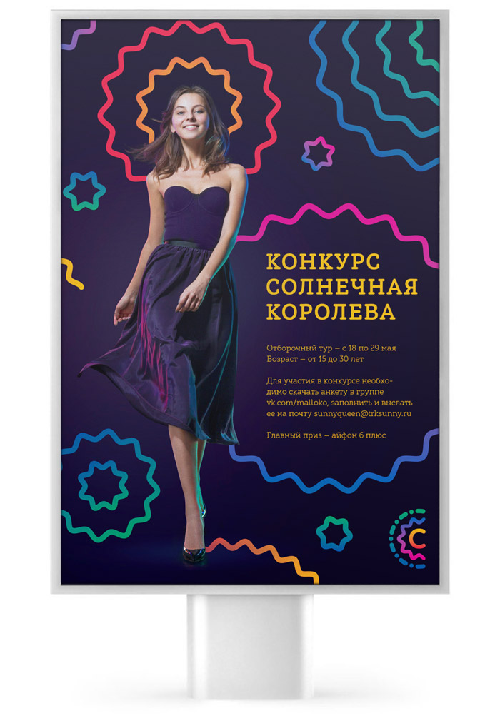
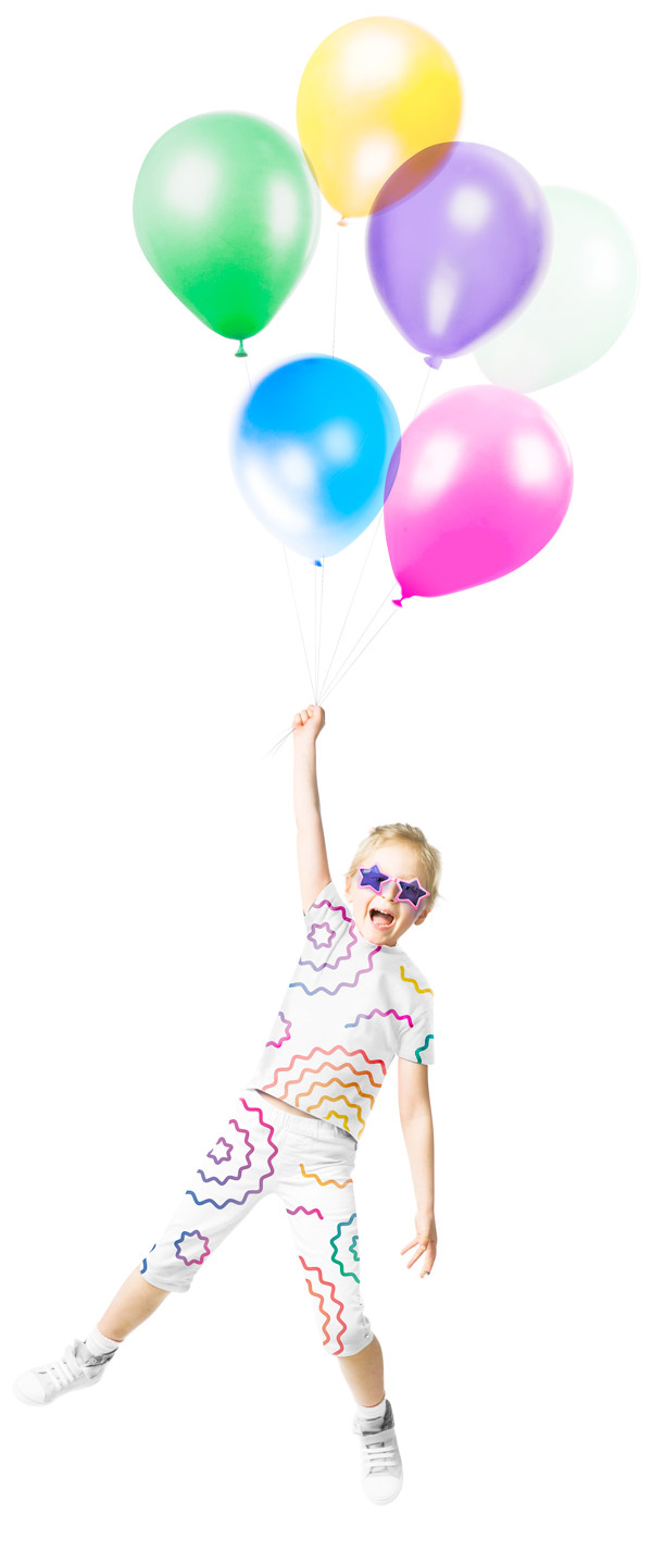
Ornaments made of recognizable lines open space for creativity in decorating various media.