Sotbi website
Quite often, after some smart guys find themselves deep in debt, they decide to conduct a range of relatively legitimate activities to come out clean. They end up with few assets and nothing to pay off their multibillion (rarely, multimillion) debts with.
Their lenders get very upset by that fact. And go to Sotbi where experts know all nuances of working in this legal field and generally have been around the block more than once. Realizing that it’s time to make sure the form matches the content, Sotbi came to Art. Lebedev Studio for their new website.
The first concept

The well-regarded professional company is very careful about information it provides but also wants to talk about what it does in an interesting way. It would be great if the website could explain all the peculiarities of their field while attracting new clients.
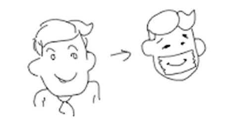
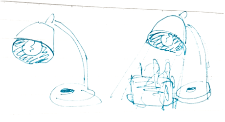
After a detailed discussion of the project at a meeting, we decide to present Sotbi staff on the website as superheroes. They hide their faces but are always there to help. The character of each employee should be obvious by their mask. Starting the fitting.
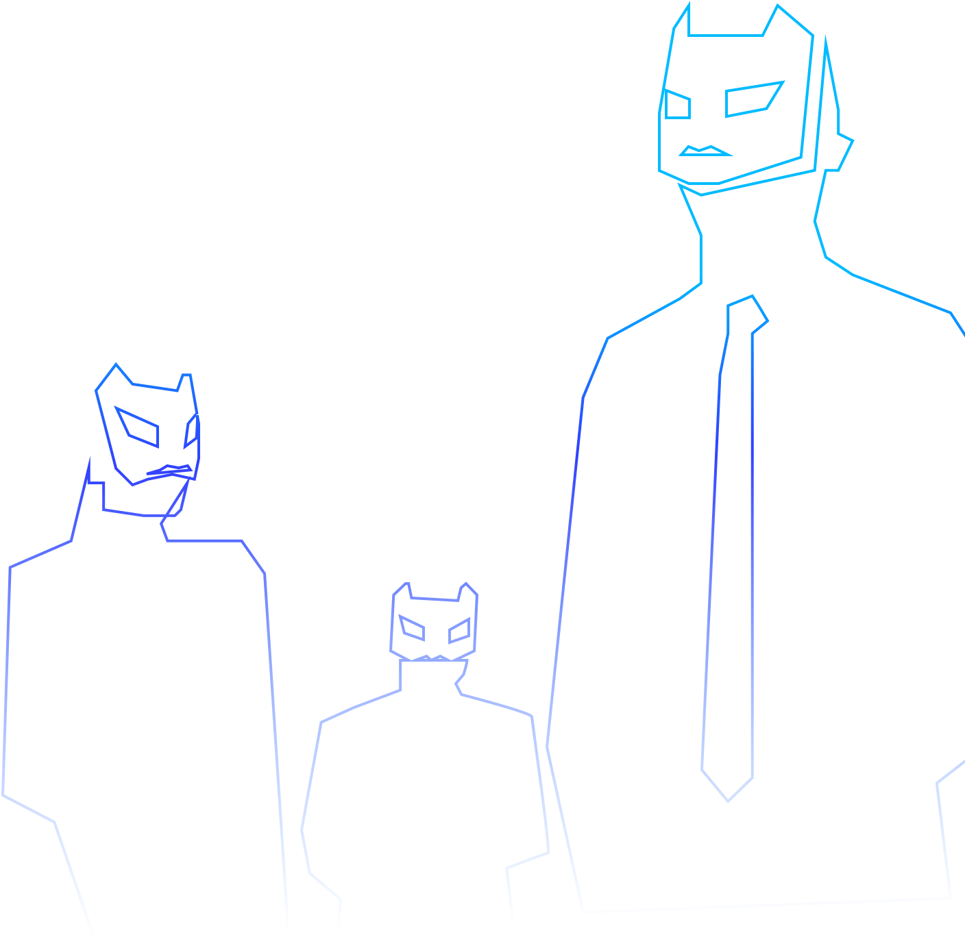
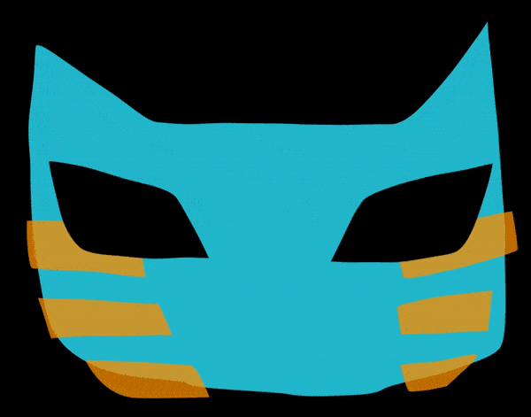
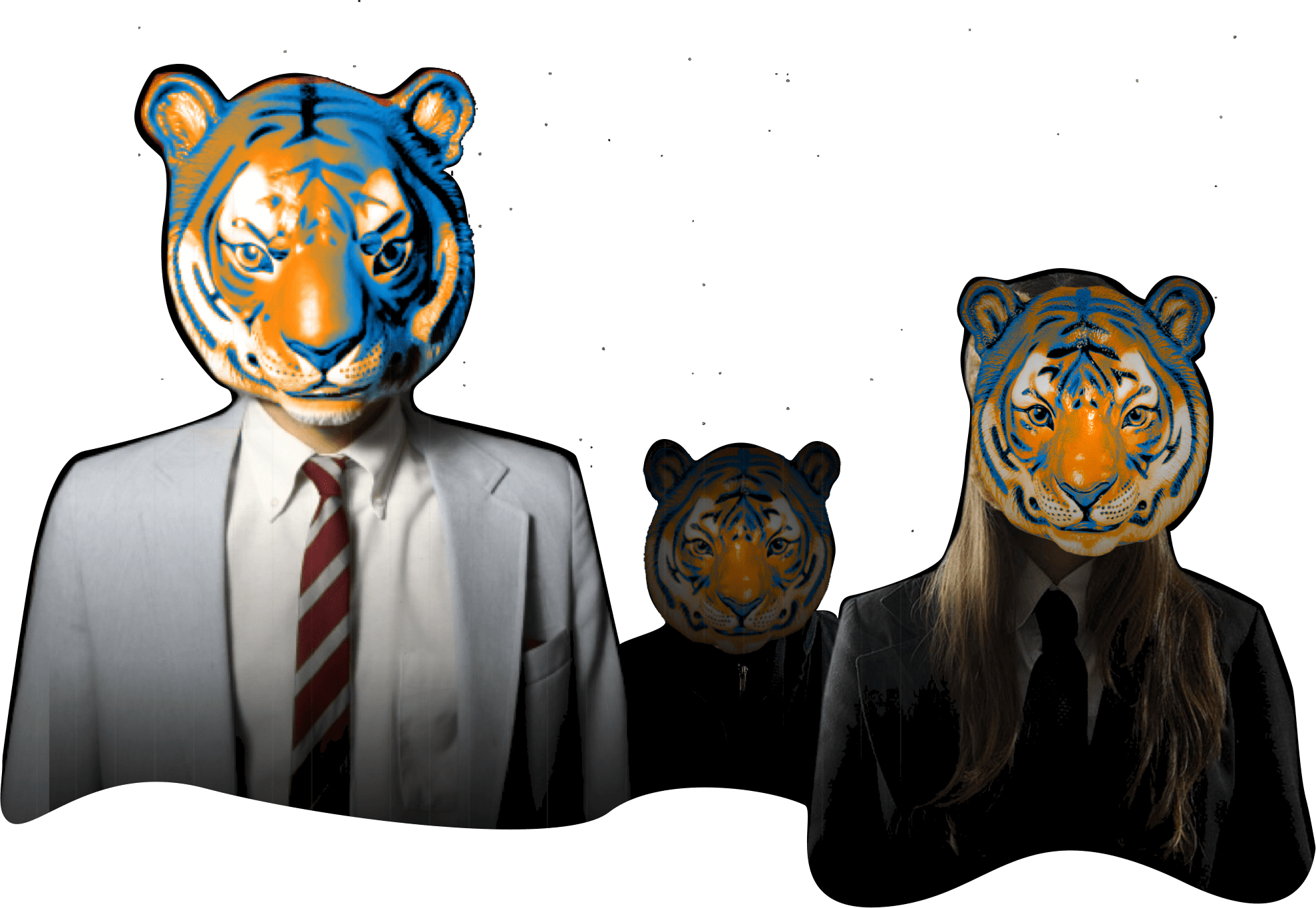
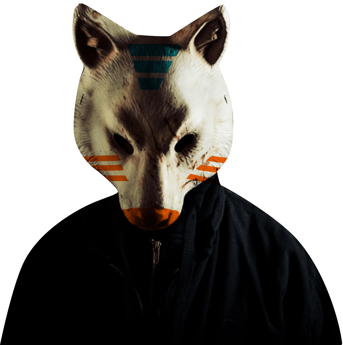
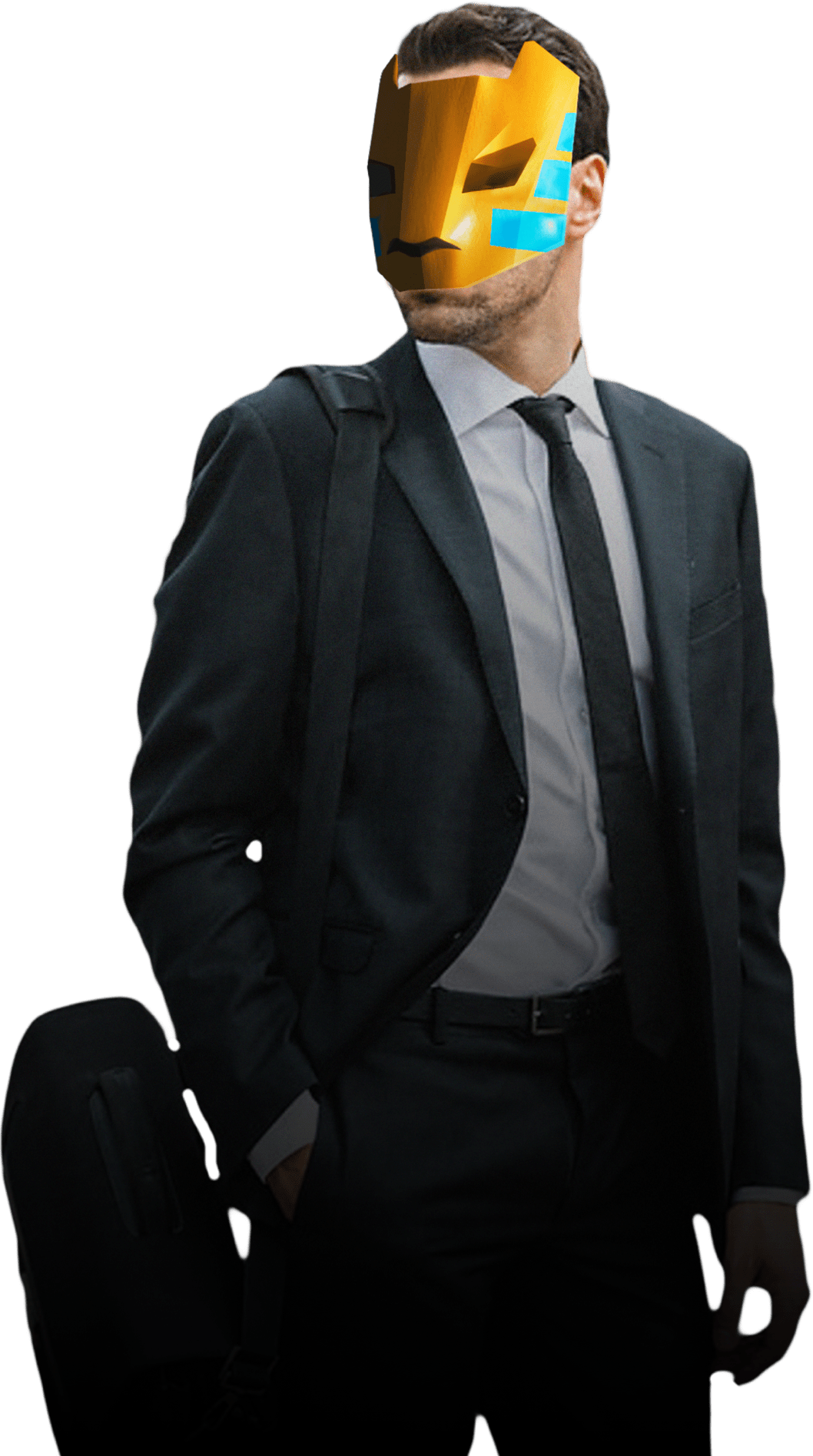
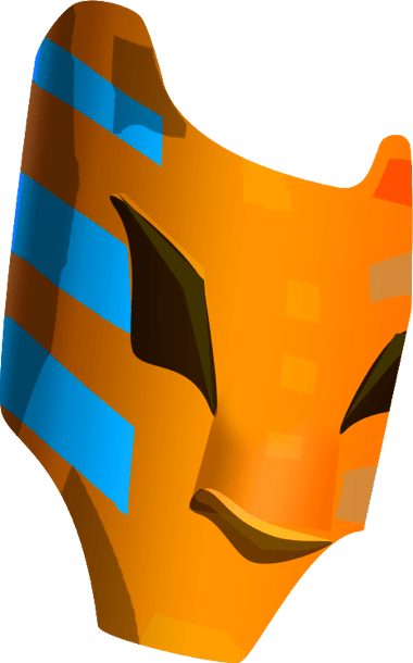
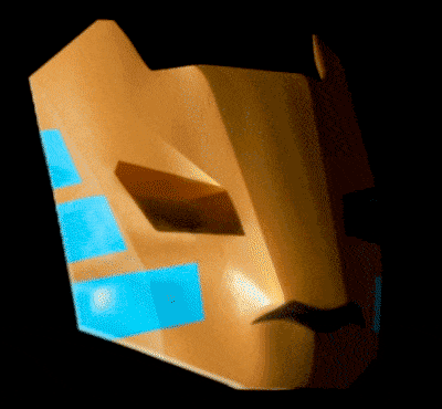
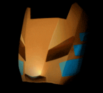


Guys, it’s all really great but it doesn’t look like us ¯\_(ツ)_/¯
Making the second attempt.
The second concept
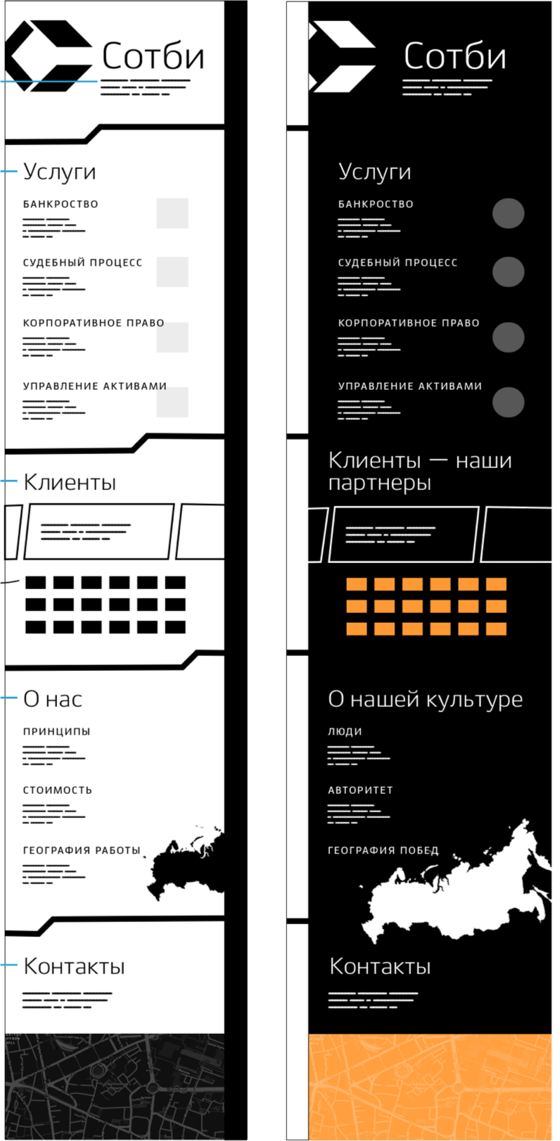
The website gets a “dark” side. It is hidden by default and can be revealed by clicking a special button. The “dark” version contains the same sections as the “official” one but the information is written on behalf of the company’s employees. And these people often see their job in a very specific way, with unconventional humor and appreciation for internal values.

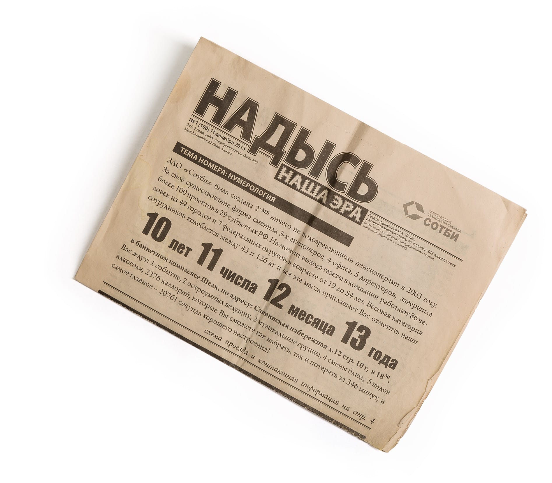
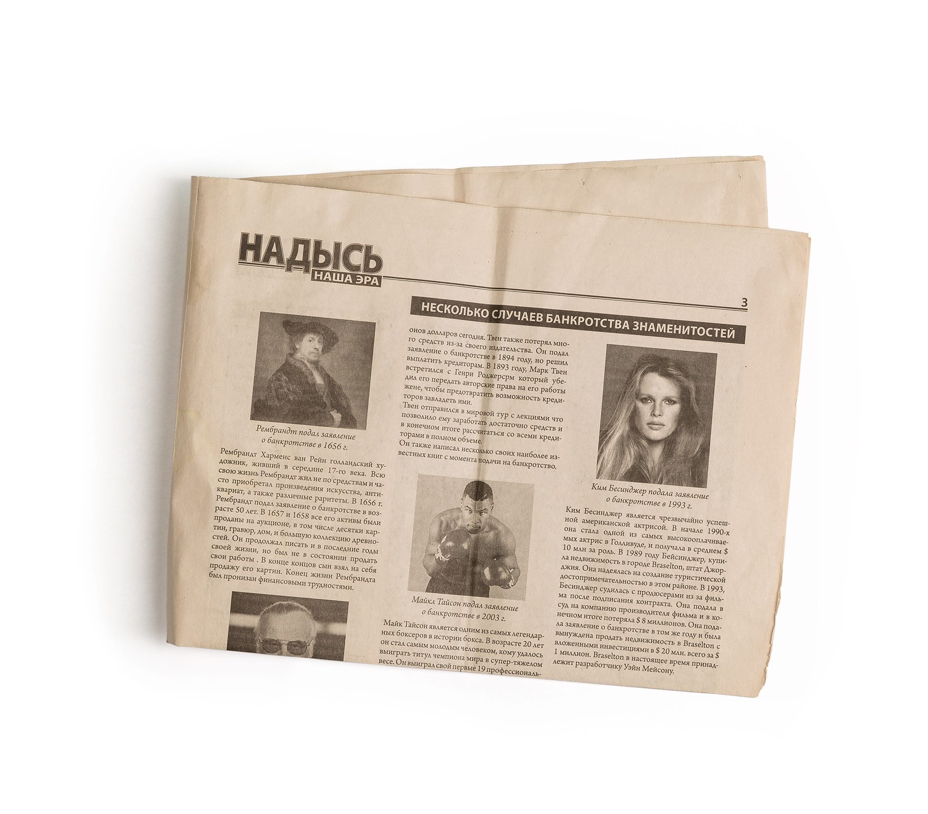
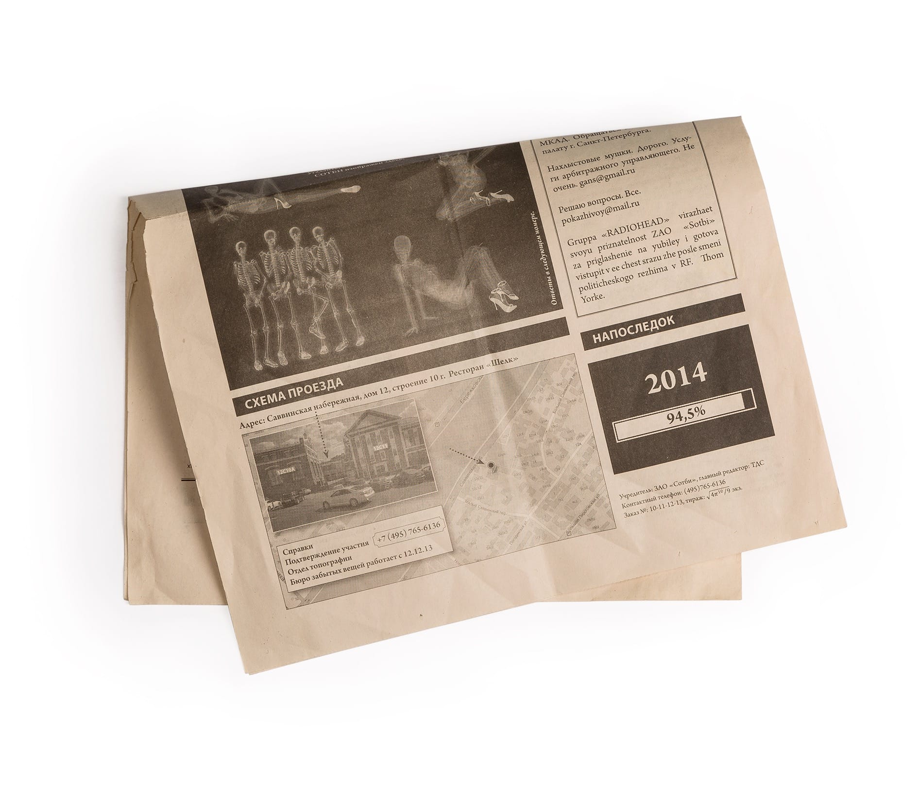
Since the design has changed, we now need to write extremely serious texts for the “white” side and raunchy ones for the “dark” side. It’s important to make sure both sides talk about the same things but in different ways. Reading the company’s corporate newspaper helps better understand the genre.
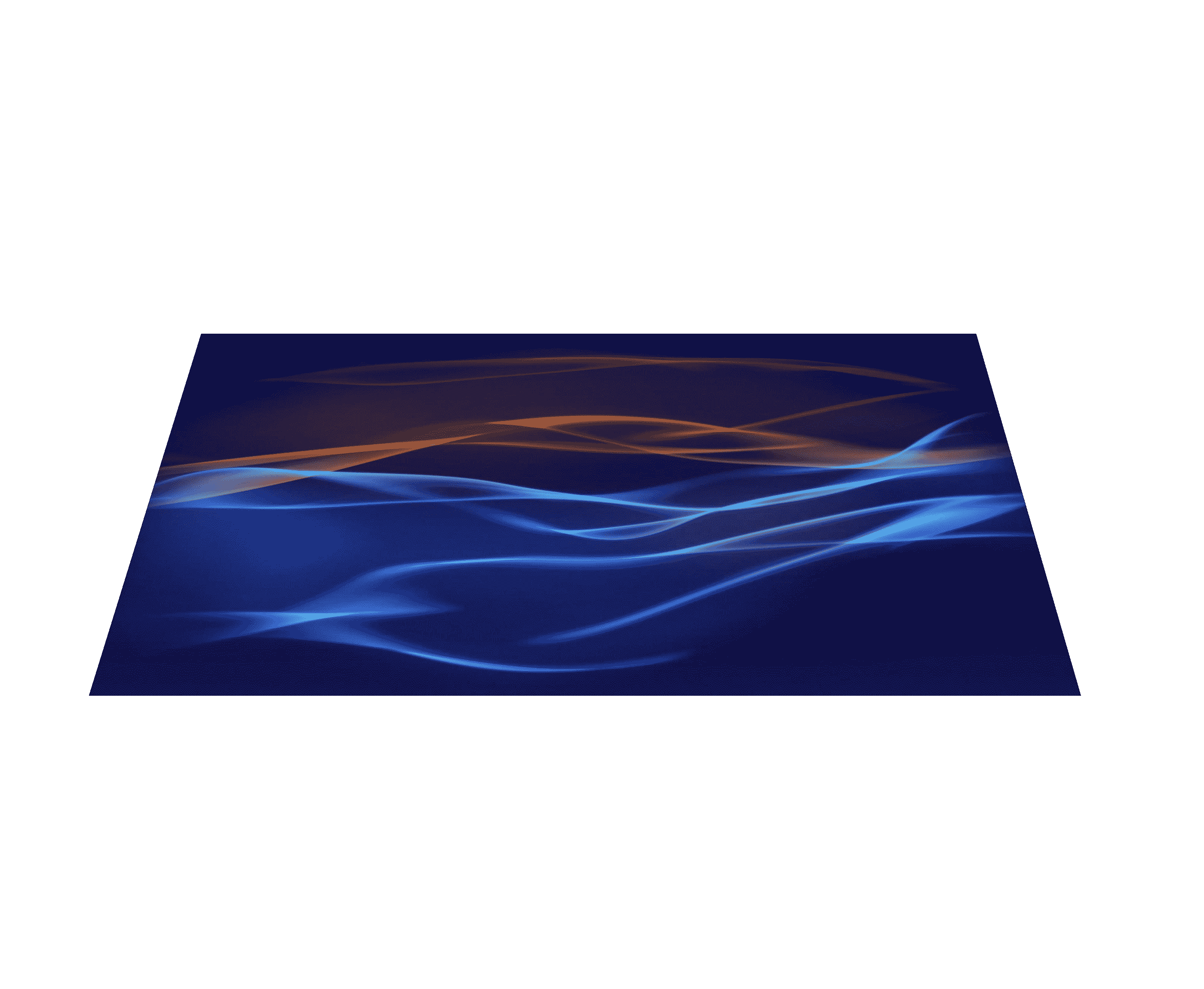
The client really likes their slogan “in debts as in silks” so we spread beautiful fabric on all backgrounds. The canvas wavers arousing understandable curiosity to find out what’s hiding behind. Fabric movement was modeled in 3D and saved as a video.

Switching between the “black” and “white” versions of the website is done with a “curtain” and the top block of the “black” version should be fixed in place with absolute positioning.
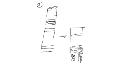
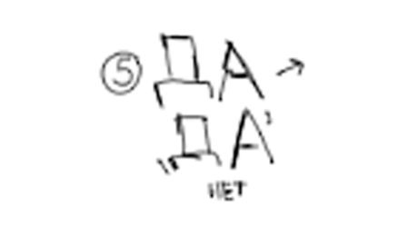
The logo turns into a cool sandwich menu.
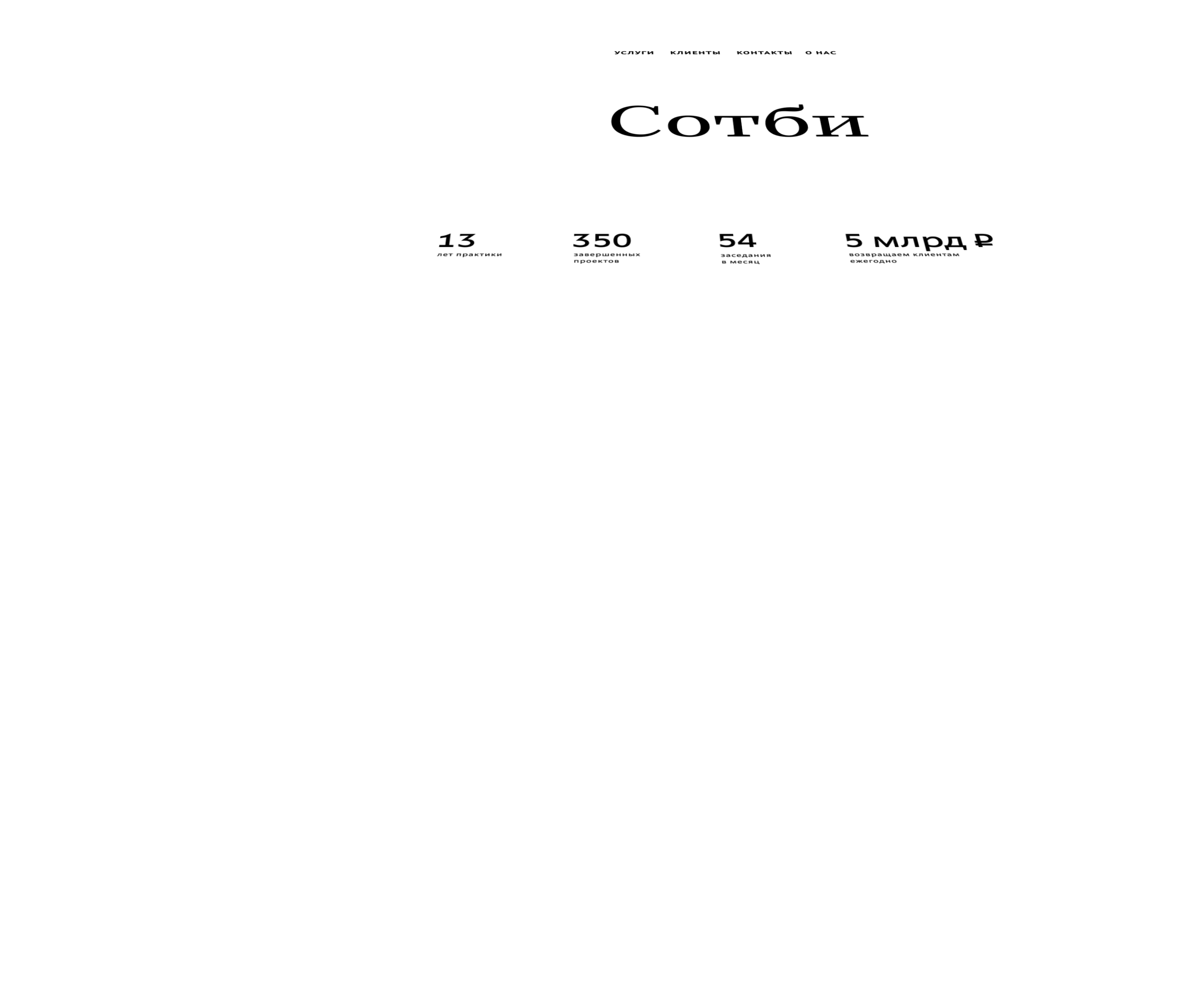

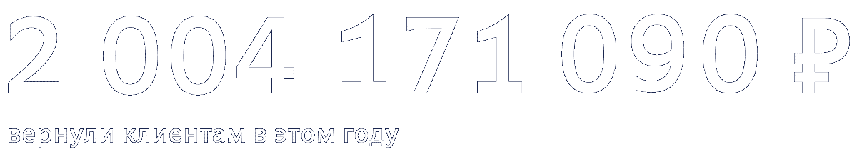
We decided to show Sotbi’s performance by using counters on the main page. Statistics that usually receives no response from people apart from yawning becomes dynamic, inviting to follow the company’s successes. Of course, the money counter is the fastest and it’s a pure pleasure to watch.
The services
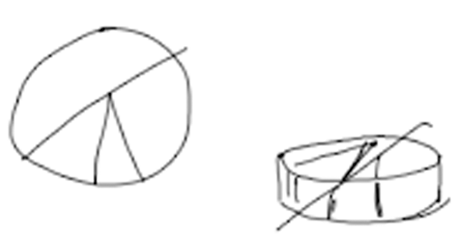
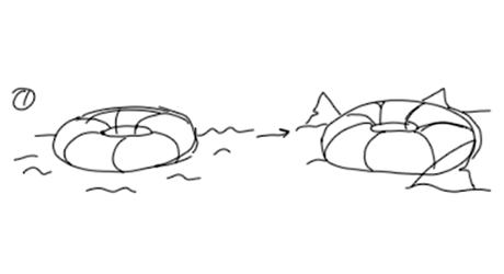
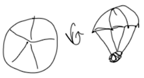
Images are also different in the two versions of the website. They are made of almost the same parts but what they show is completely different. Move over to the “dark” side and a pie chart becomes a parachute that lifts a briefcase up in the air.
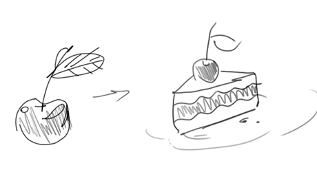
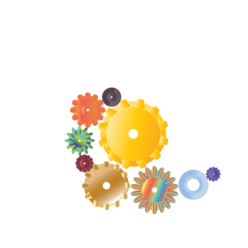
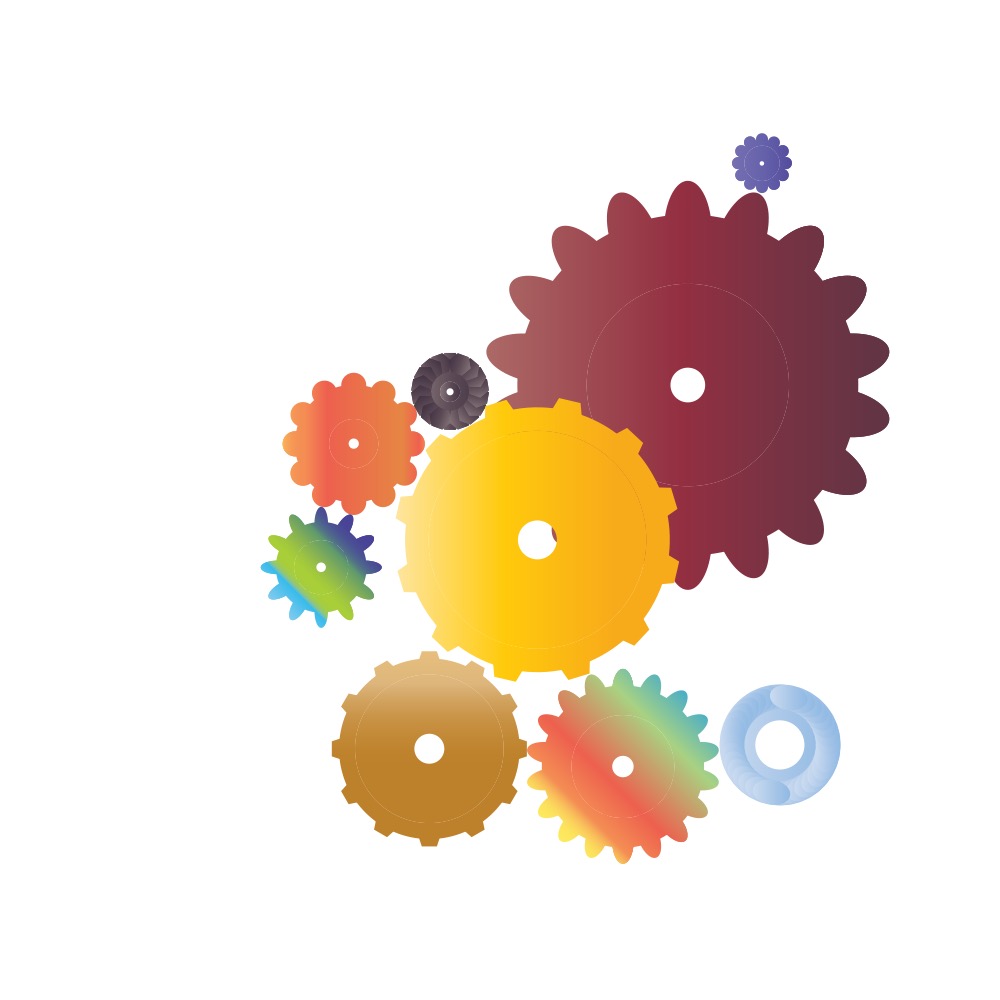
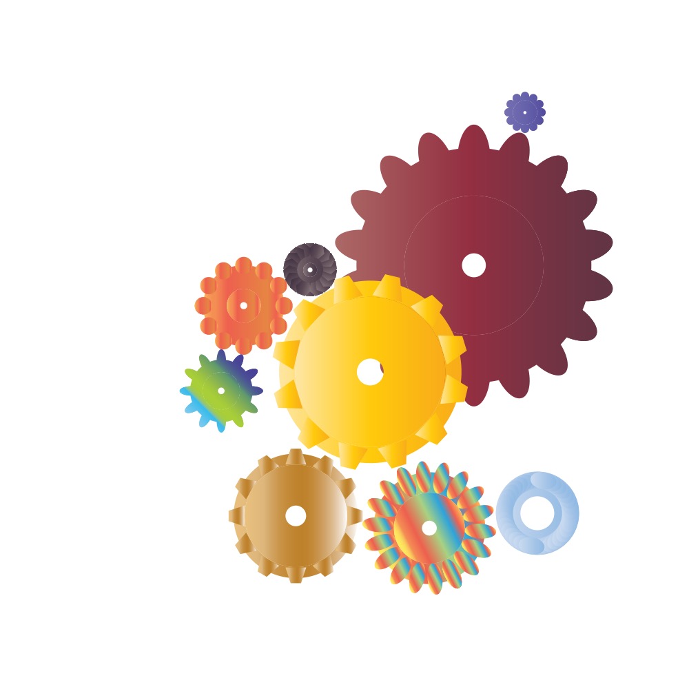
Images for the metaphors were created by designers and illustrators who were invited to help with the project, resulting in an ample selection of art.

The first version of the animation was done using CSS. This allowed quickly changing settings on the fly according to the designer’s comments and edits.

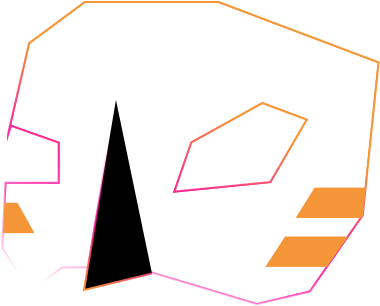
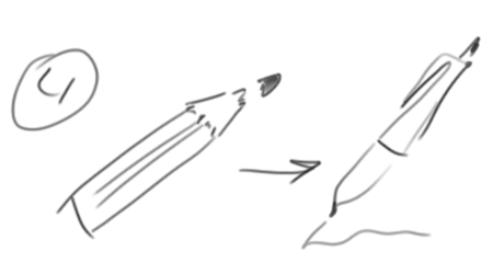
Drawing images starts with simple metaphors. A pie chart turns into a parachute dome and the chart’s leader lines become ropes.


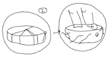
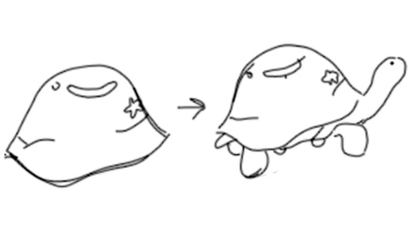
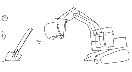
The factory that the client didn’t like is replaced by documents that are lifted up into the air.

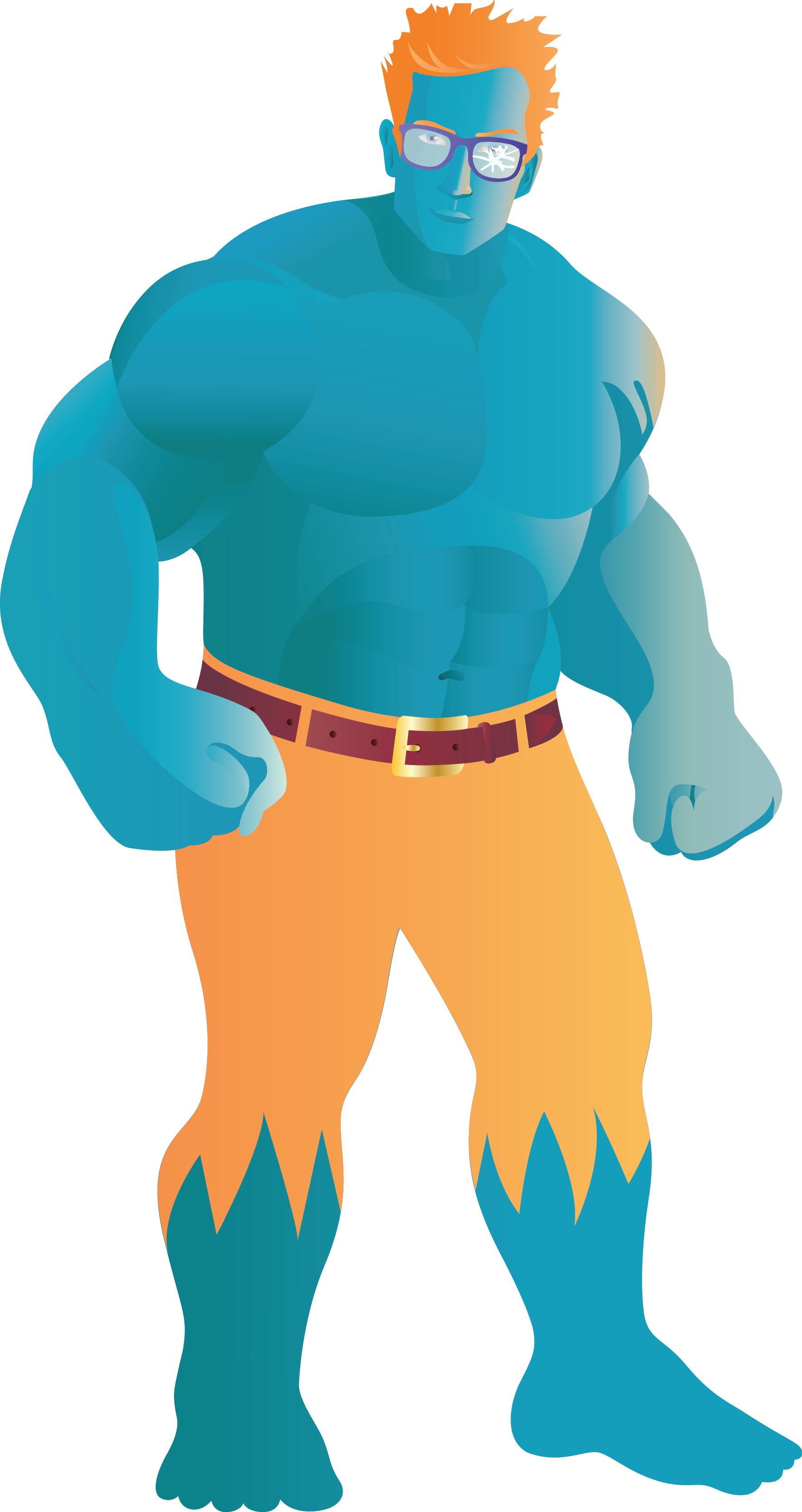
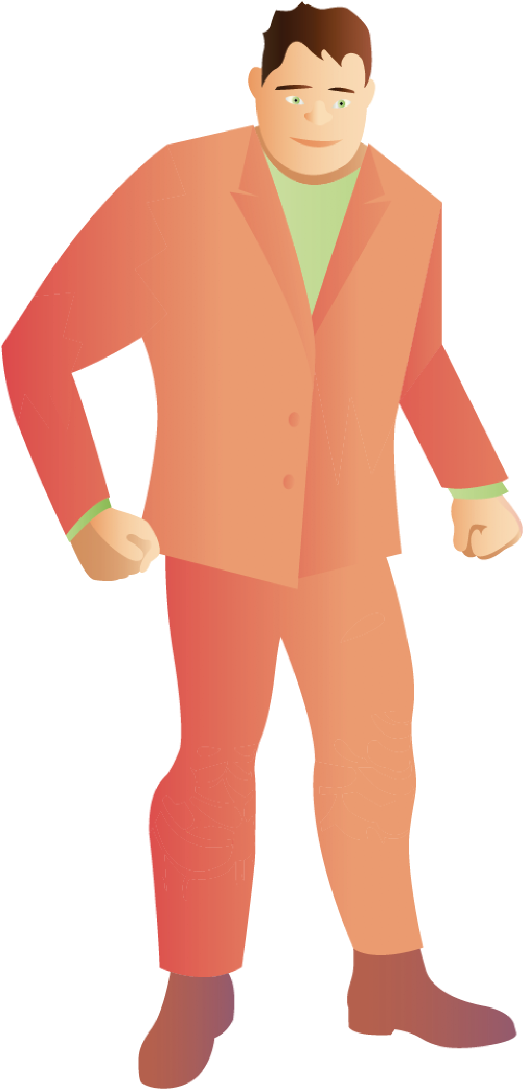


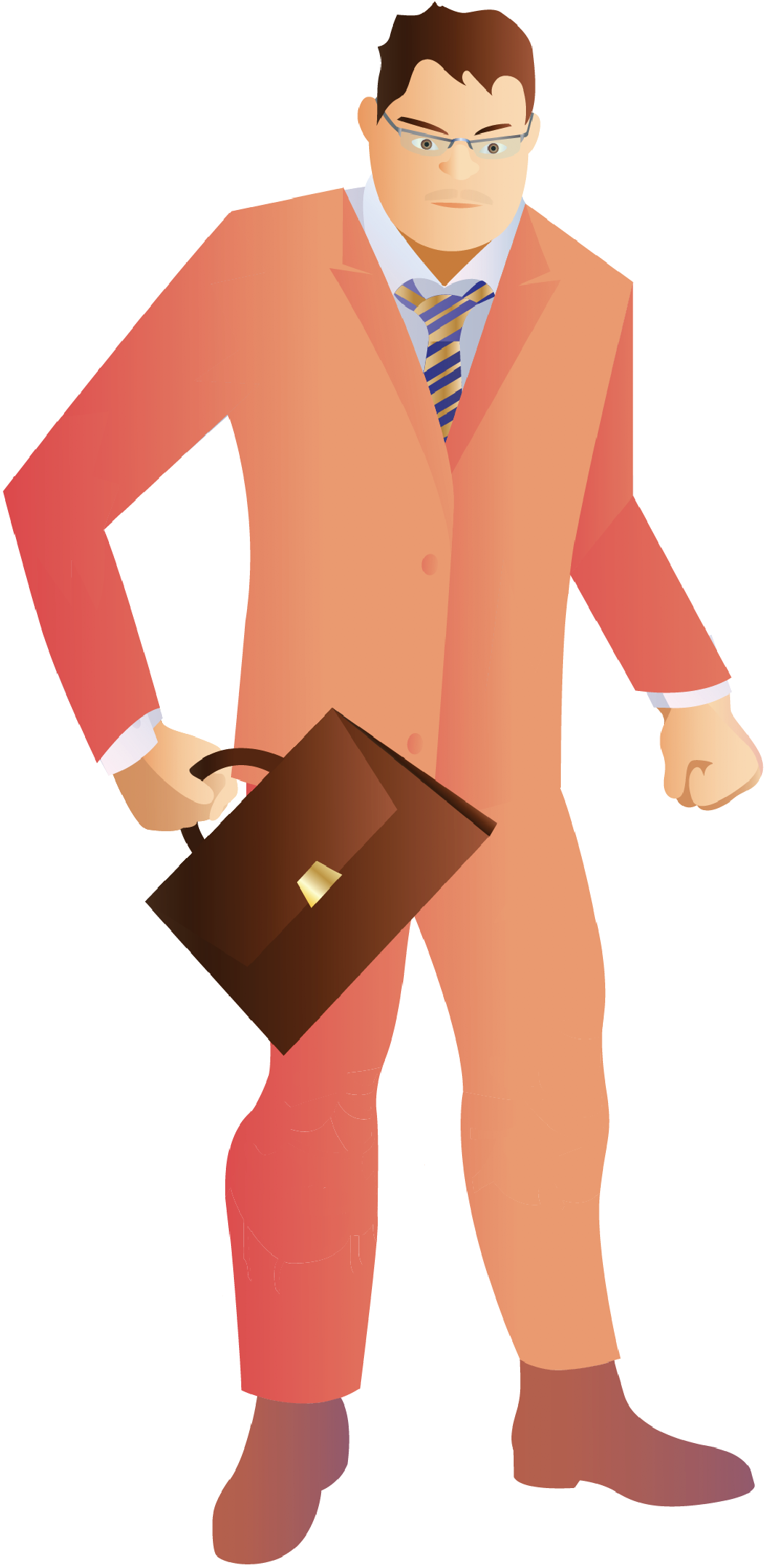
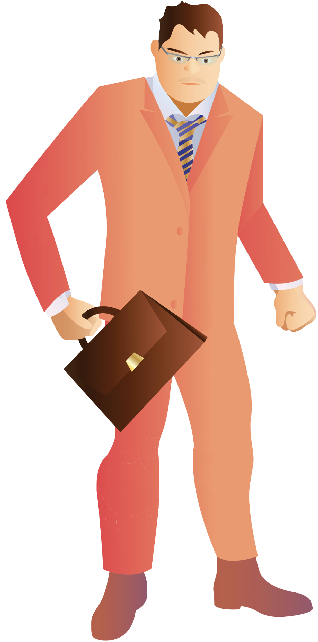
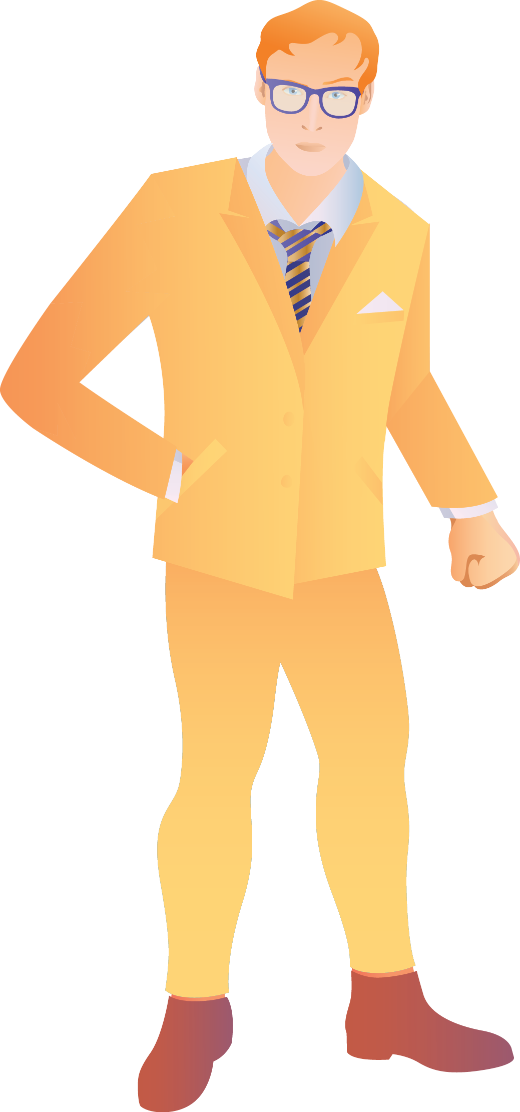
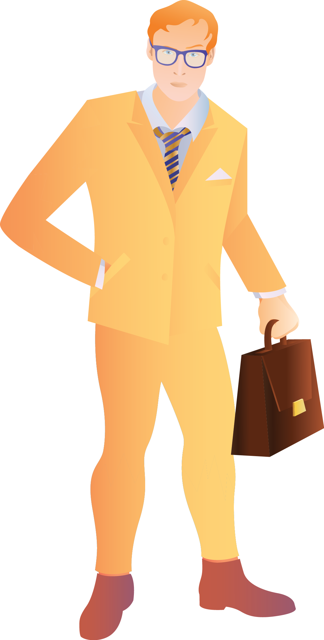


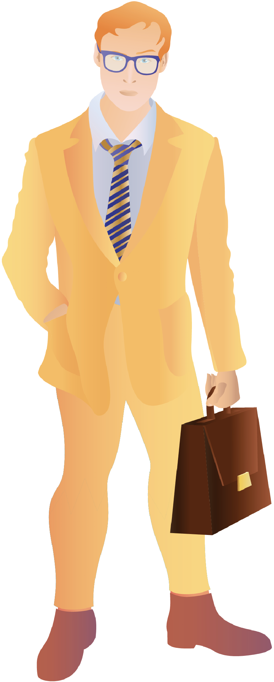
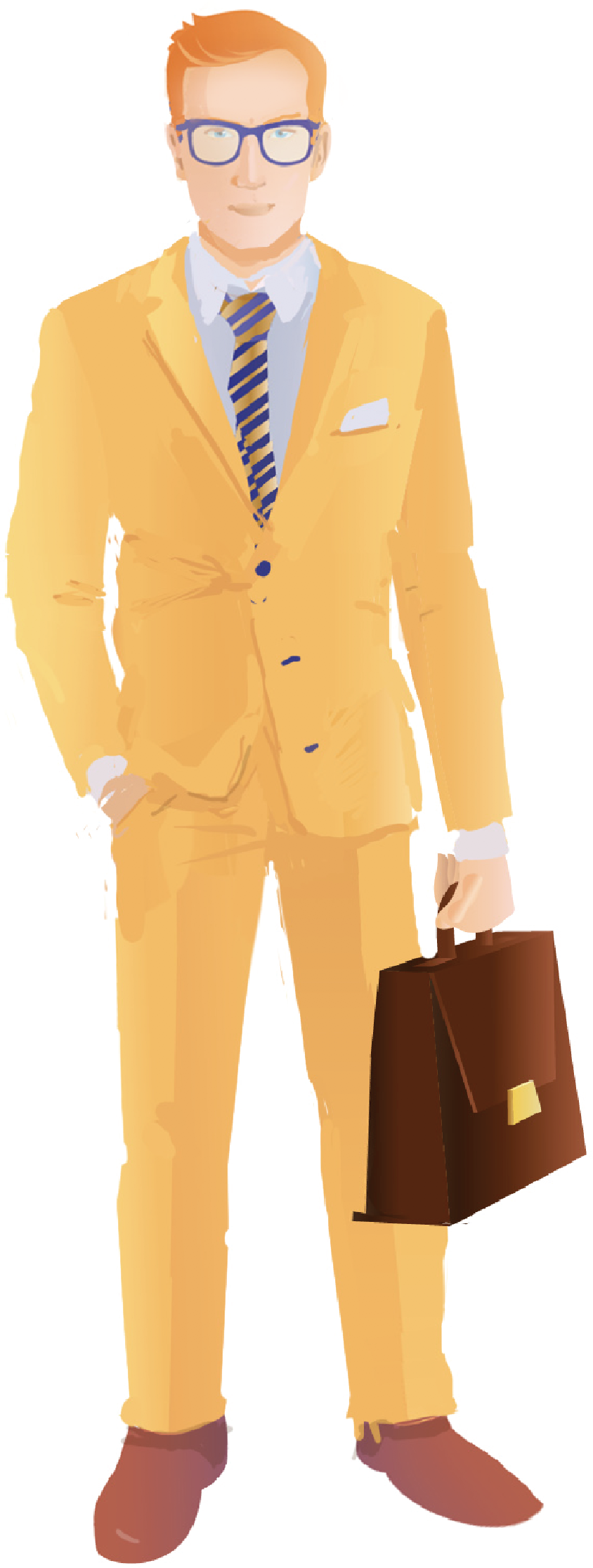


The superhero lawyer turns into the Hulk on the “dark” side. In the first version the Hulk was simply putting on a suit and losing his biceps in exchange for a suitcase.
He ended up becoming a regular person that you can meet in any office, complete with a tie and even creased trousers.
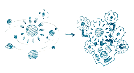
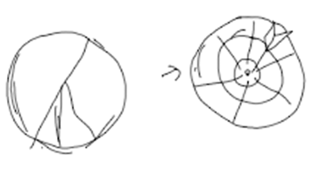
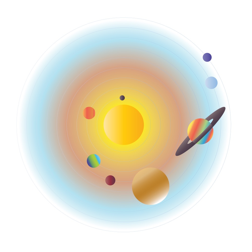
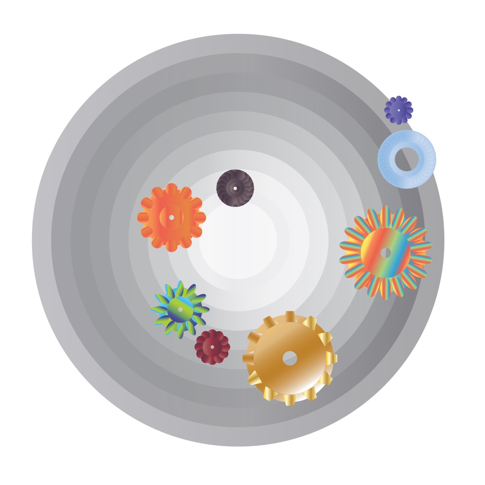
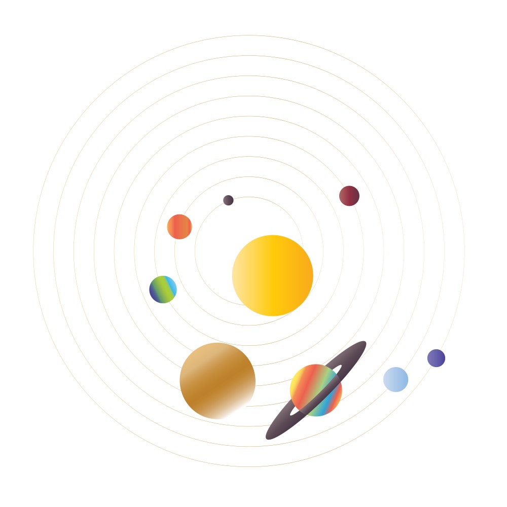
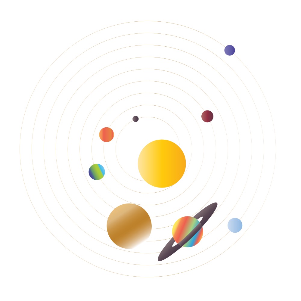
The solar system demonstrates that the company operates extremely precisely even on a planetary scale. Planets don’t just rotate, they work together as a well-tuned mechanism.

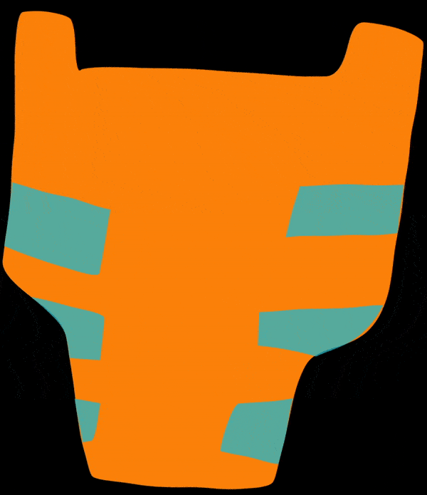
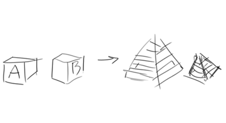
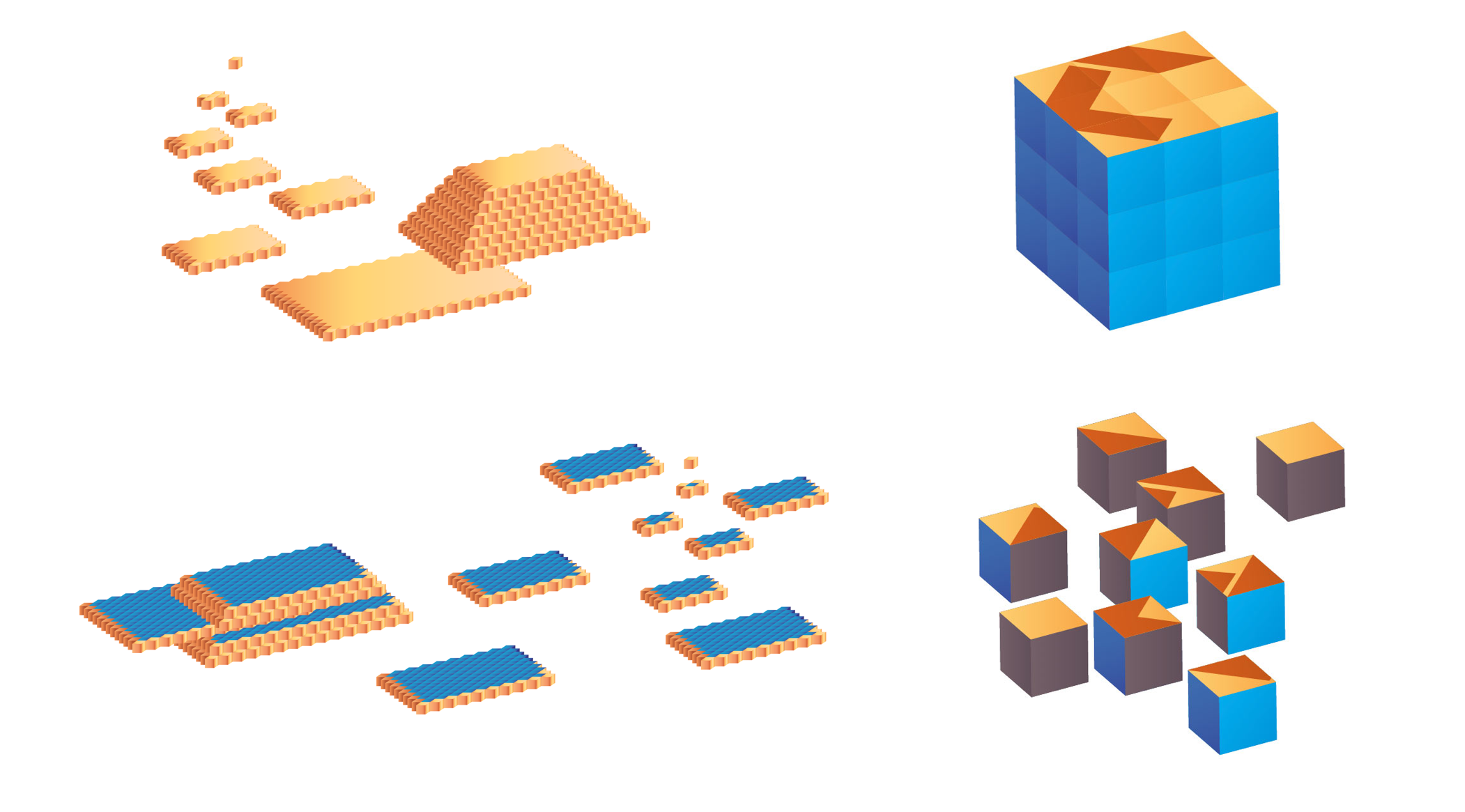
Initially we wanted to turn the randomly scatted children’s cubes into a neat pyramid but ultimately decided to go with a Rubik’s cube. It’s more wholesome, complete and solid, plus it requires thinking, something that the company’s employees really enjoy.
Animating all the metaphors required more serious tooling than regular CSS which fell short in this case. We decided to go with the svg.js library but had to fix a huge number of bugs before it became sufficiently reliable.
The clients
The Clients section on the “white” side contains real reviews provided by Sotbi. For the “dark” version though we needed something more interesting. We decided to go with messages from non-existent companies.
We need to think up who these people are, what their names are and why they used Sotbi’s services. The characters should evoke emotions so it would be good to start with something familiar.
For example, the Granny made a gingerbread man and later launched a full-scale baking enterprise. And so on, with all the beauty of official letter style.
To make the joke complete, the technical designers came up with a logo for each made-up company.
The principles
We needed a fresh graphic and semantic move. We already used illustrations and that cost us dearly. This time we wanted to avoid pictures completely. However, simply writing new text from scratch is boring.
We decided to keep the original text on the “dark” side and have words fall out of it, creating a completely different reading. Let the editor have his fun.
A death-defying act reminding of the old joke about using four cubes with the letters S, I, H, T to build the word “happiness.” Something like this?

The geography
The “light” side shows cities where Sotbi has successfully completed projects. This is fine, but how do we make the “dark” side exciting?
There are a lot of places in Russia with unusual names. That’s where the made-up companies should be located.
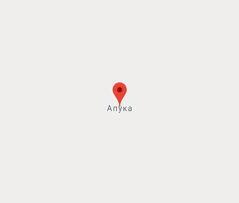
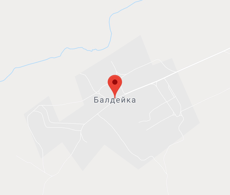
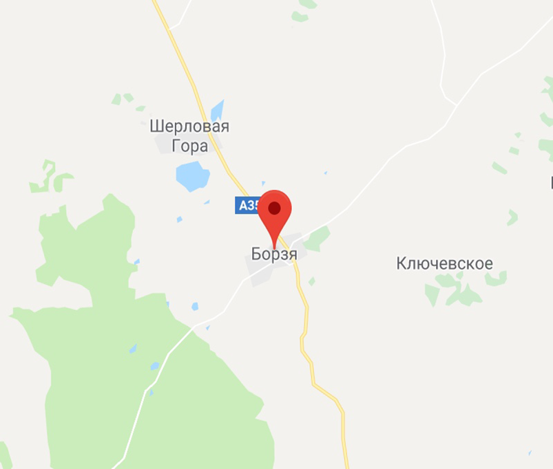
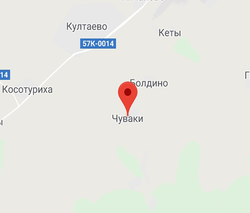
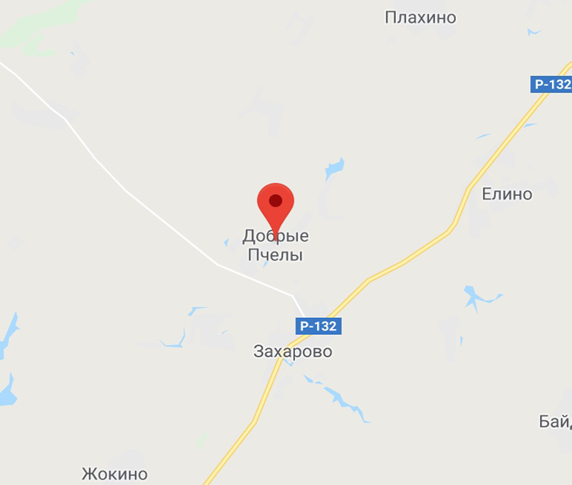
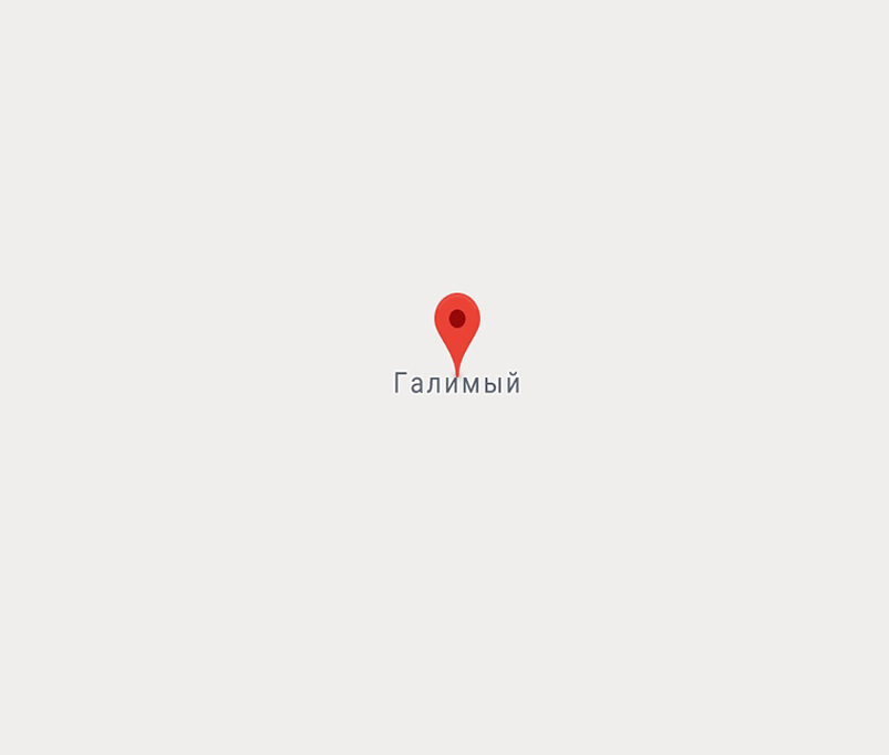
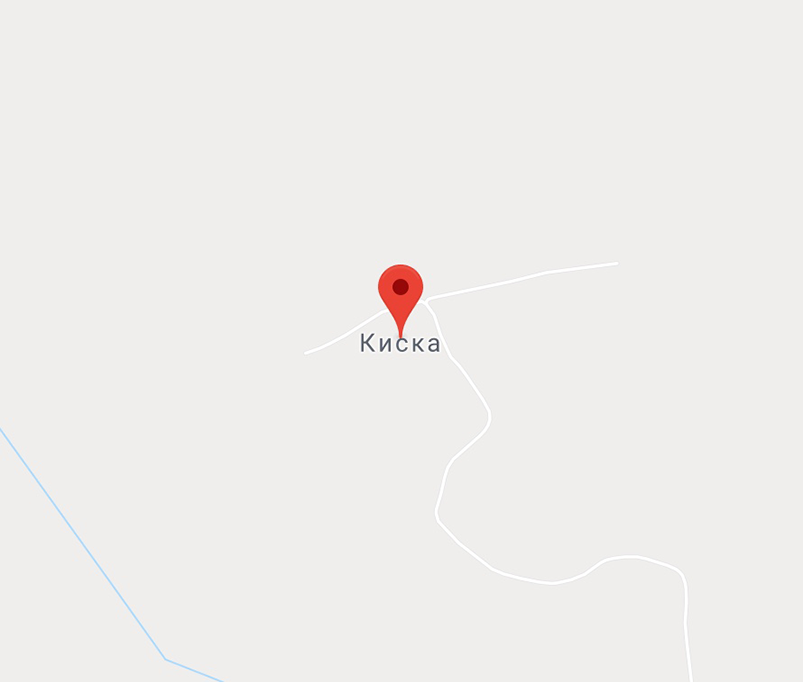
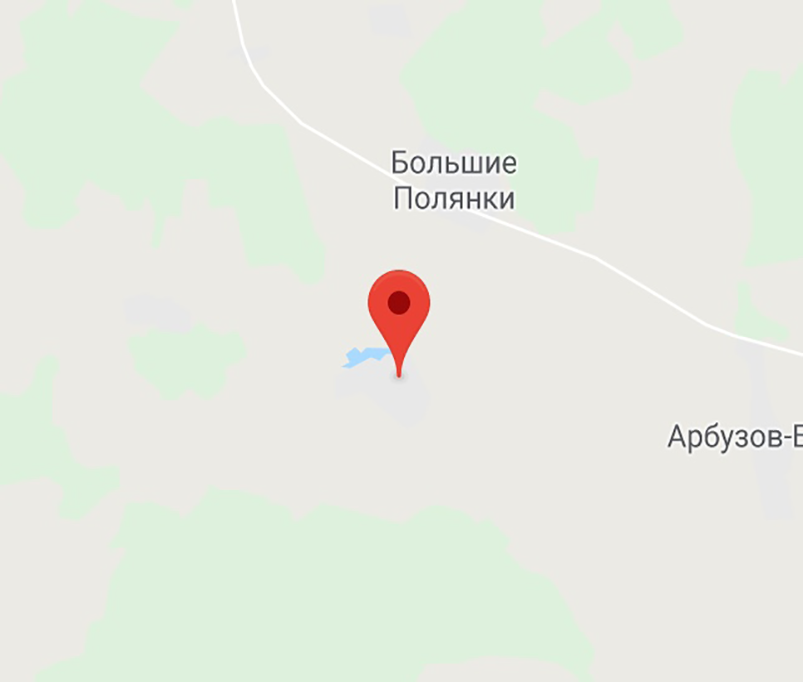
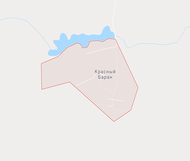
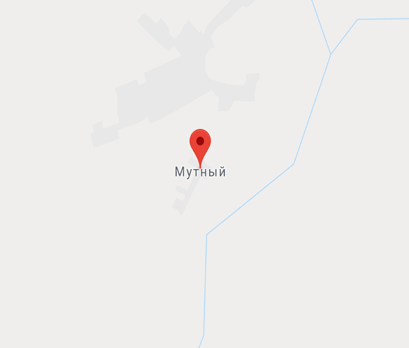

Each of the five dozen cities, towns and settlements that we selected can easily become a setting for a project that would look just like a real one. But since we’re talking about the “dark” side, we created a fascinating story for each of the places. It’s obvious that a hostile takeover of a beehive farm by a honey producing conglomerate could have taken place only in a place called Kind Bees.
The careers
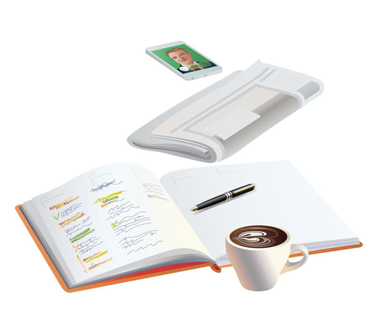
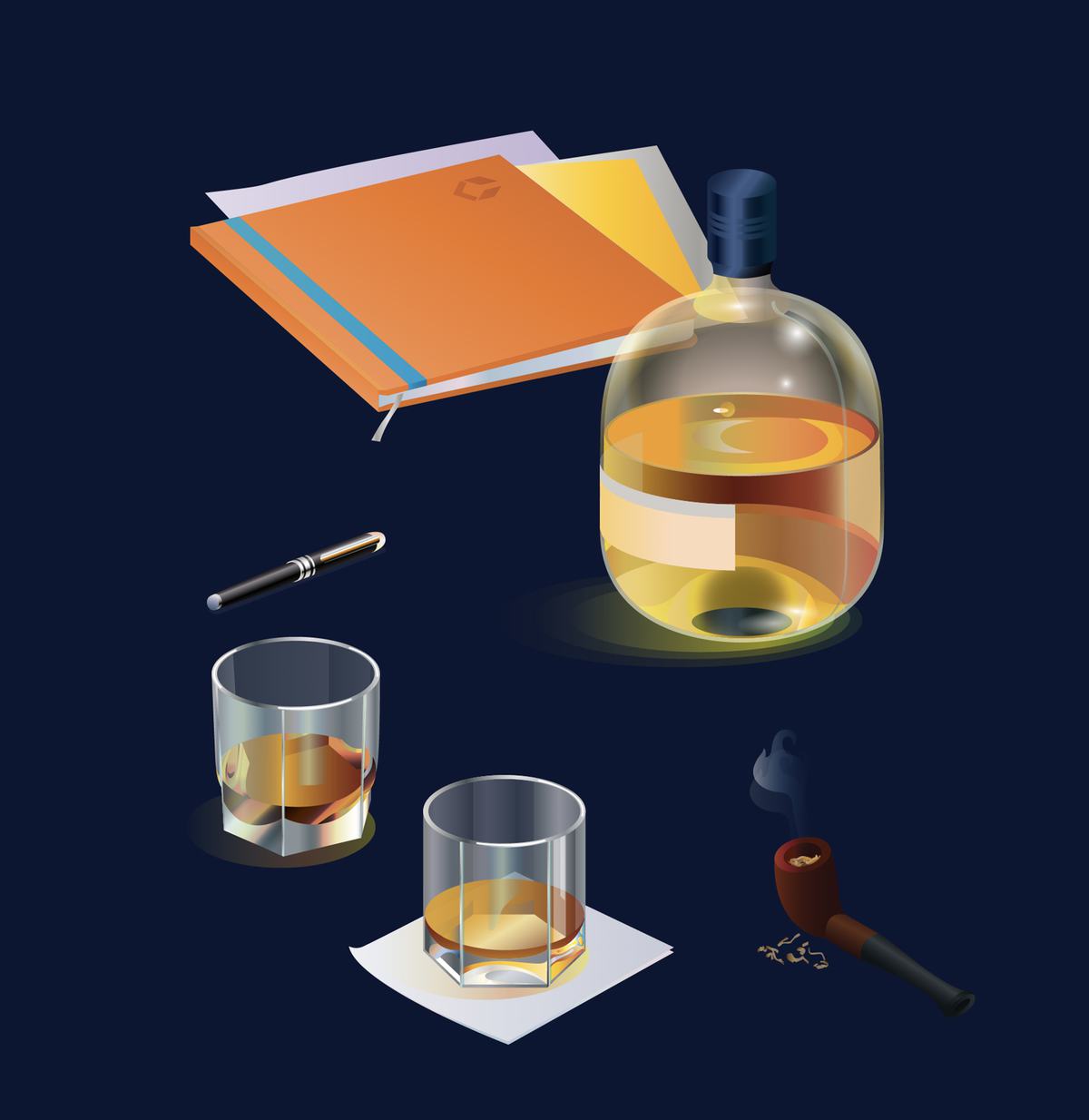
Sotbi hires staff in three categories: students, experts and managers. We came up with a character for each group. As you go through vacancies, the images change, showing an intern, an experienced boss and everything in between.
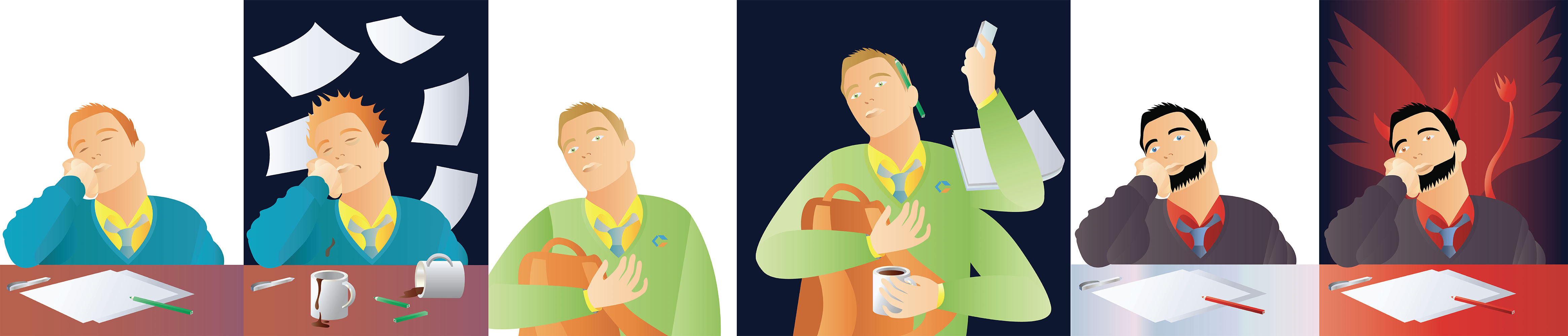
( ╯°□°)╯
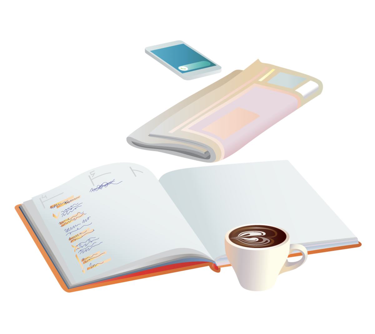
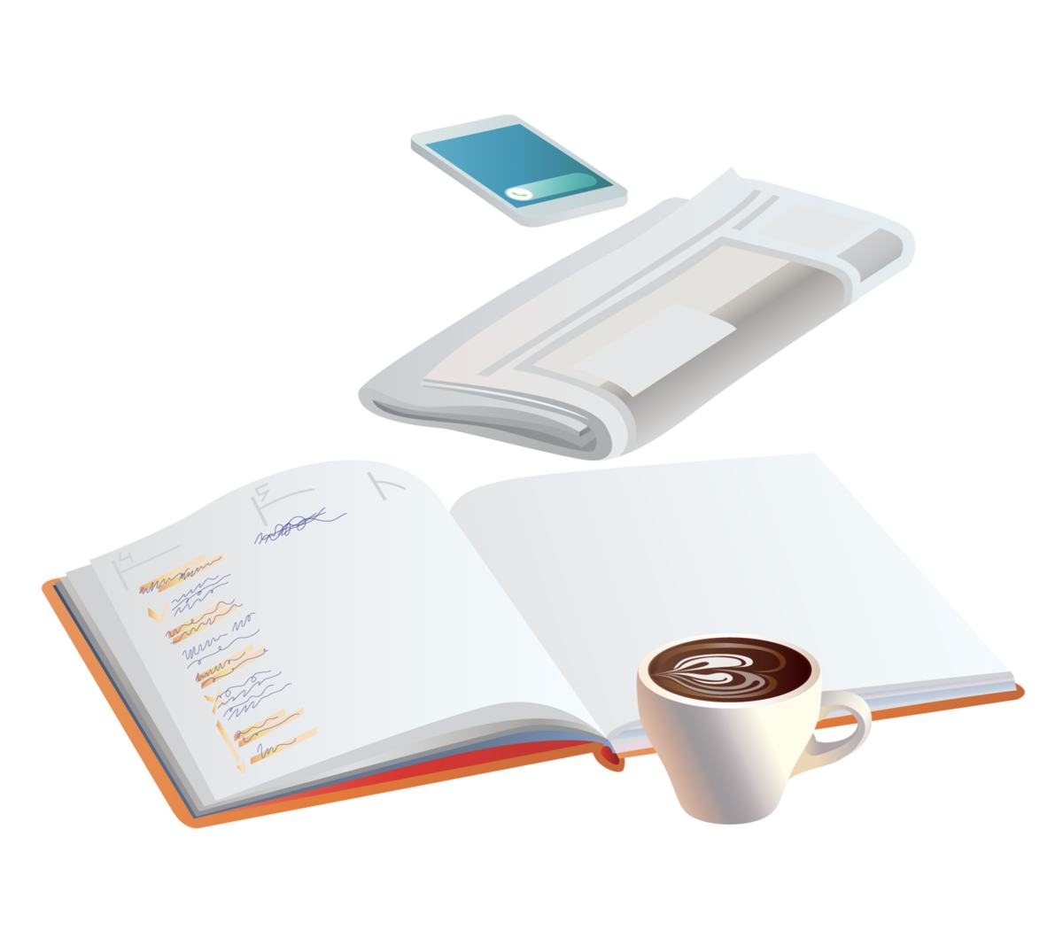
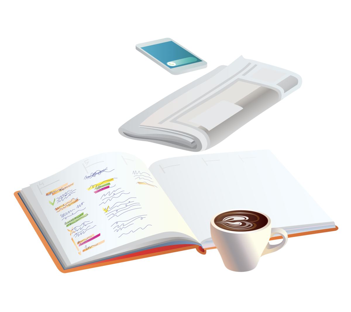
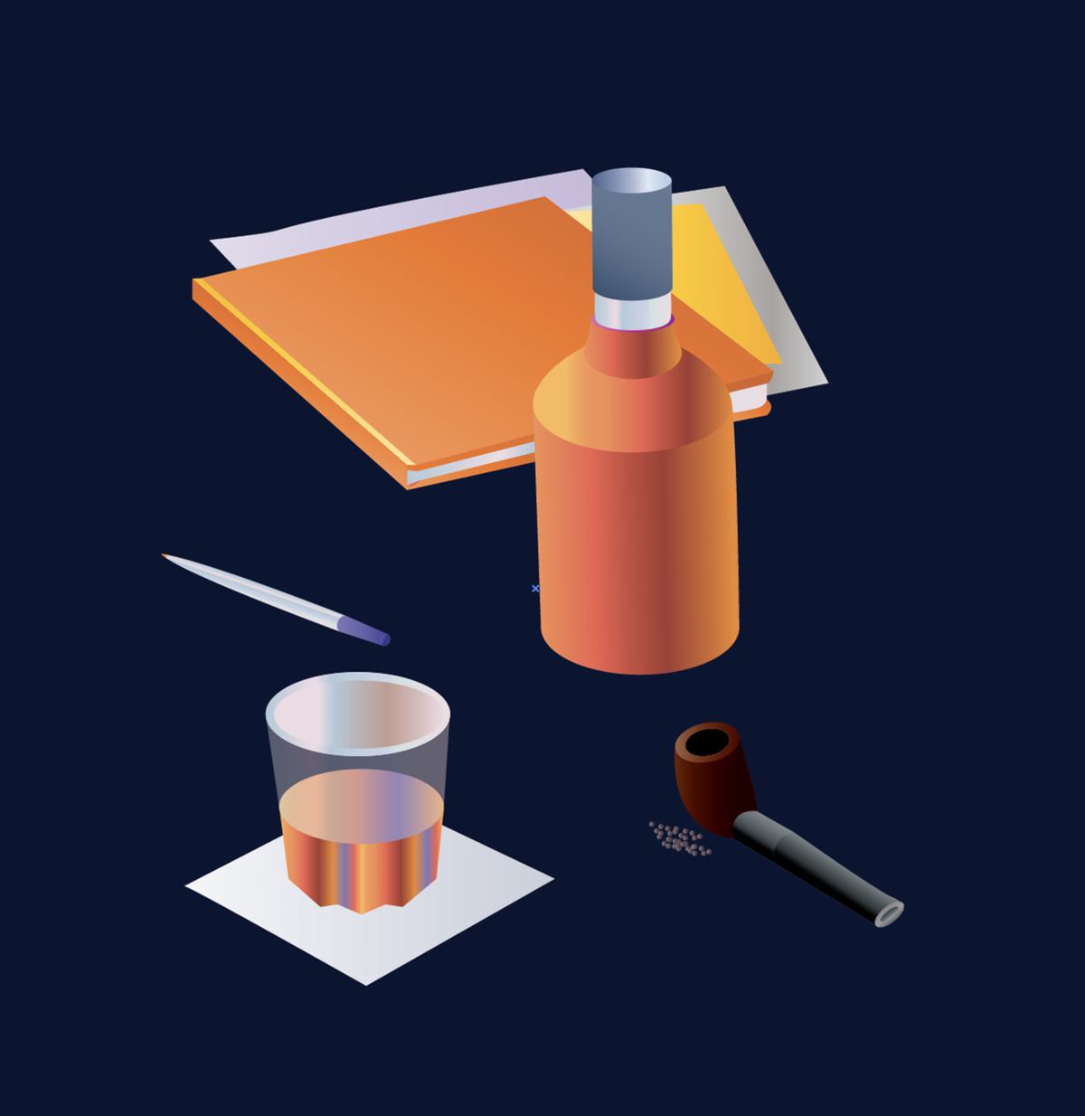
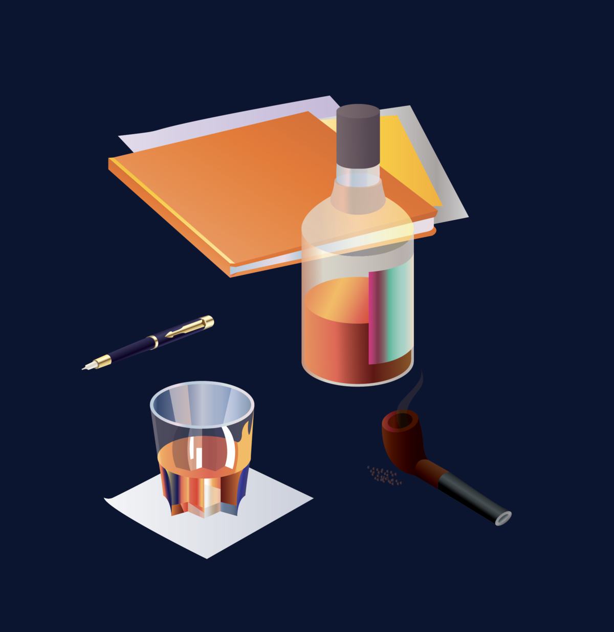
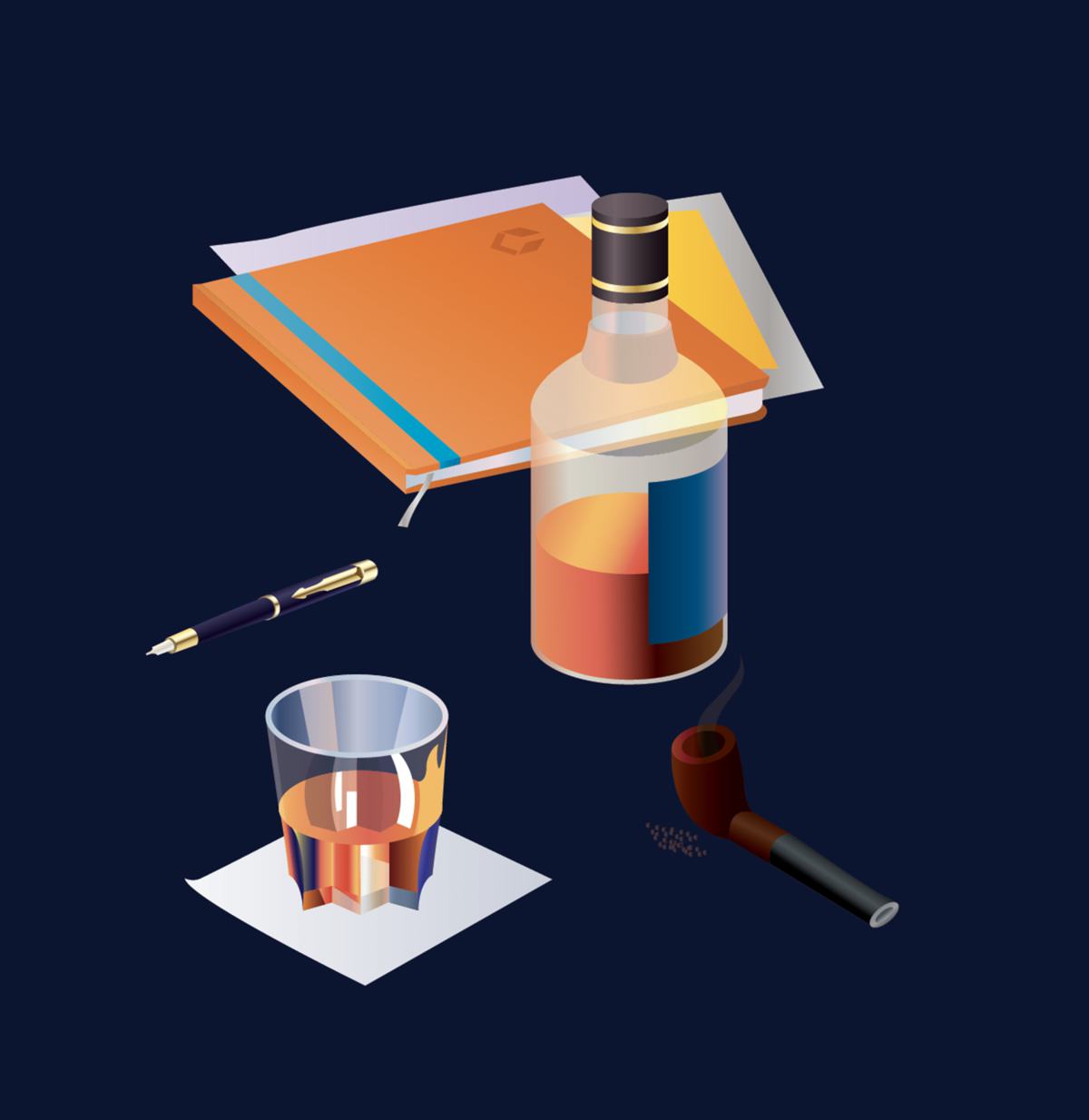
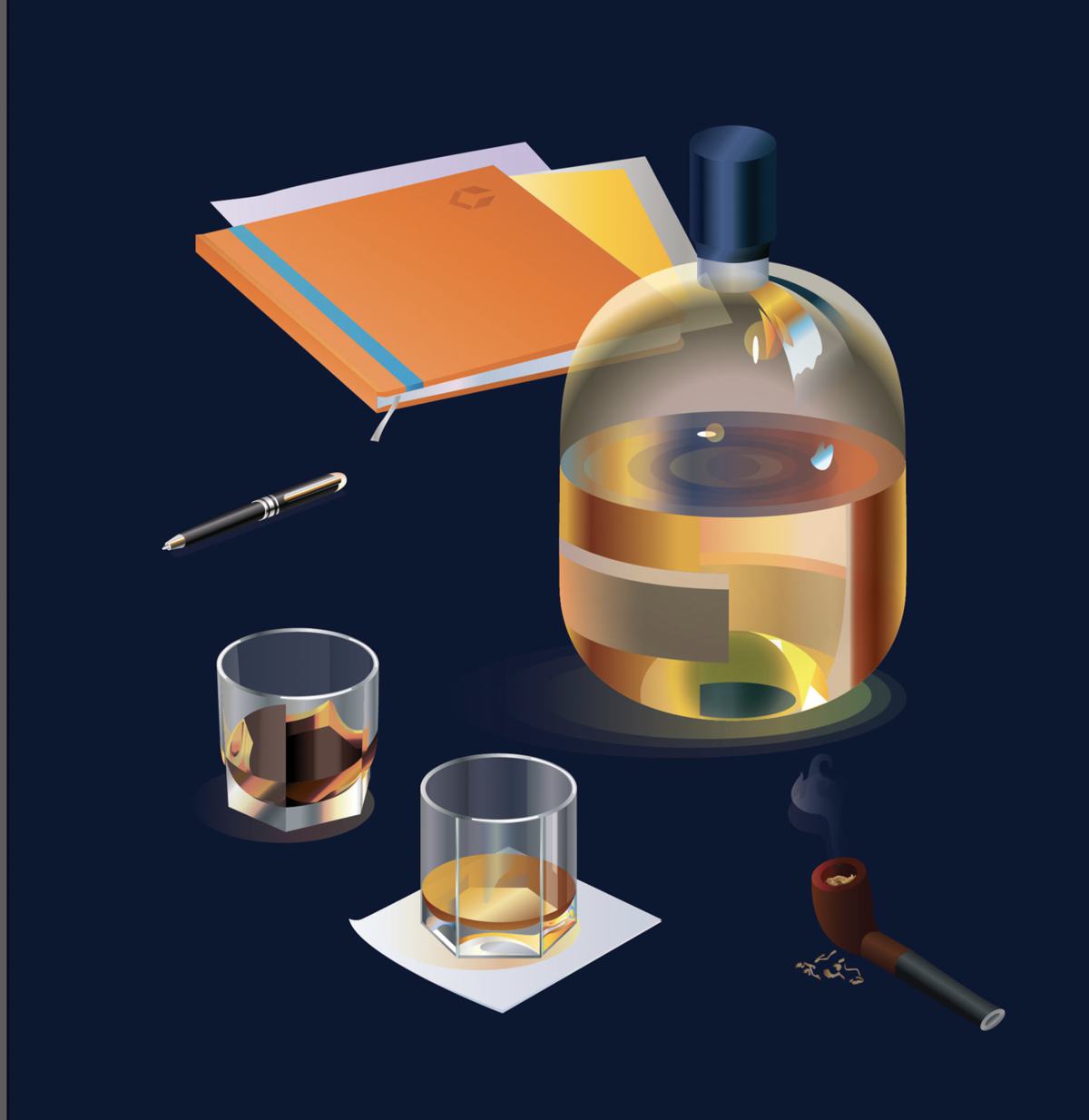
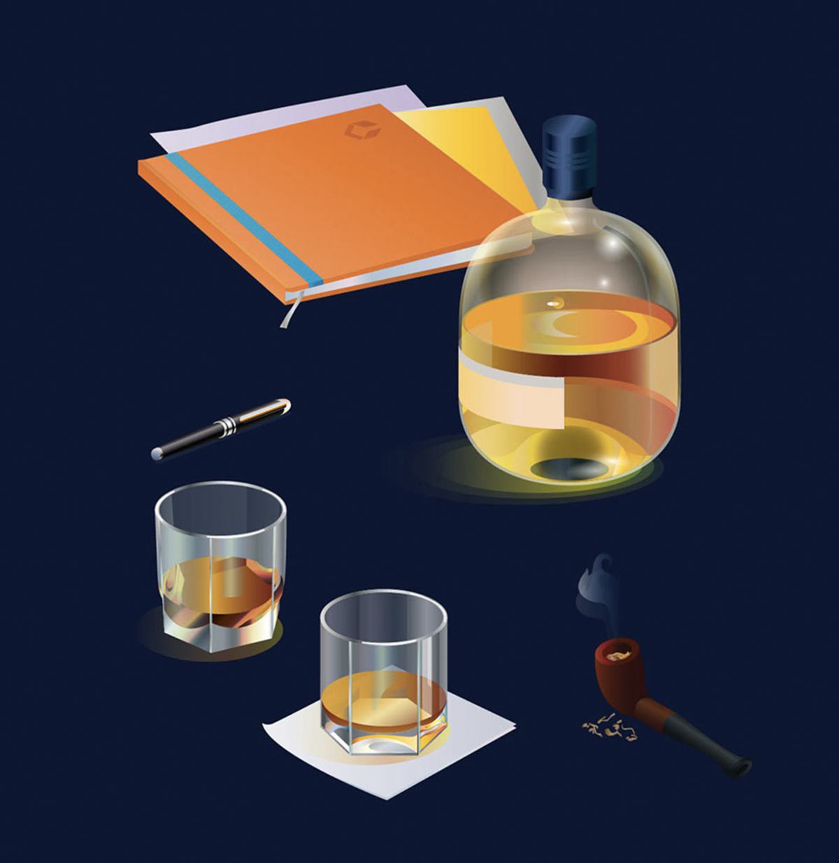
After serious considerations we decided to replace people with realistic illustrations of characteristic attributes of their work. Of course, they all have their own items they use every day. Company employees use exactly the same fountain pens to write in exactly the same notebooks and prefer to drink their coffee out of exactly the same mugs as we drew. We checked.
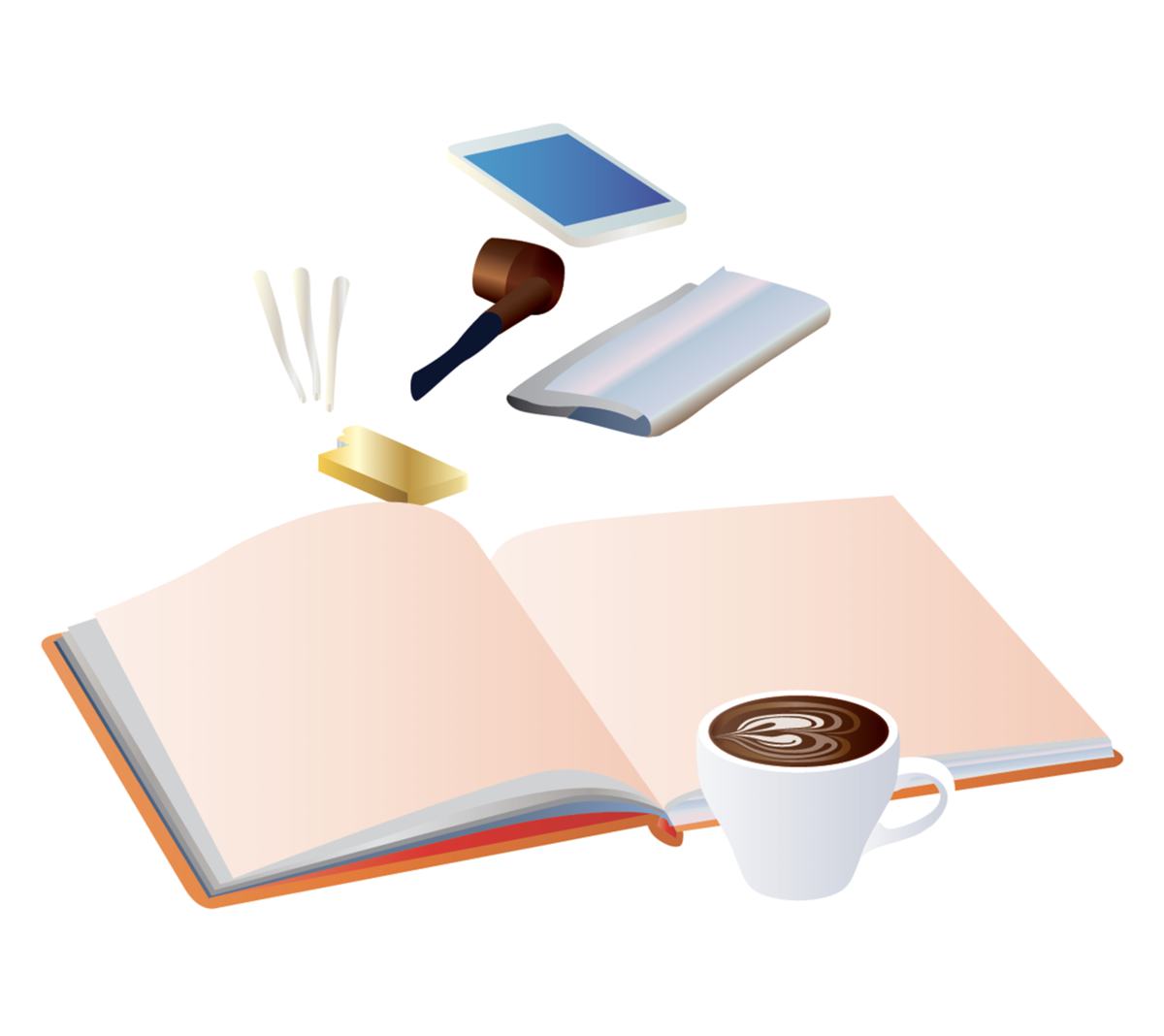
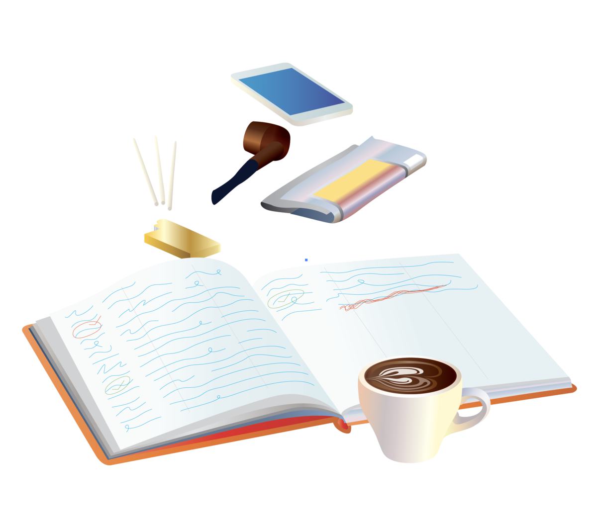


Switching from the “white” version of the website to the “black” brings about the end of a work day making everything look completely different.
The website is filled with many details not always obvious at first glance that make each page much more interesting. Never before have serious legal cases been presented on a website in such an unconventional manner and aroused so much curiosity from the viewers.

and show you a printed presentation
- The website is managed using Imprimatur III (Parser) proprietary technology
