Client: Our company provides international mail transportation services, our main clients in Europe are local post operators. We believe a design inspired by letters, postcards, parcels, flying machines, etc. would work. It’s a connection of postal operators and airlines, the combination of two industries. Websites of our clients primarily have blue, orange and yellow colors, in case that’s important. It’d be interesting to see if you could integrate the company name SPP Stolitsa Ltd. into the logo: despite it’s Russian nature, we are fairly well known on this market. The logo and the identity should be targeted primarily at the middle and top management of state postal operators, airline managers and, to a lesser extent, potential foreign investors. They might be interested to see in our logo and identity a reflection of the main principle of the Universal Postal Union: creating and developing sustainable and reliable postal communication between people.
Designer: Letters and a teleport.
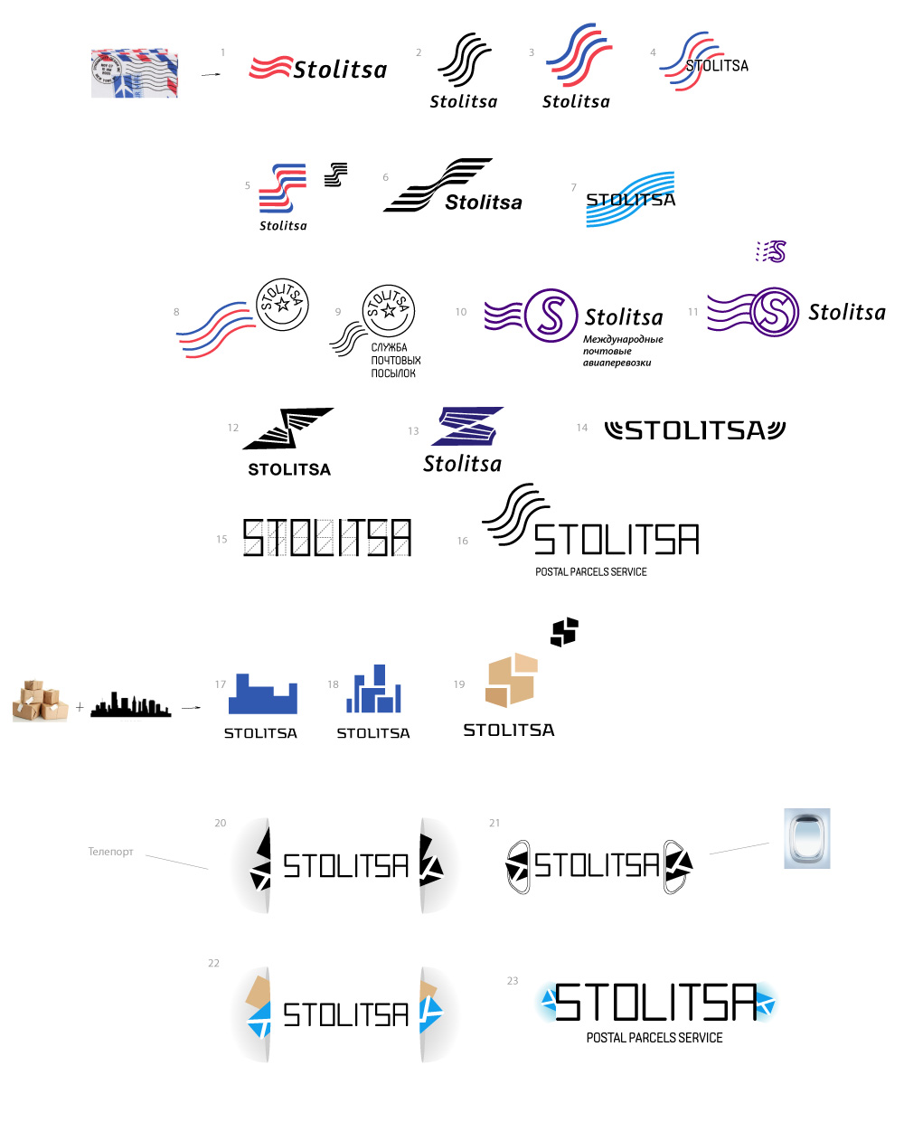
Art director: I don’t see anything new or cool here.
Designer: Counterforms.
Designer: A few more with the teleport.
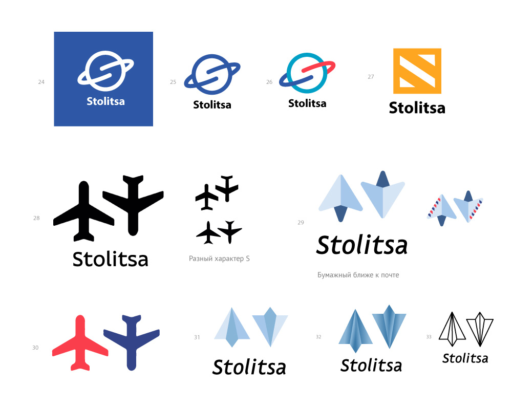
Art director: Number 30 can be elaborated.
Designer: I played with the planes a bit.
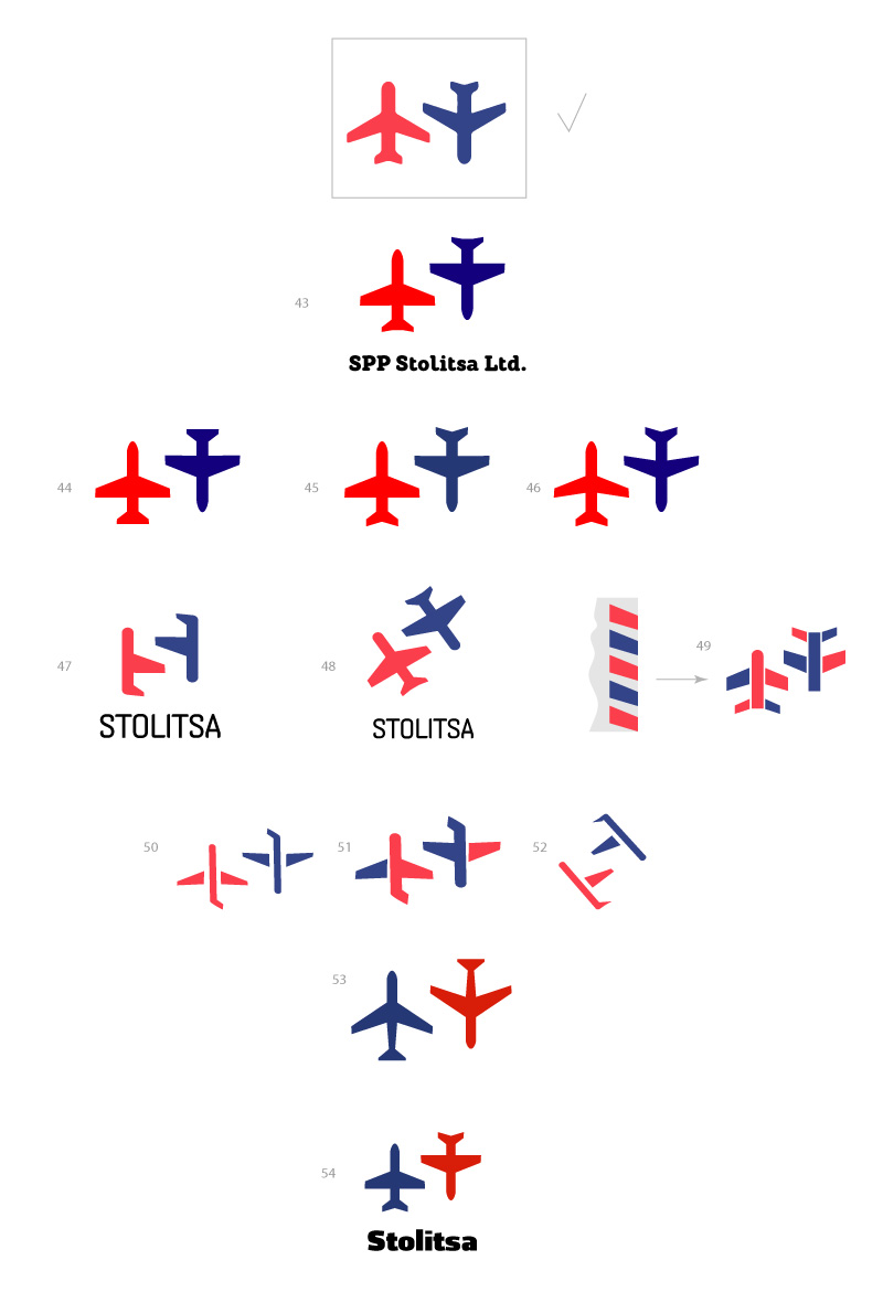
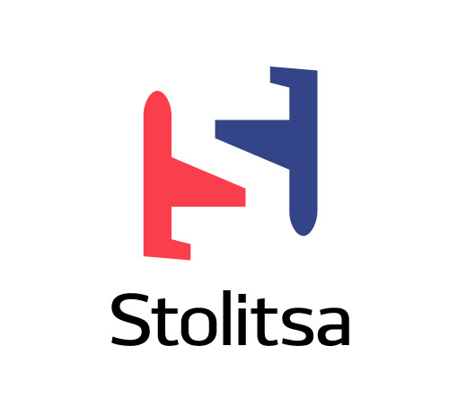
Art director: 47.
Designer: Here.
Art director: Right. Now to support it with an identity.
