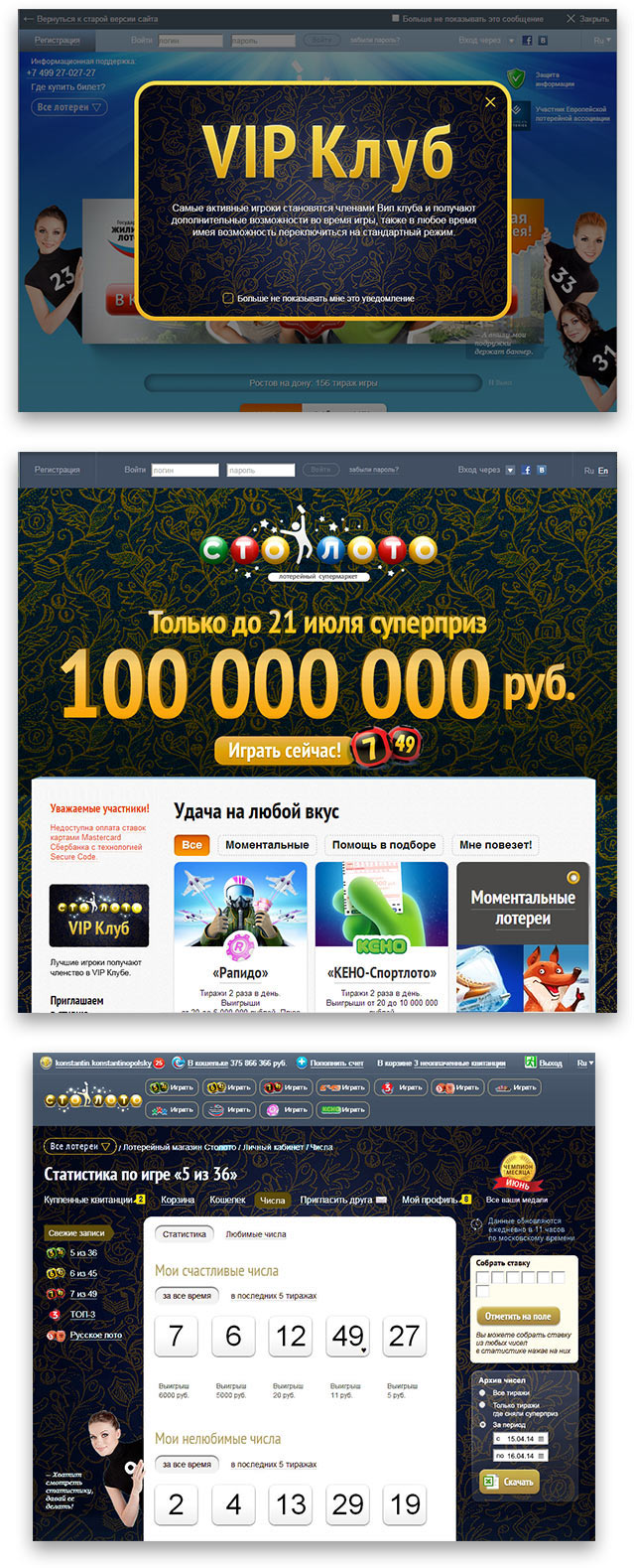
The making of the Stoloto Premium Club templates
Overview Process
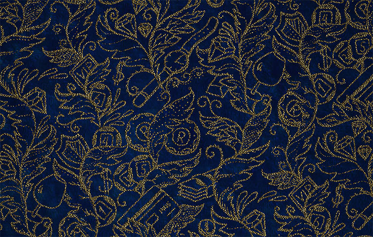
Trying a pattern imitating gold embroidery over dark background.
The client approves. The illustrator draws the pattern.
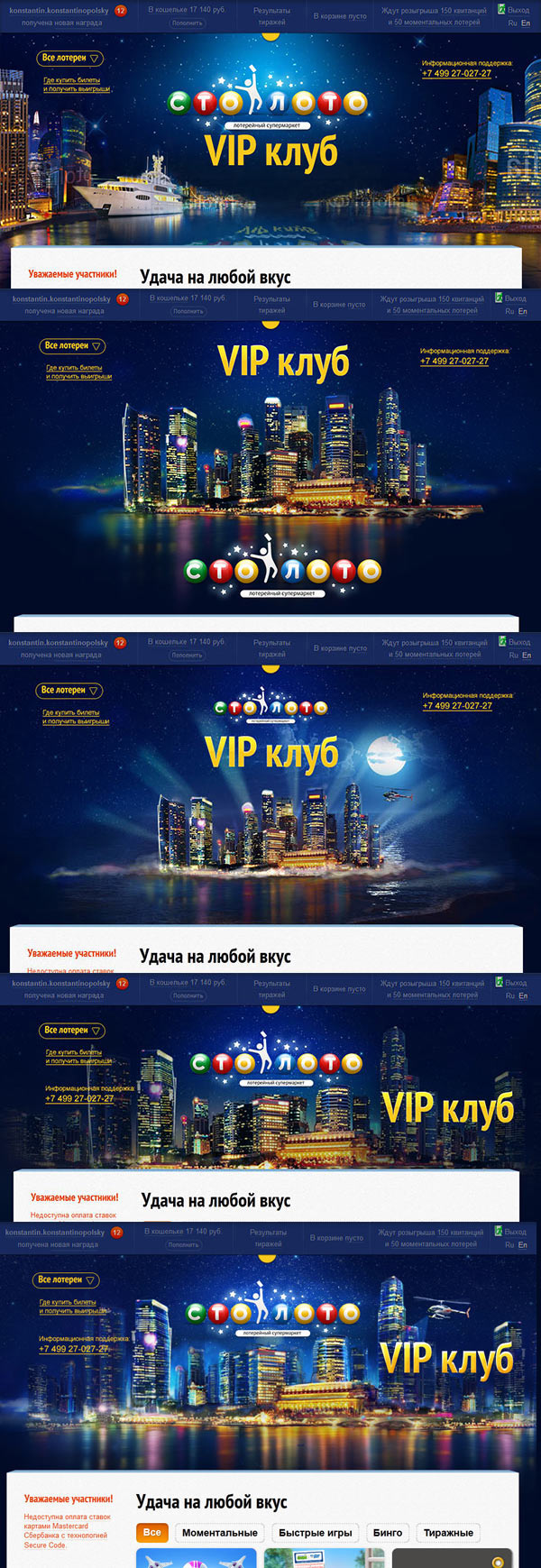
The client suggests to use images of a night city.
Making sketches.
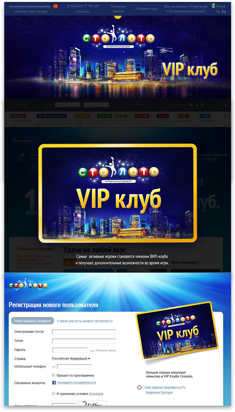
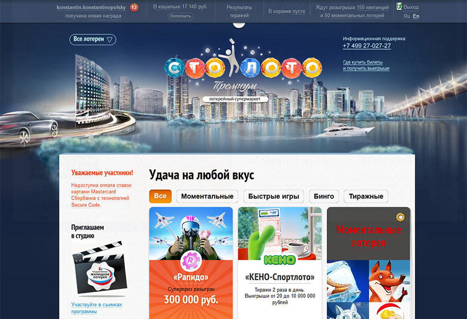
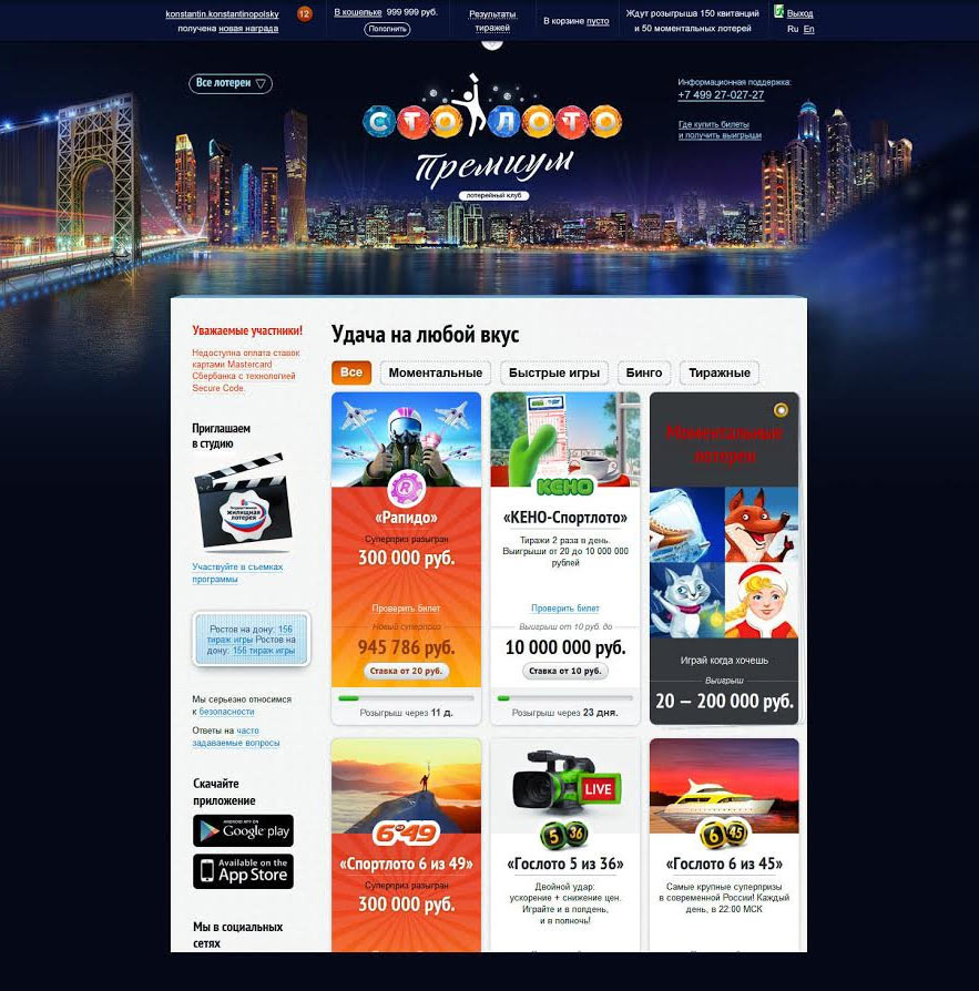
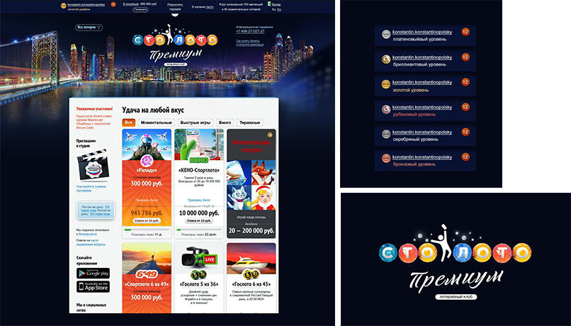
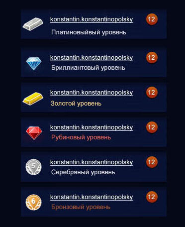
The main page:
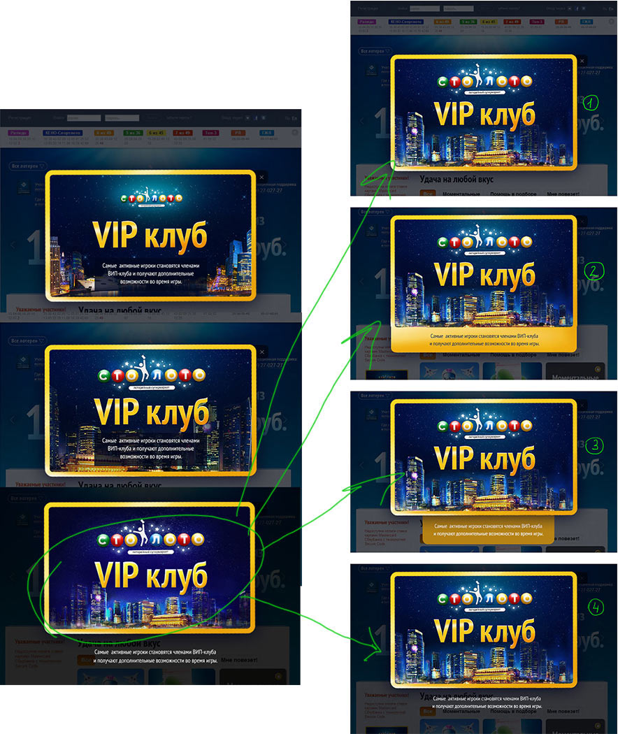
Banners:
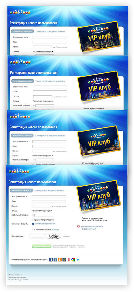
The card on the registration page:
Choosing the brightest city and showing it to the client.
The client doesn’t like the result. The picture is too bright, there are too many colors and the helicopter looks out of place. All in all, wrong.
Creating a less bright alternative.
Now the chief designer doesn’t approve. This time everything is bland and washed out. Trying to adjust the colors.
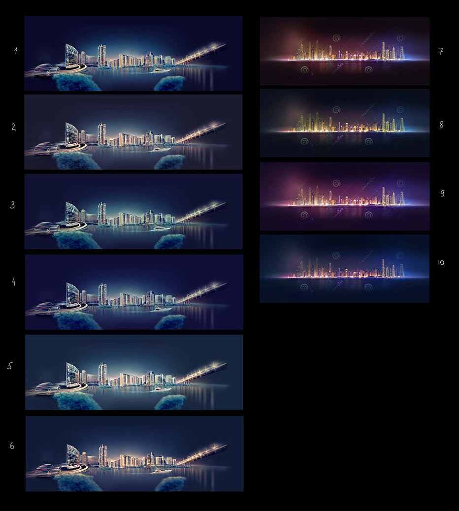
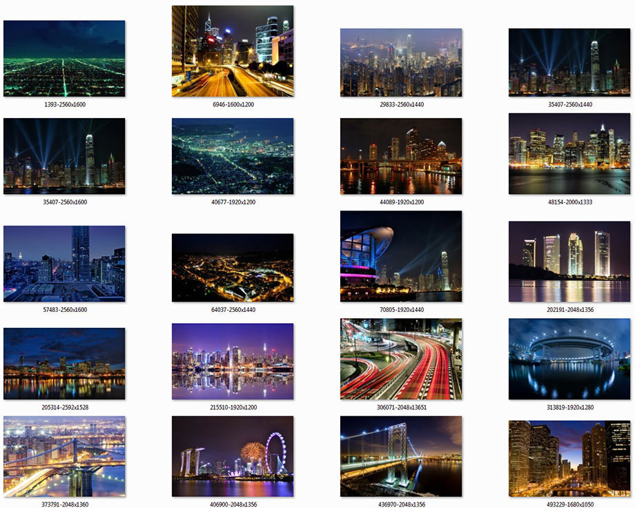
But it doesn’t make it better. We need to start over. Getting inspired by night city views.
Creating another sketch.
Art director: Show it to the client.
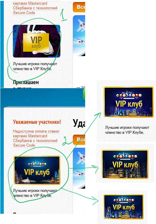
Starting to work on the Premium Club version of the logo.
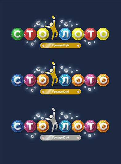
Art director: Too many details, it has to be simpler than that. Just use three times less decorations and it’s going to be OK.
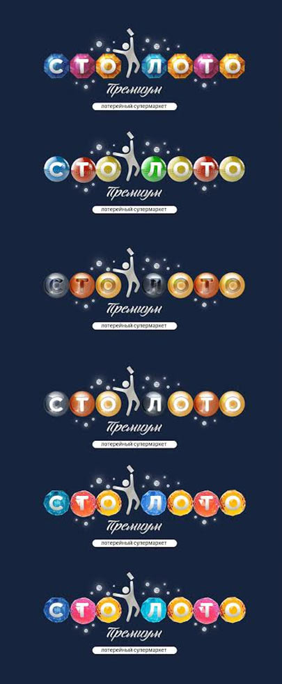
Art director: Numbers 4 and 5 are the coolest, but there should be no black balls. Also, the figure looks dirty.
Developing Numbers 4 and 5.
Art director: The slanting doesn’t have to be so drastic, see the attached picture. The bar at the bottom has to be more compact, with no white spaces on the sides.
Now it’s down to two variants.
Art director: It’s better to make the logo in brighter colors but borrow the ball shapes from the faded version. You can show it to the client.
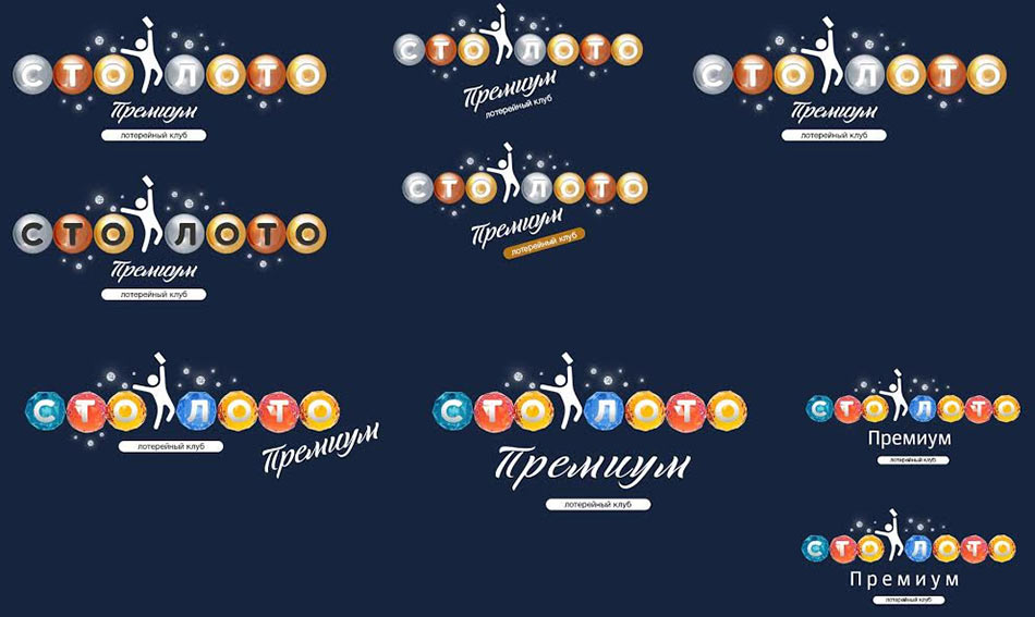
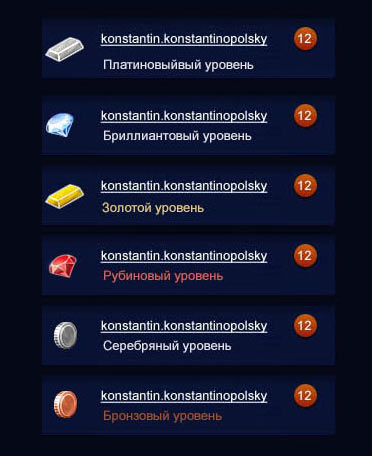
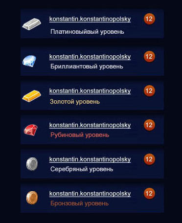
Simultaneously working on level icons for premium players.
Art director: Number 4 is OK.
Presenting to the client.
Client: Overall, the design is OK but we don’t like the level icons. Also, the Lottery Club bar in the logo has to go.
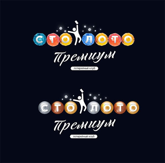
The technical designer and the type designer work on the final version of the logo.
Client: I don’t like the letter П, it looks childish.
The type designer replaces the letter.
The designer starts to work on the bulk of the premium functionality.
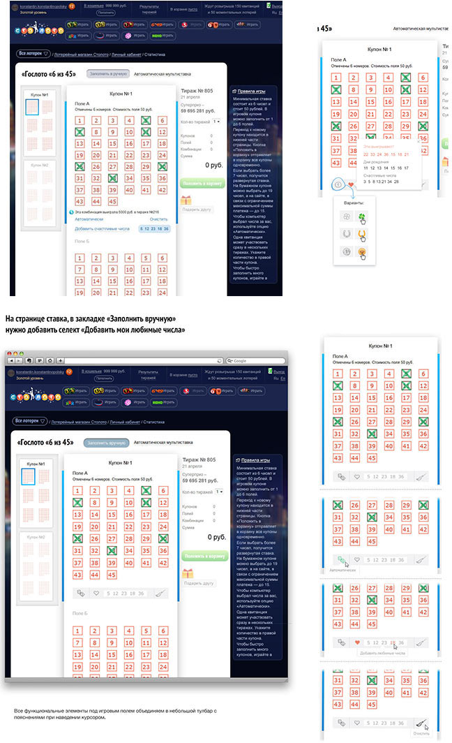
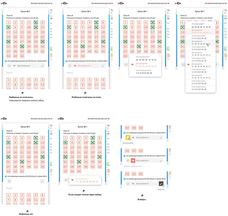
Considering the pages for favorite and lucky numbers.
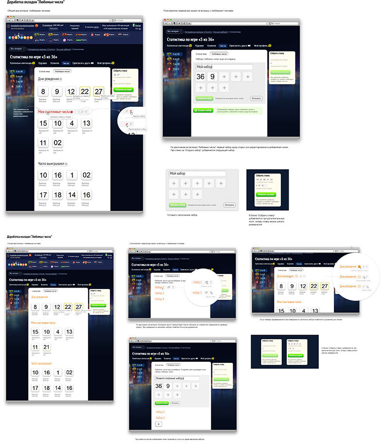
Now premium players can choose sets of favorite numbers to be filled in coupons. Thinking how we can realize it.
As we go, we get the idea to redesign the top bar on the website.
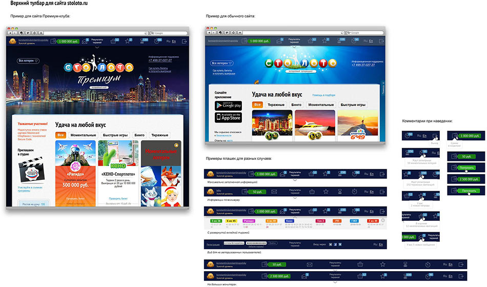
Alas, it doesn’t excite the client.
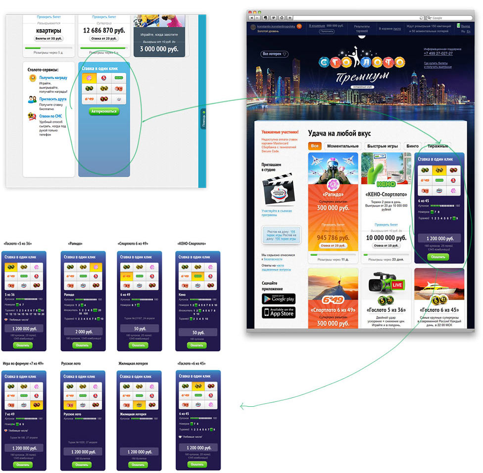
Drawing a block for making quick bets right on the main page.
Sketching variants of the promo page with information about the club.
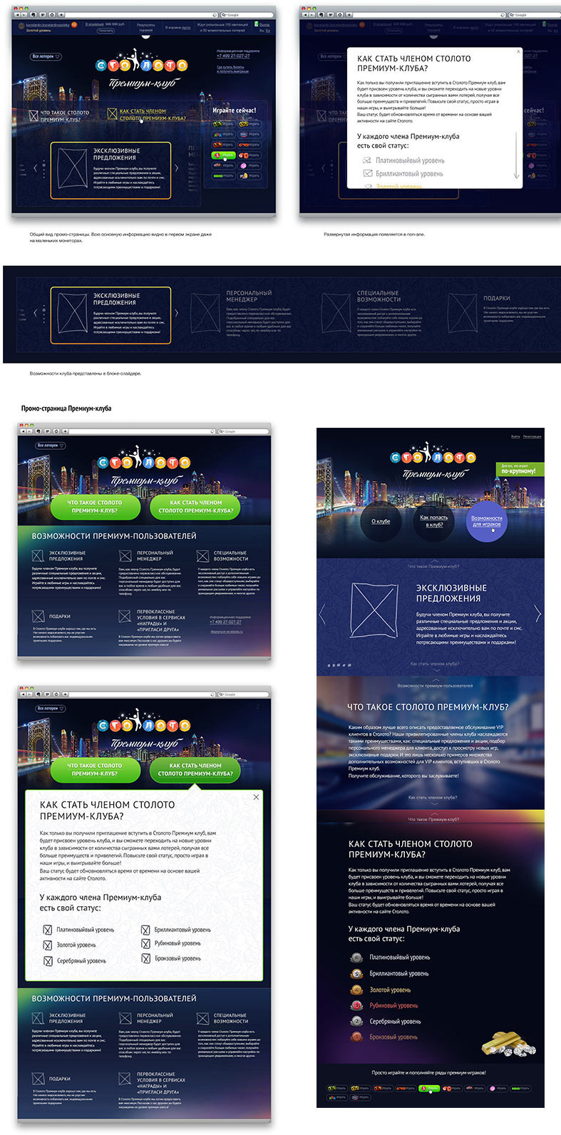
The art director chooses the last design. Demonstrating to the client.
The client says that it looks too complex, it has to be absolutely simple. Making it simpler.
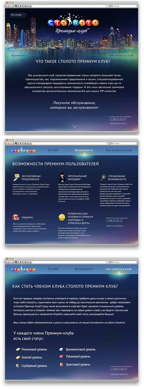
Approved!
The final drawing stage begins.
Creating the main illustration.


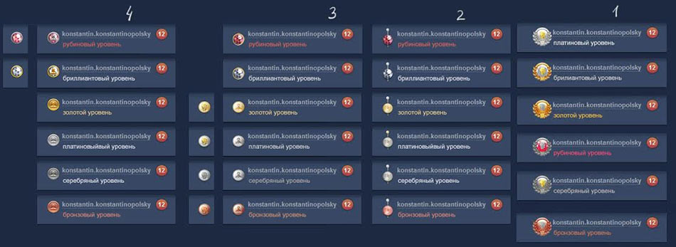
Remaking the level icons.
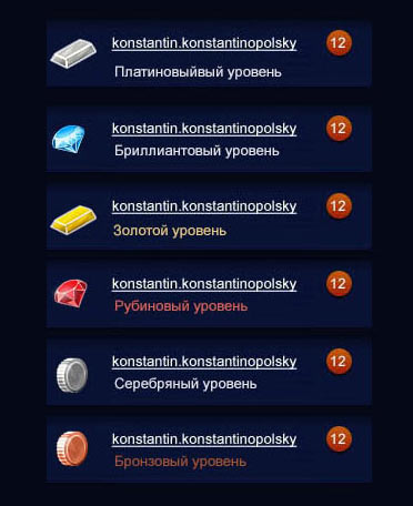
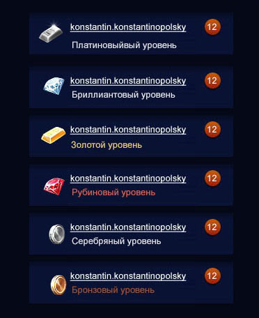
In the process the level idea gets abandoned entirely.
Drawing the final graphics, icons for the promo page, correcting a bunch of small bugs. By the time we are finished, the Stoloto logo gets updated, so we abundantly use it in different scales on the website.
The technologist turns pictures into code. Celebrating the launch!
