/pl.gif) Technogrette
Technogrette

|
Sergey Kulinkovich
Ten rules of good forms December 20, 2012 |
|
The speed of solving user tasks and the overall impression left by a service are often largely determined by successful interaction with forms. User authorization, filling in shipping address, payment information or account details are all done with forms which require attention.
A form is good when a user has no questions when filling it out. To achieve this, it is enough to follow these rules:
1. Suitable control elements
Interface elements have to correspond to the type of information expected from the user.
 |
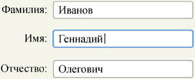
Text input fields. |
 |
Radio buttons for choosing one value out of many. |
 |
Check boxes for choosing one or several values. |
 |
Buttons for actions. |
The full list of controls is available on the W3C Recommendation website.
Interactive properties of interface elements must also apply to their labels. For example, clicking a radio button label should change its value.
Visual styles of control elements must unambiguously convey their mode of operation. This is why all control elements must inherit specific traits known to the user.
| Correct | Incorrect |
 |
 |
Visual representation of form elements should help user estimate the approximate volume of required data.
| Correct |
 |
| Incorrect |
 |
2. Field validation
Form field validation must take place as the form is filled out. At the same time, the system shall be silent while the user enters data and point out the mistake only when the value was entered (focus was moved to another element or the Submit button was clicked). When the user goes back to the field to correct the mistake, validation of the field must happen continuously during input.
Messages about errors should contain information on how to fix them.
| Correct | 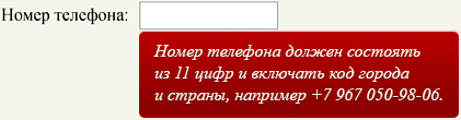 |
| Incorrect | 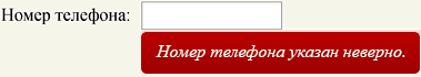 |
3. Error protection
Form submit button should remain inactive until the user has correctly filled all the fields.
At the same time, the user should know why they can’t press the button yet. For this reason in large forms (where error messages can appear outside of the current screen) it is helpful to place pseudo links to fields with errors.
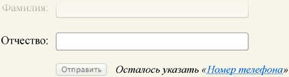
When the user presses the inactive button, they should be brought to the first incorrectly entered field.
4. Help and prompts
The user should always understand which data they need to enter and why. This is why in complex forms all non-obvious fields should be explained.
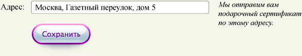
If the form contains fields for personal information such as phone number or address, there should be a note on how this information will be used.
5. Proper layout
The user should be able to quickly understand the size and structure of the form and the sequence of fields. To this end, form elements should be aligned on one line and grouped logically.
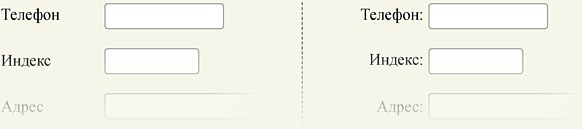
Labels should be positioned to the left of entry fields. In the case where block width is limited, such as in mobile versions, labels can be placed above entry fields.
If field labels are aligned along the right edge, each should include a colon.
Sometimes in order to maintain a compact layout field labels are put inside entry fields. This is allowable only for very short forms (such as authorization forms). Otherwise the form will become unreadable when the user populates the fields with data.
Form area should be clearly separated from other elements on the page.
| Correct | Incorrect |
 |
 |
6. Correct focus
The field with which the user currently interacts must be highlighted. When the page is first loaded, the focus must be put on the first entry field.
7. Data retention
The form must “remember” all entered information. In case of an error, reloading or accidentally closing the page the user should not have to enter the data all over again.
8. Keyboard support
Users should be able to go from one field to another with the Tab key in correct sequence and choose variants in autocomplete fields with arrow keys without having to use the mouse.
9. Obvious buttons
At the end of any form is a button that sends all the data to the server. The caption, which should always be a bare infinitive, should correspond to the action that will happen after the button is pushed. For example, a search form would have a “Find” button, an authorization form—an “Enter” button and an order placement form—an “Order” button.
There must only be one main button on the form page. If a user should be able to do other actions such as upload files, corresponding control elements should be less conspicuous:

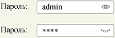
10. Keeping secret data
If a form implies entering secret data such as a password or a credit card number, a user should be able to hide this information from prying eyes.