/pl.gif) Technogrette
Technogrette

|
Dmitry Kharchenko
Using filters in IE November 11, 2010 |
|
 Internet Explorer is required to view this example.
/cc4.gif) |
Task: | to create a nice shadow under text and glow for pictures in IE. |
/cc1.gif) |
/cc3.gif) |
/cc2.gif) |
Sometimes you need to create a shadow under text. In many modern browsers it can be easily done with text-shadow CSS property. However, in the case of IE we have to find workarounds since it still does not support this property (at least as of IE9 beta).
Internet Explorer has a whole bunch of filters for various effects. Unfortunately, the Shadow filter created specifically for making shadows gives an incredibly poor result. But there is a trick we can use here: filter effects can be overlayed on top of each other.
|
Note |
To make it work, the According to the new Microsoft specification, the format should be this: Simply writing |
Solution
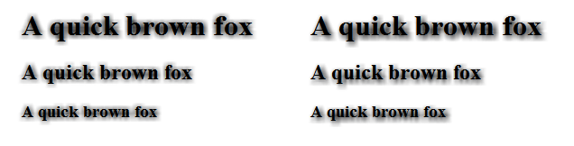
In the article (Almost) Cross Browser Text-Shadow by Kilian Valkhof the author explains how to create a more or less passable shadow in IE using Glow and Blur filters. The idea is that first we use Glow to create a halo around the text and then blur it with Blur. The resulting shadow is then placed under the text using absolute positioning. The result is acceptable but slightly rough especially if the shadow is moved relative to the text (IE is required to view this and following examples):
A quick brown foxA quick brown fox
A quick brown foxA quick brown fox
A quick brown foxA quick brown fox
A quick brown foxA quick brown fox
A quick brown foxA quick brown fox
A quick brown foxA quick brown fox
This is what CSS code would look like:
|
|
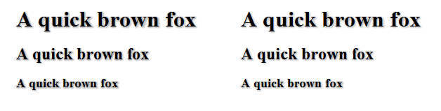
Turns out, the Glow filter is at fault here. To make it nice, let’s turn its strength down to 1, change the color to black (the alternative is to replace Glow by dropShadow which has more understandable parameters) and add another filter, Alpha. Here is the result (Glow on the left, dropShadow on the right, the differences are negligible to the naked eye and can be brought down to zero with further tweaking):
A quick brown foxA quick brown fox
A quick brown foxA quick brown fox
A quick brown foxA quick brown fox
A quick brown foxA quick brown fox
A quick brown foxA quick brown fox
A quick brown foxA quick brown fox
Here is the CSS code for this case:
|
|
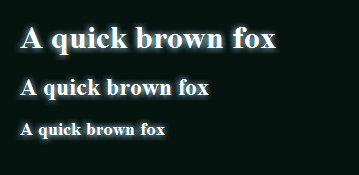
In the same way we can create glow around the text. The live example can be seen in the menu on Mriya website. Funnily enough, this could be done in IE5 when text-shadow didn’t even exist.
A quick brown foxA quick brown fox
A quick brown foxA quick brown fox
A quick brown foxA quick brown fox
Bonus track
The method described above has one other interesting application: making images glow.

Here is how it can be achieved:
-
We start by placing a copy of the original image under the original and move it up and left to the value of
Blurfilter’spixelradiusproperty (or their sum if several filters are used). -
If the background is dark, the first filter we apply is
Wave(freq=100, lightStrength=100, strength=0, add=1). Basically, it will make the image two times brighter. - Next we blur to our liking.
-
To smooth glow angles we add another filter,
Alpha(opacity=100, finishopacity=30, style=2). Thestyleparameter with a value of 2 means that opacity will change from the center (opacity) to the edge of the image (finishopacity). You can read more about this and other filters on this website dedicated to JavaScript.
CSS code for the example above:
|
|
In case with pictures there are three substantial drawbacks. First, the speed: a large enough image with glow will slow down the browser even on a more powerful computer. Second, glow is displayed differently on different graphics cards (the filter uses DirectX). Finally and probably most importantly, there is no universal solution for other browsers yet.
