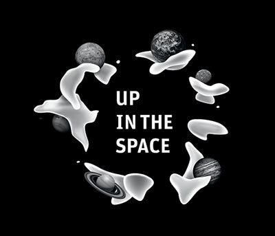
The making of the Up in the Space logo
Overview Process
Diving into space. Reading, watching and learning lots of interesting things.
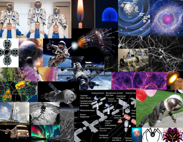
Checking out solutions that come up.
Designer: Polar lights is space breathing down on Earth. Spectral prints. Constantly expanding Universe. Space as a sea—technogenic jelly-fish. Such a cloudy space.
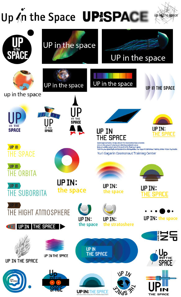
Art director: People fly into space to look at Earth from above. The polar lights and all other particles don’t work.
Designer: We could divide the name into two logical parts: the action—UP IN—and the direction—THE SPACE, THE ORBIT, THE SUBORBIT, THE STRATOSPHERE.
Looking further.
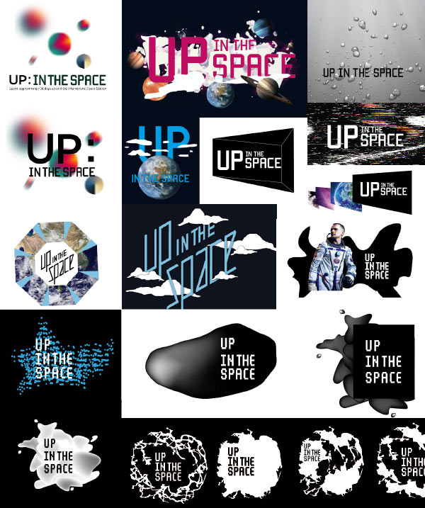
Designer: Let’s spill some milk in space. White matter that created everything.
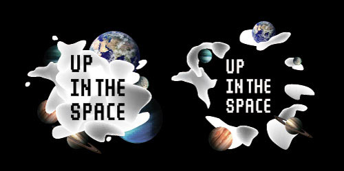
Art director: OK.
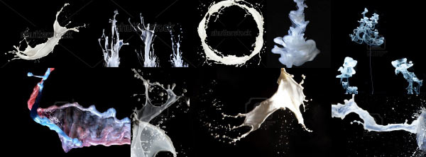
Looking at how milk splashes.
Deciding that we need something more abstract. Testing out 3Ds Max.
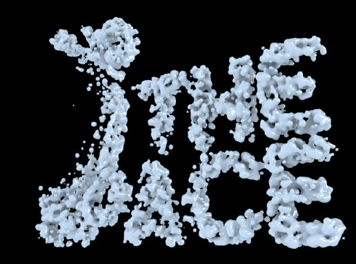
And then the RealFlow technology.
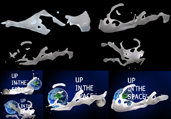
Deciding to use 3D only for planets and getting back to vector graphics. Simultaneously trying out other ways to develop the idea.
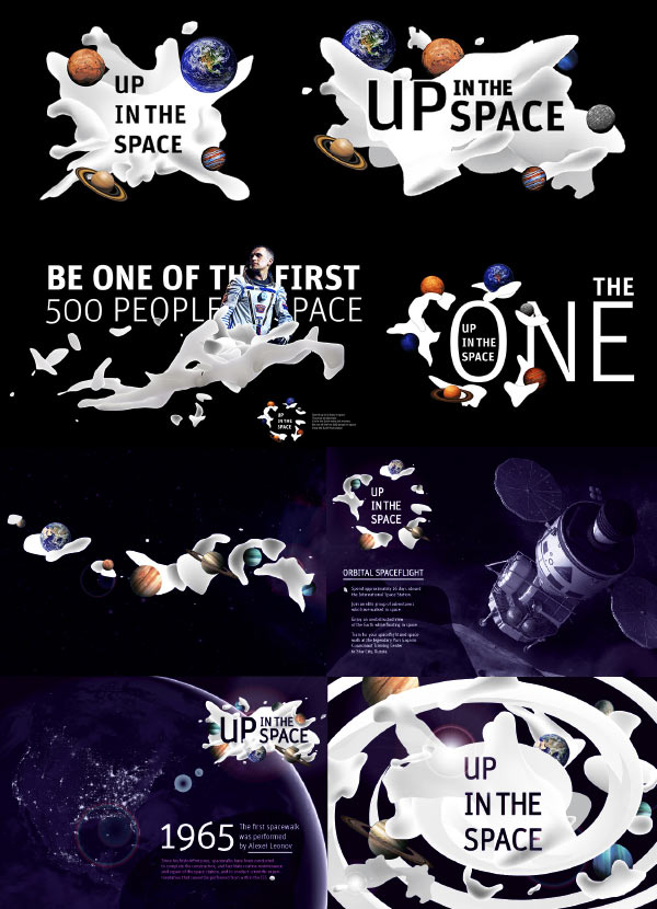
Cleaning up the final version, creating three alternative logos for different scales and a monochrome version. Done.
