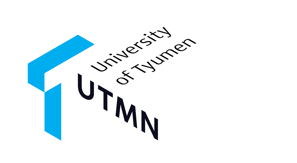
The University of Tyumen was founded in 1930 and is considered one of the best universities in the Siberia Region (and in Russia in general). Till this time, its logo remained as stable and solid as the establishment’s principles, only the direction of the ship sometimes changed.
At the beginning of the 21st century, the university decided that it was time to change, and it needs a new recognizable logo that would serve it for the next dozen years. Naturally, the university’s department of strategic communications addressed this task to the studio.

The logo combines a three-dimensional letter T and the number one brightly lit from one side. The arrangement of the textual part of the logo strictly adheres to the rules of the dynamic three-dimensional environment in which the logo exists.
With the letter T, it’s all clear: it is the first letter in the name of the university and the name of the city where it is located.
Number one is an obvious choice for the city’s first college. The historical and educational leadership has never been reflected in the logo before, and now it is fairly obvious to everyone.
Light blue is chosen as the main color. It is pure and bright (and it fits perfectly with the current university’s color palette). Nevertheless, if required, the color can easily be changed to adapt the logo to the university’s needs and to attribute it to a selected department. Each department can choose a color of their liking.
The logo can decorate hoodies, t-shirts, sweatshirts and any other apparel.

For business cards and documents, separate elements of the logo are used.


art director and designer
designer
project manager
- The studio wishes to thank Elena Druzhinina and Ivan Kruchinin for their comprehensive assistance with the project