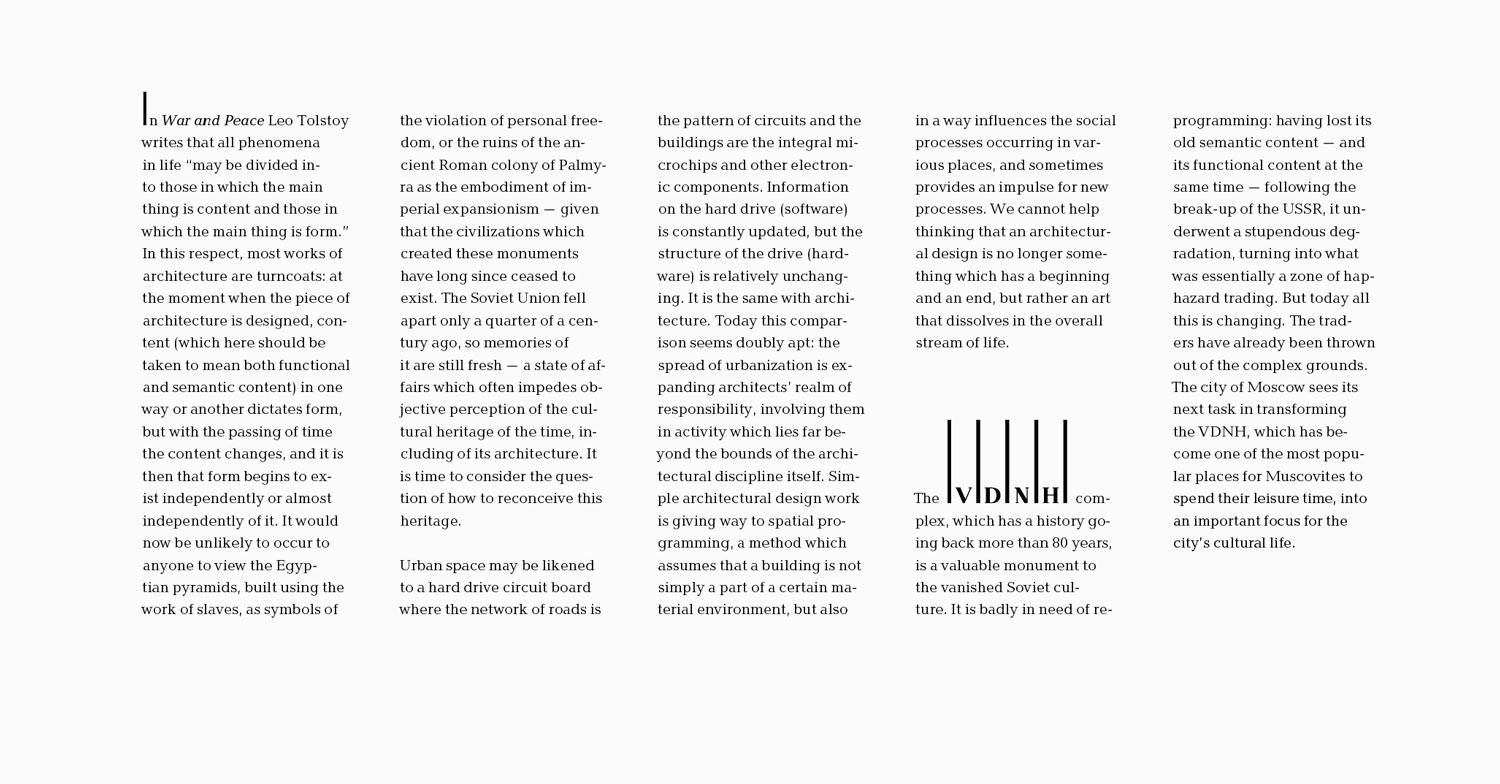
Russia’s 2016 exposition at the 15th International Architecture Biennale in Venice is dedicated to VDNH, an outstanding architectural monument of the Soviet era. A typography-based design was created at the studio for one of the exposition halls that contains the exposition manifesto and presents interviews with architects from around the world about VDNH.
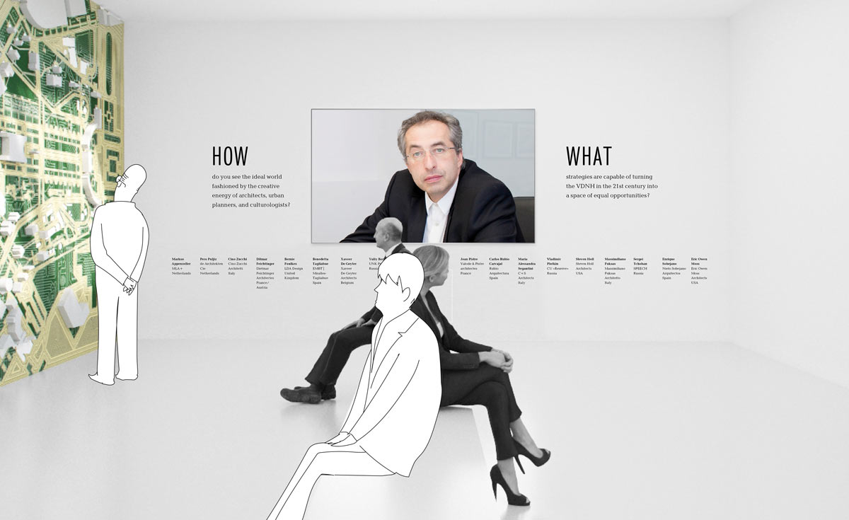
Baltika, Russia’s pavilion corporate typeface, is used in the text matter. The manifesto is typeset in five columns representing the five vertical lines of the logo which in turn reference monumental colonnades of VDNH and poles in the Gulf of Venice. An additional display typeface used in headlines rhymes with the text portion of the logo. The airy composition makes the strict and solemn typesetting look light and modern.