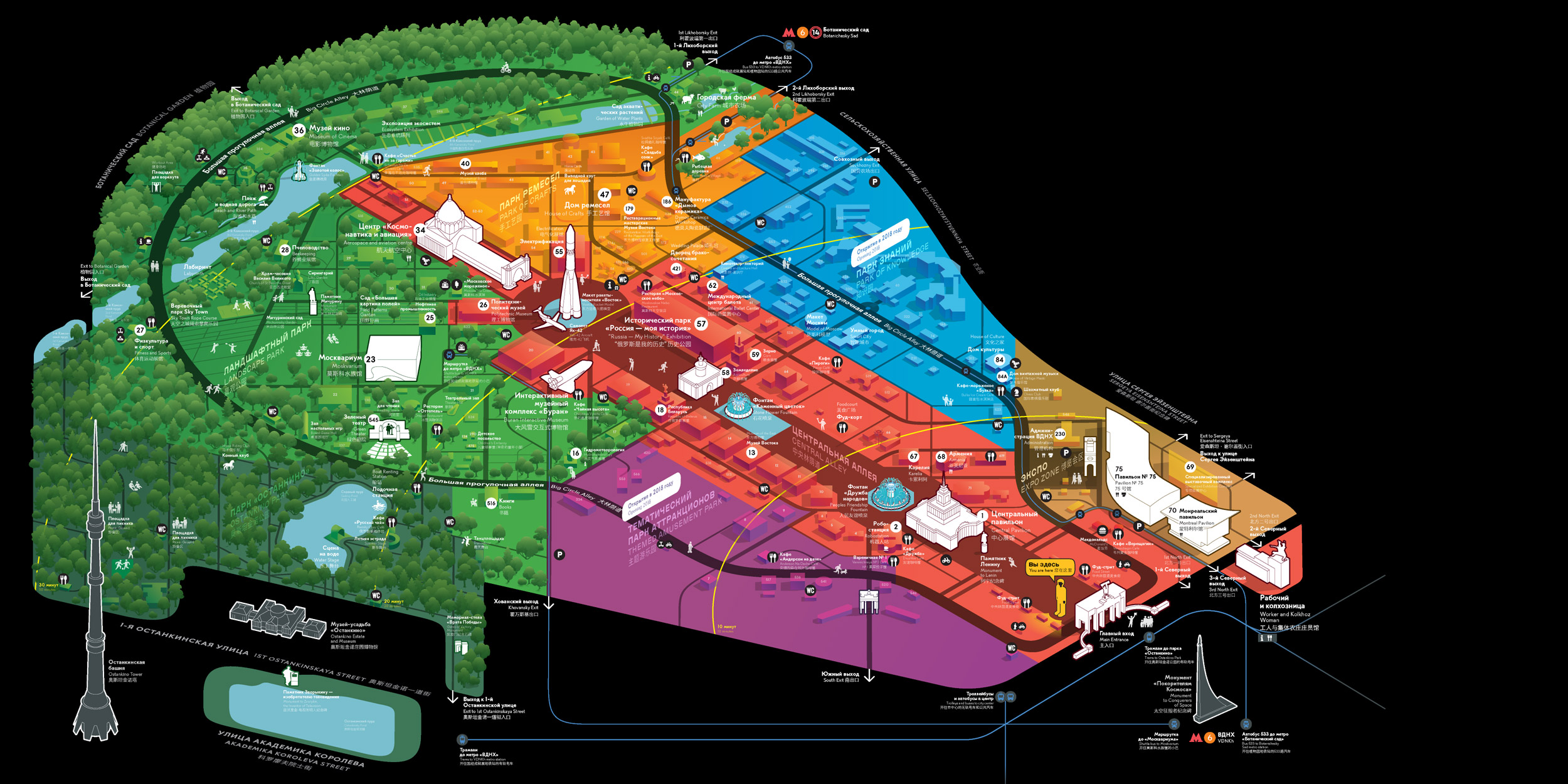
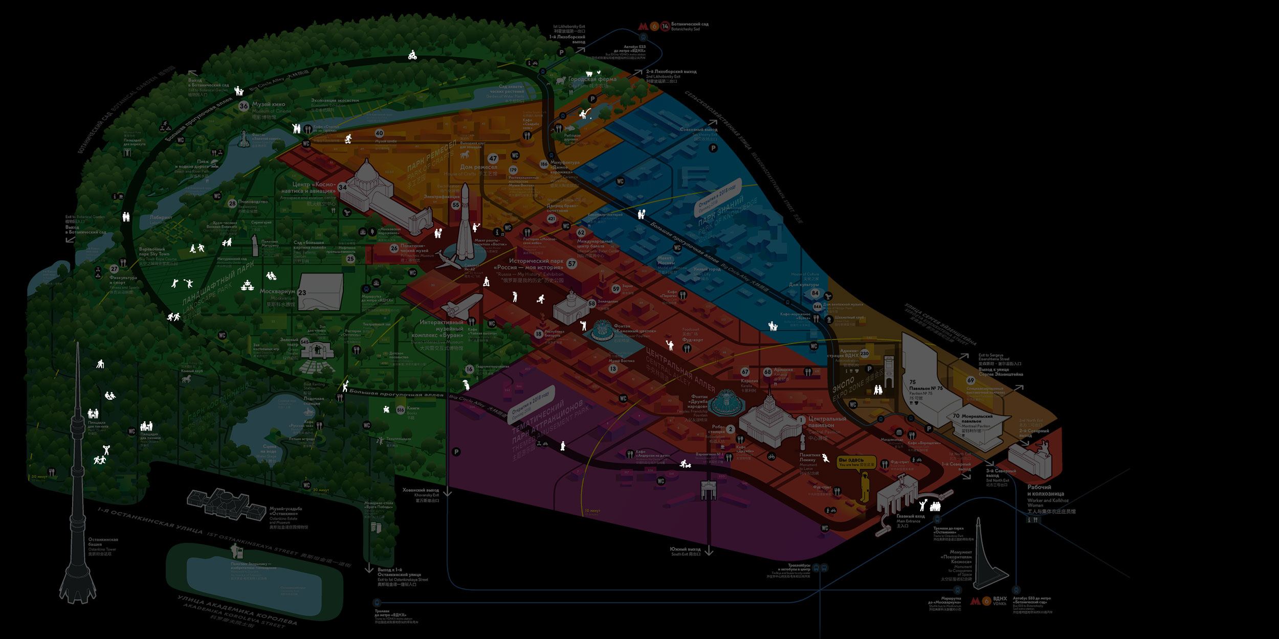
Ask any Moscow resident about the most interesting landmarks at VDNH and you will invariably hear about the fountains, the pavilion with the spire and the rocket at the end of the Central Alley. Reach it, and you can consider the trip a success. But this is just a small fraction of all the cool stuff VDNH has to offer. Today it has a knowledge park, an artisan park, a landscape park as well as amusement rides. The new map shows the famous Moscow exhibition in all its glory.
For a map to be more useful than Google Maps, it has to be based on the way people see the space.
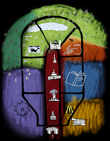
The brain is lazy and the memory is limited, which is why people don’t remember every single thing they have encountered in their life in detail. Instead, their memory contains an image of those objects, their mental models.
Everyone remembers VDNH differently, everyone has their own map of it in their brain
A drawing of the map from memory is a projection of the mental model of the territory that can be analyzed. Before starting the work on our map, we gathered dozens of such drawings.
After comparing all drawings we were able to see common patterns. The result is a collective image of VDNH
Here, the shapes are simplified, zones can be easily identified, there are several key landmarks and of course a blind spot beyond the Central Alley.
Other areas worthy of attention were laid over the collective image
This resulted in a map familiar to visitors but with new elements.

Just like in the movie Inception, we created a basic image that can be planted into someone’s mind. It doesn’t conflict with the mental image that each visitor has, so every park guest remembers it well. What’s more, they are sure that it was them who memorized it all so well.
The mental model was used to create a complete map of VDNH.
While being detailed and informative, the map maintains three basic properties of a mental model: zoning, simplification and clear hierarchy.
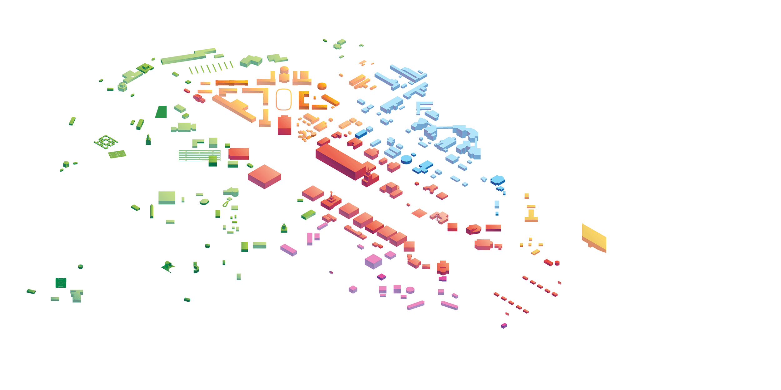
Early prototype of the map
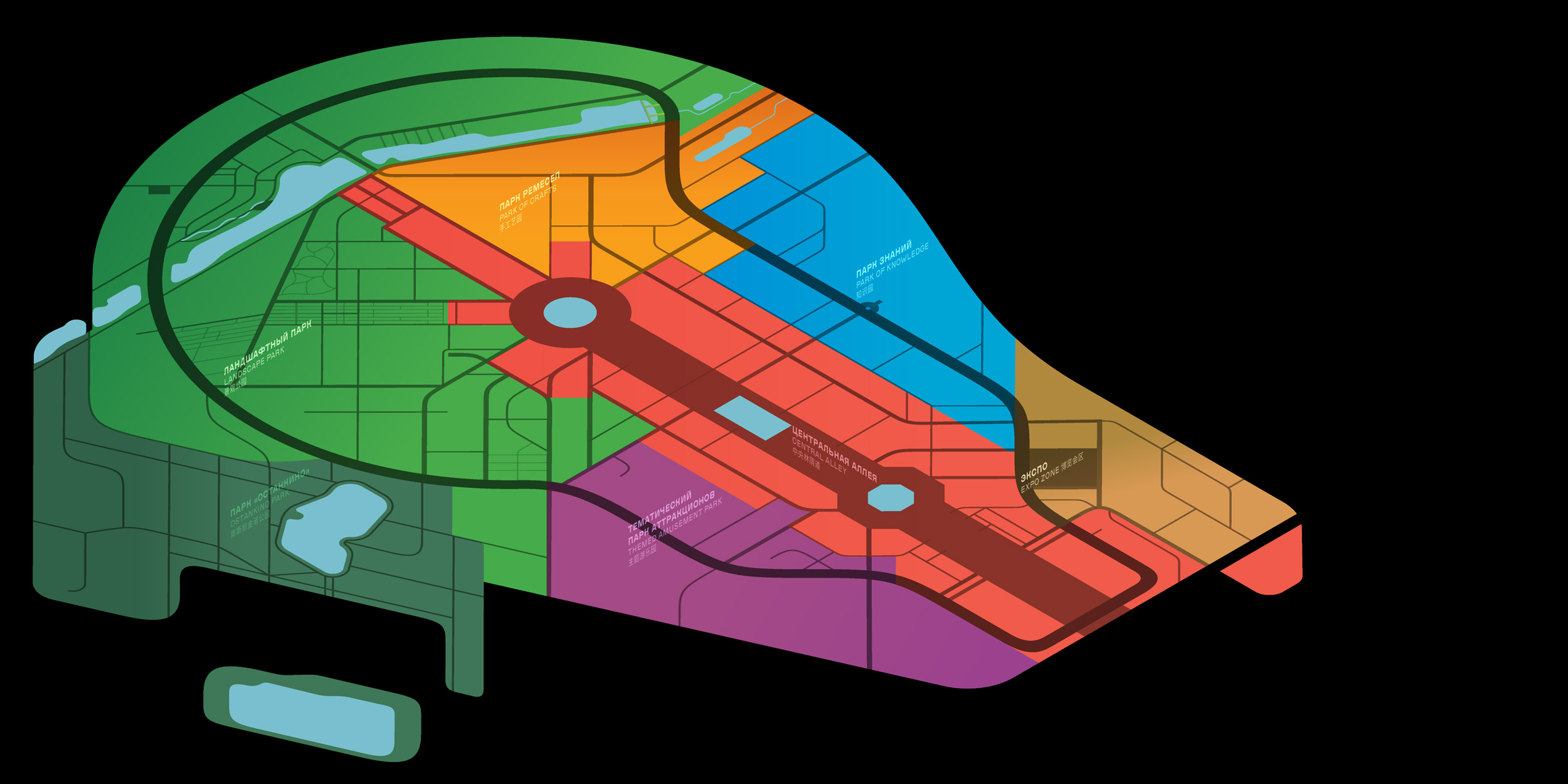
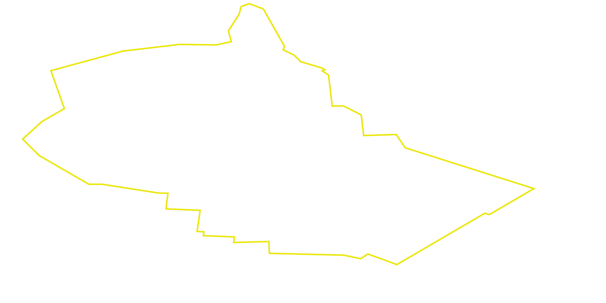
Actual outline of VDNH


1.
Zoning
Previously, the Central Alley was a synonym to the entire VDNH. Today it’s only one of seven themed zones each with its own name and color that are carried through the entire navigation system. Meaningful zoning of the territory helps better remember its layout.
2.
Simplification
Visitors don’t need geographically precise contours of VDNH and georeferenced pathways. Simplification of the shape of the territory and of the network of walkways made the map clean and memorable, yet still topologically correct.

Isometric projection allowed to make the map twice as large on media of the same size and show buildings at a more familiar angle
3.
Hierarchy
Based on the popularity of the pavilions and the priorities set out by VDNH administration, the contents of the map were divided into levels of importance each located on its own graphic layer.
Looks childish by comparison but on a map simpler is better
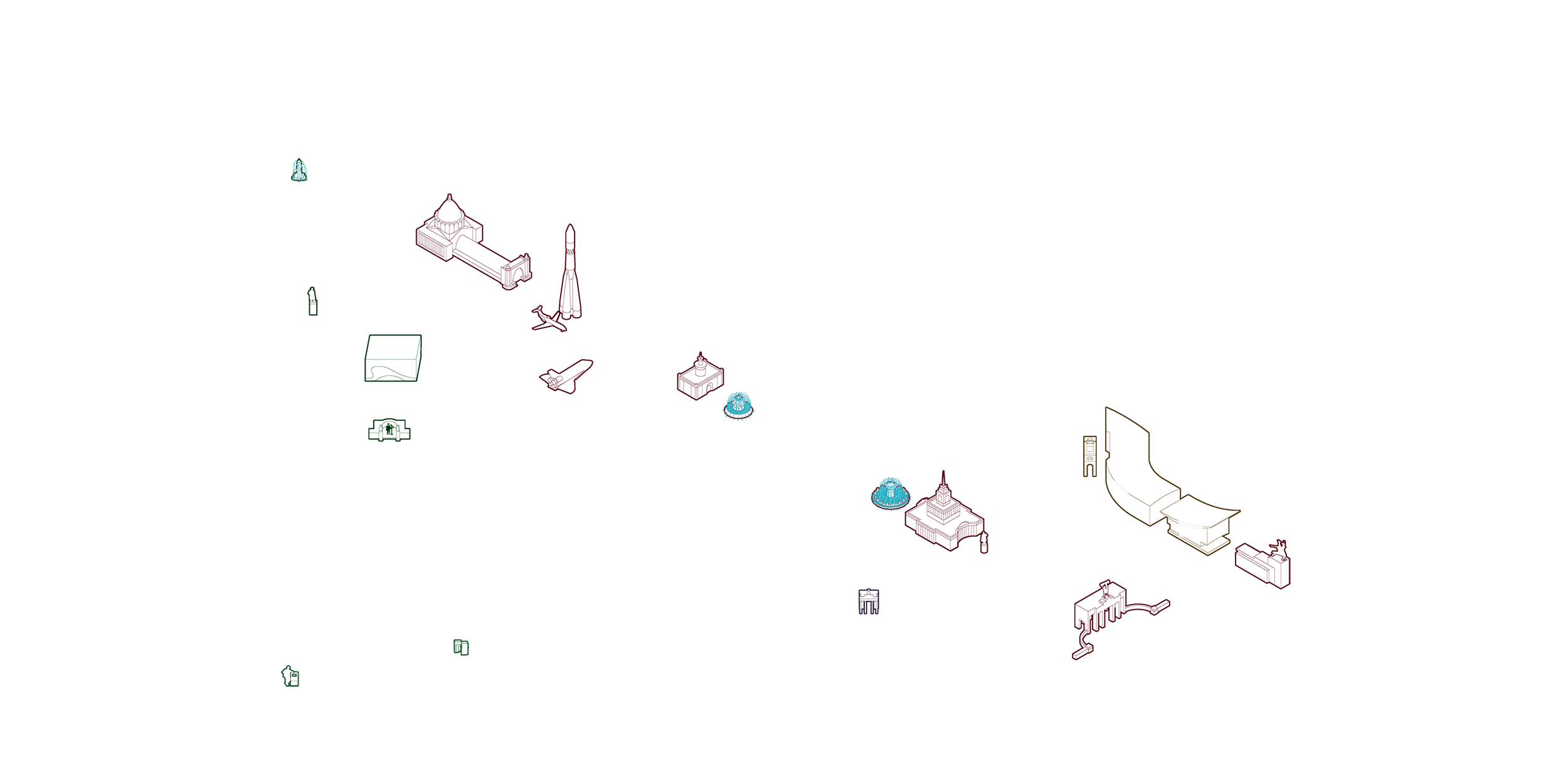
The most famous pavilions and key landmarks are made more noticeable. The drawings do not have engineering precision to them but instead are exaggerated to become more recognizable.

Other pavilions are built from basic geometric shapes and are colored in the color of their zone. This ensures the map is not overloaded with details.
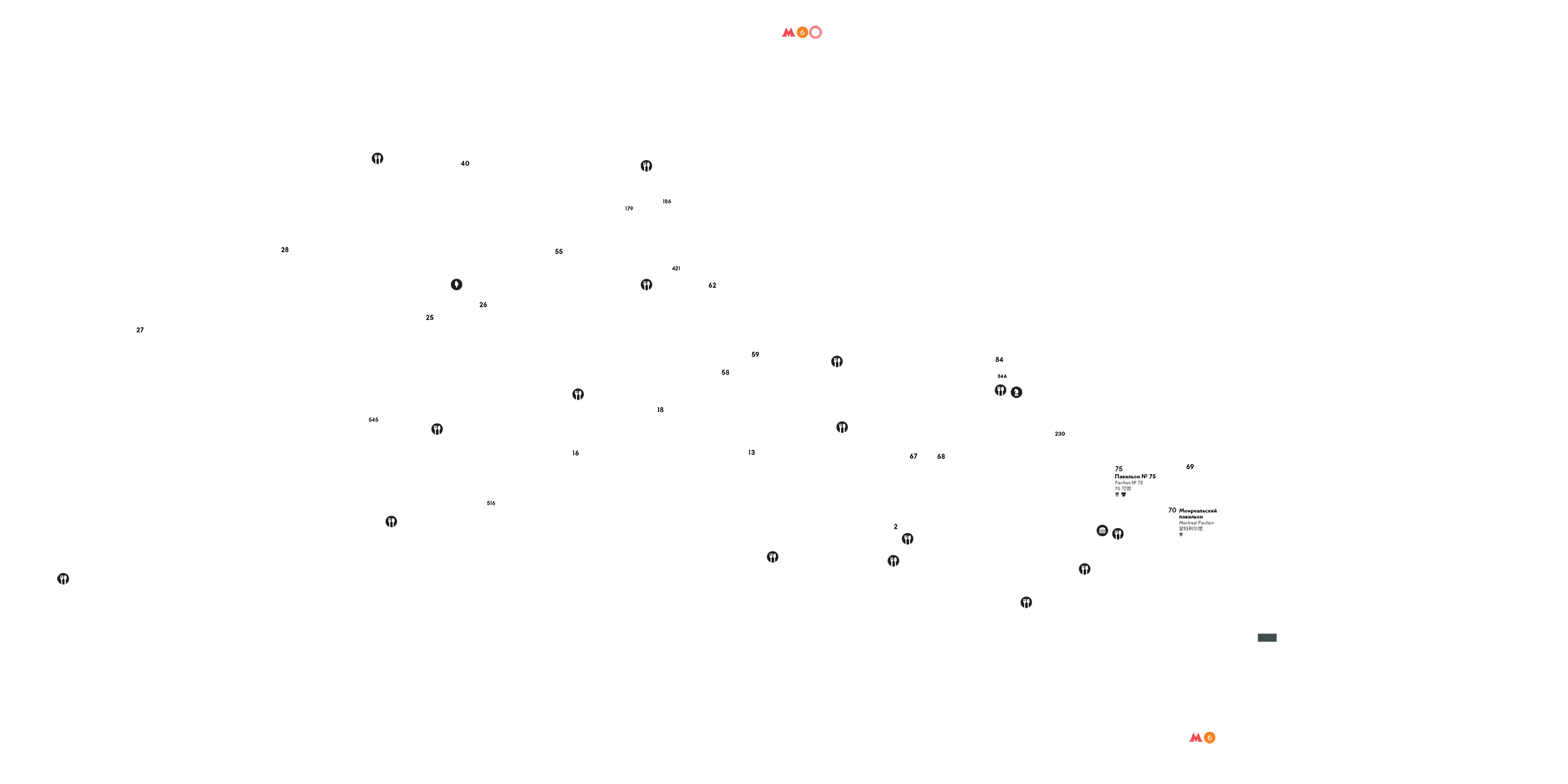
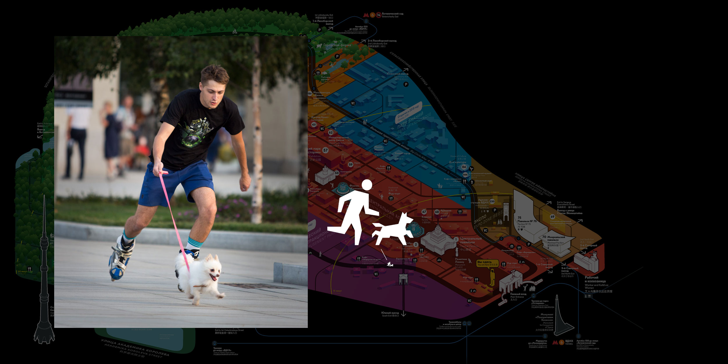
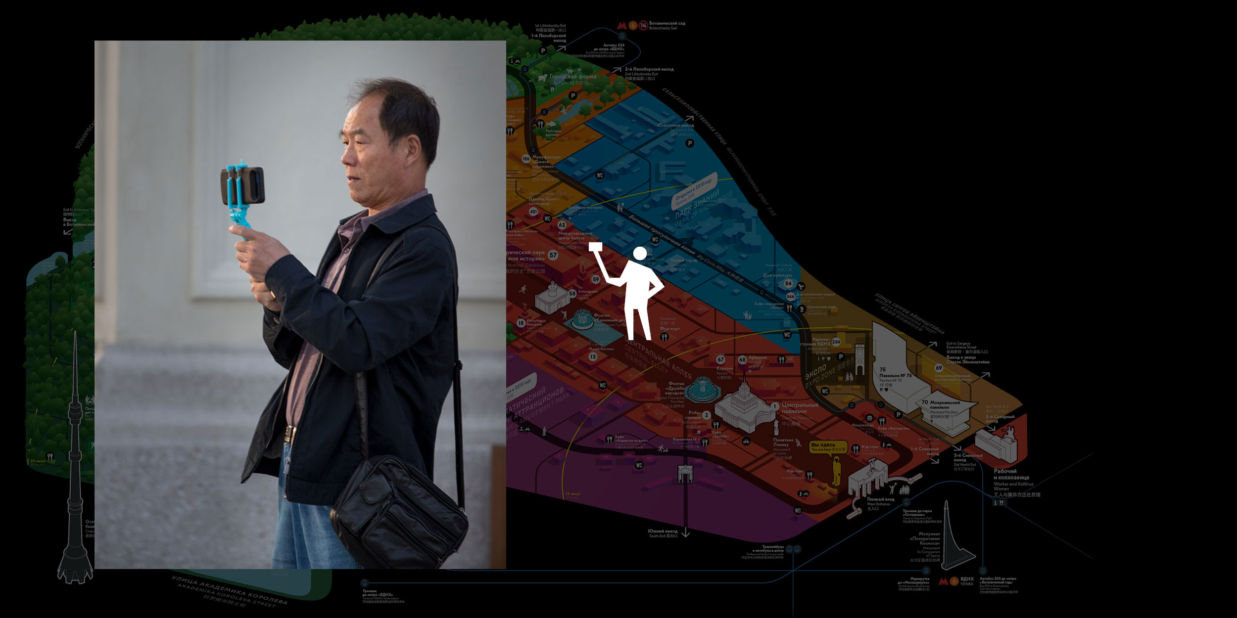
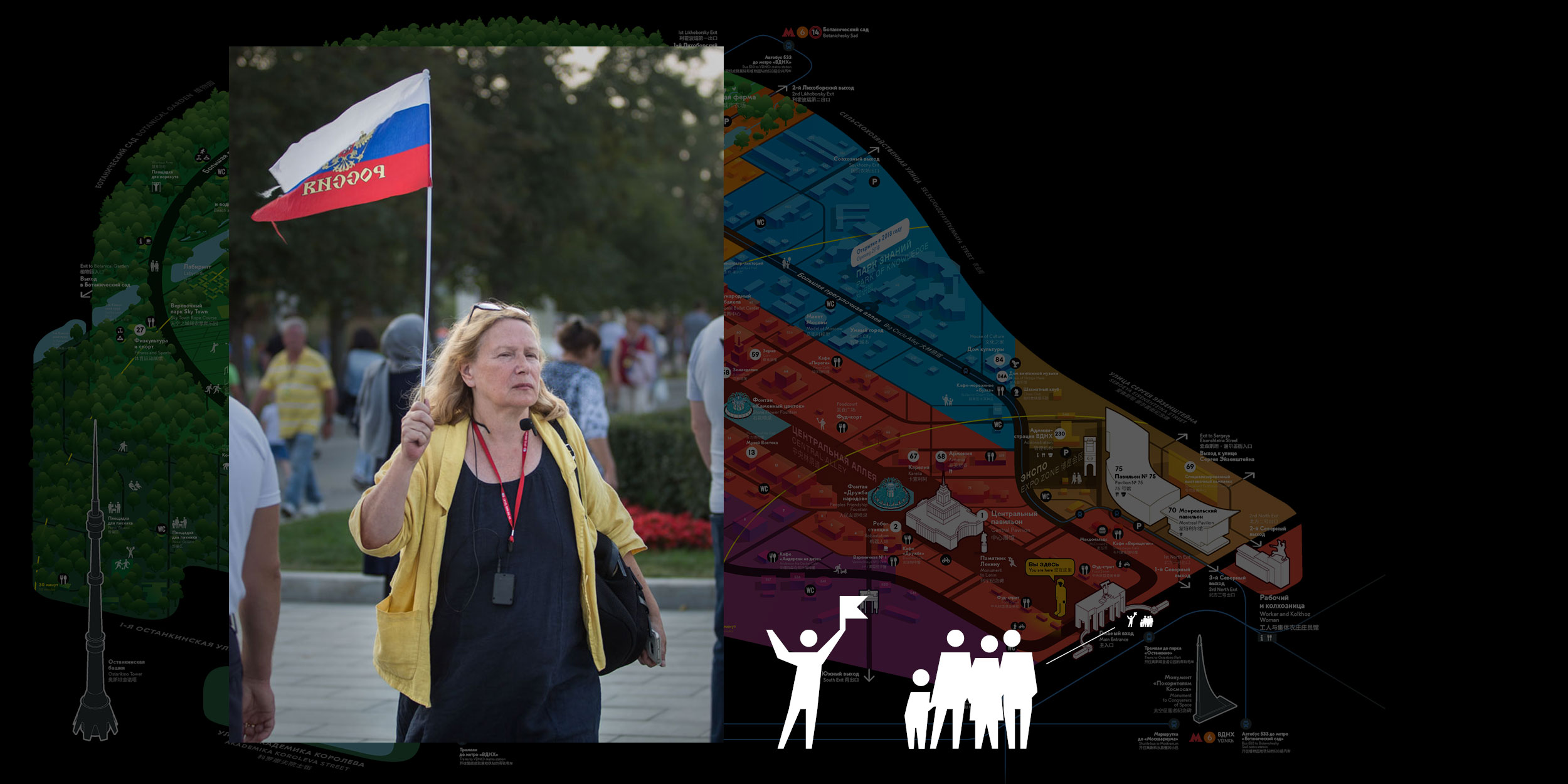
Icons are drawn in a lively chopped style. They can be easily read even in small size and invite to be explored when rendered large.
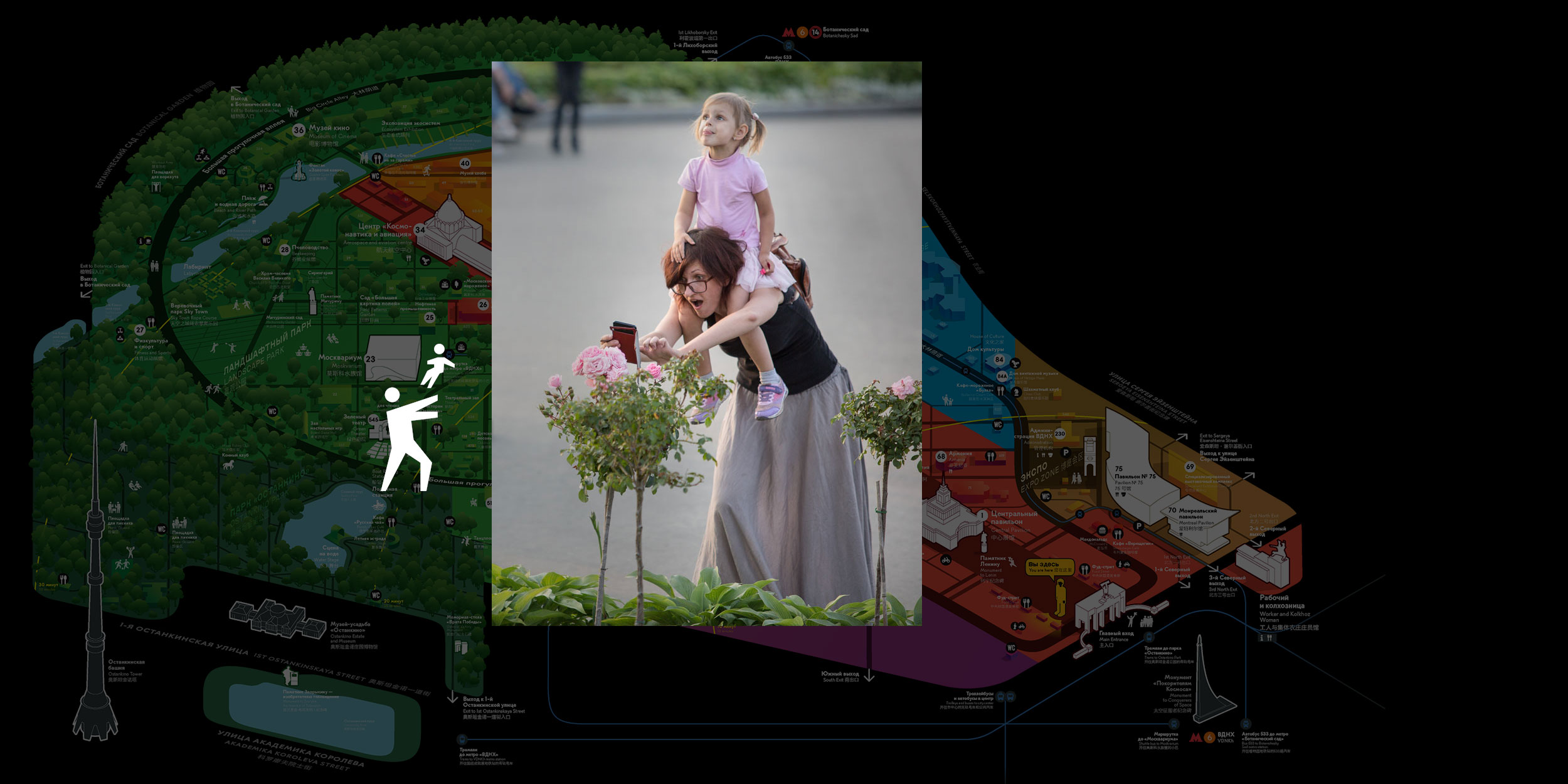
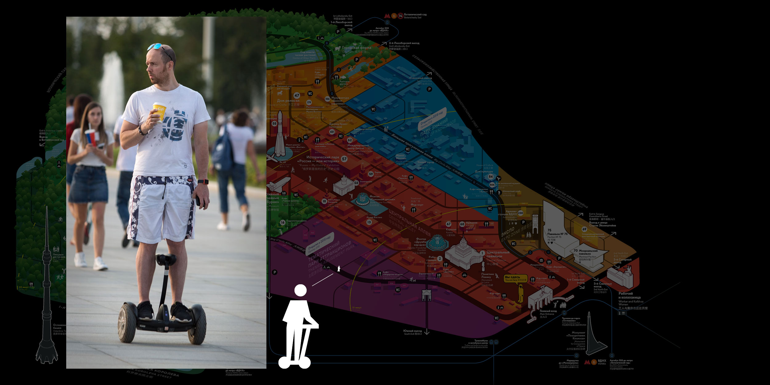
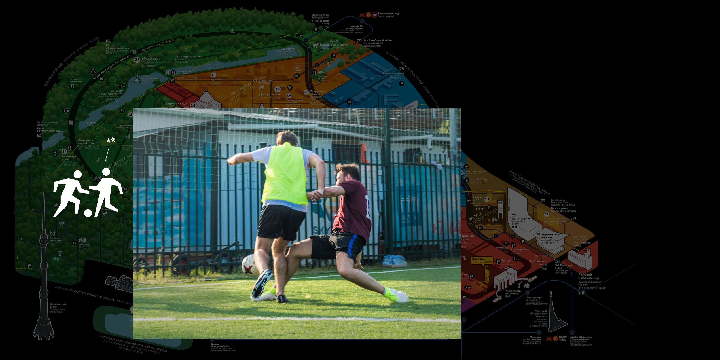
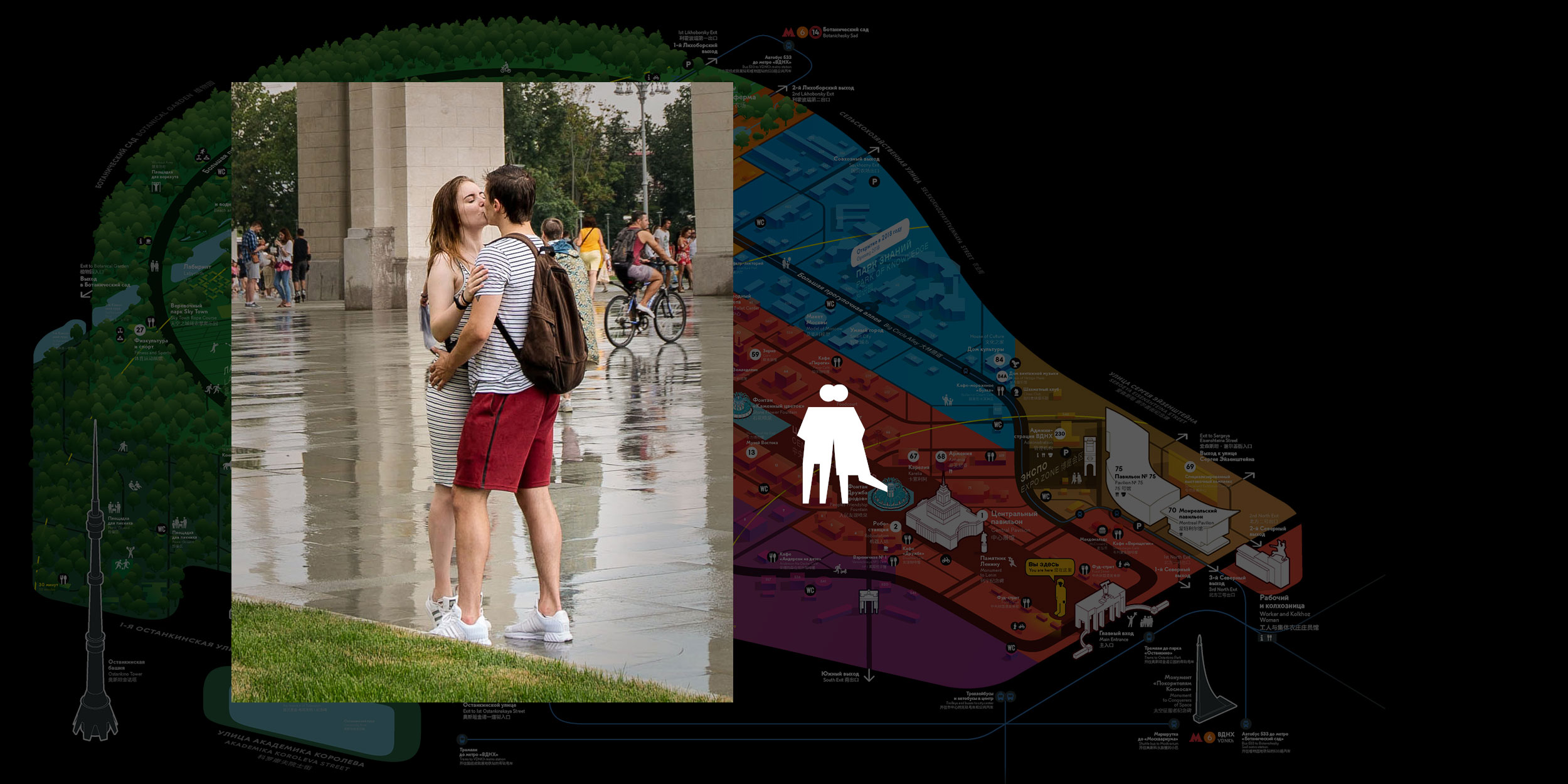
Visitors walk on the territory of the complex, just like in real life.
The map looks great on any background and can be rendered on any media with little effort.
We also developed a navigation system and information signs for VDNH
