VkusVill is a large chain of stores selling natural products. They offer the freshest fruit and vegetables, milk, the tastiest meat and fish.
We restyled VkusVill’s logo making it lighter, more elegant and better emphasizing the close connection of the company to nature.

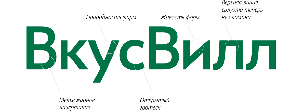
Specifically for the new logo we created striking grotesque lettering. The open shape of the letter С symbolizes friendliness.

The curved dynamics of the letter У reminds viewers of nature (VkusVill sells fresh and tasty products, just like in nature).
Thanks to their softened shapes and smoothened lines, the letters К and У look lively.


The letter Л has changed a lot. The new curve added gaps between the two letters making the logo cleaner, brighter and lighter.


The new logo with its thinner stroke lines is a better fit to the store’s healthy and light image.

