
|
The development of the bank’s new corporate identity started with a new logo. We decided to keep the existing logo in place but redesign it. Lower-case letters were added to the bank’s name, while the full name on top was removed.
|
|||||
|
We rejected the decorative typeface and pseudo-three-dimensional effects altogether, and instead created a typeface based on the proportions of the new sign. 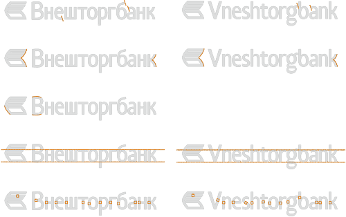 Common elements of the updated logo and the new font
|
Sign structure |
||||
|
The new logo became the basis for Vneshtorgbank’s new corporate identity. Logo: lightweight, legible, non-aggressive, strict and contemporary
|
|


Order a design...