The making of the Wellum logo and corporate identity
Overview Process
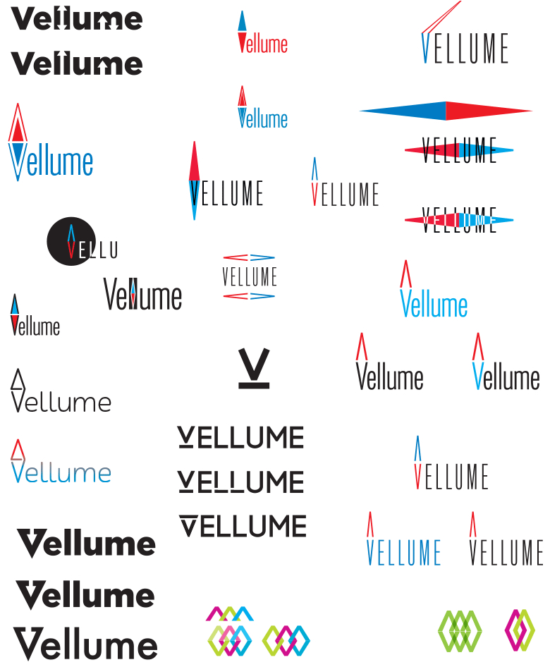
Creating the name: Vellume. Piling up the first ideas.
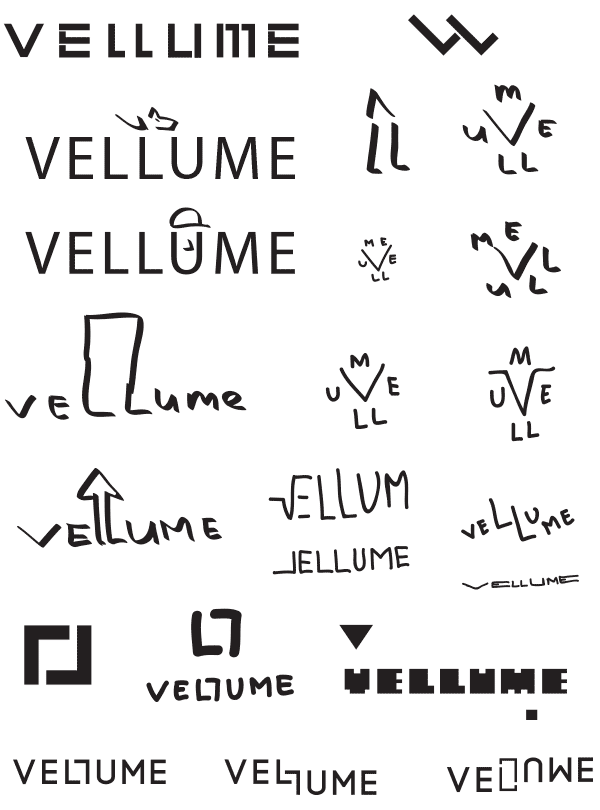
An idea is born to do something with the double L in the name. This leads to a powerful runic image.
Rhythm and perspective.
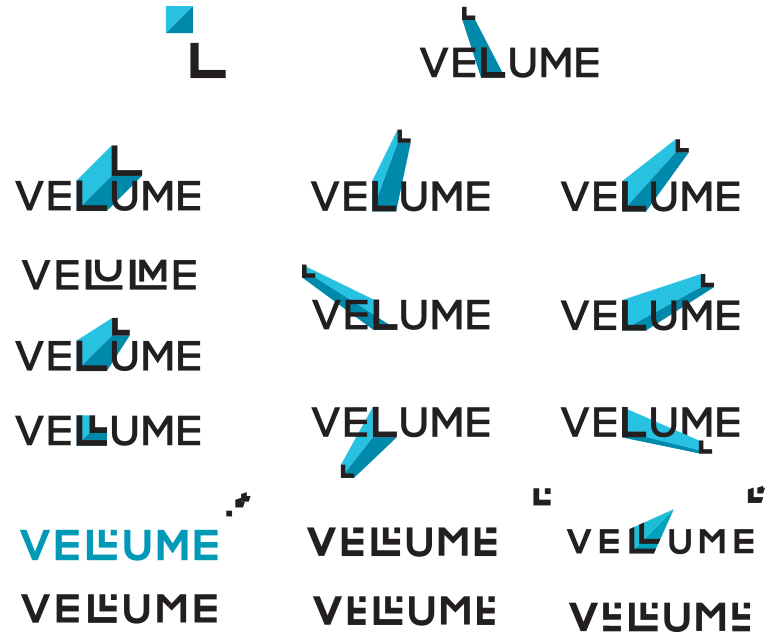
Double Ls also look like legs.
Drawing a guiding star.
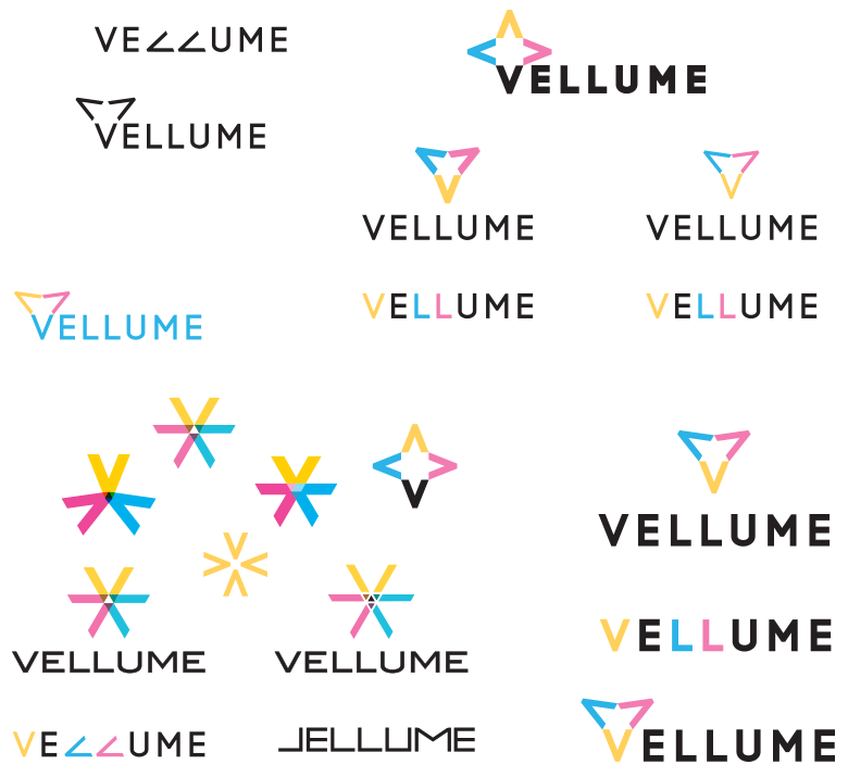
Preparing a presentation and showing it to the client. The client likes the rune idea, but thinks that the logo does not convey the character of the company to the full extent. The search goes on: compass, azimuth, direction, route.
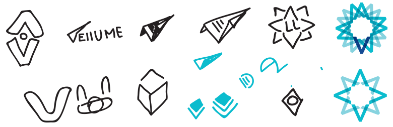
A fun idea with a spiral: it’s a nice metaphor for implementing solutions.
Triangulation, checkered geometric mosaics. The triangles form the letter V.
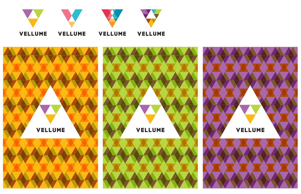
The sign can be different, but is always recognizable.
Artistic director: That looks like Polycom.
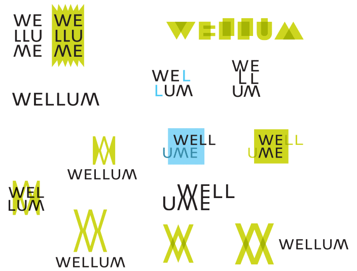
We need something laconic. Looking further and trying out other ideas with letter L.
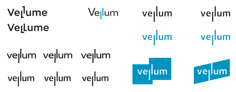
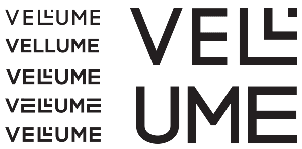
Deciding to drop the last letter e. The word sounds exactly the same without it, but the composition looks more balanced.

And another decision: we replace the first letter V with W. Now we can find a way to marry it with the M at the end.
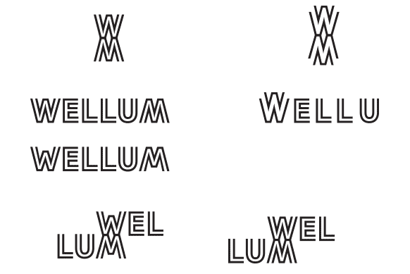
Unnecessary Xs are starting to appear.
Zigzag, sound wave, growth chart—anything?
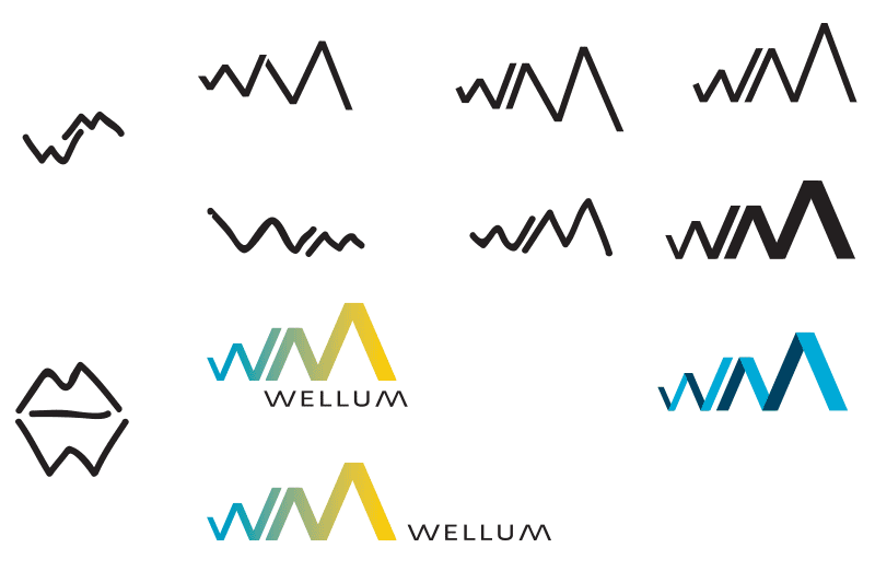
Nope, trying further.
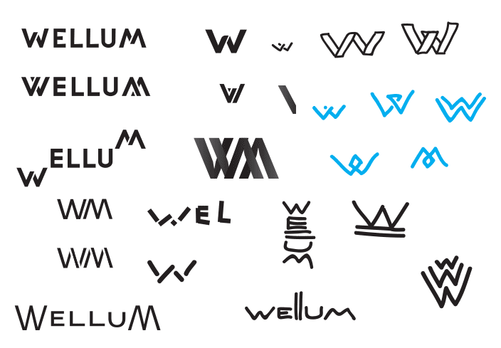
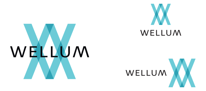
There. Looks like we found an interesting graphic solution: here we have the integration of the two letters, a combination of hot and cold, an abstract laconic symbol.
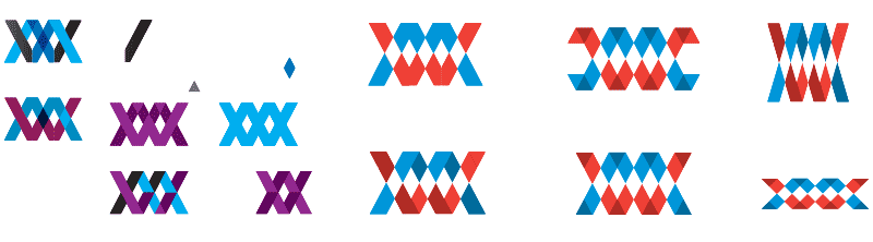
Demonstrating to the client, who likes it very much. So much, in fact, that he is ready to change the name of an already registered company.
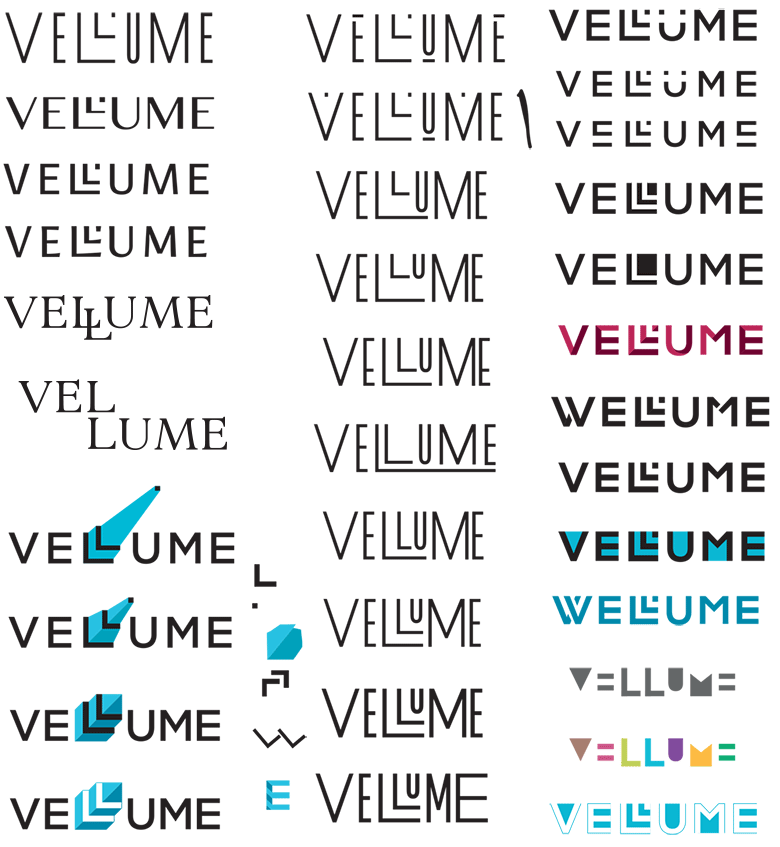
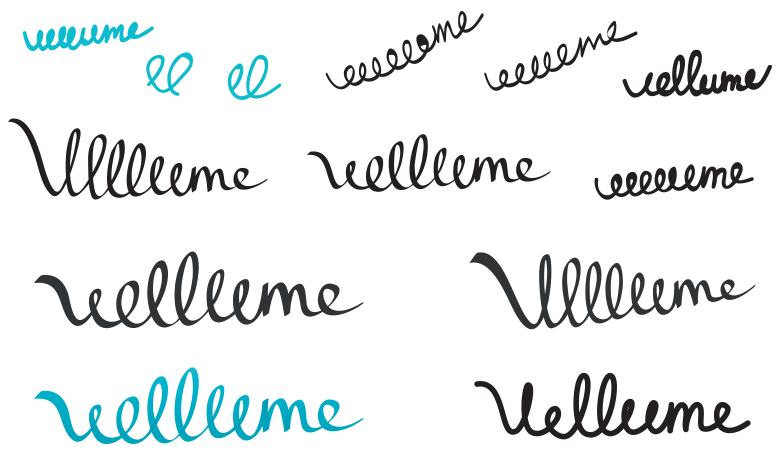
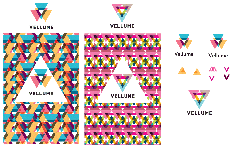
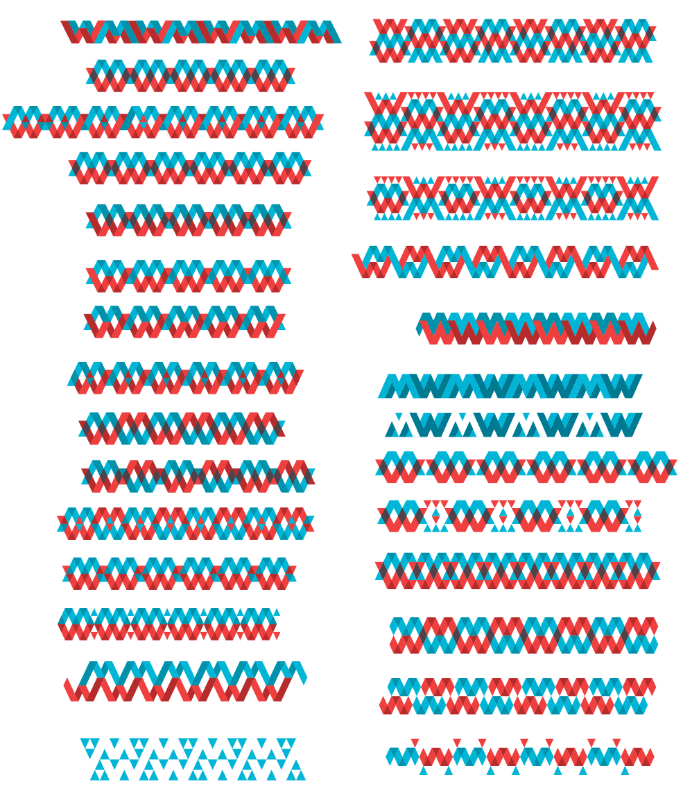
Developing the approved concept. Assembling a pattern and checking out how it might look in real life.
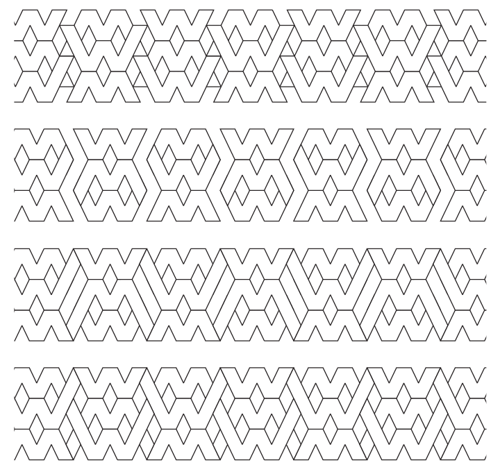
The client asks to get rid of sharp corners where the pattern comes together: they attract too much attention.
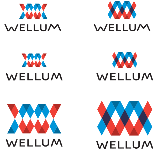
Simultaneously we keep searching for the form and width of the letters.
And creating new patterns.
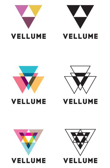
Trying to generate a monochrome version.
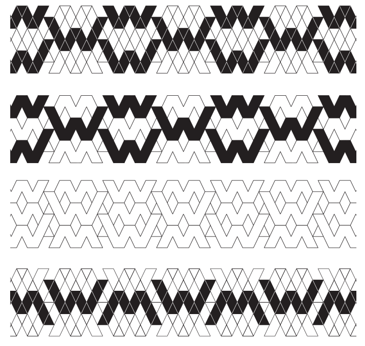
Looks better in outline.
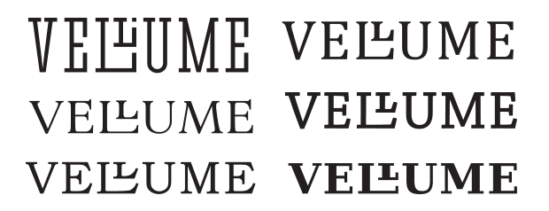
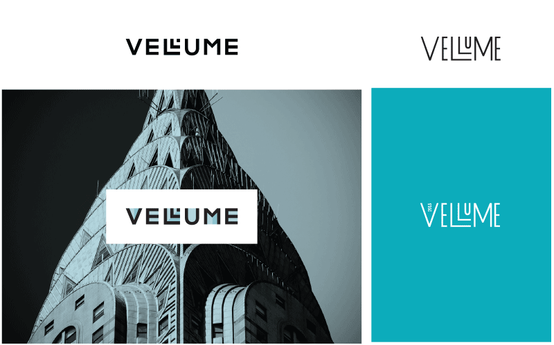
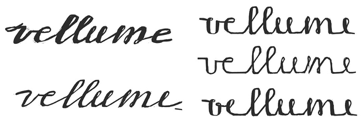
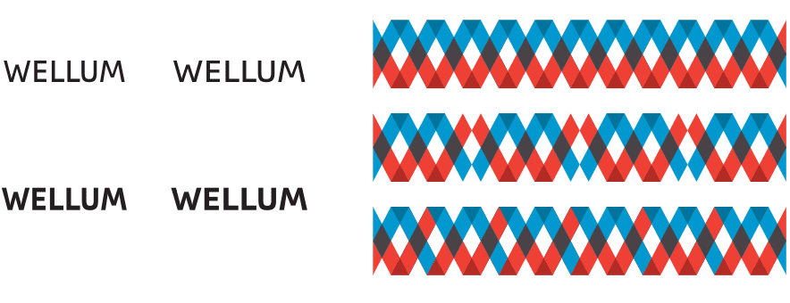
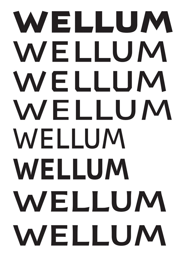
Looking for the style and density of the text.
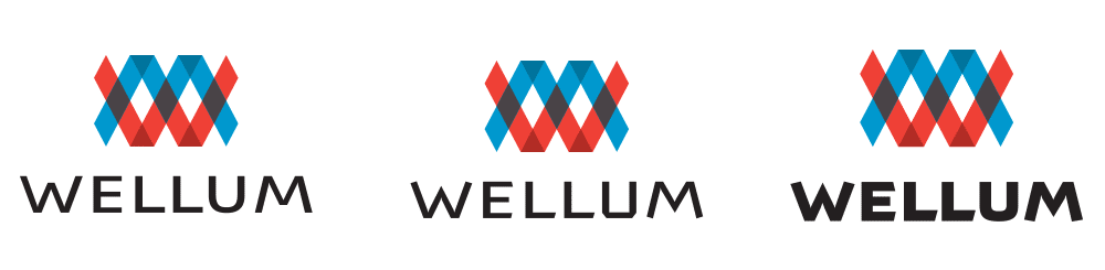
The client decides to use only the logotype, dropping the emblem. Drawing and fine-tuning the letters, all while discussing a lot.
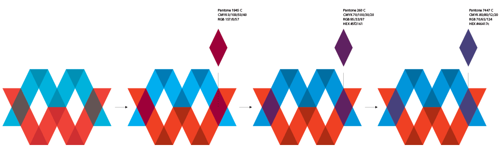
The letters are ready, adjusting and picking the colors.
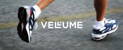
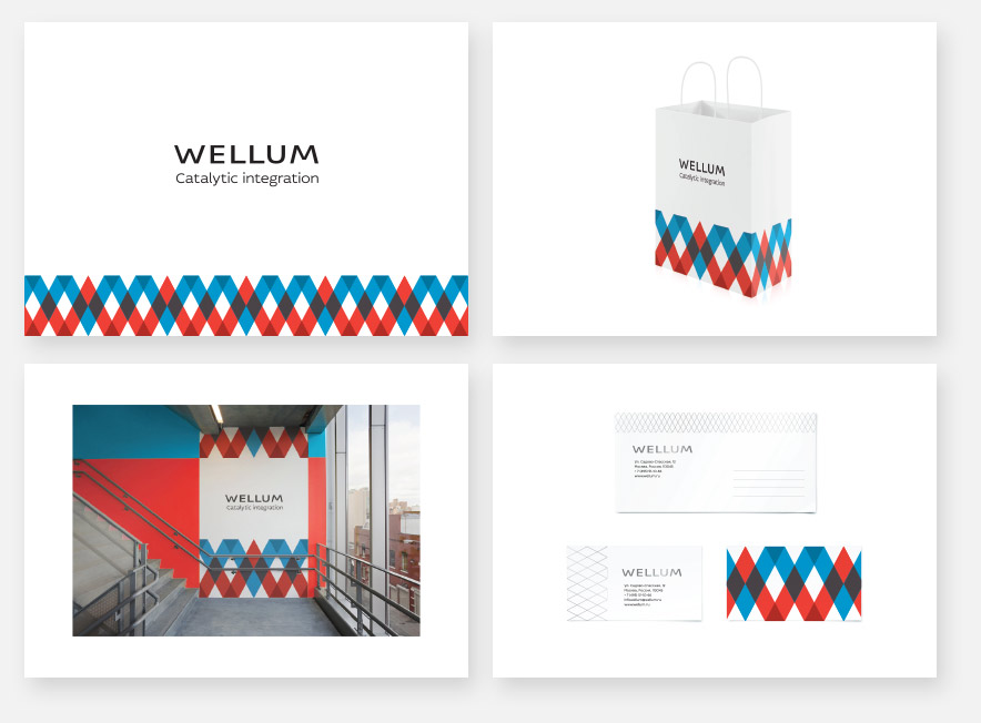
Working on the details, assembling the guide and it’s done.
