1.0 2.0
The making of the Workplace logo and corporate identity 2.0
Finding out how the previous version of the logo came to be and reaching an agreement with the client to make a second attempt.
Designer: We can use a sport analogy. A true master handles his tools with ease, twists and twirls them as he pleases.
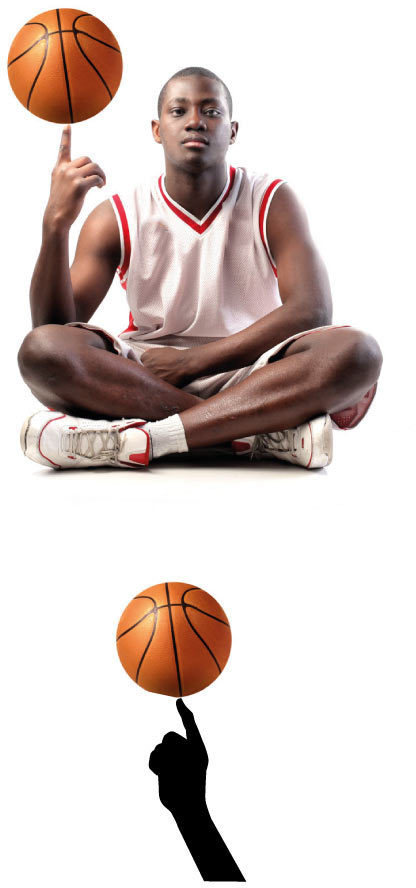
The ball can be replaced by any tool. If they will expand to other trades later, they will have an easy way to visualize them. We can use different speed lines.
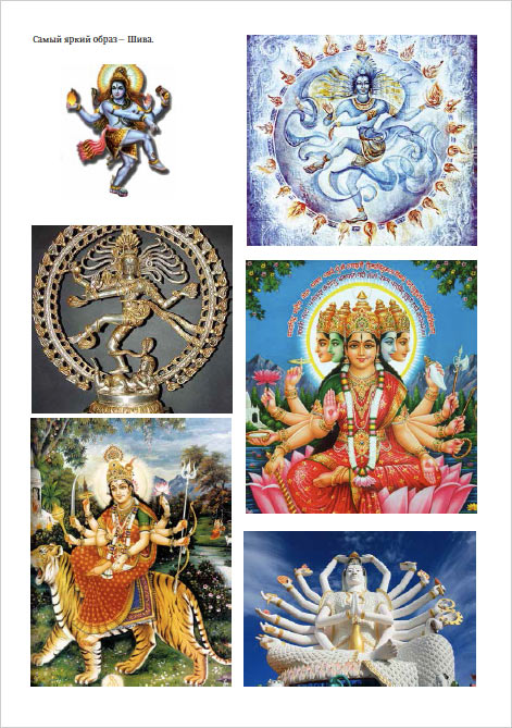
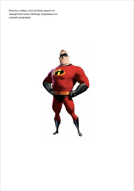
Art director: Let’s try it with Shiva.
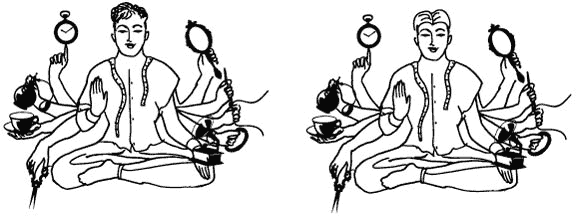
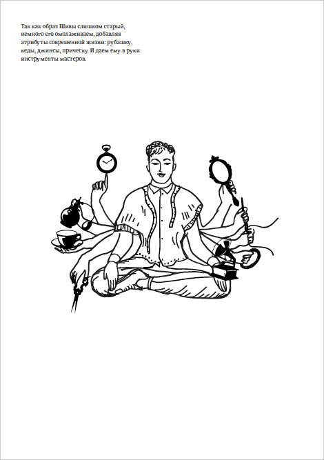
Designer: I think he has to be a superhero and don a modern suit. We can style it as an engraving or move on to linear graphics.
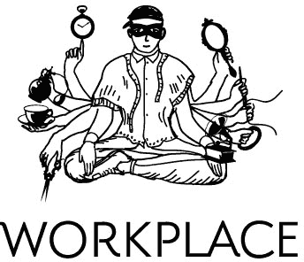
Art director: I would keep the old style. Let’s show this concept to the client.
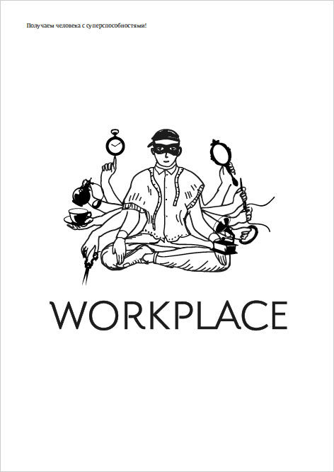
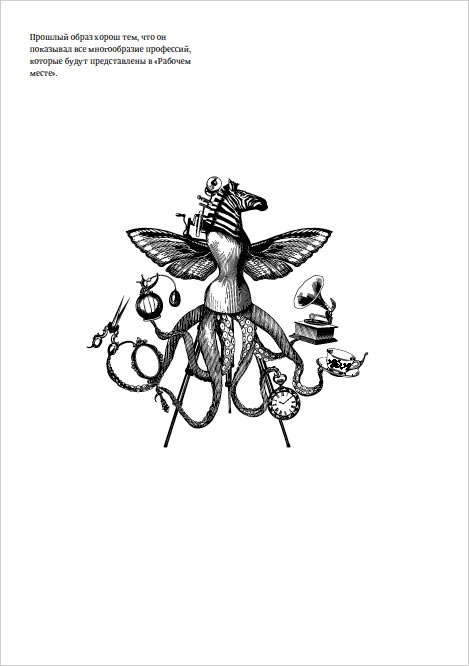
Client: Every single profession has a multitude of tools. A cabinet maker, a painter, an exotic dancer—they all can hold tools of their trade in their hands.
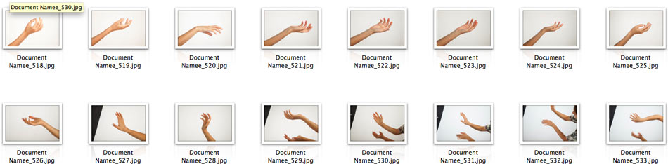
As for the hands, we’ve already covered it, any trade can be shown through hands. There are more Shiva logos than there are engraving-styled logos.
The designer suggests solutions.
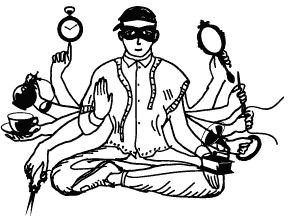
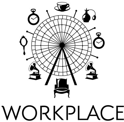
Art director: Number 4, but it needs to be more clear.
Showing to the client.
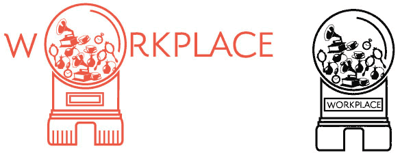
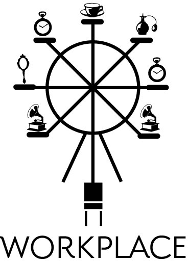
Client: No, I don’t like it. The accent is on items and the chair, i.e. a workplace. Masters come to Workplace not for a chair, but for opportunities our space gives them. The Ferris wheel idea is not easily understandable.
Meeting with the client to talk over the task again and find out what we are doing wrong.
During the meeting, the art director makes a couple of sketches of a new logo and the client approves them for drawing.
Starting to draw.

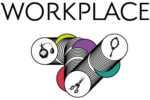
Art director: You can try more complex shapes.
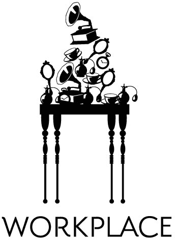
We need to place larger objects in each shape, right now they look like they sink in, which makes them look incoherent.
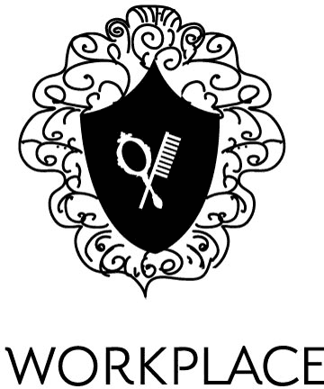
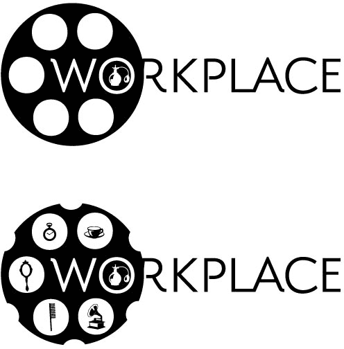
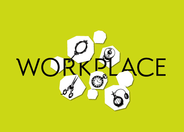
Showing to the client.
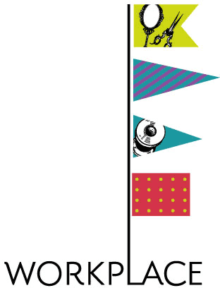
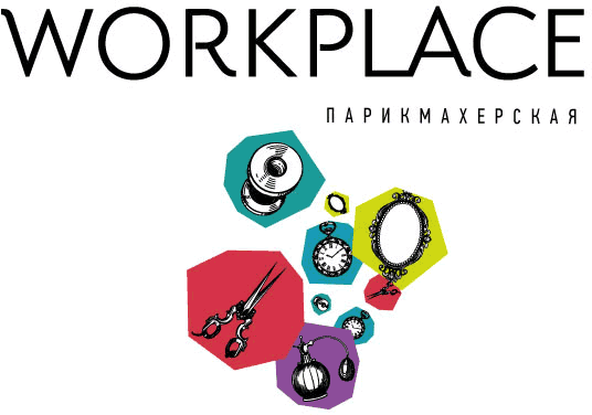
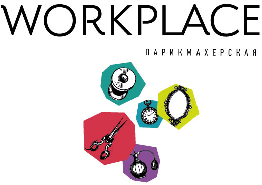
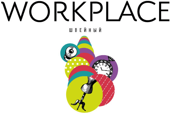
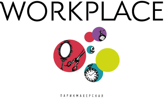
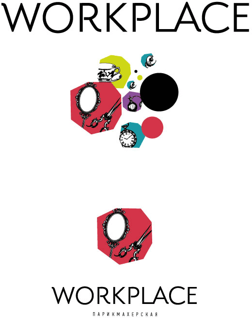
The items in circles are too obvious. The overall mood has to be more strict and serious.
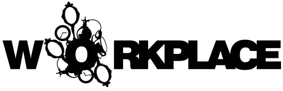
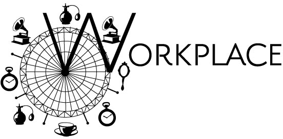
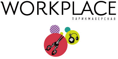
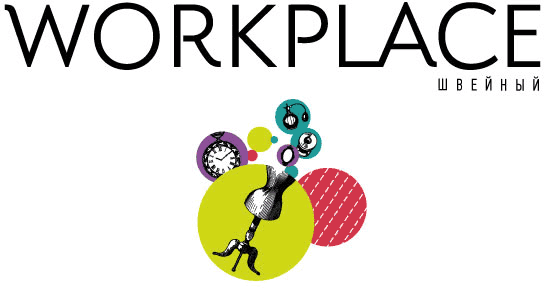
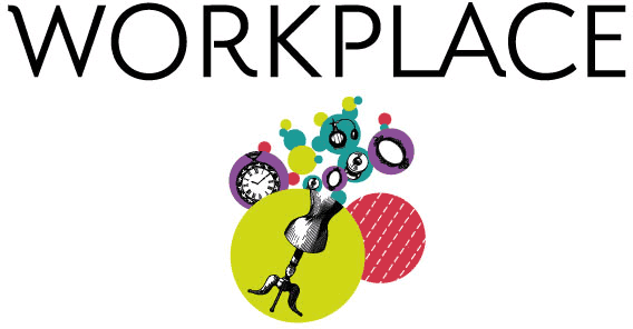
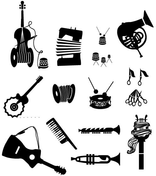
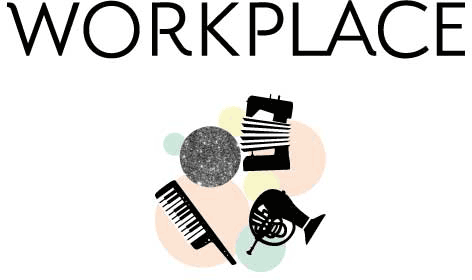
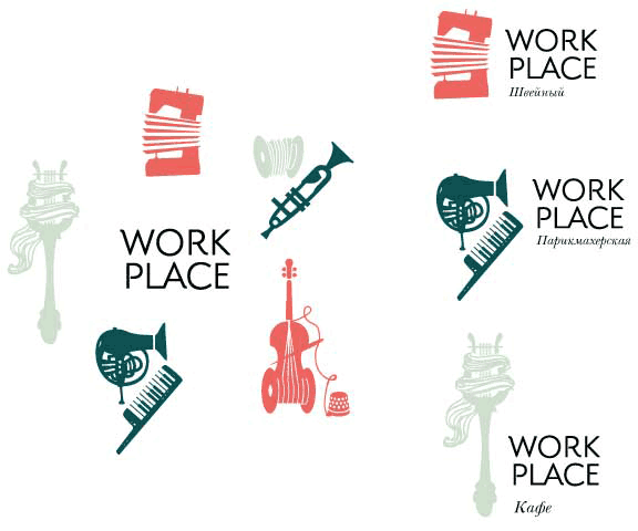
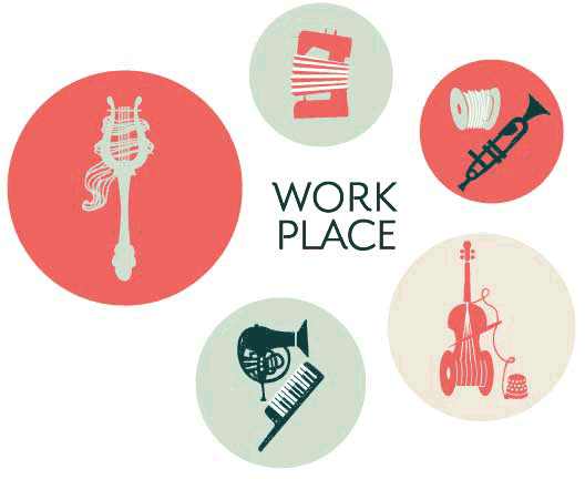
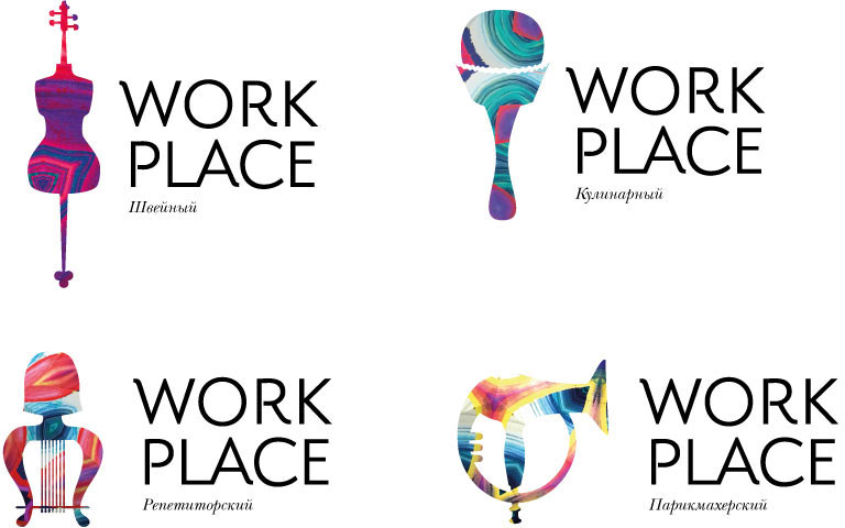
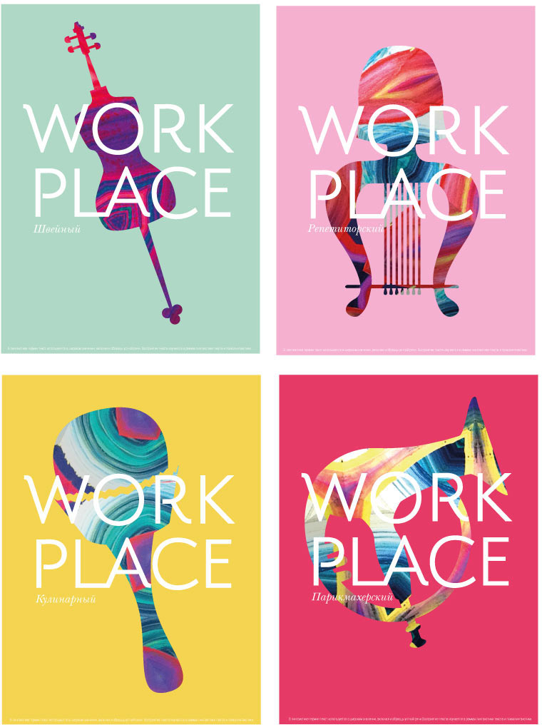
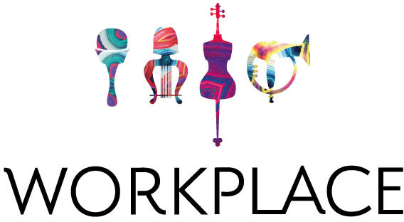
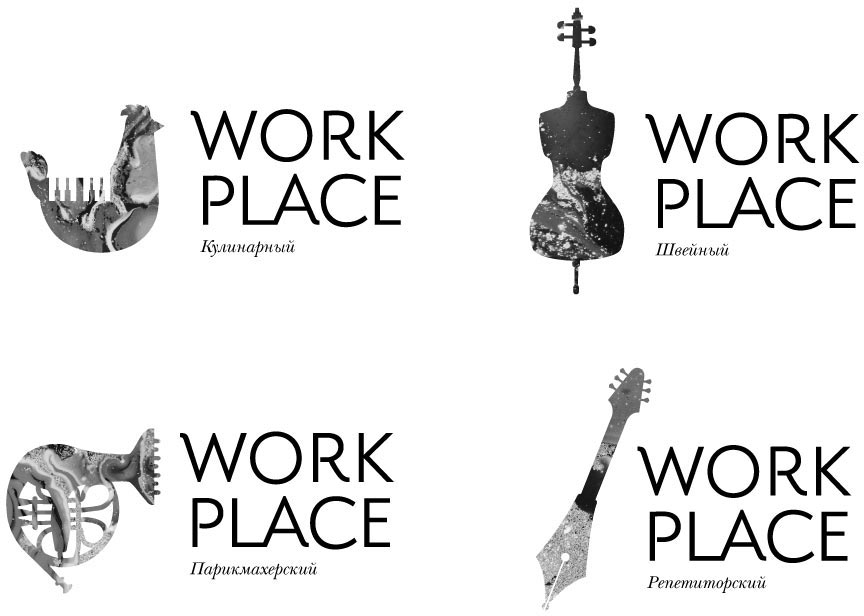
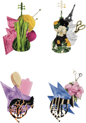
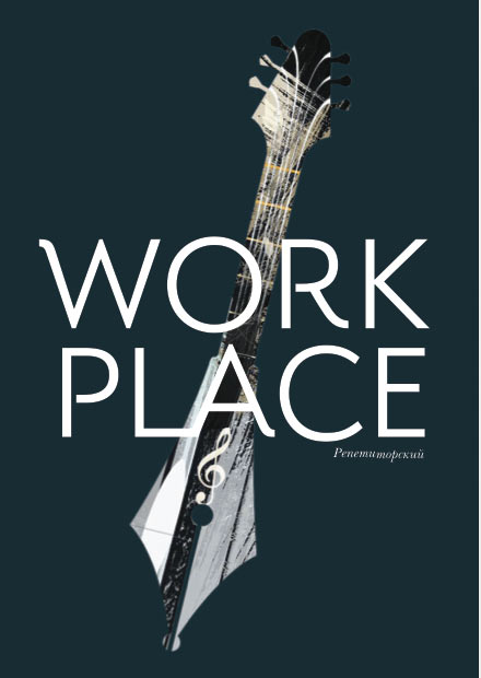
The designer gets the idea based on cross-breeding that the client liked in the old logo. But this time the tools themselves change their appearance and start to look like musical instruments. Workplace as an orchestra.
Assembling a presentation.
After some deliberation the client approves the concept. Selecting the best drawing style for the logos.
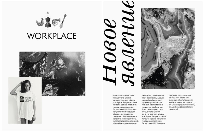
The designer suggests to use textures from fragments of paintings with prominent brush strokes.
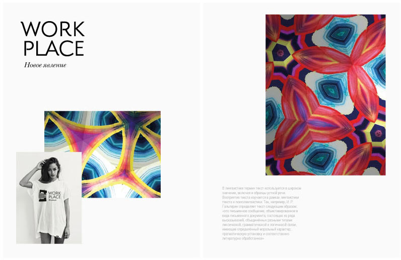
And another variant.
The client doesn’t like that the logos are filled with a texture. They already have complex shapes which become incomprehensible when put over a texture.
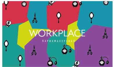
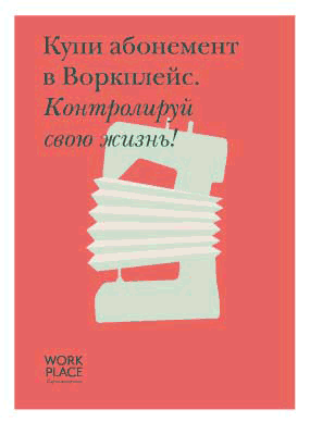
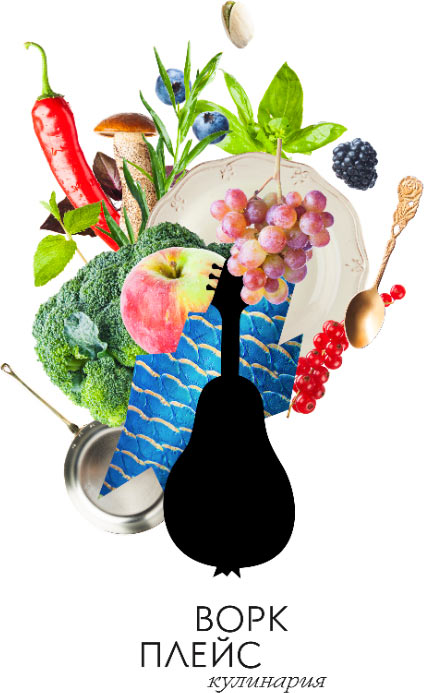
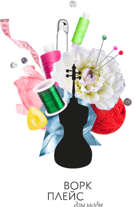
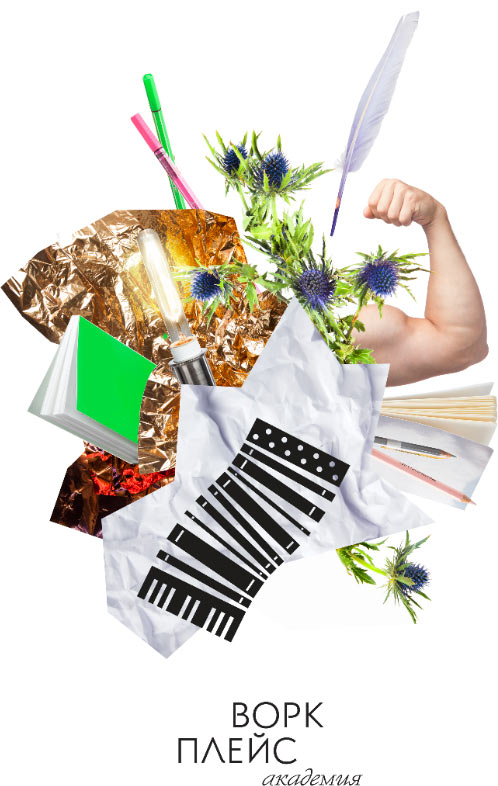
How about this? A collage with the logo of a trade in the center of the composition?
And drawn in another style, more strict and beautiful.
The collage idea is cool, but it would be difficult to use it for logos: the shape is too complex.
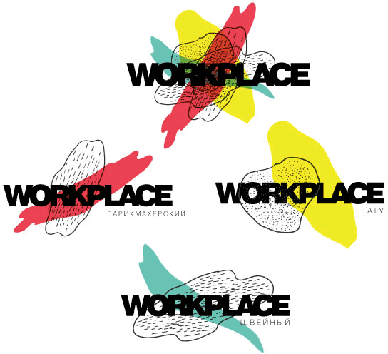
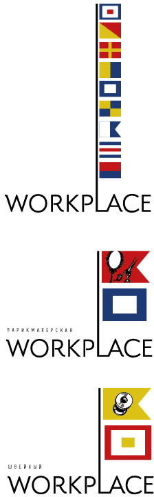
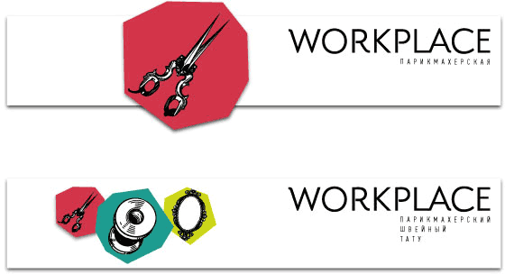
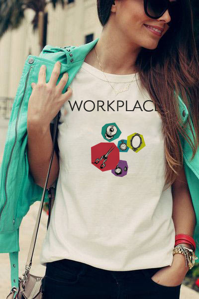
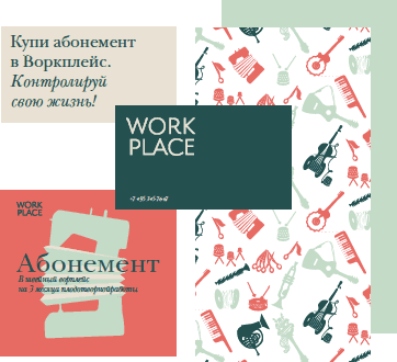
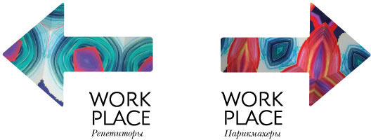
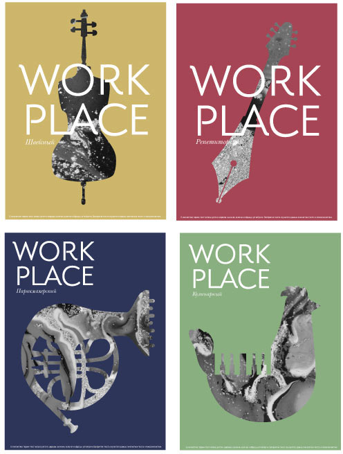
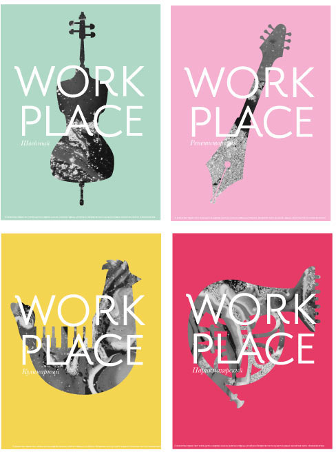
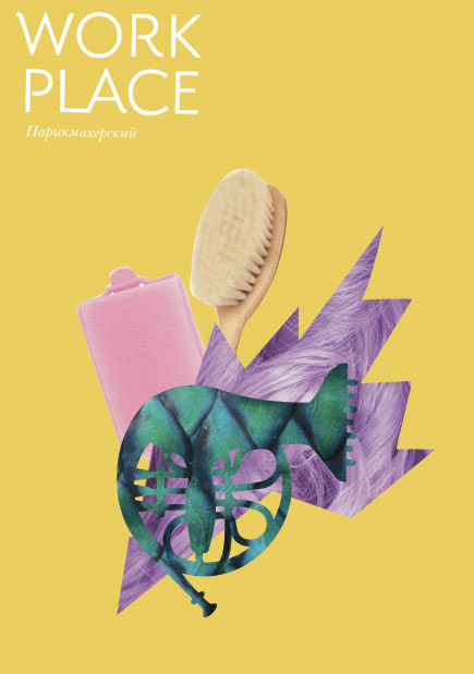
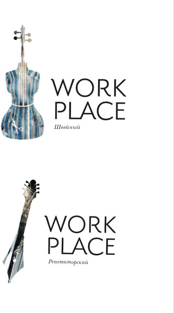
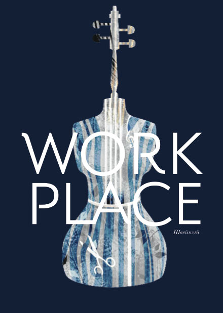
After thinking for a while, the client makes the decision: the logo will be made of only the text part and trade names while the collages will become the corporate identity.
Now we need to draw a Russian version of the logo. Going to our type designer.
Now the subtitle. Making it more expressive than the logo.
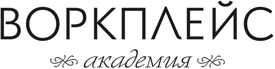
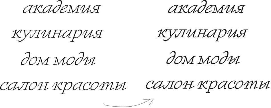
The curls are too much. Removing them.
The captions came out too light, making them bolder and adjusting the shapes of some characters.
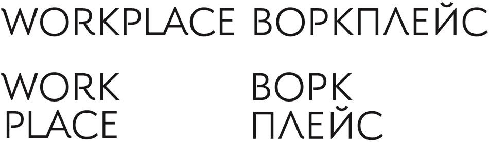
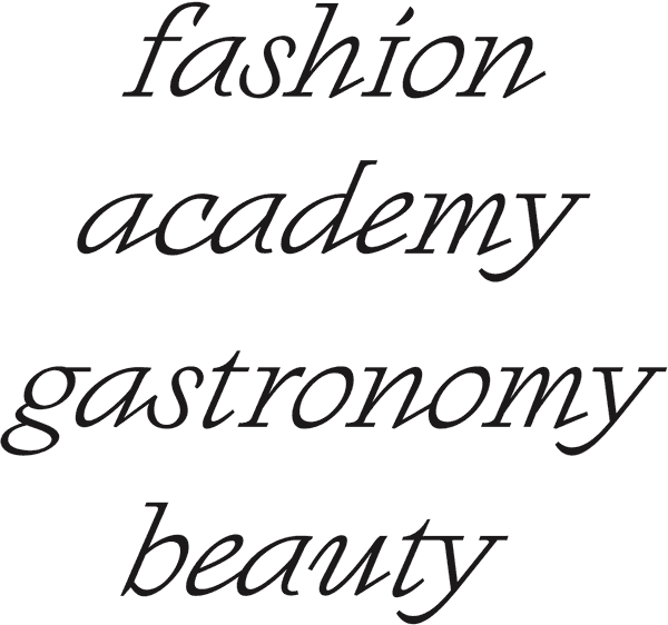
Now the English text.
Typesetting all versions of the logo.
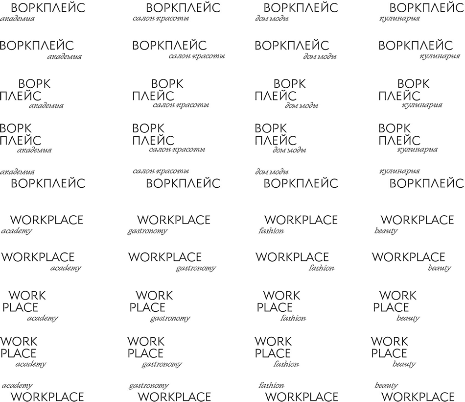
Done. Though Кулинария in English is Food, not Gastronomy. Fixing.
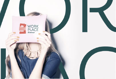
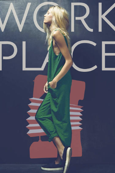
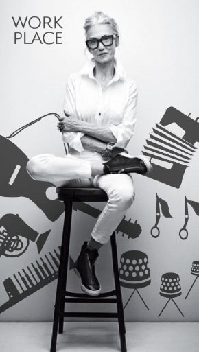
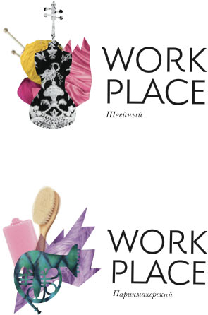
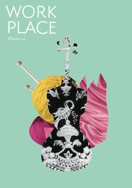
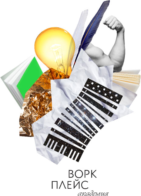
Meanwhile, sketches of the corporate illustrations are ready.
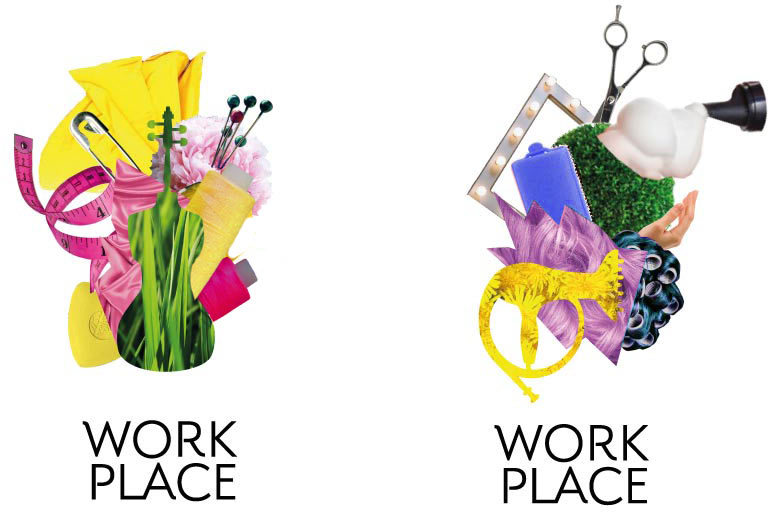
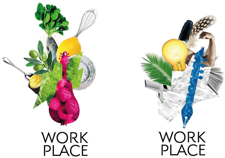
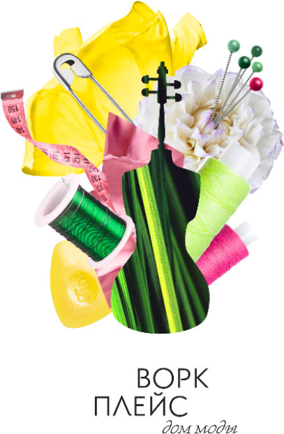
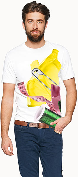
The client brings in property items for the Fashion House collage. Starting the photo shoot.
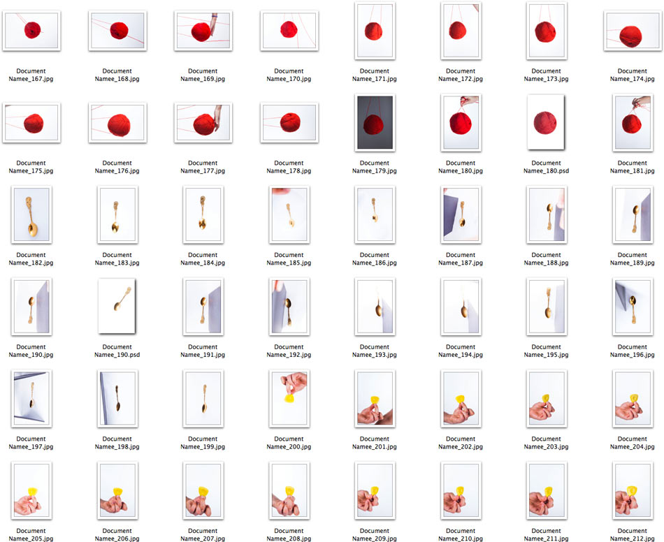
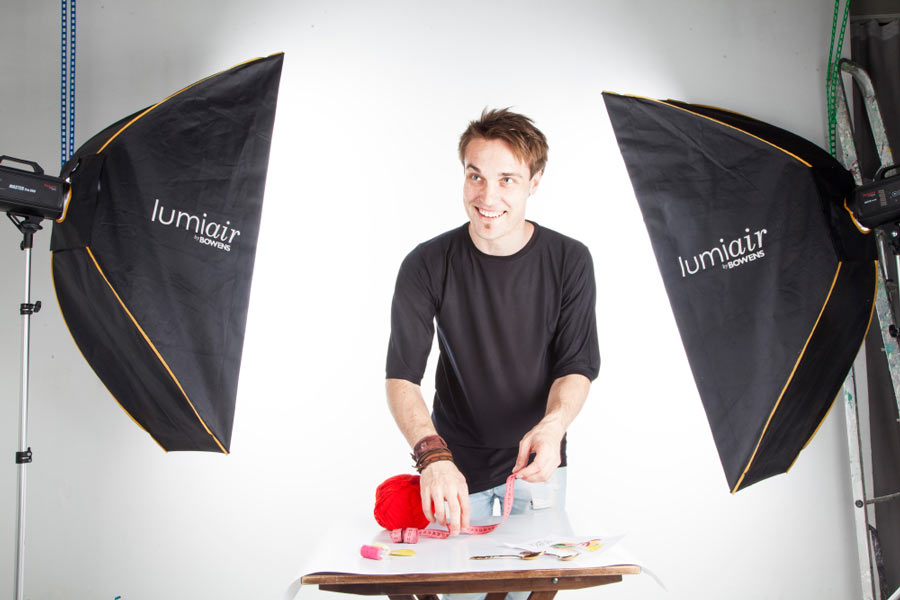
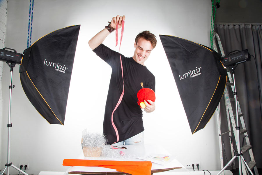
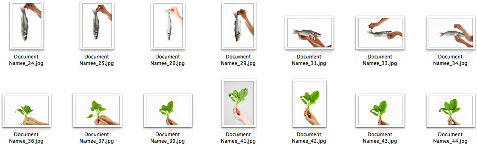
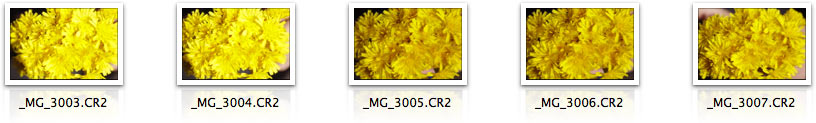
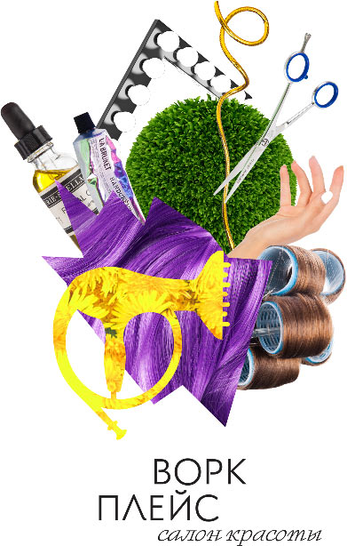
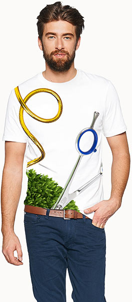
To make pictures for other occupations, we buy props at a food market and cosmetics stores. Taking pictures of grass and flowers.
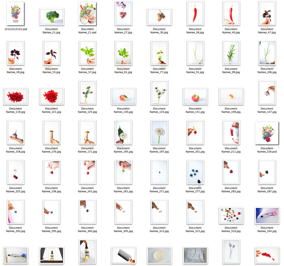
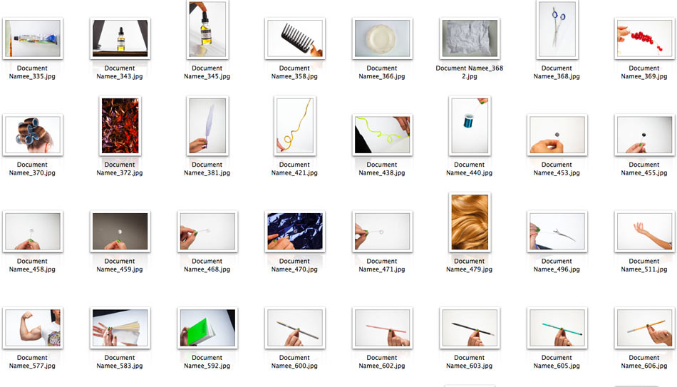
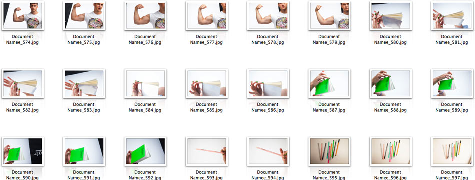
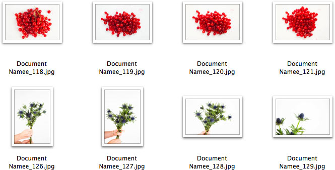
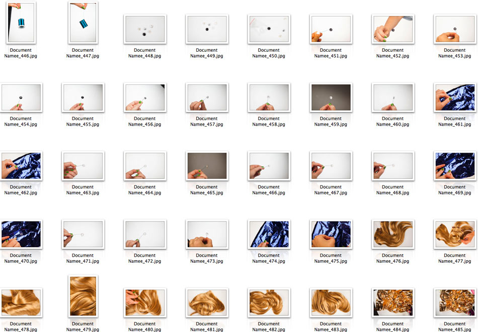
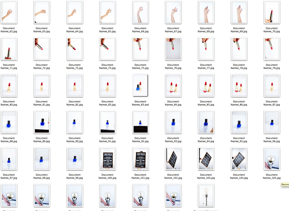
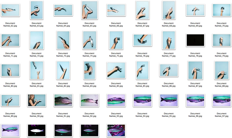
Assembling the compositions.
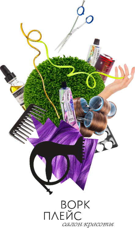
Art director: The sketches looked better, return to the original idea.
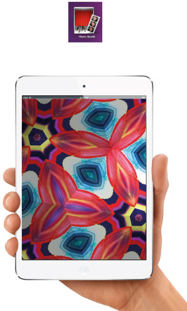
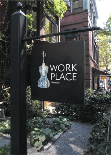
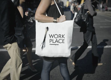
Reassembling the collages. We also need to add more items: lipstick and other lady things for the Beauty Salon, and something about studying for the Academy. Checking out how the final result would look on various media.
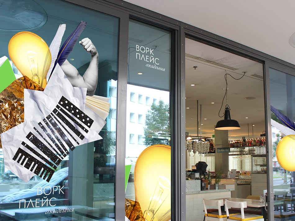
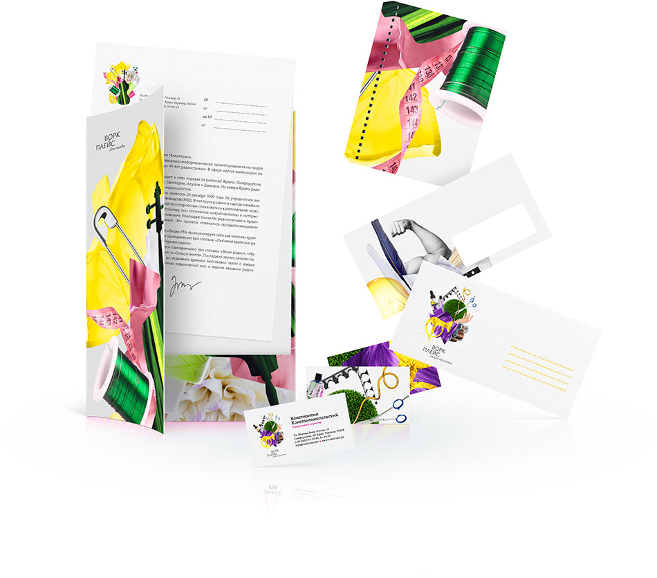
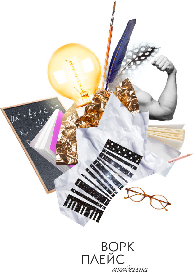
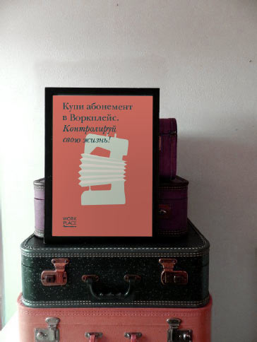
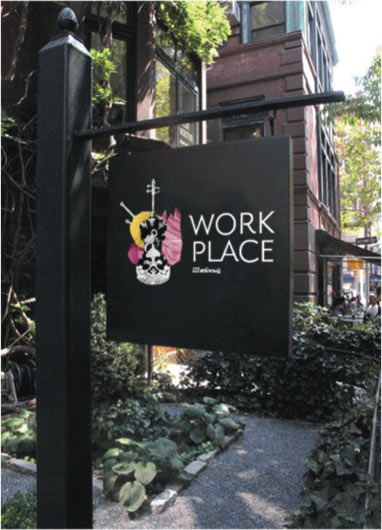
Looks great, preparing the files for submission.

Order a design...