The making of the third version of Yandex Money
Overview Process
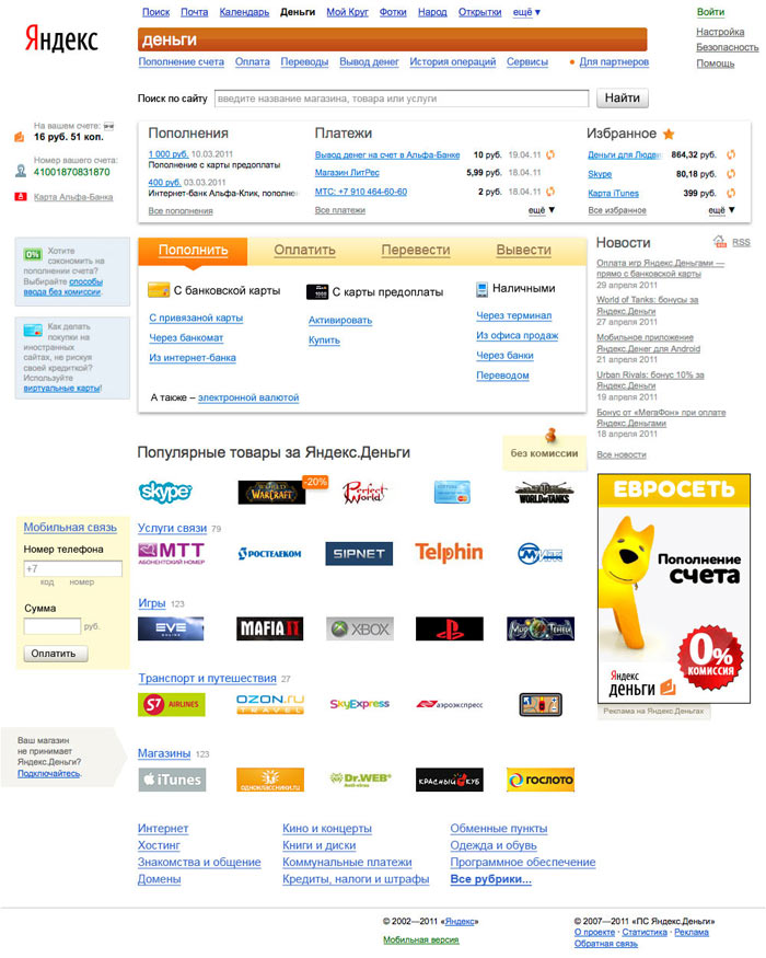
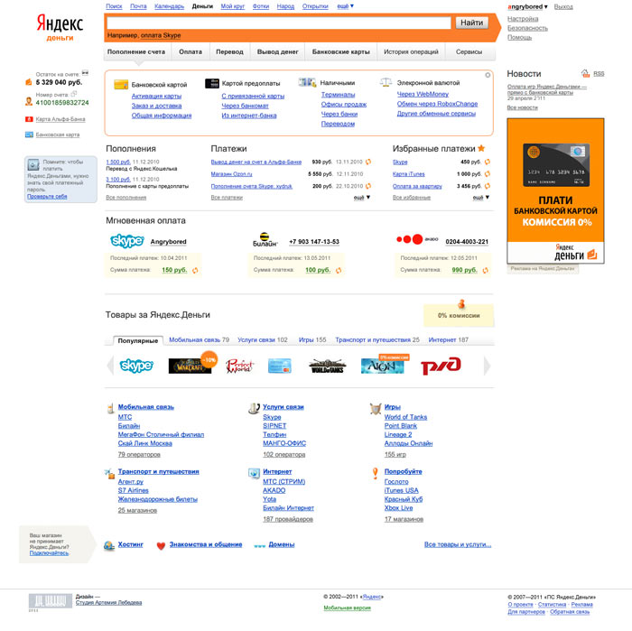
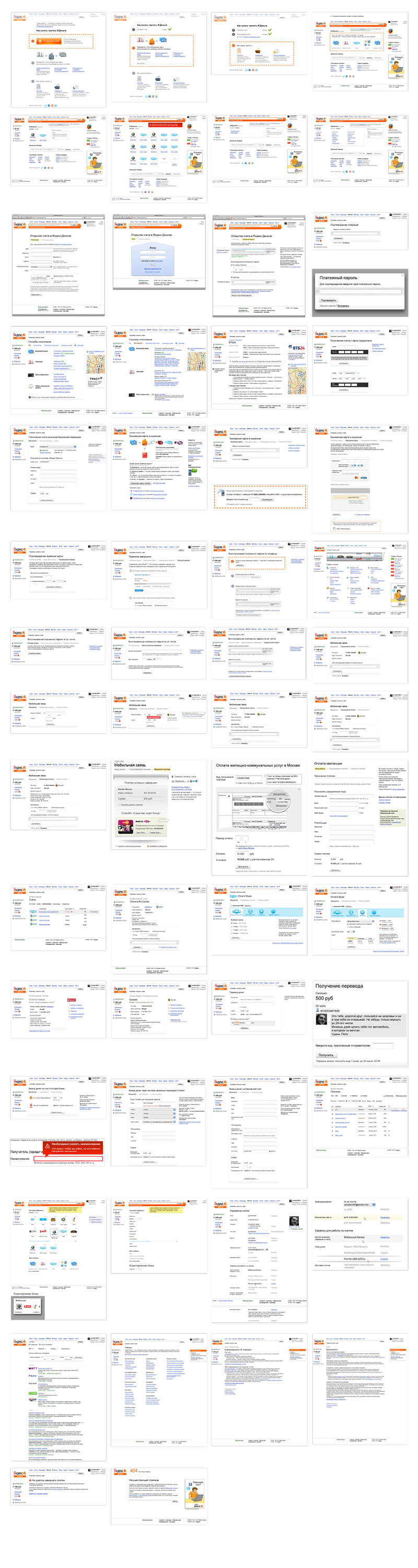
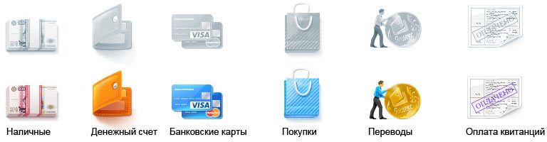
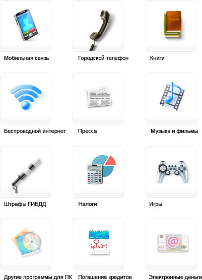
Starting to design the concept from the main page. Determining one of the payment scenarios. Drawing attention to the search by placing a search field on every page. Putting the list of last transactions and Favorites section to the central panel on the main page. In the Stores section, replacing text links with stores’ logos. Putting a top-up form on the main page.
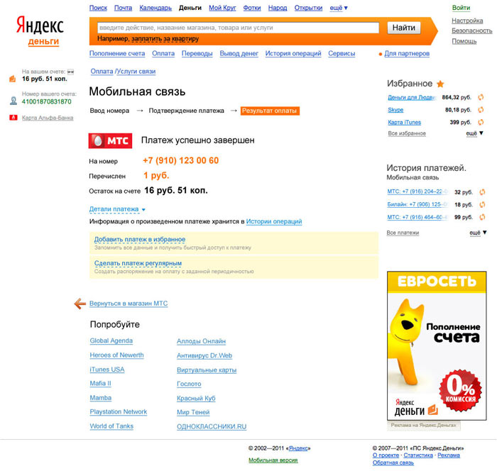
Trying to simplify navigation across the sections and inside one operation. Adding bread crumbs and step-by-step layouts. Highlighting the most important features and hiding excessive elements.
On the final payment page, adding the options to add the transaction to Favorites and make it regular.
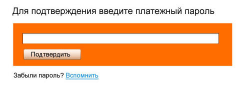
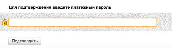
When making transactions, users need to enter a payment password. It is often confused with the Yandex password. Thinking of how to eliminate the confusion. Deciding to put the payment password form on a completely different background to make users think: “Different form—means Yandex Money password.”
Designing the password box. First making it orange.
Art director suggests an idea: when receiving a bank card, you get an envelope with a PIN number, and inside there is a list covered in numbers that hides the password so you can’t see it against the light. Embracing the idea.
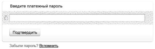
Adding a golden lock and a frame to show that the service is safe.
Going back to the main page. Thinking how to incorporate hints and recommendations in the main menu. Putting stores’ logos in the scroll menu, categories—in tabs.
Experimenting with a colored background. Doesn’t work.
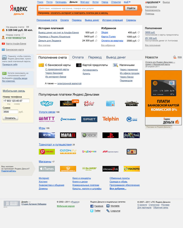
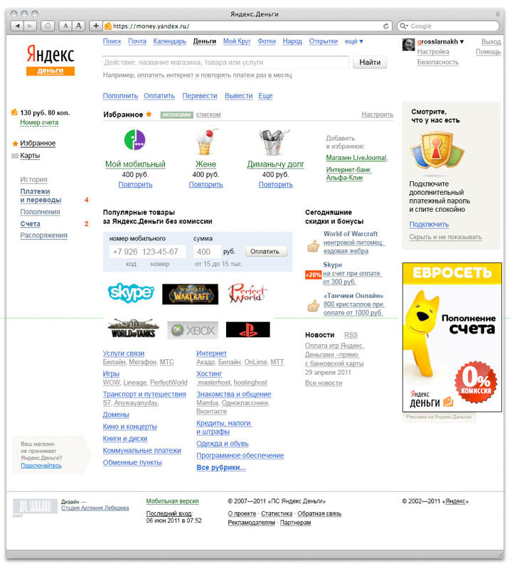
Deciding to make the main page customizable, with links to the user’s most popular transactions. For example, those who give money to charity would see the top-up link, and those who use Yandex Money to pay for services would see the Favorites section.
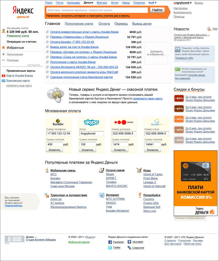
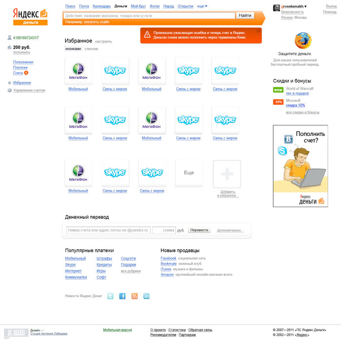
Separating the Favorites section from the menu on the left. Now the main page contains only 10 positions, and the others can be found inside the corresponding sections. Adding icons for transactions. Moving all account operations to the left menu.
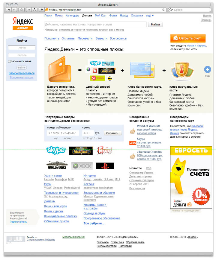
Adding a large section for new users describing the service’s functions and benefits. Benefits appear when a user opens the page. When clicking on the plus sign on the right, the benefits move to the left making room for new ones.
Simplifying the design and making it more minimalistic.
Finalizing the main page layout and starting to design other user scenarios, pages, forms and messages. Removing excessive details, thinking of the right metaphors, designing pages’ layouts.
Drawing out icons.
Preparing a final document—a guideline describing all elements.