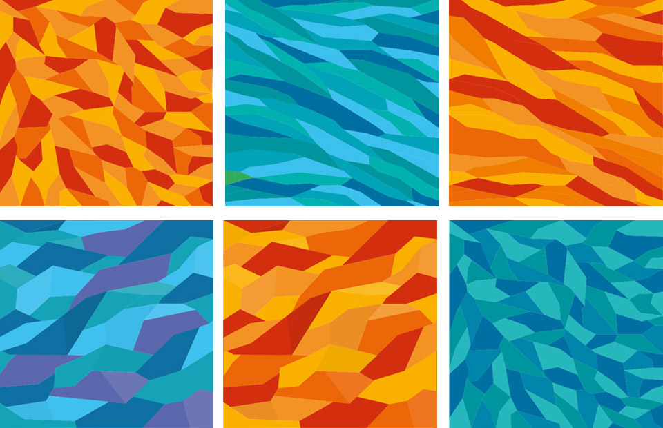
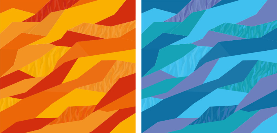
First, we start with two types of corporate patterns: a solid and a ribbon one.
The patterns are drawn in two color schemes from the start, cold and warm.

Art director: The ribbon should be more broken, not as straight and more varied.

Art director: This is better, but you need to add second-level details by adding 2–3 undertones to some of the facets.
Adding.

Simultaneously working on the solid pattern.
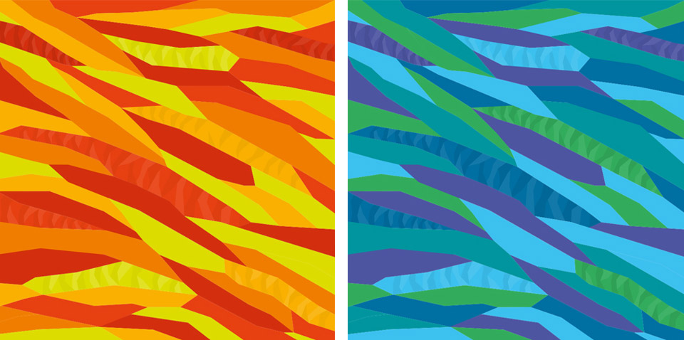
Art director: The internal small folds often look too thick and rough.
And in the large pattern the stems are often too straight with no bends.
Taking time to choose the best shape of the elements.
Finally settling on one design, but spending lots of time to finalize it.
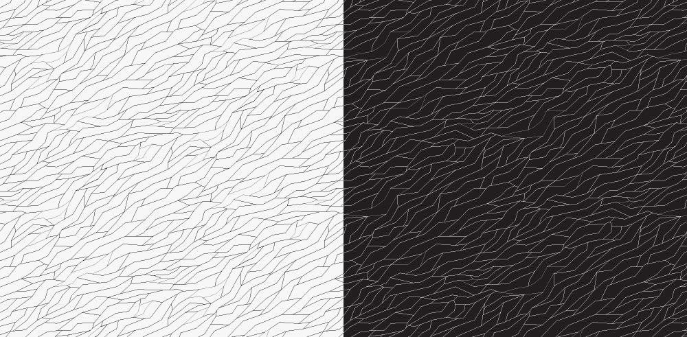
A linear pattern emerges as a supplementary one which later finds use in souvenir products.
Client: Why is the primary color scheme yellow and orange? We think green shades would work better for Zaryadye.
Explaining that due to the abundance of green colors in the park the primary colors have to be bright as they provide a much-needed accent. Besides, there isn’t that much sun in Moscow, some warmth is always welcome.
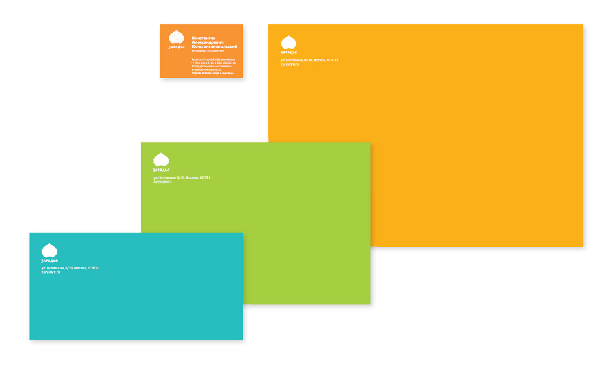
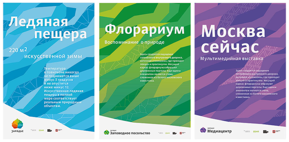
As we work on the media, we distinguish color schemes by functions: the primary one is still the warm and sunny orange and yellow. The blue and navy scheme is used for special events and holidays while the less conspicuous green colors is used for the park’s internal needs (branded transport, uniforms and employee passes).
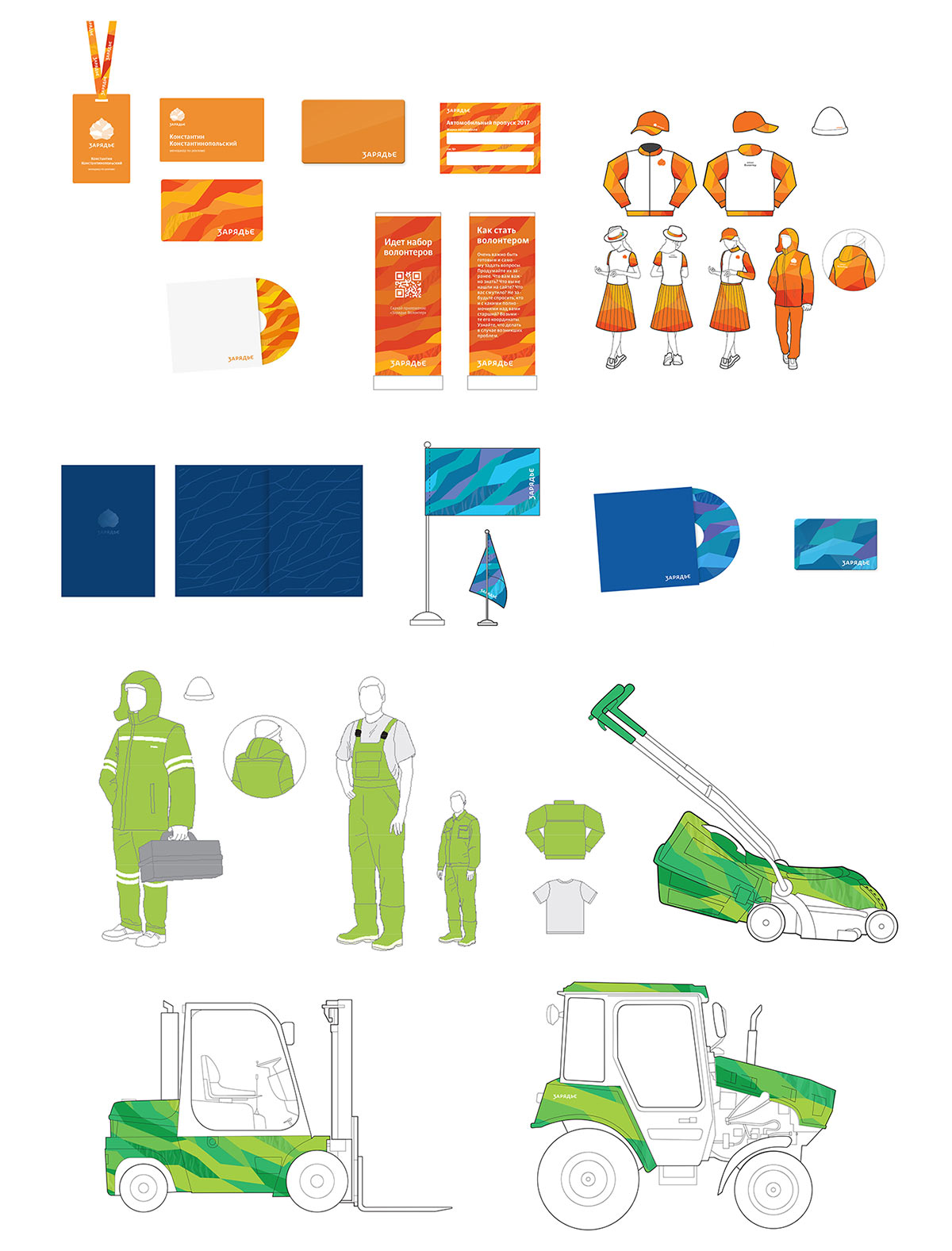
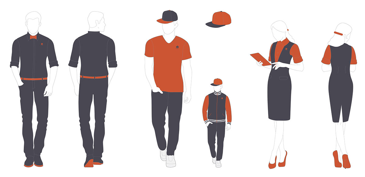
Client: The uniforms are too loud, they resemble suits of bank workers or shopping center employees. We want something more restrained yet trendy and unique.
Not a problem. Keeping in line with the primary color scheme we come up with a combination of terracotta and cold gray as well as styles for each uniform type.
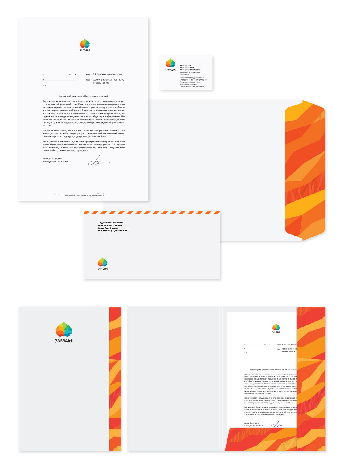
Moving on. Suggesting to use colored paper in corporate documentation.
The client asks to go with a more traditional variant. Building mock-ups based on the relationship between the vast wide space and bright accents.
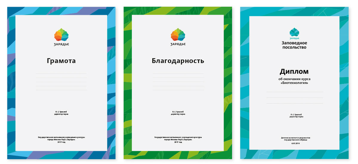
Creating a letter of commendation, a letter of appreciation and a diploma.
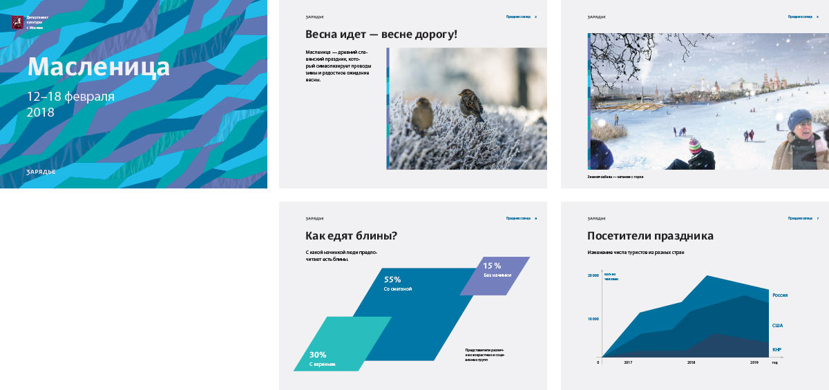
Designing the corporate presentation.
The client asks to come up with a character with a pronounced Russian flair. We get the idea to use the leaf as the traditional Russian kokoshnik. Making the first sketches.
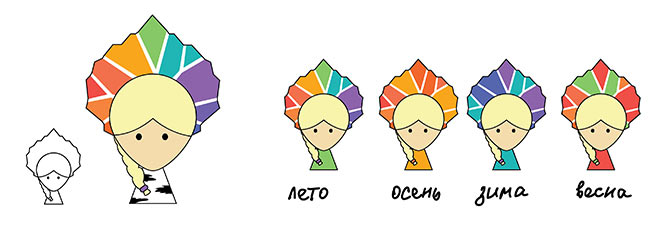
Art director: The idea is OK. Just draw it without the black outline and make the clothes look more like a Russian dress.
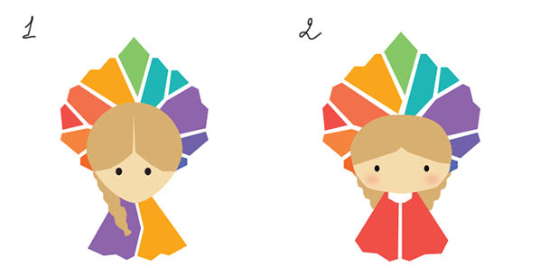
Art director: Number 2 is OK.
Artistic director: OK.
Client: OK!
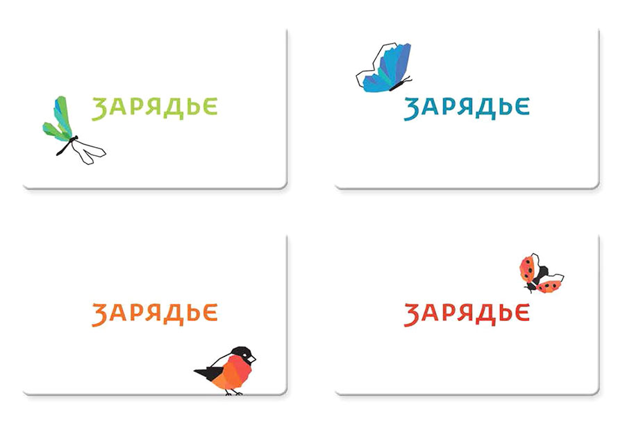
The girl evolves together with the logo.
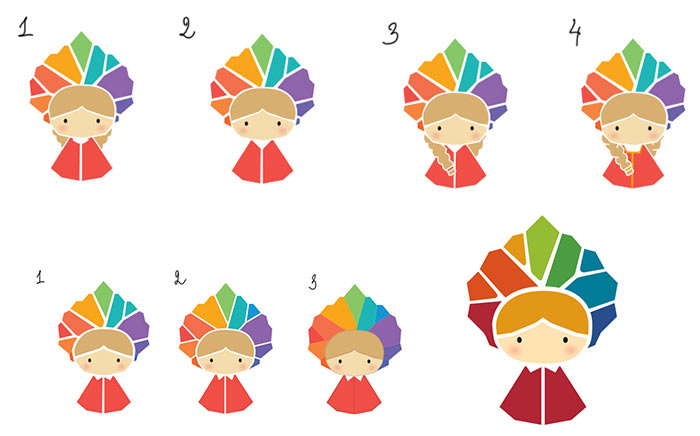
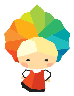
After choosing the concept, sending the girl to the illustrator for final drawing. The character acquires a faceted style similar to that of the birds and the insects.
Starting to work on posters and schedules.
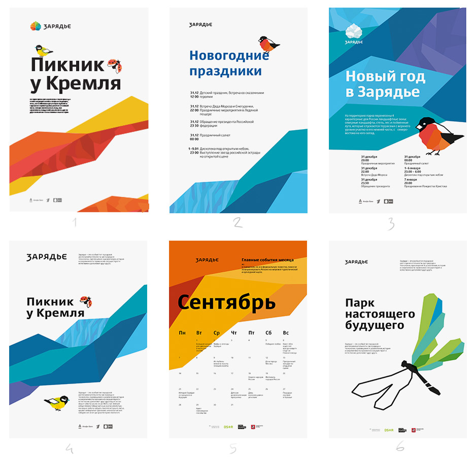
Art director: Right now all are a bit raw in their layout. Number 6 lacks a dominant spot (maybe, use a large shape filled with the pattern, insert a circle with bleed) and I don’t understand the principle of placing the small columns. In number 3 the decoration is more active than the text.
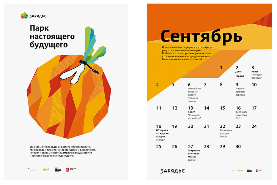
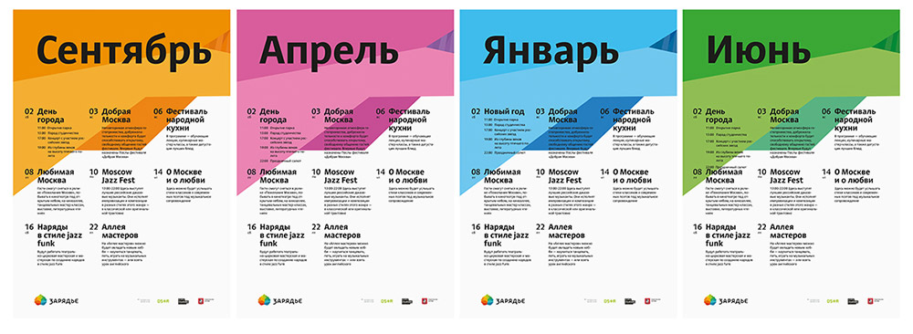
Chief typesetter: The calendar grid is uninformative. Instead of showing how many days have no events, let’s show those that have something going on.
Making the layout more dense, adding color variations of the pattern for various seasons.
Starting to work on advertising media.
Art director: We need a version with a photo.
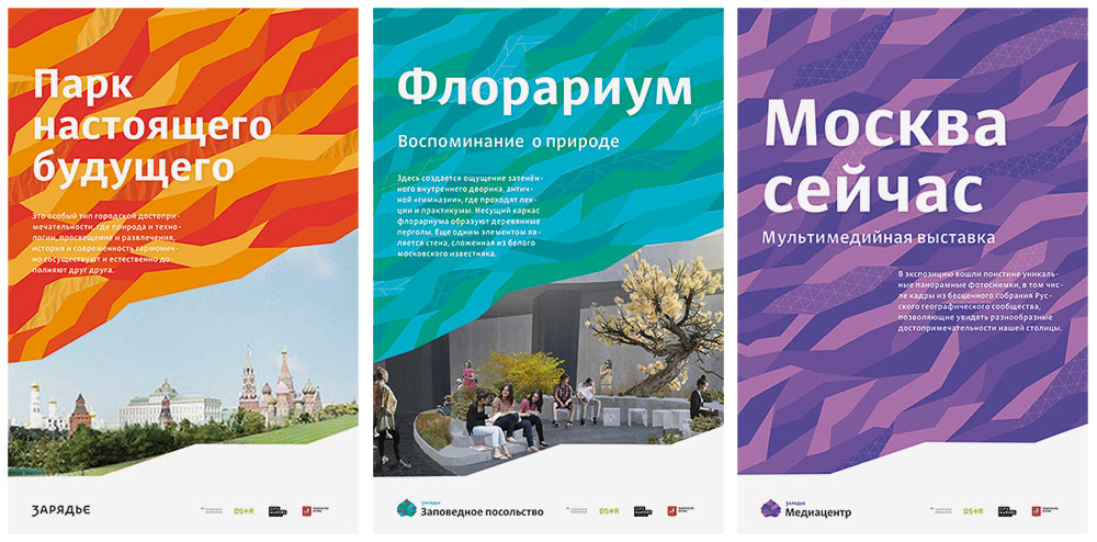
Creating billboards based on the approved style.
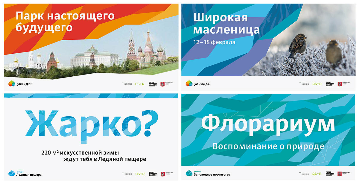
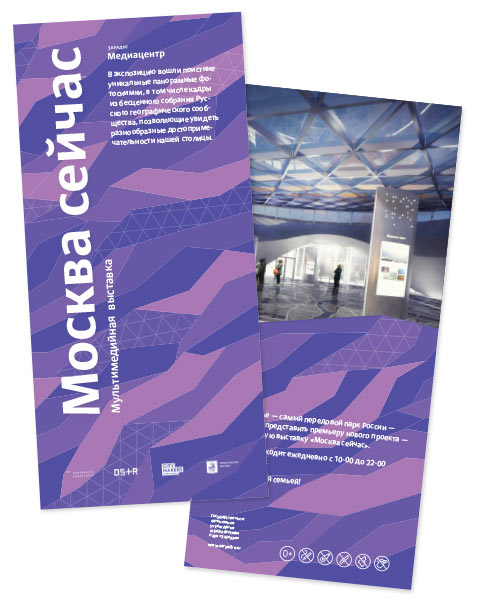
Preparing flyers.
Starting to work on the client and souvenir blocks. Deciding to use the mascots to the maximum but coming across a problem with the background. First, using white according to the standard.
Something doesn’t look right. Taking pastel versions of the corporate colors.
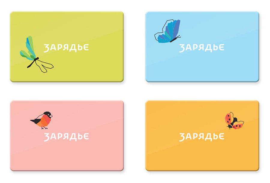
Even further from what we need: too gentle and blurry. Choosing powerful contrasting color combinations.
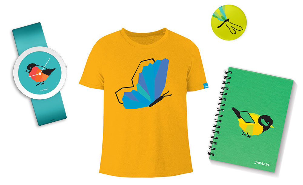
That’s more like it. Also defining primary colors for souvenirs.
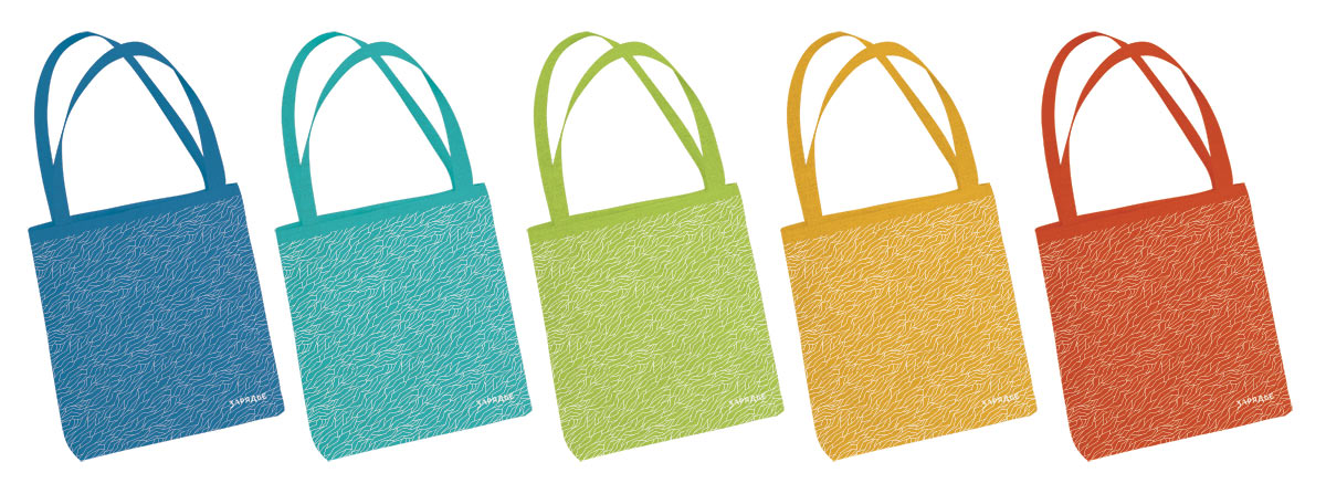
Applying the system to all objects.
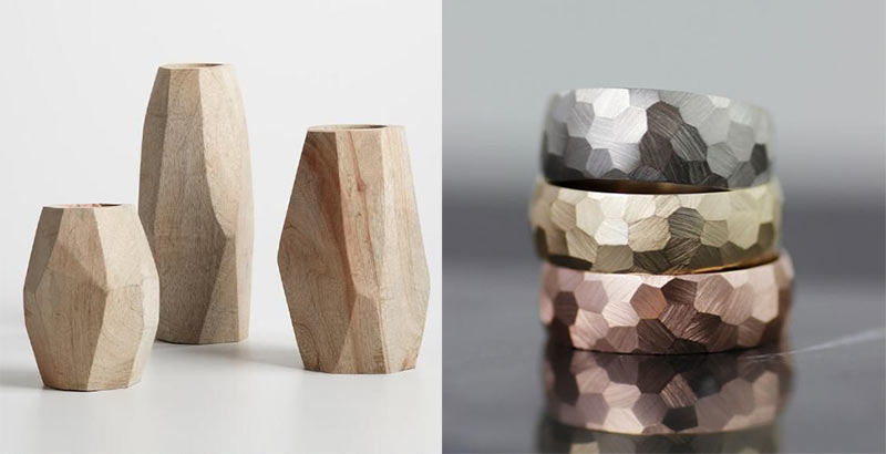
Faceted patterns beg to be made volumetric. Testing the possible dynamics using the example of the medal.
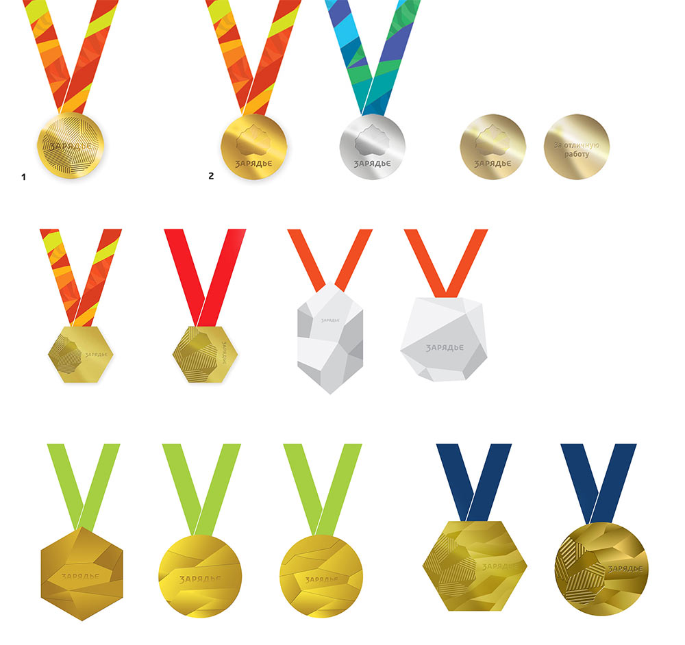
Art director: I suggest to make the medal round but faceted.
Designer: Right now the facets are too chaotic and haphazard. We need to find a more harmonious solution.
Trying to do so.
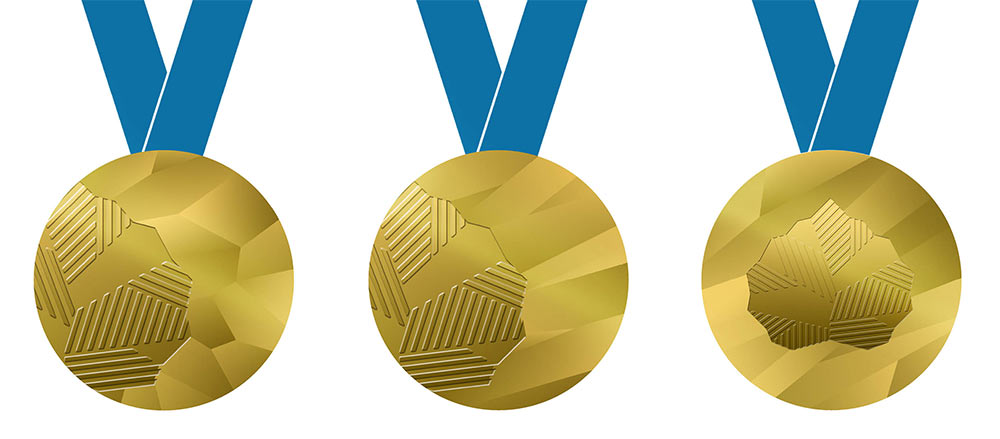
The left one looks like a soccer ball. The stretched facets definitely look better.
Art director: My suggestion was to make the silhouette faceted, not the relief. You can put the leaf in the center but the logo needs to be below it at the bottom.
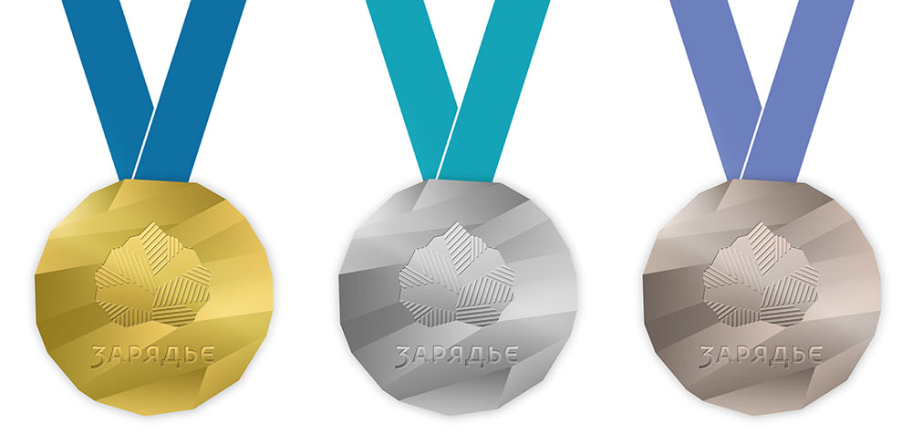
Art director: OK.
Happily rendering final versions of all media.
Simultaneously assembling all media and rules for their use in a style guide.