Zhytlobud (verbatim translation of the word is home building) of Ukraine is involved in planning and construction of high-rise residential buildings in the heart of Kiev. The company has grown and its old corporate identity would no longer fit. We’ve worked out a new one—it is spaciously planned and designed to last.
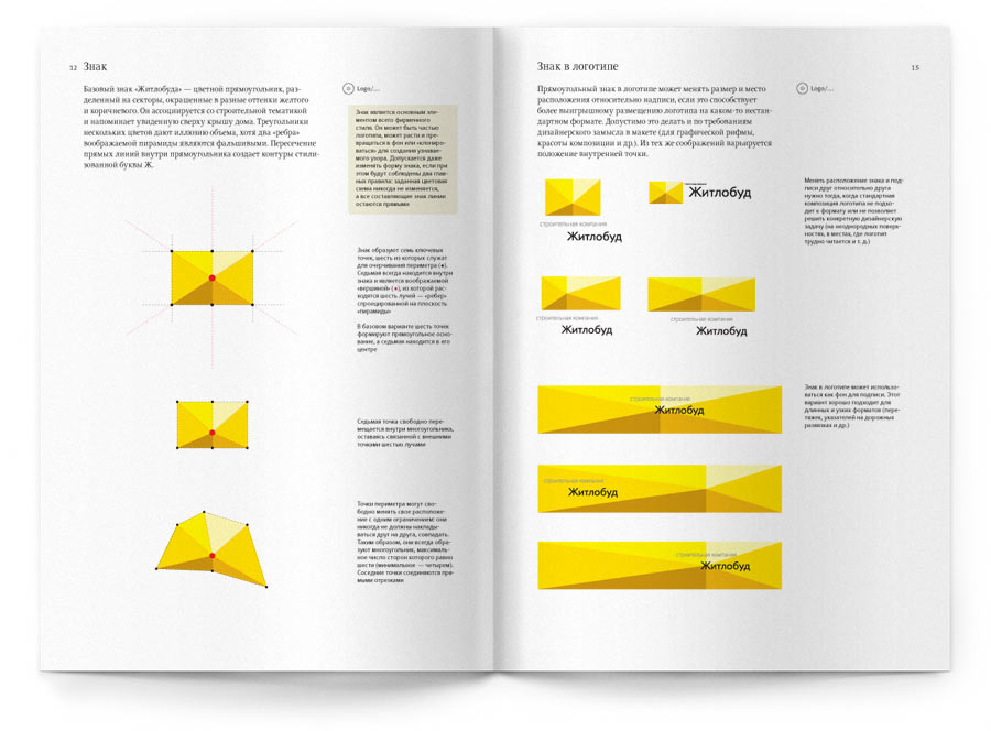
Zhytlobud logo has a lot to do with construction—it can be seen as a roof, a brick, or a fence section—and comprises the letter form of Ж (the one the company name starts with). Besides the color version, there are black and white and outline logos.
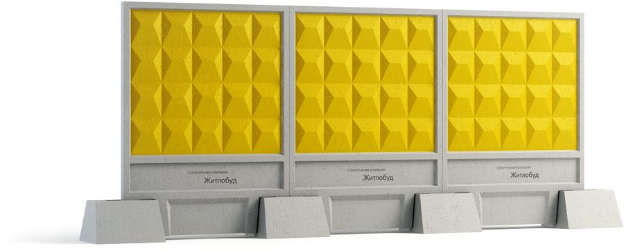
The sign can be easily transformed into any polygon remaining recognizable, so there is no problem with using it in irregular formats or applying it onto uneven shapes and surfaces. And tiling the logo creates corporate mosaic pattern with a nicely faceted look producing a three-dimensional impression.