Client: For the past six years we have been offering additional education for children with the help of mobile planetariums. Those planetariums have become outdated and stopped being attractive to children. We found a way to improve the quality tenfold (up to the level of multi-million stationary planetariums) on the edge of technology: we moved the films into virtual reality.
When the current logo was created, we were producing domes for planetariums painting them black, red and yellow. This is where the color of the logo came from. The name Altair came about as a less used “space-related” word. Altair is the brightest (alpha) star of the Aquila constellation, the Eagle eye as it is sometimes called. It is a beautiful association. Plus, since I’m from the Altai Krai, it being part of the name also played a role. That’s so you can understand why we have what we have.
What we want to have:
—A separate logo and an identity for the franchise. It can reference the existing overall logo or be entirely different, it’s up to you.
—The logo should be in English since we are about to expand worldwide.
Our mission is to give children all around the world access to quality education. The franchise is there to build a solid partner network that will educate children not just in cities, but also in remote rural locations.
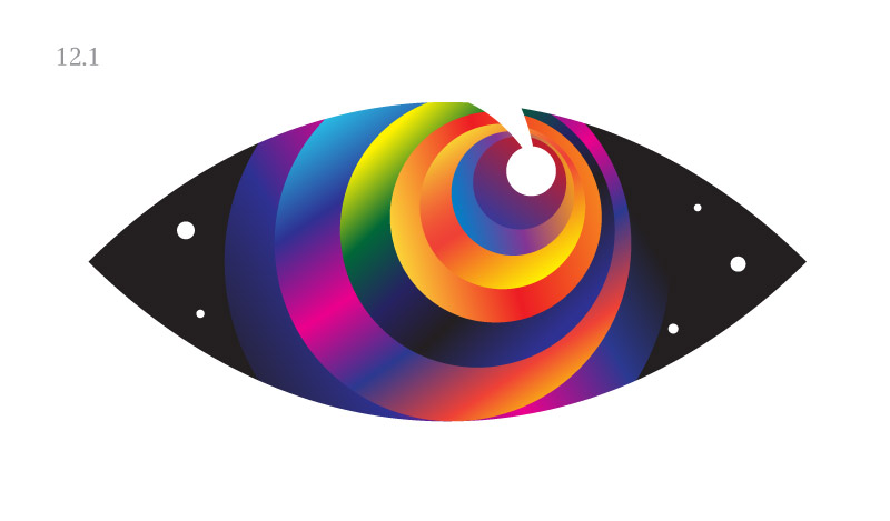
Designer: Eye of the eagle, planets in a row.
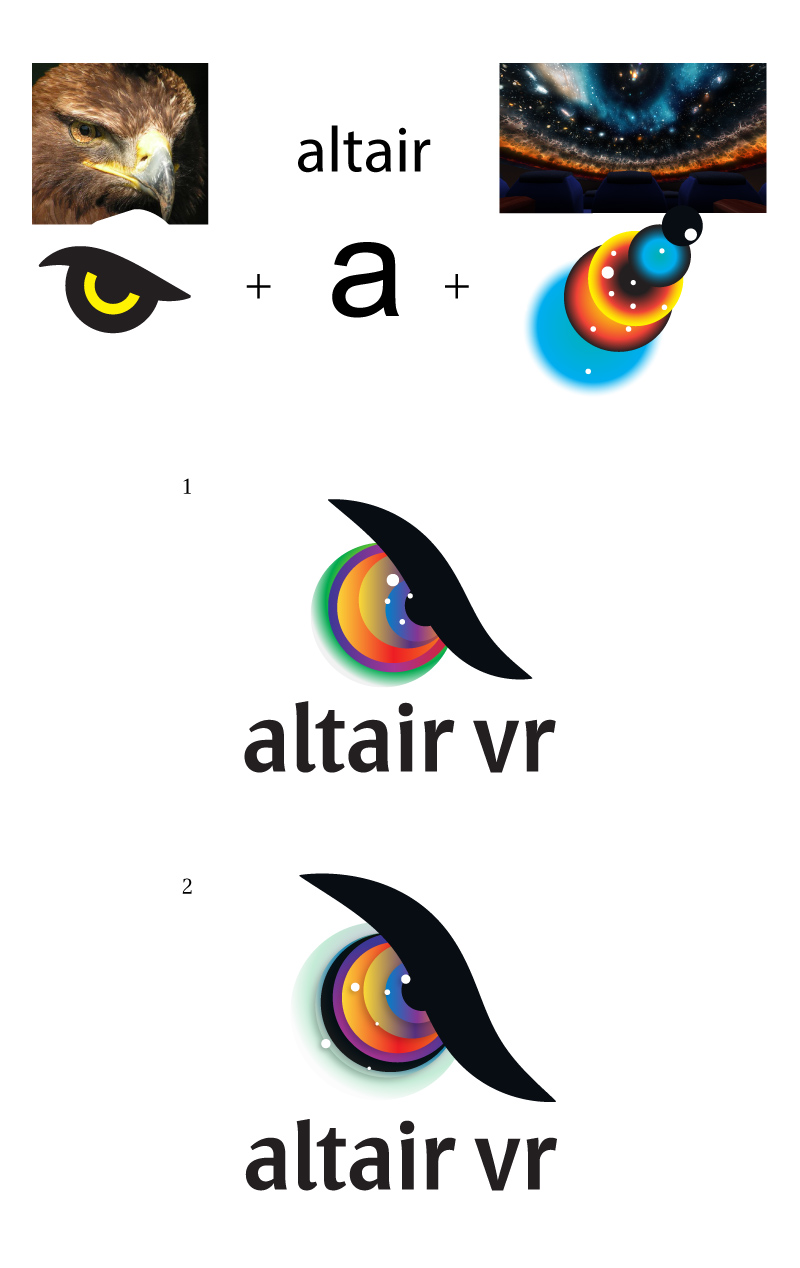
Art director: I think this frown has to go. You can just keep the colored circles. And try to point the eye upwards, towards the space. Another idea would be to use a white mask to cover these circles at the top and the bottom so they look like an eye.
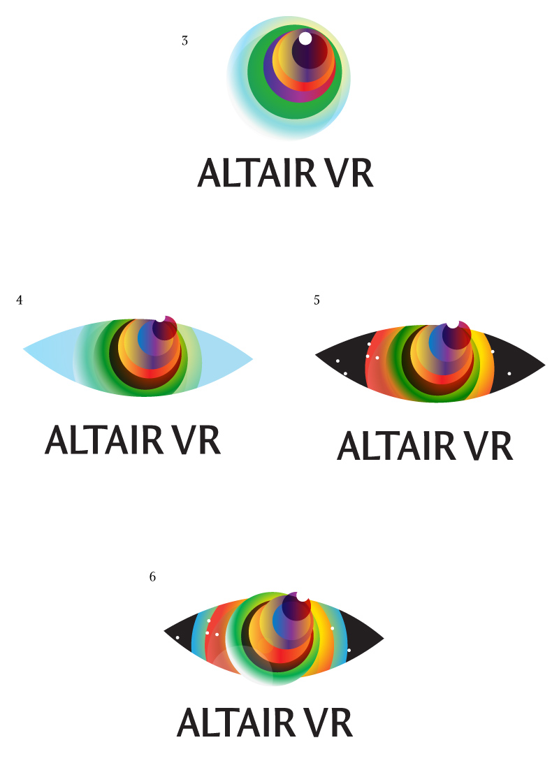
Art director: 5 is OK. But the iris shouldn’t jump out of orbit, it looks bad.
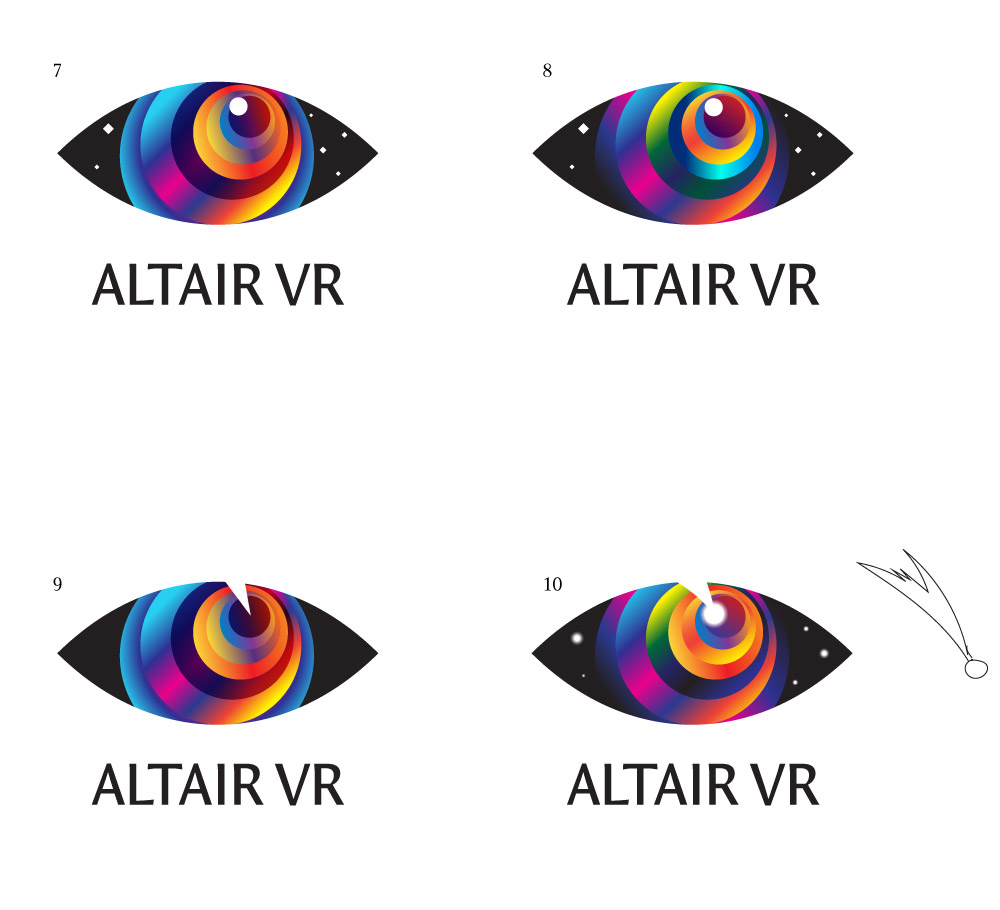
Art director: 10, but add spacing between letters.
Art director: Even more spacing. Don’t blur the stars, just use white dots for them. The same goes for the comet. Also, position it like the top of a pyramid, right now it’s tilting left.
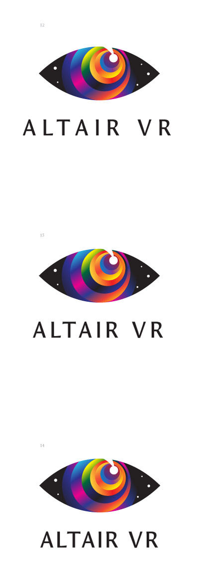
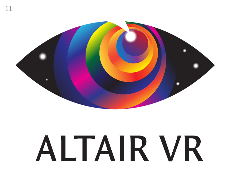
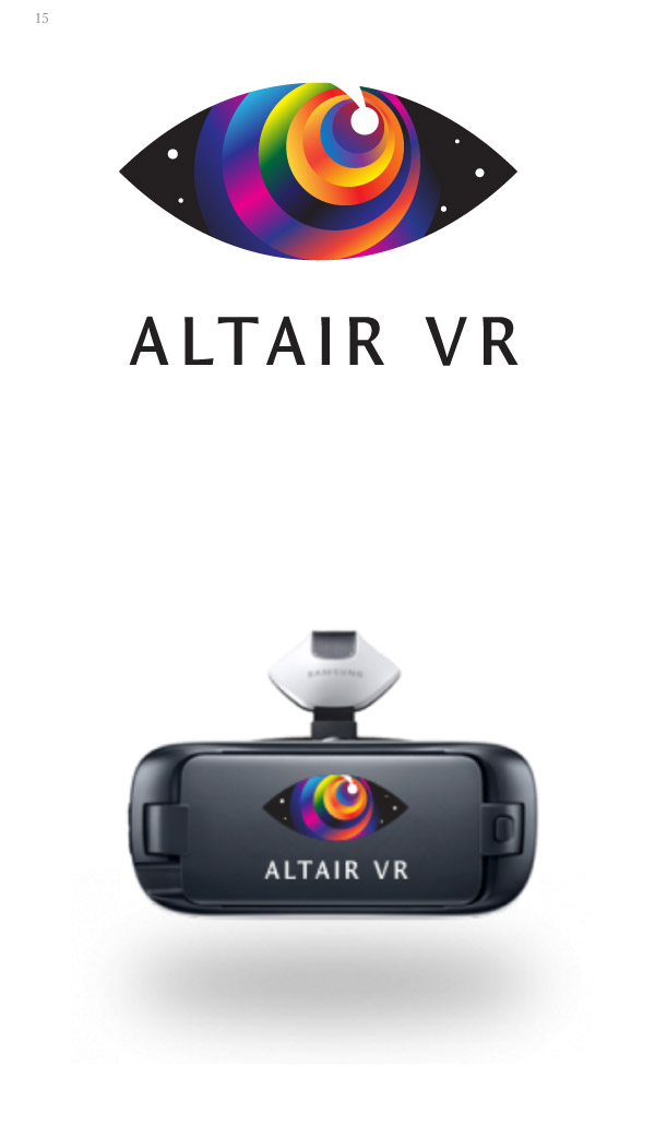
Art director: Good. But make sure the text is not wider than the eye.
Art director: Now you need to work on kerning, right now it sucks.
Art director: There’s poor spacing in AIR.
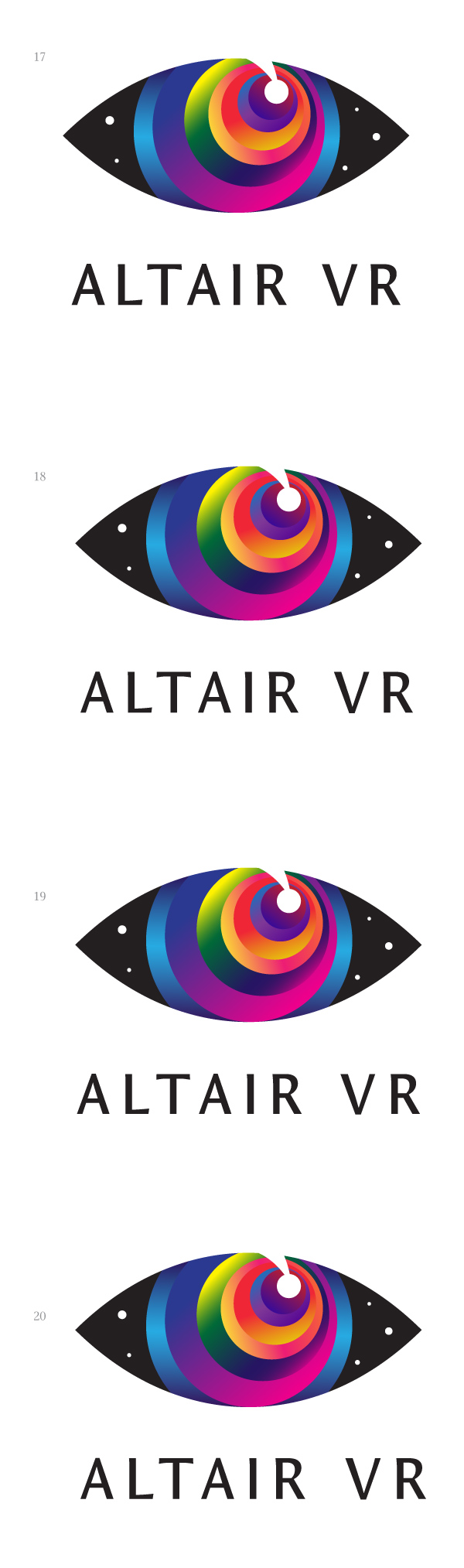
Art director: It only got worse. LT is bad and I is squished.
Designer: Asked Ksenia for help).
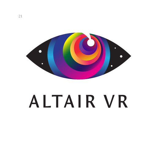
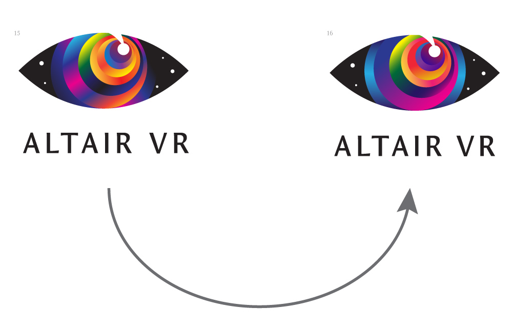
Art director: No wonder it got better :-)
