Client: AMA (ama.ru) is a service for finding apartments in newly built houses in Saint Petersburg and Moscow. We collect all offers in the cities, process the information based on facts and abstaining from any evaluation, and present the results in a digestible form.
We have five years of experience of working on this market, we know how it functions, we understand what our visitors want and know how to help them make the choice without getting in their way. The project’s emphasis is on easy search and content that minimum subjectivity. Our task is to help people find the best apartment in a newly built house with as little friction with the UI as possible.
Some of our wishes: the logo will be used on the website including its mobile version, which is why we’re leaning towards a text wordmark with no symbol.
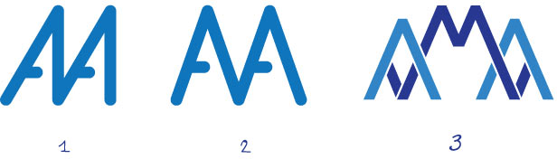
First designer: First sketches. There’s a crown decorated with a geotag in the third one.
Art director: Let’s search some more.
First designer: Here’s another one.
Art director: Looks nice graphically but it’s absolutely illegible.
First designer: What about this?
Art director: Better. What if we make the M larger?
First designer: Like this?
Art director: Not bad. Try to make it read “aMa.” And color the letters in different colors (different colors for a and m).
First designer:
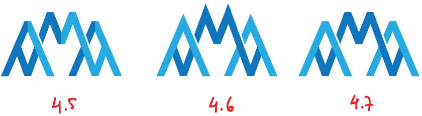
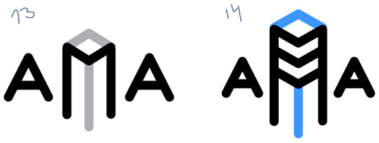
Art director: 4.7 is a possibility. What about other colors?
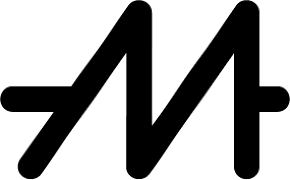
First designer: Added bends to the M in two places.
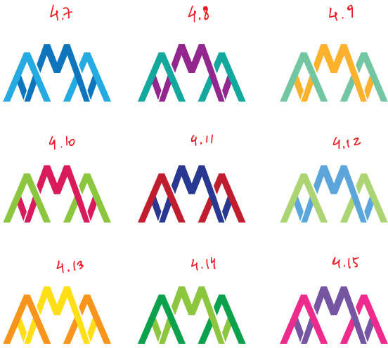
Art director: It looks better with colors but your choice of colors sucks.
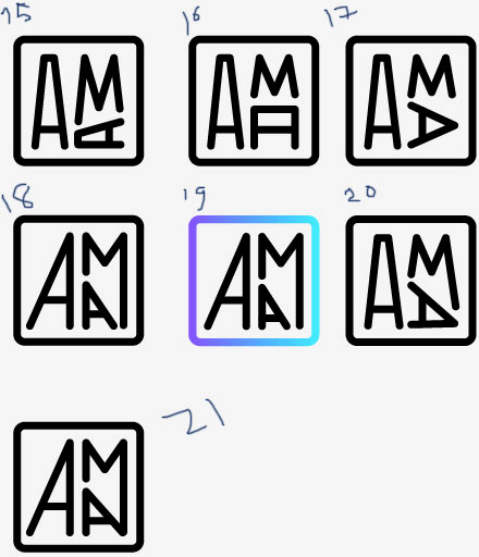
First designer: What if we use shades of a single color?
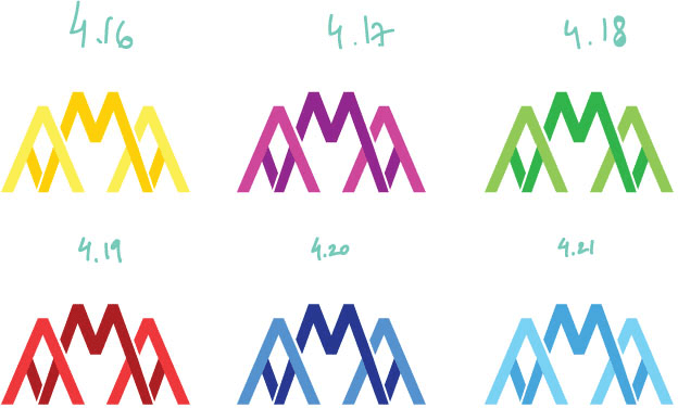
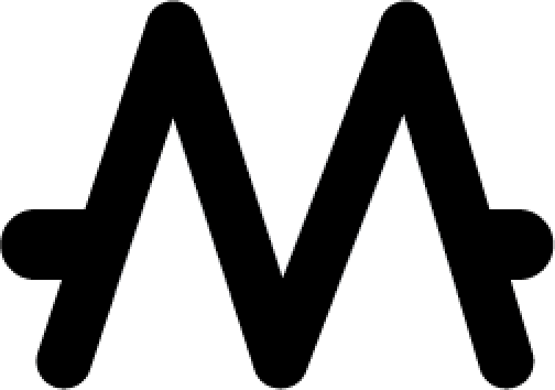
Art director: 4.20 looks like something.
Second designer:
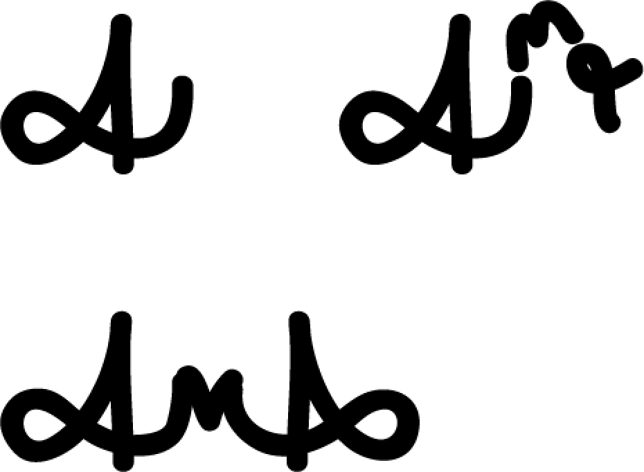
First designer: It reads Alla (they have the same right now).
Art director: Looks rough.
Second designer:
Art director: You need a history lesson: artlebedev.com/apa
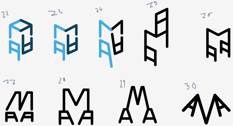
Second designer: Wow, a second hit in an hour.
Third designer: Just to break up your “Fans of Symmetry” club. Alla asked to let you know she doesn’t have to be here.
Art director: Hello, 1980s.
Third designer: It’s like I just made a logo for Alma Ata. I will be generating quick sketches. In this one it’s like two guys giving high fives.
Third designer: Skyscrapers (not boobs like you must have thought).
Third designer: A guy says hi. That’s what you should see here.
Third designer: Primitives.
Art director: Which one will get the Lions?
Third designer: What do lions have to do with it?
Art director: I’m talking about the Cannes Lions award.
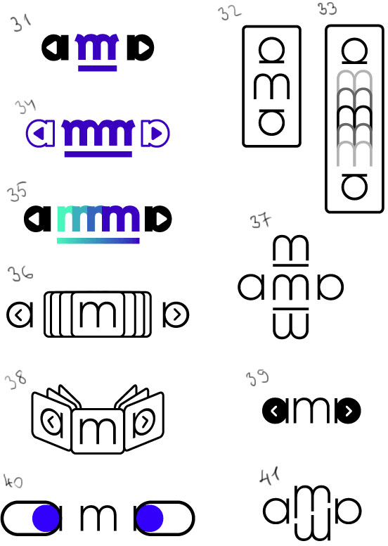
First designer: I have this (but I feel Tema will say it’s from the 1980s).
Art director: Yep, I had toys that looked like that.
Third designer: The monogram is begging to be moved out. I’ll just put this here.
First designer: I looked at your ideas and had this one.
Art director: Аиа.
Fourth designer:
Quick sketches.
Art director: Moving on.
Third designer: I’ll just put this here for now.
Art director: Jama?
Third designer: The enemy is getting stronger while you sleep.
Art director: Where’s the life in that?
Fourth designer: New architecture, fill shapes, big choice.
Art director: What if we get rid of light blue in 1? 3 is a great logo for bicycle racks.
Third designer: Inspired by Vasya Drigo.
Third designer: Another, weaker one.
First designer: Pong.
Third designer:
Art director: What if we turn the sticks inward?
First designer: Then it’ll look like this.
First designer: A guy looking for an apartment.
Fourth designer: Looks a bit like Ku Klux Klan.
Third designer: Looks nice to me. Don’t miss the deal.
Art director: Not bad.
Fourth designer: The M can change its shape.
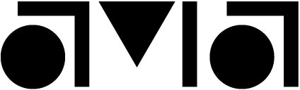
Art director: Reads like ATA.
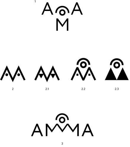
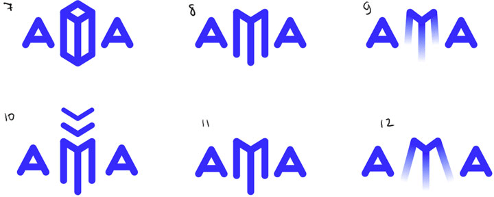
First designer: Here is mine and Ludwig’s shortlist. What should we finalize? By the way, in the first two designs the eyes can be connected to the position of the cursor on screen, they will follow it and irritate the user.
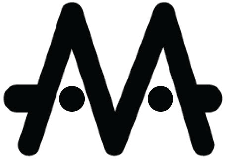
Art director: We need to try to play with the bars in 2. Put them on opposite ends. Or replace them with colored balls in the center.
Fourth designer:
Art director: No, let’s wrap this one up, it doesn’t look interesting.
Art director: Let’s go with something completely new.
Fourth designer:
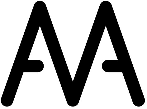
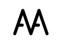
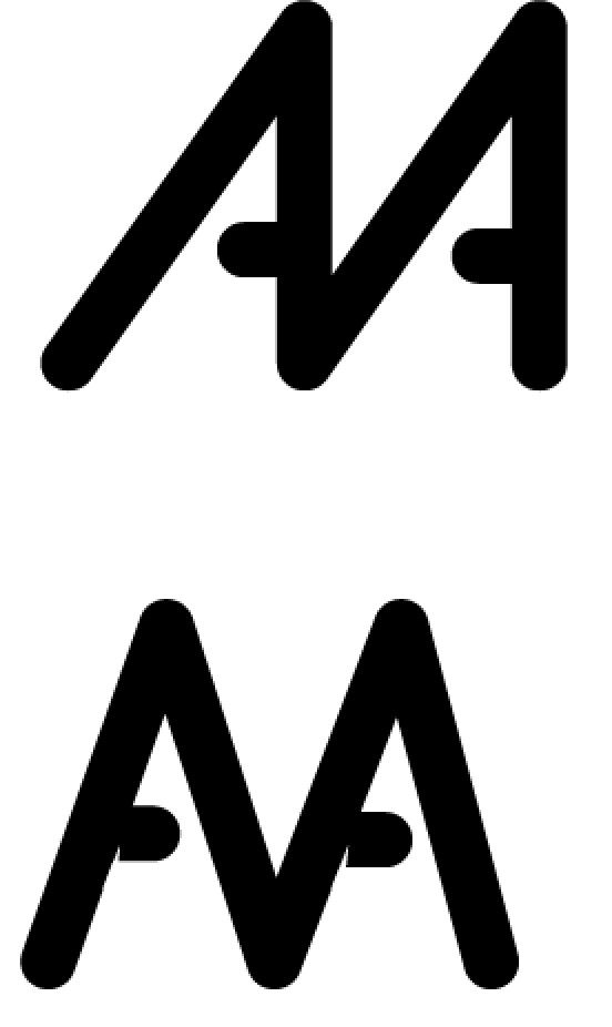
Art director: Interesting but no. Try to put the M on top of two As. Or glue them together so that two As grow out of the M’s sides.
Third designer:
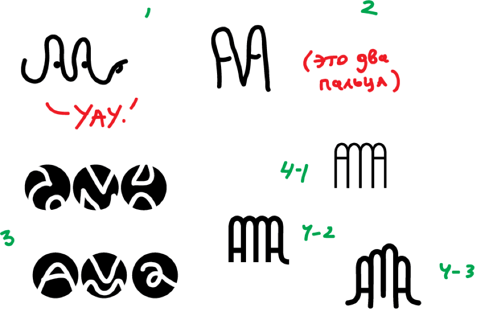
Art director: What if we turn 4-1 into the horn gesture?
Third designer: 4-2 already looks like it with its two fingers.
Third designer: Oops, I mean just 2.
Third designer: Hold on.
Third designer: The second one is funny :-)
Art director: I would work on 2. It’s missing a thumb. And also make sure the As don’t look like fingers with rings on them.
Third designer: OK, I’ll sleep on it and generate more tomorrow.
Art director: No.
Third designer:
Art director: I have hopes for the left one.
Third designer: For example.
Third designer: We can also fine-tune line widths here to make the M slightly thicker and support the perspective.
Art director: And stretch the bottom out.
Third designer: This. Probably enough for today.
Art director: I can’t read it.
Fourth designer:
Art director: Looks bleak. Let’s try something completely simple.
Fourth designer:
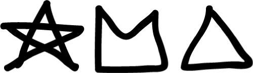
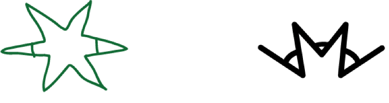
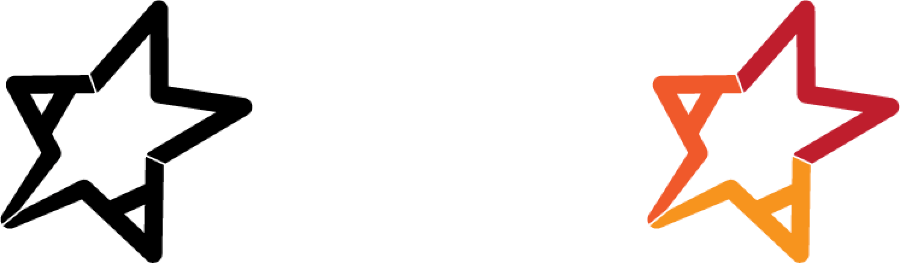
Art director: No, forget about it. We’ll go with Ludwig’s star.
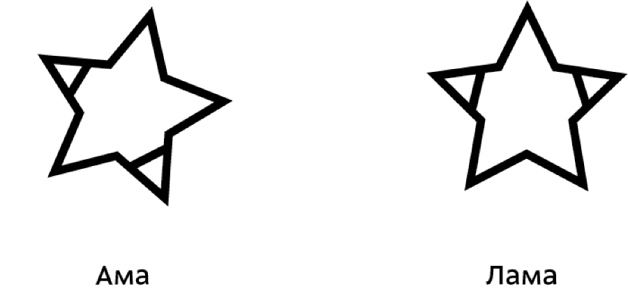
Third designer:
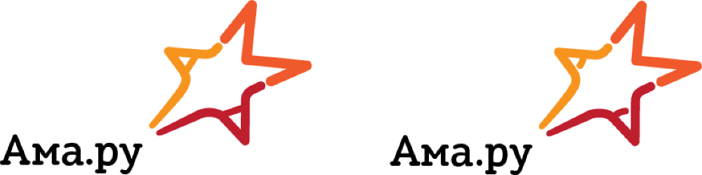
Third designer: M isn’t red to prevent it from looking like Gmail.
Art director: Let’s keep the horizontal line.
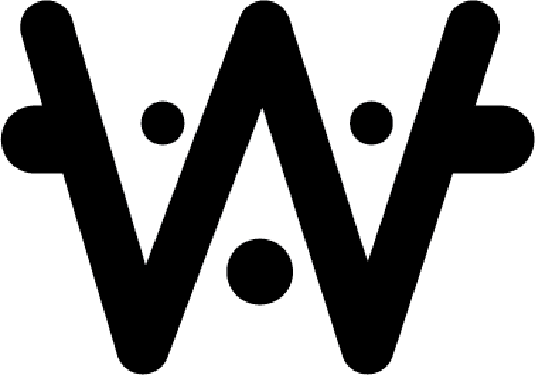
Third designer: It’s only logical. The right one differs by the holes in the A.
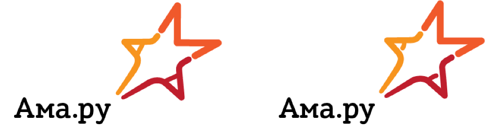
Art director: You probably need to raise the right (from the viewer’s perspective) arm higher to make it more upbeat. And replace the bars in As with dots.
Third designer: The dots look like nipples.
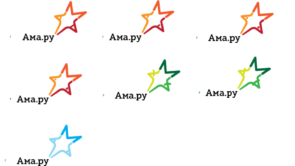
Art director: OK, let’s go with 1.
