Client: Our company is focused on business clients from various countries (at this point it means customers from Russia, Germany, the USA, Egypt and soon other countries), which is why we would like to see a corporate identity that would be attractive, instill trust and encourage fruitful cooperation. Also, since we are targeting different countries, the style of our letterheads, business cards, pens, mugs, signs and other office accessories and later our website should reflect this multi-lingual international focus.
Currently we have a team of developers who are in charge of our web projects, systems integration, implementing loyalty programs for various service industries (bars, restaurants, online stores, etc.). We offer solutions for businesses and that gave birth to the idea of the bfb.one website where BFB means Business for Business. But we can’t find the time to work on our logo or corporate identity :)
First designer: I’m not sure which name I should use in the text portion of the logo: BAKSET or BFB? Bakset is Cyrillic (which means it’s not international and not multi-lingual) while BFB is simply their domain name.
International = aimed at all parts of the world.
1. Like on maps. International = aimed at all parts of the world.
2. Openness to any clients from all over the world. I took the word “any” and illustrated it with an inhuman face.
3. Many languages, international orientation, dependability, variety of projects. Simply variety, simply colored squares?
Art director: So far that’s not what we need. The last thing we want to do is look for a metaphor for the word “international.”
I’m waiting for the client to clarify their name.
The brand name is BFB.
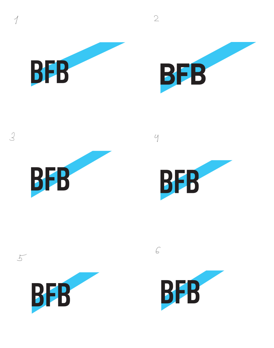
Second designer: Logo ideas.
First designer: We can use the connection between the letters b. In 3 we can make it look like icons of applications, social networks, YouTube.
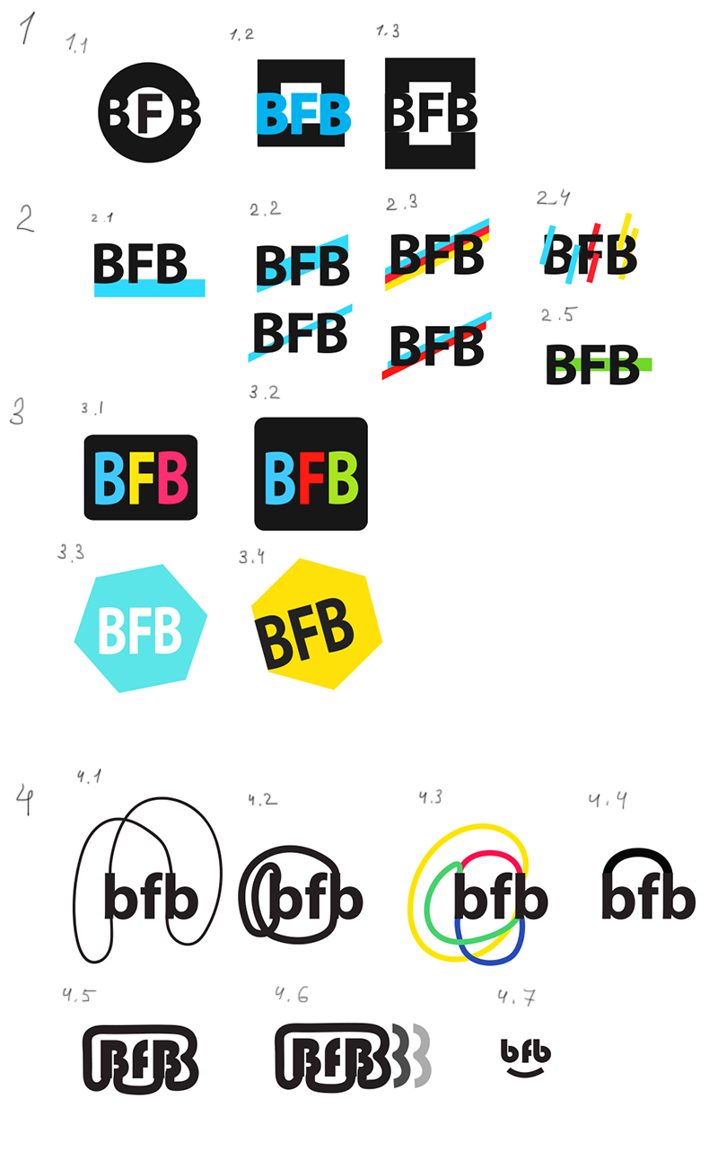
Art director: The top one in 2.2 is nice, you can work on it some more.
First designer: We can extend this line in the corporate identity, although then it won’t just connect the two letters. But at the same time the upwards direction is about growth and development (of BFB projects).
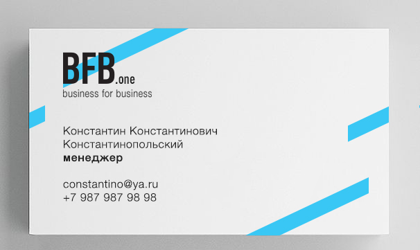
Art director: The stick that goes beyond the format edge is OK. The design on the business card is the best.
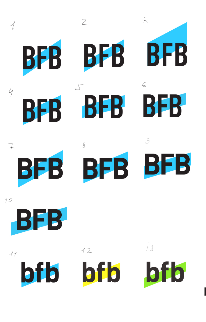
First designer: With minor modifications. Number 1 is the same as on the business card.
Art director: 5 is OK.
