Client: Brighton Business IT is a small IT company located in Brighton in the south of England. We are aiming to compete with larger companies and focus on solutions for small and medium businesses. Our clients like us because we make their systems simpler, often removing excessive solutions that have no reason to be there in the first place, reducing stress and IT-related expenses. In short, we know how to solve their problems effectively and they don’t.
Right now our clients are small and medium-sized companies that can’t hire a full-time IT consultant or are looking for additional support during a large-scale modification of their systems. Our typical clients right now are companies that are experts in their field but do not necessarily have strong IT expertise: real estate and recruitment agencies, architectural and law firms, dentists, mortgage brokers, a small school and a variety of small companies: construction firms, cafés, local manufacturers and shops. We also work with non-profits and know a lot about solutions tailored to their needs.
We love our clients and want to help premium clients with narrow expertise in their area—law firms, investment bureaus, auditors, real estate agencies—and we have experience of solving their problems and working with their systems. Now we need a logo targeting premium clients.
Very important:
—the logo should be in English only: the company is located in England, all our clients are British companies, we operate in Brighton and the surrounding area;
—instant recognition: the logo has to make it instantly clear what exactly we are doing and that we are working with businesses only, not fixing PCs at home.
It would be great to convey that:
—we aim to provide consulting services: find a solution to an unusual problem or remedy the situation after a previous failed installation;
—we are targeting premium clients;
—we really don’t want to be associated with laying cables or computer networks, that’s something electricians can do.
Starting to work.
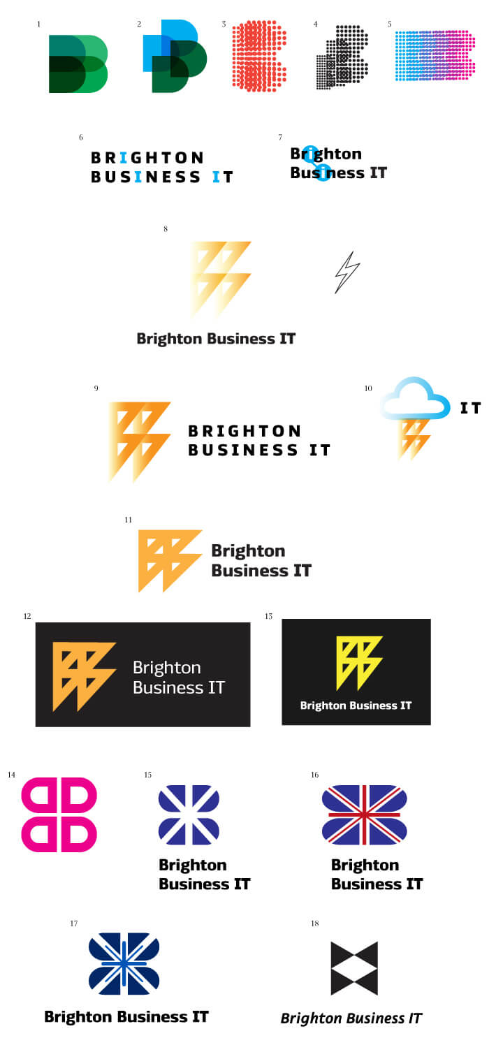
Art director: The D shouldn’t cry for the viewer’s attention. 8 looks like the SS logo. 9 could be OK, but still has a hint of SS in it. 12 is fine. The effect in 16 is worthy of further consideration. 18 looks good graphically but has no relation to IT. Adjustments need to be made here.
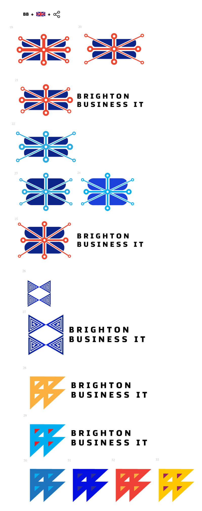
Art director: 25 is OK. What if you make it square? Or black and white?
Designer: More ideas.
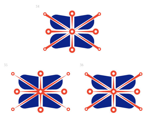
Art director: The B looks too much like boobs or sanitary pads.
Designer: Whoosh.
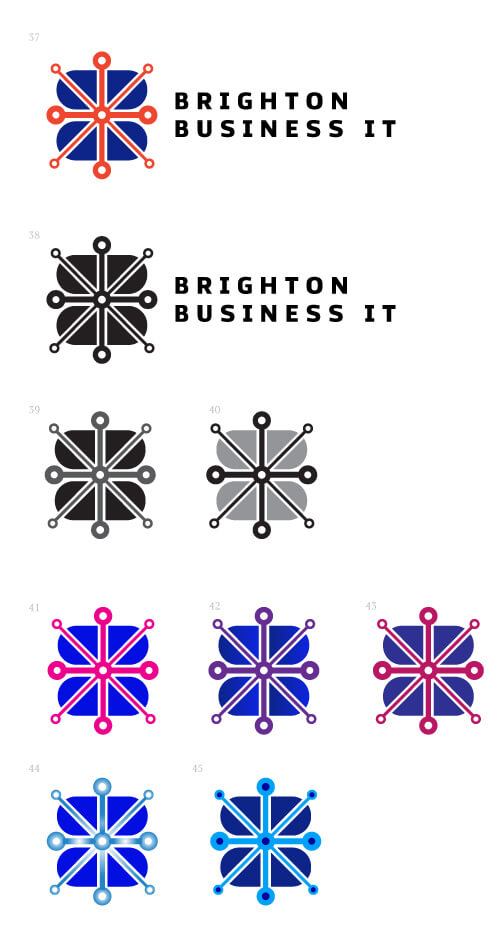
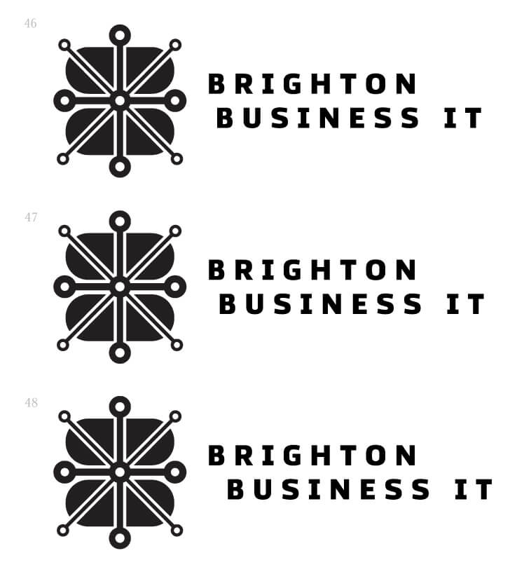
Art director: 38 isn’t bad. What if you move the bottom line a bit to the right?
Art director: How about we put IT on the third line? And make the rays thinner like you had it before?
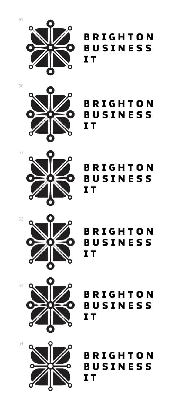
Art director: 52.