Reading the book and identifying three main themes: making more money, standing out from the crowd of competitors and getting new customers. We need to combine all of this in one picture without losing anything along the way or adding anything extra.
Three ideas are born:
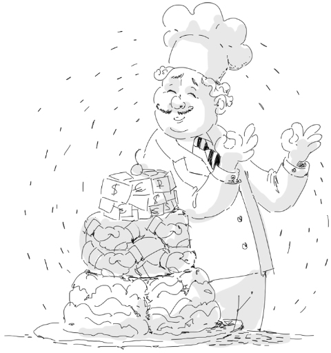
—A chef with a three-layer cake: the first layer is a brain, the second is a pattern of handshakes, the third is money.
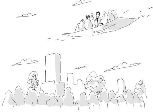
—A banknote-shaped carpet plane flies over a city carrying a businessman and his clients.
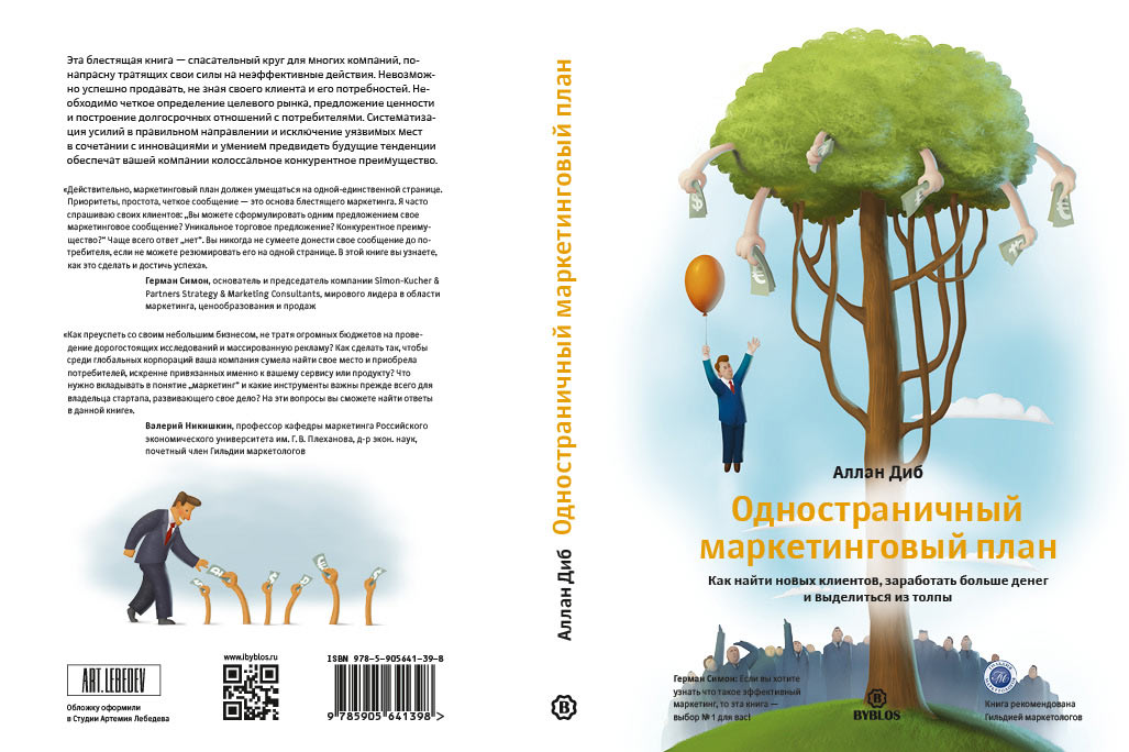
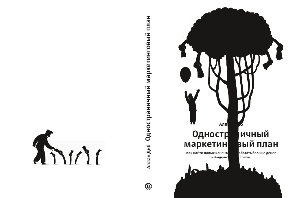
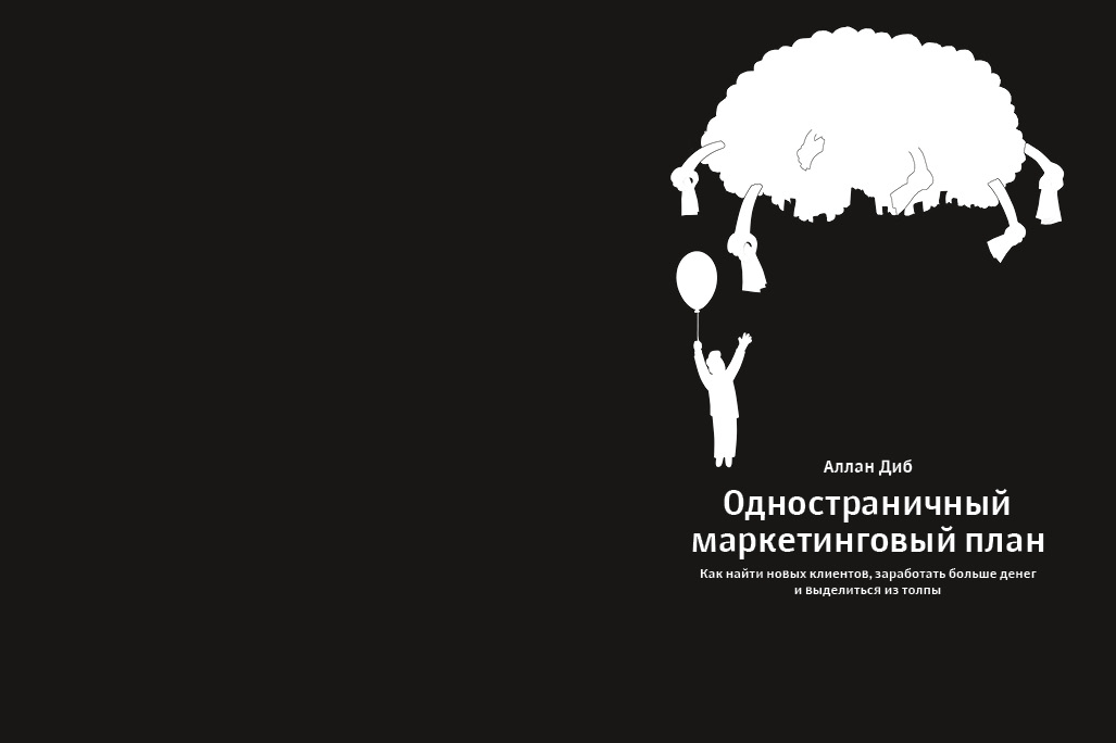
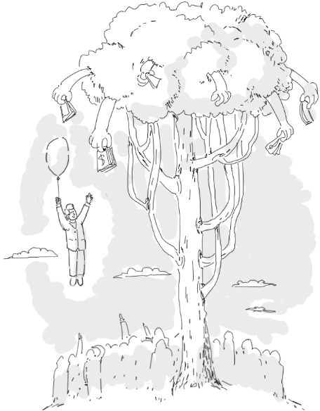
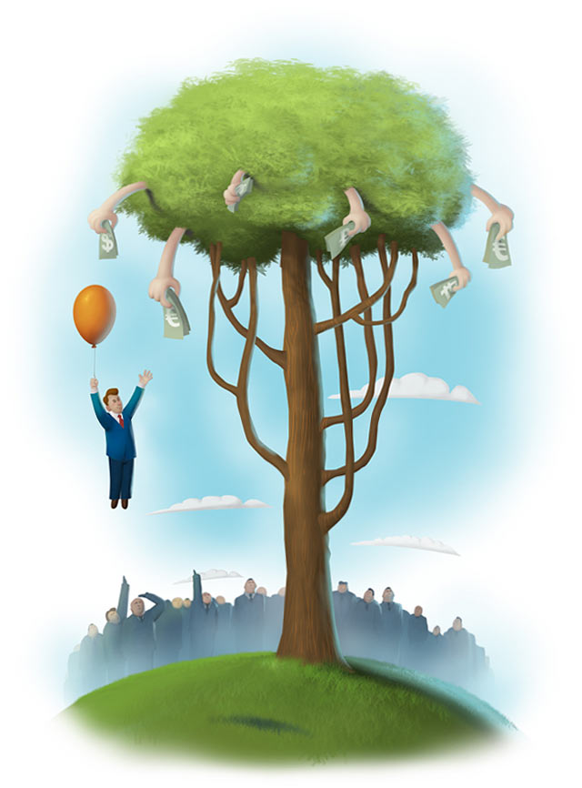
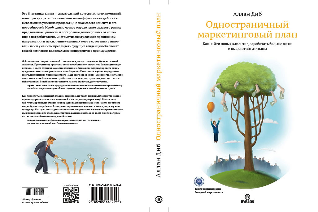
—A money tree with client hands as fruit and a businessman flying on a balloon above the crowd (a slight Winnie the Pooh reference).
Showing to the client.
Client: Are you kidding? You give us three ideas and we don’t know which one to pick, they’re so good!
Here’s what the author of the book has to say about diversity of products: «Offering too much choice can actually prevent sales. The psychology behind this finding is that people get caught like a deer in the headlights. Fear of making a suboptimal choice prevents them from making any choice at all.»
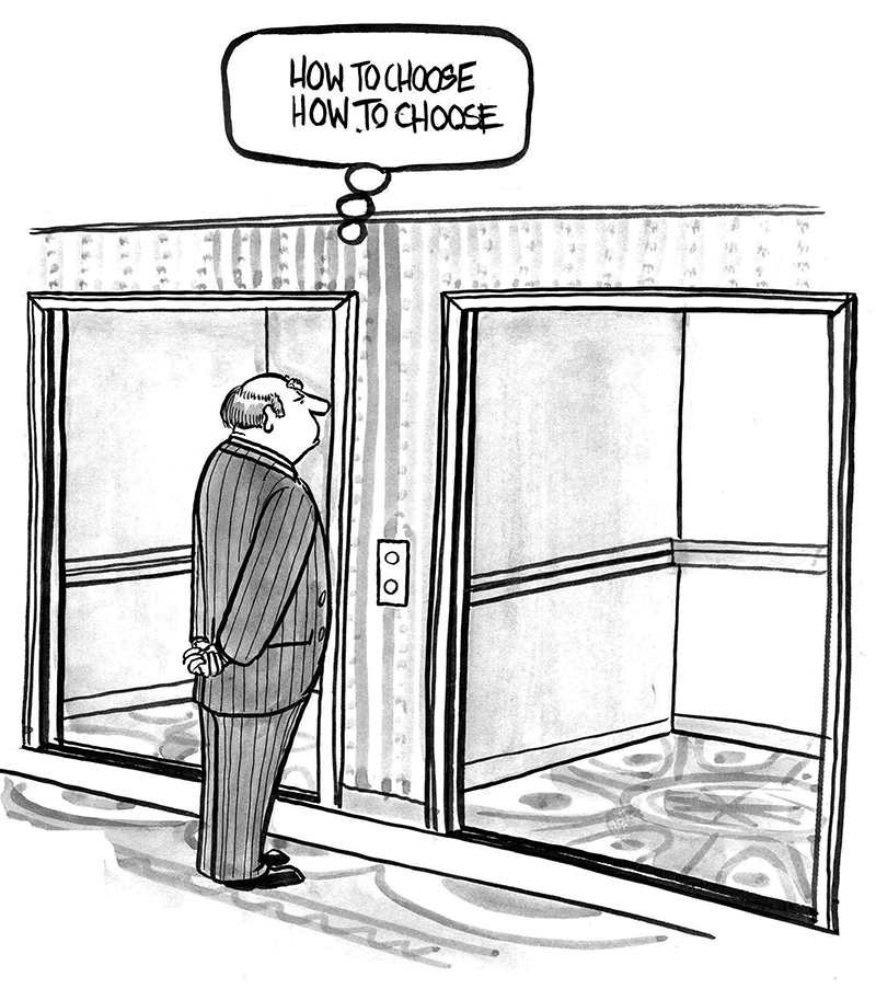
Of course, thank you very much for giving us the choice because we know the contents of the book well and it’s great to have something to choose from.
The carpet plane would probably work less well since first of all it’s about magic and secondly it makes it look like you don’t need to do anything, everything will just happen and fall in place by itself, like in a fairy tale. This is far from reality where marketing is a tremendous and tedious undertaking, not a one-time event but rather a constant process.
The one with the chef looks beautiful and memorable, it’s a large and noticeable.
However, we liked the tree best, both from the calligraphy standpoint and because of its subtlety.
Let’s use it.
Drawing the final image as well as pictures for the fourth cover board.

Sending the illustration and all the texts to the typesetter.
Something’s not right. The illustration on the first cover board needs to be bigger.
The typesetter enlarges the illustration, ruthlessly stretches it from the middle and decisively throws in the title, replacing the antiqua typeface with a grotesque. Just what we need!
Sending the mock-up to the illustrator to do some work on the tree and the hill.
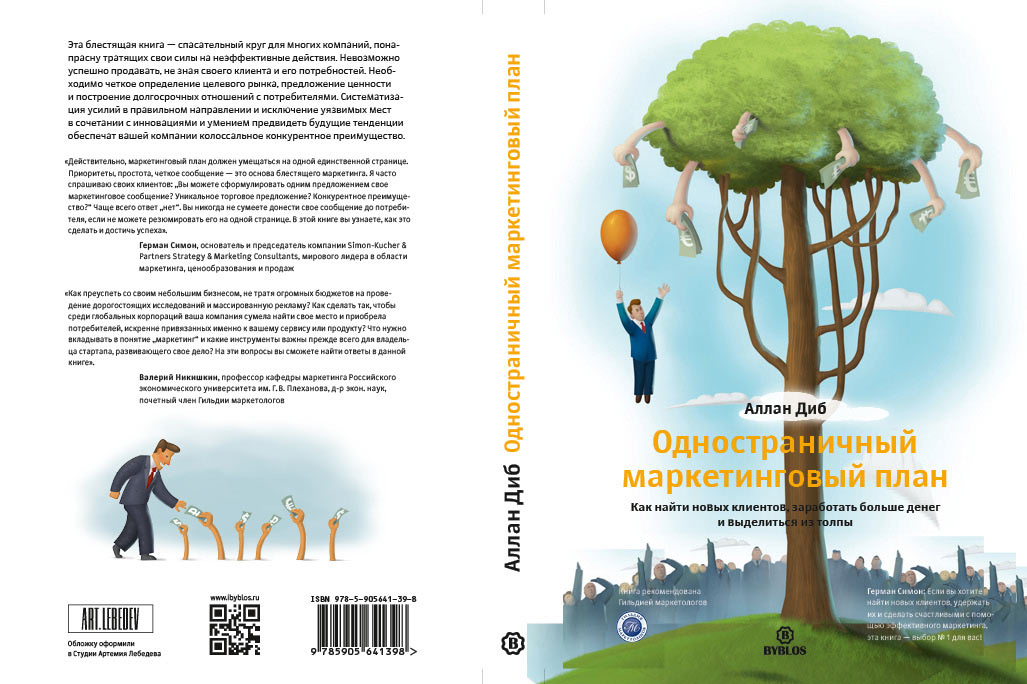
Showing the cover to the art director and the client. Everyone is happy.
The editor fixes typos. Adding a clearcoat, hot stamping and it’s done, to the press it goes!