The making of the cover design for The Kind Worth Killing by Peter Swanson
Overview Process
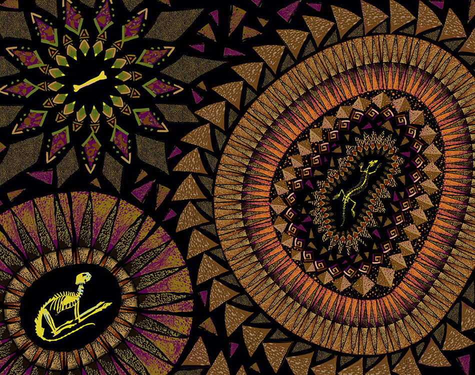
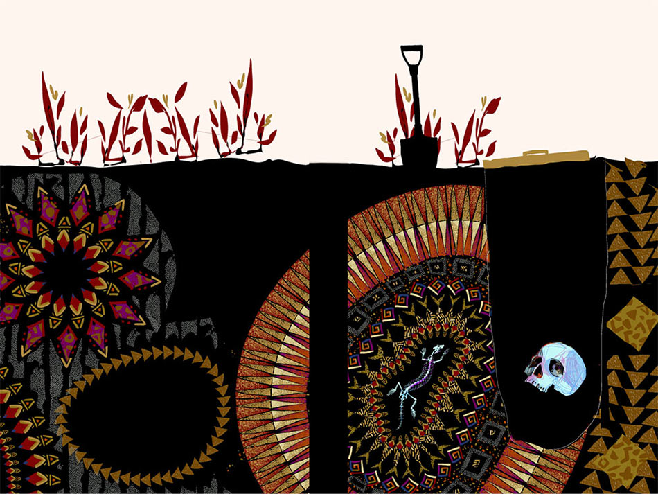
Reading the book and thinking up a sketch.
Presenting.
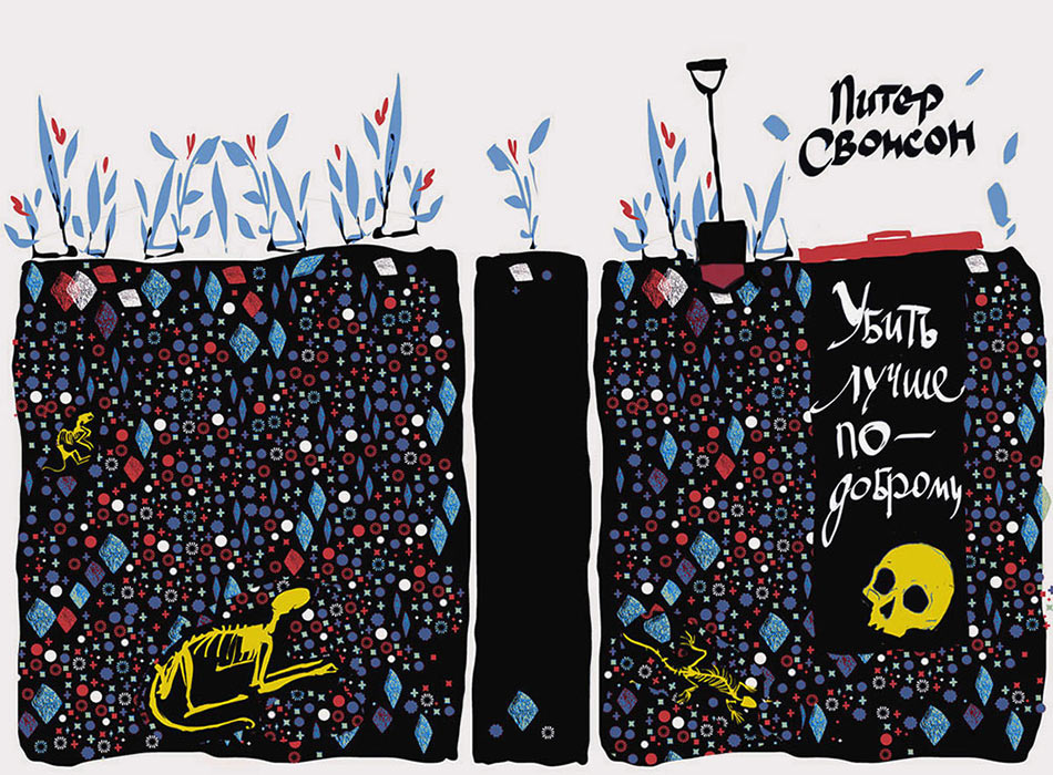
Client: That’s very gloomy, it seems Yana does indeed favor the color black. Was the blue color a conscious choice for the plants and all those pieces underground?
A brief pause ensues.
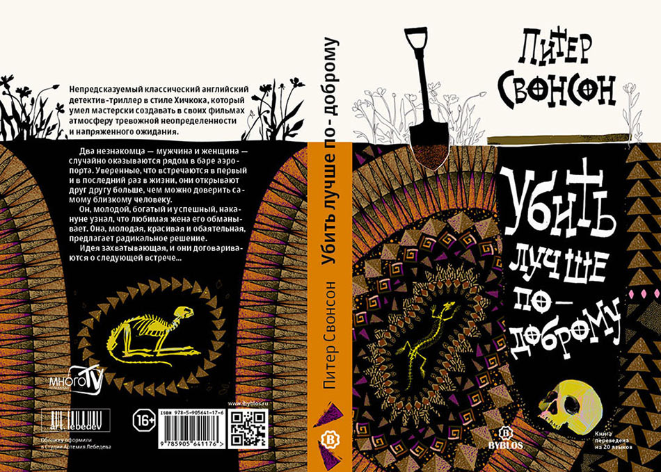
Client: I think that this is both fun and unusual))). I think we need to make sure all those pebbles give the cover a special character. At least its very unusual compared to other versions of this cover. We’ll take it! Drawing, changing the colors as we work to find the best design.
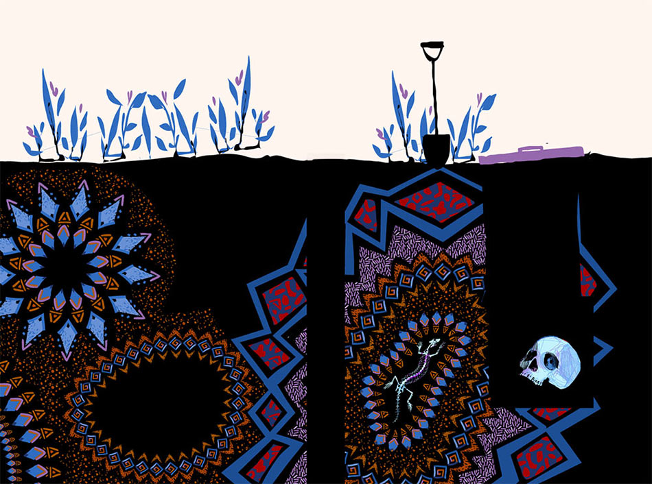
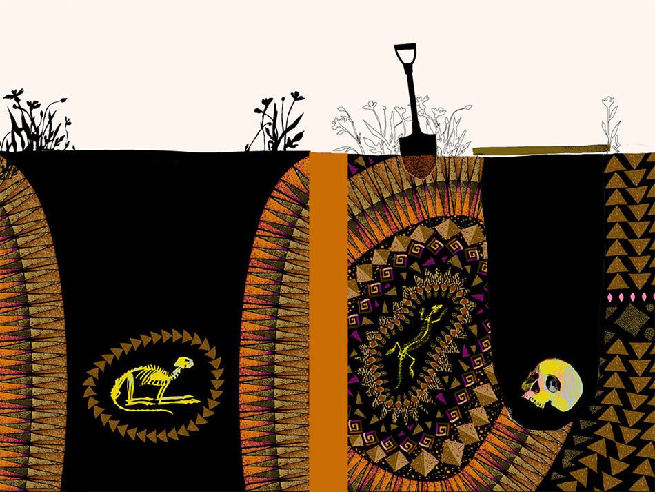
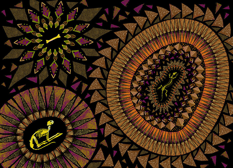
Working on the endpaper.
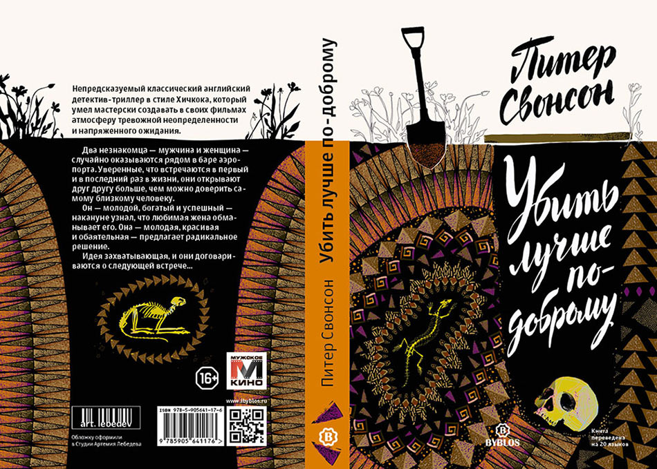
The sketch is ready. Starting to work on the calligraphy for the title.
The calligrapher takes the brush and a couple of sheets of paper and quickly sketches the text. The second variant written with a wide brush seems to be reinforcing the broken cartoonish style of the illustration.
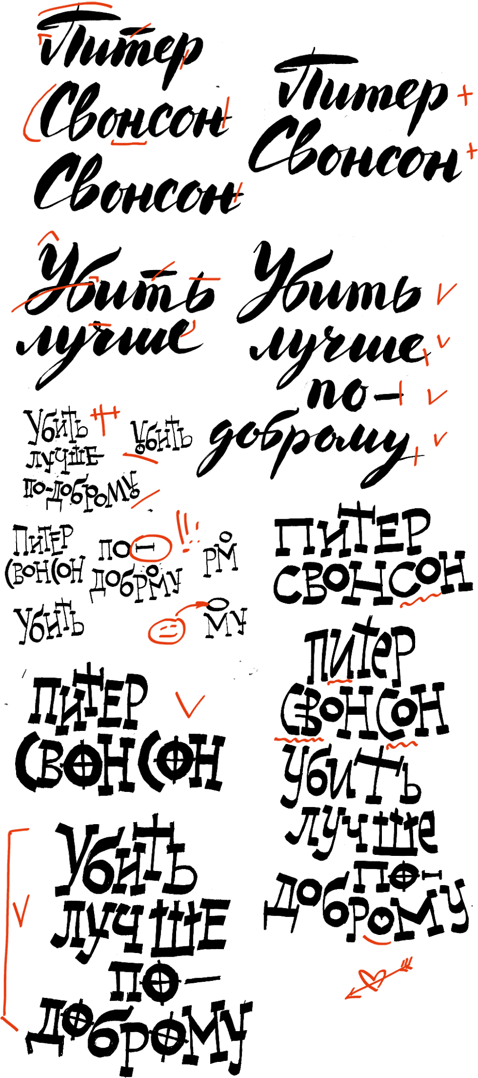
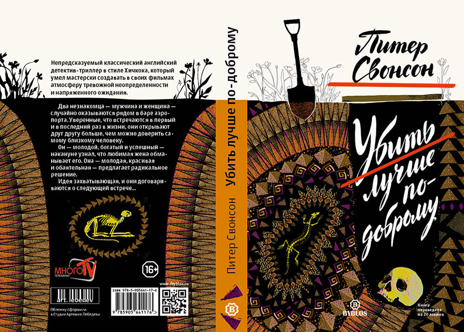
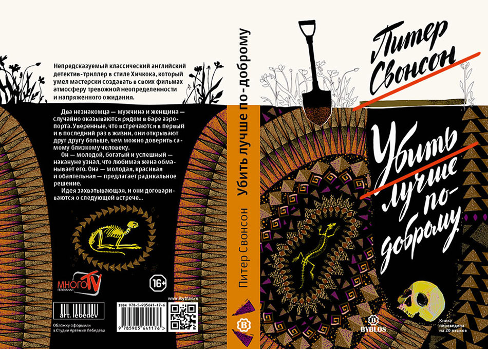
Typesetting both designs and showing to the art director. Should we go with the cartoonish one or the round hand-written one?
The art director chooses the round text and asks to make the lines straighter, fix their varying slant and fading off towards the end. A couple of iterations is all it takes to fix these problems.
Receiving sponsors’ logos and the picture for the endpaper. Positioning the text, and it’s done.