Sketching first ideas.
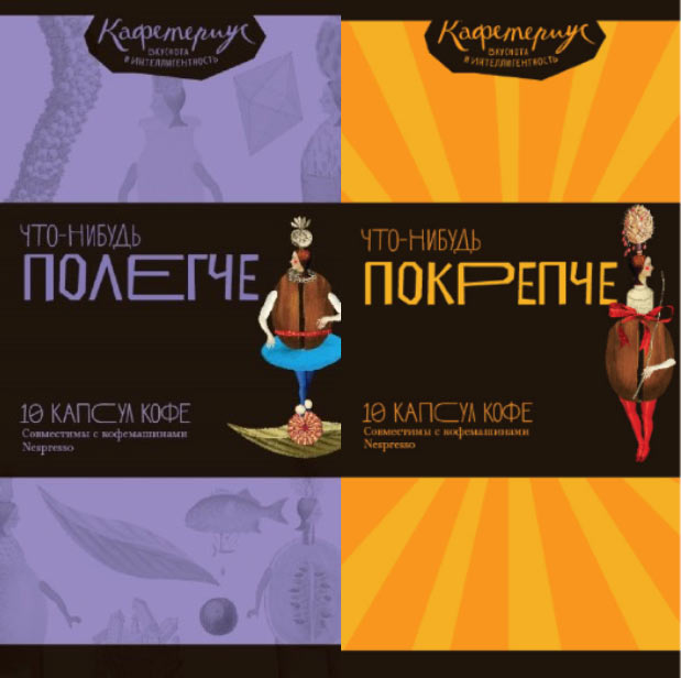
The first design. Putting stripes or our illustrations on the background, similar to our menus. The names are temporary.
Getting an idea to make the strong coffee different.
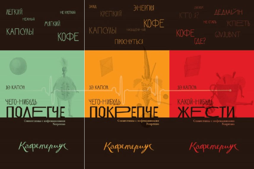
Second alternative: something with tags and joke about a heartbeat line.
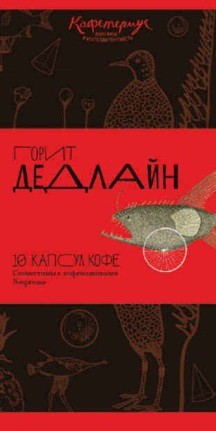
Third design: adding more trash as the coffee gets stronger.
Art director: The third one can be called “Something tastier.” But overall the ideas are quite poor, more area is covered by Caféterius pictures. “Deadline approaching” is a nice slogan, I would put it in a circle of some sort. We can potentially come up with similar ones for the rest of the coffees.
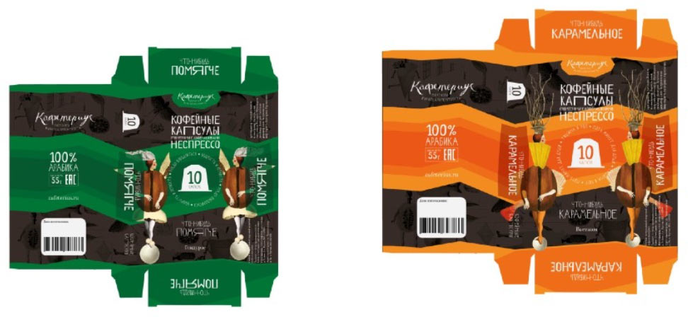
Designer: I worked on this some more. I got an idea to try the Coffee and Spices pattern on the dark area and put smaller versions of our pictures on the lighter area. Above the barcode is an area for a stamp with manufacturing date. (The back is still in development.) At the bottom if the name of the country of origin.
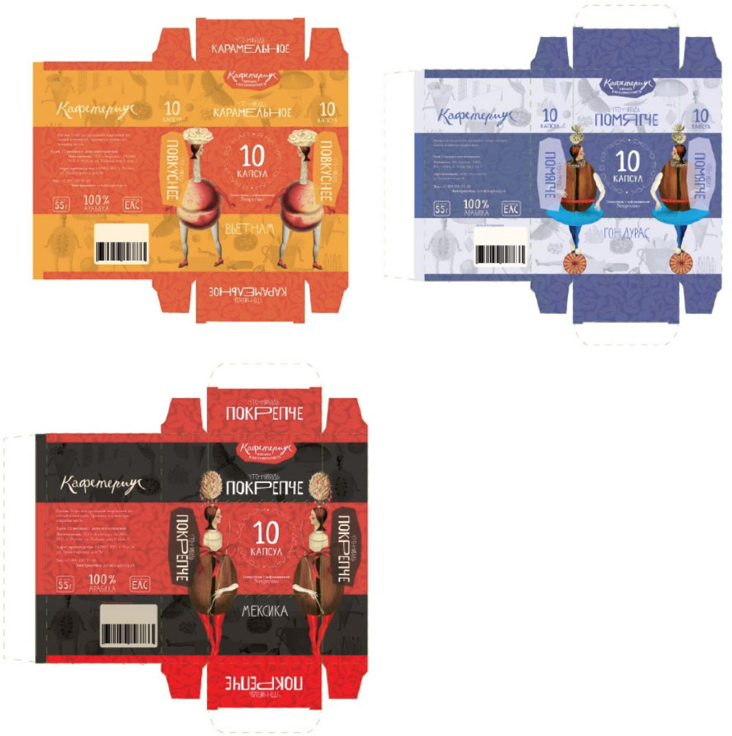
Art director: You can even show an outline of the capsule, it’s pretty recognizable.
The designer generates new ideas.
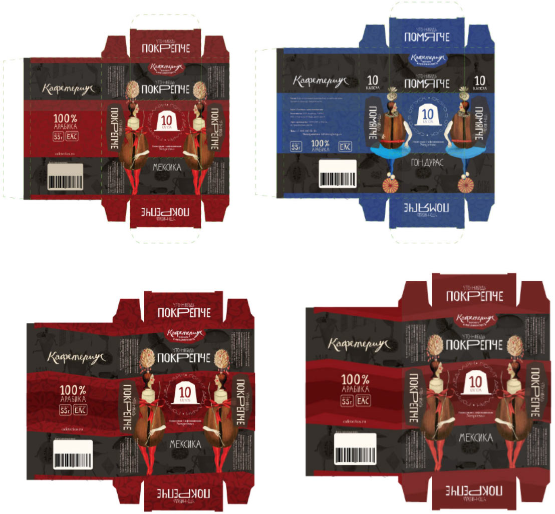
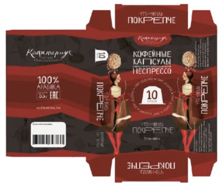
Art director: Right now the design is less about coffee and more about chocolate, I’m talking about the package as a whole.
Designer: Maybe we should make the colors darker?
Art director: This is OK. I want to look at an assembled mock-up of a box. And why do you write Nespresso in English?
Art director: OK.
Showing to the chief typesetter and sending for printing.
