Client: Online store offering bagging products: industrial sacks, gift bags, related packaging materials. Website under development at dokpak.ru.
Wishes:
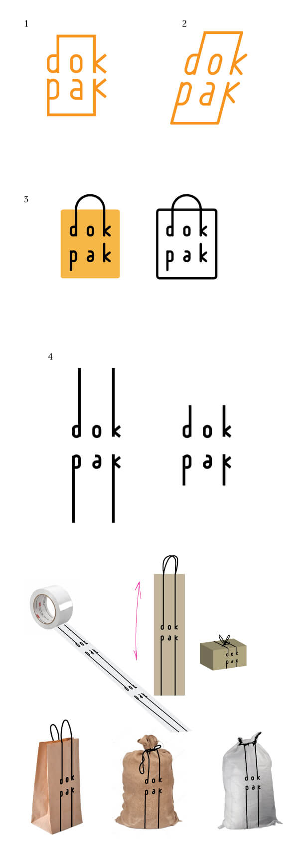
1. First of all, we need the logo for our store at dokpak.ru. This is a store selling primarily bag products (polypropylene and polyethylene bags, paper bags, vegetable string bags, soft containers, sacks made of natural and synthetic fabrics), which is to say these are industrial (80%) and gift (20%) bags. You can see our products here: tarra.ru/katalog_produkcii (this is also our website). Secondly, the store offers the entire range of packaging products (boxes, crates, gloves, tape, plastic wrap, etc.—everything that goes along with product packaging).
2. We would like the logo to instill a feeling of a guarantee of having products in stock and matching their specifications as described on the site (not having something promised on the website and poor quality in real life).
3. Our clients are small manufacturers, wholesale warehouses, stores. Both wholesale and retail.
4. Age of our clients varies greatly (25–60 years old).
5. We are planning Dokpak to become the largest online store in Russia for packaging-related products.
6. We need an extremely simple logo, with no extravagances, no monograms, national motifs, it should be easily readable and not excessively creative.
Starting to work.
Art director: OK. Let’s search for some more.
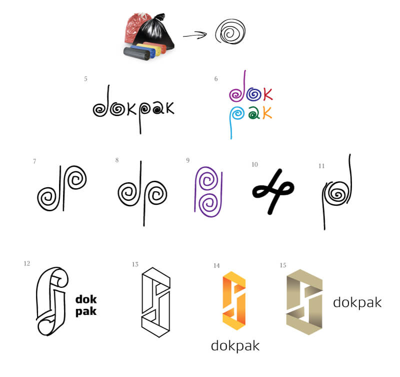
Art director: 14-15 are very interesting. But there’s an S starting to emerge in counterform in both of them, we don’t need that.
Designer: What if we get rid of the counterform? It has a d, a p and a bow tie )
Art director: No, this looks like Microsoft and a currency exchange.
Designer: Another batch.
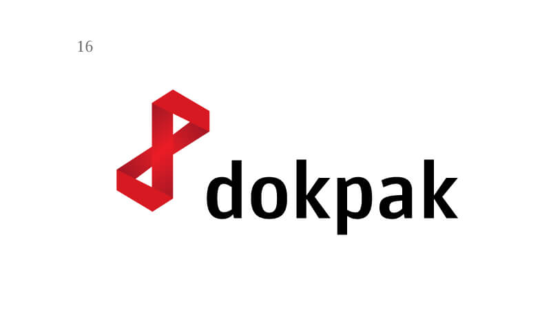
Art director: 29 is good.
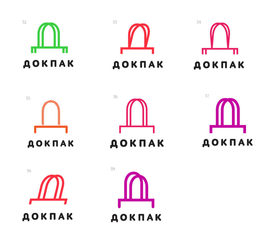
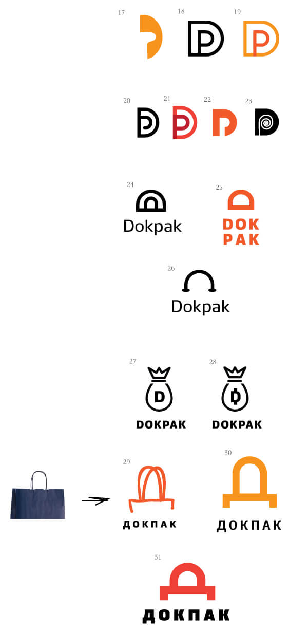
Art director: 33 is OK. Let’s try to use the legs of the Д to write П to make it read ДП. Even though this would work better for gift bags. These guys are more about potato sacks.
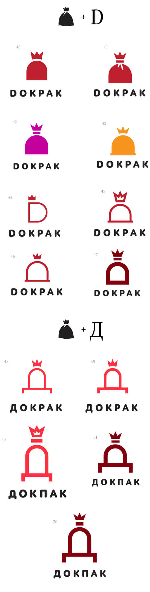
Designer: With the П it looks completely like a gift bag, or are we all about gift bags? Should I generate more ideas?
Art director: There can be a bag, but there also has to be a sack.
Designer: A king of sacks.
Art director: Maybe write the name across the sack? To make sure there are no associations with trash bags. And try to break out the bottom П.
Designer: If we break out the П, it starts to look like a story about chairs and sausage )
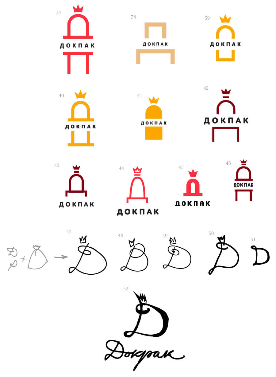
Art director: Yeah, there’s too much sausage and too little of a good logo here.
Designer: What about this?
Art director: Good.
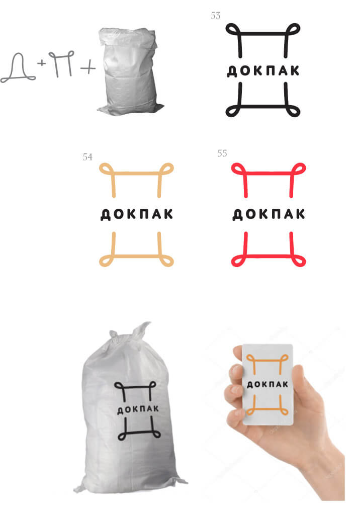
Designer: Large and in color.
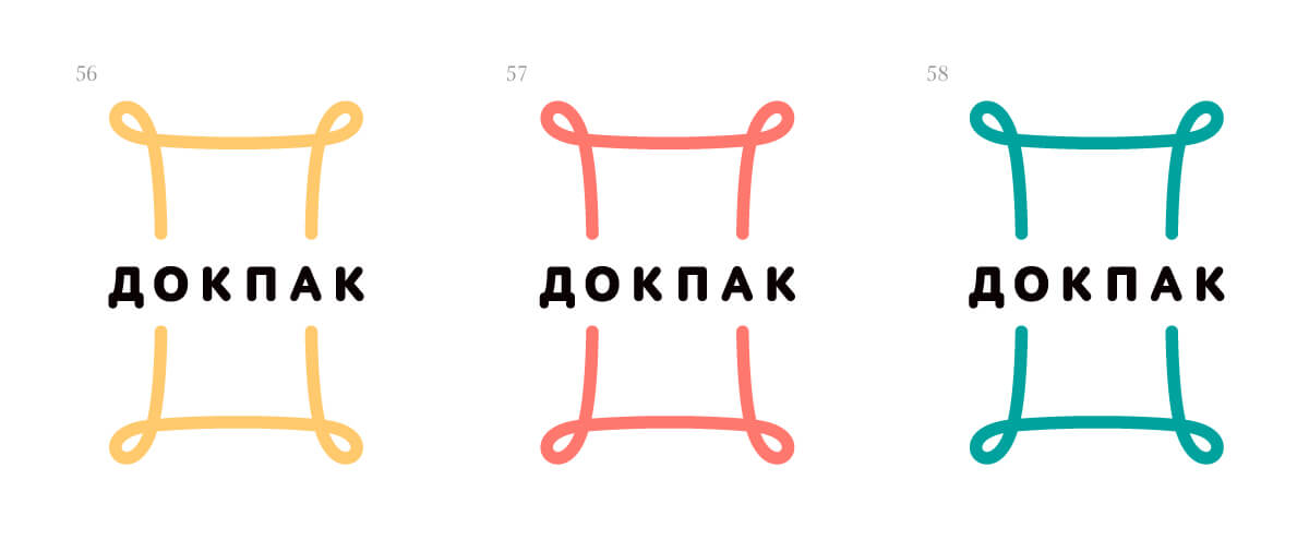
Art director: OK.
