The making of the Pocket Dictionary of Quotations for iPhone
Overview Process
Creating a screen map for the application.
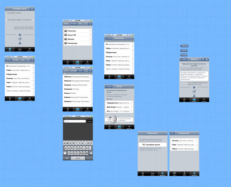
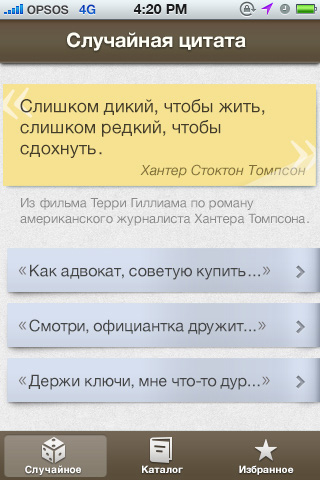
Trying out the first design option on the screens. Removing excessive elements.
Art director: It doesn’t look like a quotation book. The green color is also odd.
 |
 |
 |
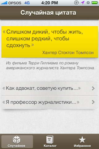 |
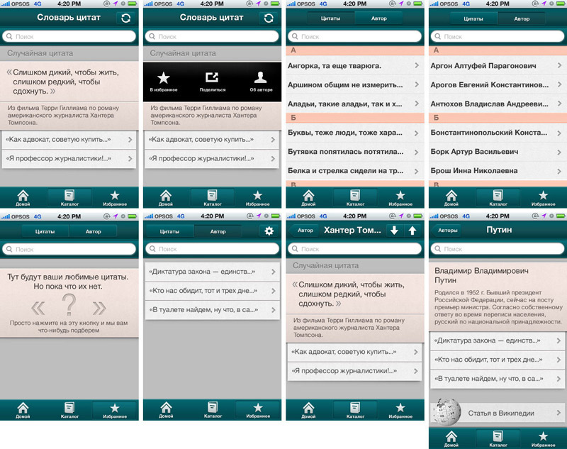
Art director: Still, it’s not it.
Designer: Maybe bubbles?
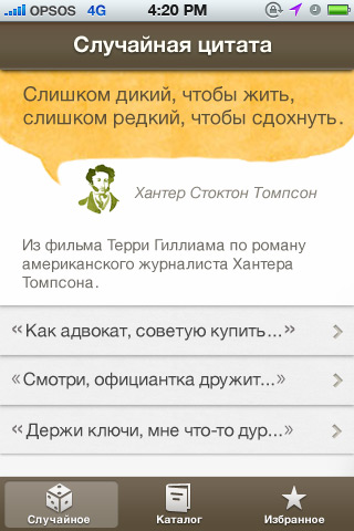
Art director: It looks like a coffee cup at the studio, and it shouldn’t.
Art director: Yeah, but the bubble should be so good, others would want to steal it.
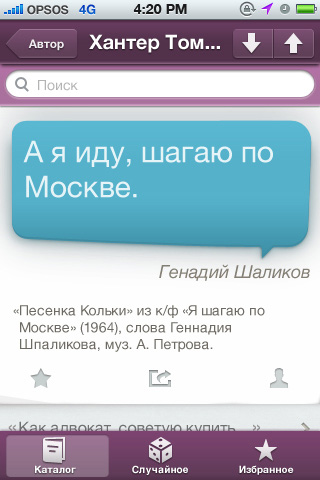
Art director: OK.
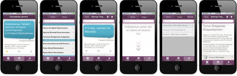
Working through the rest of the screen map in the same style.
Creating alternatives for the app icon.
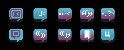
Abandoning the idea of a bubble in the icon. All that’s left is the color and the quotation marks.
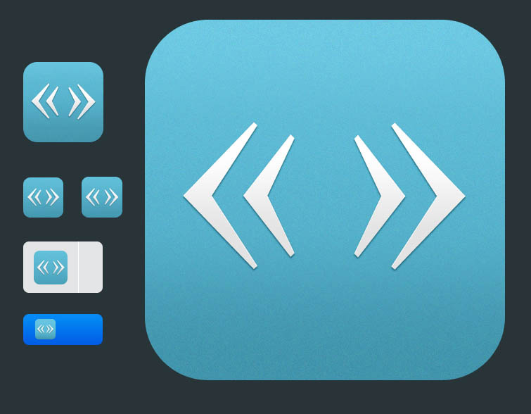
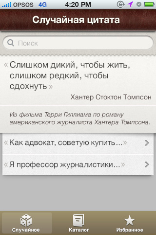
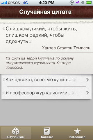
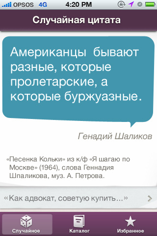
Trying it out on screen.

Order a design...