Art. Lebedev Studio website 3.0
|
Design and interface of the Art. Lebedev Studio website have always been created with maximum service life in mind. The first version lasted for three years. The second one—more than three. The new third version must be good for at least six years. |
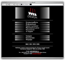
First version |
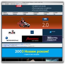
Second version |
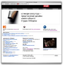
Third version |
|
Main features of the new design: maximum simplicity, accessibility and user-friendliness. The modular grid remained the same: the basic stretchable six-column layout that has been used by the studio in web and on paper since 1999. The black header with the logo now matches the style of our business cards, letterheads and envelopes. We removed frames, rulers and other graphic noise. Many website sections were relocated, some were entirely deleted as they were repeated in several places. The new website will continue to be developed and improved every day, just as it happened with the second version which had been renovated over 50 times over the course of its life. |
Before:  Page title also indicates the nesting level of a page. |
After: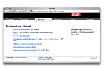  Page title is a title, nothing more (nesting level is evident from the context). |
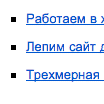
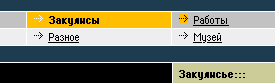 Two-line main menu. Navigation problem: the Backstage section name is in the first line with the second line separating it from the content of the section. Arrows near menu items always point right which turns them into decorative elements. |
 One-line main menu. The main principle: the current section is always highlighted. The second navigation line appears only when needed and adheres to the nesting logic. Arrows are now used as hints: “Portfolio section is one level above, we are currently in the Backstage subsection, while the Tools section is in a different place.” |
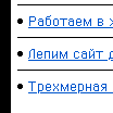 Link list divided by bullet points and horizontal rulers. |
 Bullets are enough—it’s impossible to mix-up different lines. |
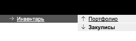
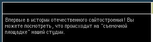 Black column with small text on the left is used to fill space. The subtitle line is empty as there is nothing to write there. |
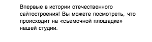 The column moves over to the right, now there are no problems with filling up space. The fine text emphasizes the column but does not claim to fill it entirely. |
 Frames put unnecessary emphasis on the modular grid of the website. To start a search, a visitor has to press the Enter key. |
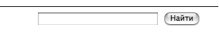 Search bar is stretched along the grid and does not require decorative frames. The Find button adds another way to start a search and simultaneously hints at the purpose of the field: the word “search” is no longer required. |
