|
Part 1. Introductory
I bet many of those who are keen on drawing icons have noticed that Mac photorealistic icons are not yet perfect
because they lack natural shadows (some of them are just terrible) and right reflections.
However neither, as we know, bothers the non-designers. In other words, muggles are very little concerned about this.
I will not go on about the shadows—it is clear that the painstaking kind draws them by hand
while those who don’t care much use Photoshop option to make it in 30 seconds. So let us speak of reflections.
Part 2. Reflections
Any reflection on the object depends on its surroundings.
That is to say, if a steel Parker pen is placed on green matting, it has to reflect that matting
and the reflections should also be green. Perhaps, creators of Mac icons did not care (or they actually did care)
that their works could be used on backgrounds other than the white field of Finder file editor—in fact,
all the reflections are white. But we sure realize that the icon can be placed on a background of any color,
and besides, Finder settings could be changed, too.
So here is an idea: this problem can be resolved by using semitransparent pixels,
which would allow through the underlying color creating the right reflections.
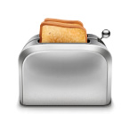
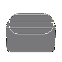
Reflections appear on just about any material, but they are most obvious on the metal surface.
That is why I would like to introduce to you this metal toaster:
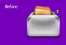
And now we change the background color to purple:
Muggles didn’t notice a thing. But we are designers and we know that if a toaster is on the purple surface, it has to have at least some purple reflections and its front should also reflect the purple surface. And here comes the most interesting part—
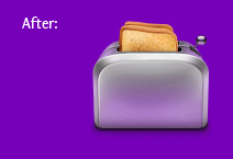
we take the eraser and slightly touch up the parts that are supposed to be reflecting.
The toaster is sure no gem yet, but it already looks much more natural—the front, the upper sides and the ball now do reflect the purple. No need to say that you can play around like this until you are satisfied with the result. And it’s important to keep remembering about the white background and hide the purple layer from time to time to make sure the icon stays fine.
Lets check it on other backgrounds:
Just beautiful!
The erased part is see-through and with no solid background behind the icon looks like this:
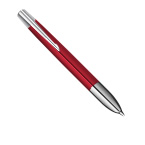
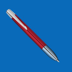
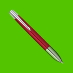
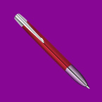
Another example we could use is a metal pen tip:
Part 3. Closing
This here is a simple and original technique. With semitransparence you can create amazing things, for instance, “chameleon icons.”
But don’t you get carried away with it forgetting all about the important stuff, or you could spend your whole life drawing reflections and shadows.
In the end, see how our toaster icon was made.
|