Congratulations on March 8
Making of an illustration for Samsung promo campaign on occasion of March 8
|
What is needed is an illustration for Samsung promo campaign on occasion of International Women’s Day (March 8). The gist of it is that everyone who buys Samsung T500 phone is given a perfumery gift coupon for 1000 rubles and a brand telephone package. So, here is the phone. 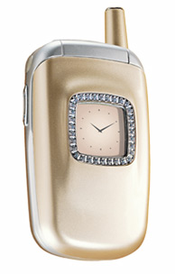 Lets put it along with a coupon in an abstract bag which will represent brand packing and at once join together all the objects. I would also introduce a buyer’s certificate—it can fill spare space and show the phone model name which is T500. I draw bag handles twisting them to form an 8—it’s the eighth of March, isn’t it? Now I want something that would help to understand the size of the phone. It would be nice if this element could set positive mood, too. Since it’s springtime, let it be a flower. Really quickly I make a Photoshop composition draft. 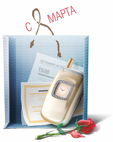 And then it’s all simple—I get an old dish made of clear plastic and model the bag using scissors and sticky tape. I take my camera and choose the right view and light. The lighting has to match that of the telephone—there is one light source in the right upper corner of the image. To make the task easier I choose an infinitely far light source which will allow me to construct shadows using parallel projection method. So, now I have a “live” model. I study light and shade patterns, reflections, glare, changing transparency and perspective distortions. And model an ideal bag leaving out the details for the moment—the bag will be full of things and some elements may become unnecessary. I take care to draw the bottom and the bend lines on the sides that form when the bag is folded. 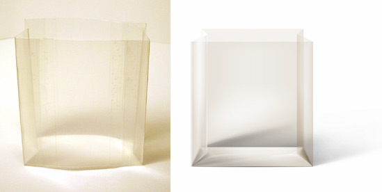 I print out the coupon sent by the client, draw an abstract certificate with the model name T500 and print that, too. Lighting, view angle, camera shutter… 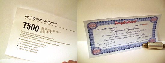 And now comes the twisting of the handle to make an 8: 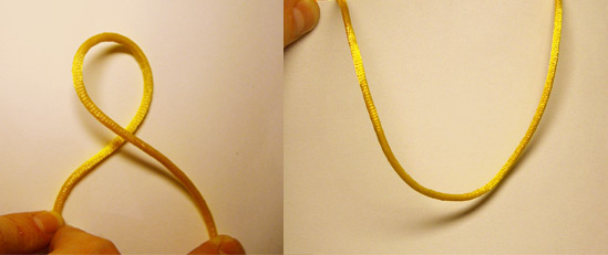 I arrange the parts, retouch, draw shadows, reflections, correct colors and bring everything close to an end trusting my intuition and visual memory. I remember to put glare (reflections) on the bag—it is to define its front side. I make them soft and light so as not to distract attention from the phone—I want the viewer to feel that there is a clear layer before the object. So I have two light spots overlaying the objects that seem to be “falling out” of the bag—the phone and the certificate. I leave alone the coupon because it sits between the two. I intentionally blur heavily the underlying objects and the folding parts of the bag to “push” these elements further back. And I leave the front side looking almost glass—I feel it would be the right thing to do in order to attract attention to the phone. 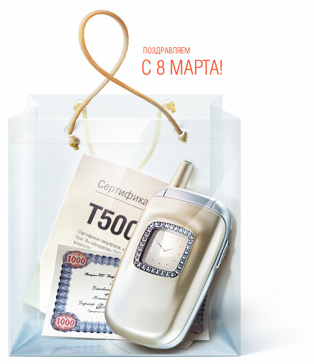 It looks fine and all that, but I want some festivity. I pull on my clothes, run to the flower shop and buy a rose. It needs to be sprinkled with water until there are nice drops. I keep in mind lighting and view angle. From under piles of papers on the table I dig up my camera…  It’s ok, but the drops lack some expression. I make a close-up of one of them and return to Photoshop.  I get rid of unnecessary details and place the drop…  More emotions! The phone wins the foreground in full—I make it red. I put a rose in the bag, gather all the elements up and smooth them out. The illustration is done. 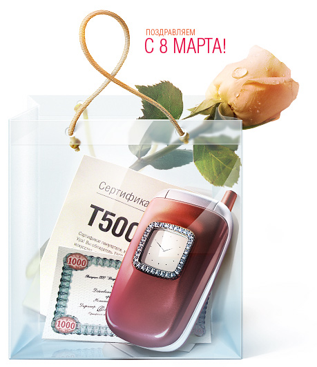 |
Narrated by Andrey Tikhanov |

Order a design...