It’s quarter to eleven. Man, it’s getting late.
Making of a font for Verbarius clock
|
On the one hand, a pixel font is easier to make. But on the other hand, it’s more difficult. With type size of 12-14 points you can’t really have any subtle features. And my first intention was to make a pixel version of Artemius which is all about little quirks. The result was this:  Firstly, it simply does not look good. Secondly, the letterforms are too thin. The clock is not that large, and it would lack readability. So I tried to make it thicker.  Well, this is better, though doesn’t look much like Artemius. 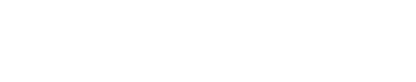 Lets try it on the clock (photograph of a sample on a scale of 1 monitor pixel to 1 panel pixel):
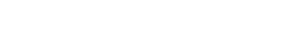
No, no, no. It sucks. Too wide. Longer phrases won’t fit. And it looks bad again. All right, I got it. It’st useless to try to render our specialty typeface with all its peculiarities into a single-color pixel form. I should make a new one. 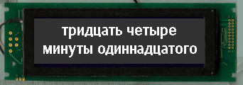 Ah, this one I like.  It’s almost fine. Lets try the capitals and the numbers. 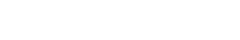 And all the lowercase type. Good. Only good is not good enough, so it’s bad. It’s a little too heavy for its size. And there is need for more space. The counters should be larger. It all means I have to redesign it another time.
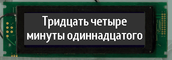
This is it. I say, it’s done. “C” and “e” have opened up. The contrast is almost gone. The type is bigger, yet long phrases fit just fine. Now it’s time for everything else. I won’t go for exquisite “g,” but I’ll make another twist—letters “y” in Cyrillic and Latin will look different. This is fun and no one will know.
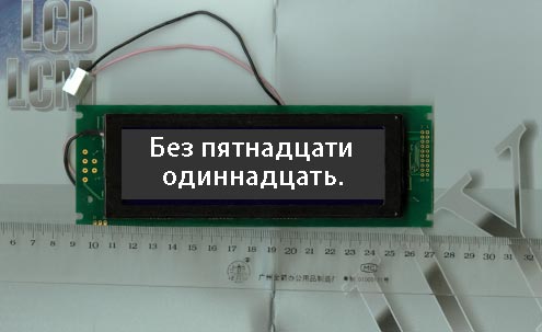
I won’t design figures. A spelling clock does’t need them. Then I went to the lab to see if it looks good on the prototype. It sure does. OK, I can now go on to special characters and kerning. |
|


Order a design...