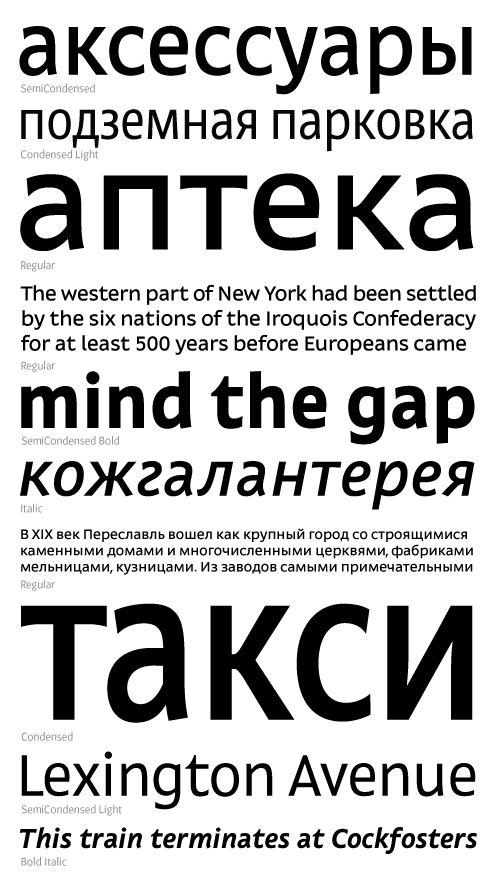
Direct is an open and dynamic typeface with clear-cut letterforms that make it instantly readable. It’s pattern is neutral, yet agreeable and modern feel.
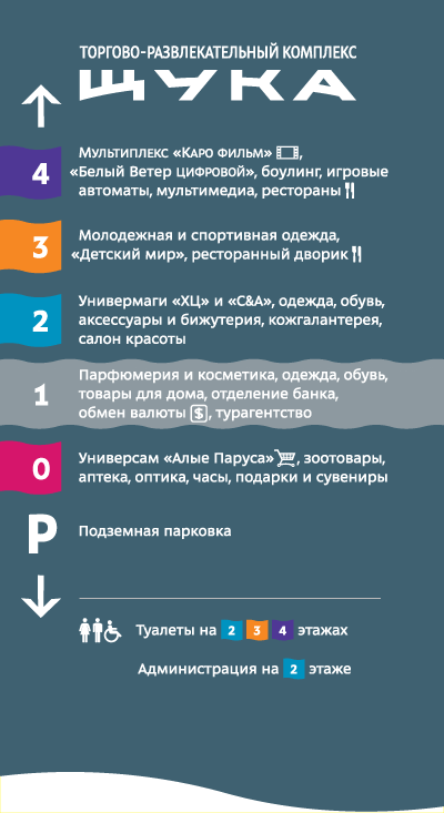
Direct typeface family includes nine fonts convenient for the purposes of navigation signage. Regular weight letterforms are rather wide, because direction signs are likely to appear before readers at an angle, so the type needs to withstand perspective distortions. And as signs and boards may vary in size, Direct was developed to include several width variations. Condensed fonts can be used in horizontally limited spaces without sacrificing body size and readability.
A signage typeface must be easily readable from distance and have simple letterforms with clear-cut features to quickly identify characters. Designing a type for a potentially wide range of purposes calls for a universal approach. If not destined to be used for navigation in a particular building, it shouldn’t incorporate any peculiar elements to agree with certain design or architecture.
All of the above determined our choice of a sans serif with large and clear counters and definite features allowing readers to instantly recognize letters. Descenders are made compact not to interfere with the line below or above. The low contrast between thick and thin strokes renders all letterform elements equally perceptible.
The x-height is significant, close to the cap height, which inhances readability of the lowercase type. There are two reasons why directions to avoid setting instructions in all caps. Firstly, lowercase letters are more diverse and include ascenders and descenders identifying some of the letters in the line. And secondly, people recognize words as a shape rather than read them letter by letter, which makes lowercase text more readable, since words set in all caps all have a uniform rectangular outline.
With Direct being a signage typeface, first to be developed were its width variations, while different weight styles and italics were added later. Another thing to keep in mind was that signs often use dark background colors, and white type on a dark background appears smaller than reverse.
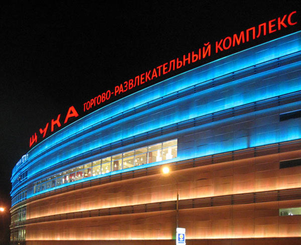
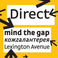
Direct is the first Cyrillic typeface created for navigation purposes. Before that, designers could use the Cyrillic version of Frutiger (Freeset) developed by Adrian Frutiger for the Paris Charles de Gaulle International Airport, and a number of others, mostly neutral sans serifs. However, signs and boards were dominated by Arial, which Direct would be glad to replace offering elegance and lucidity of form instead of type bluntness.
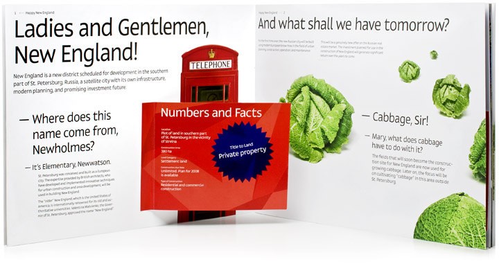
Direct is not meant for typesetting extensive text blocks, such as in books. Direct Regular characters are heavier and a bit wider than that of usual text type—it is perfectly suited to appear on signs, but would make a body copy look bulky. Nonetheless, Direct is a fine choice for small text blocks in booklets and flyers, and for headings.
/c1.gif)
/c2.gif)
/c3.gif)
/c4.gif)